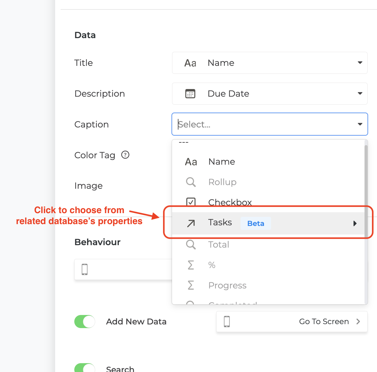
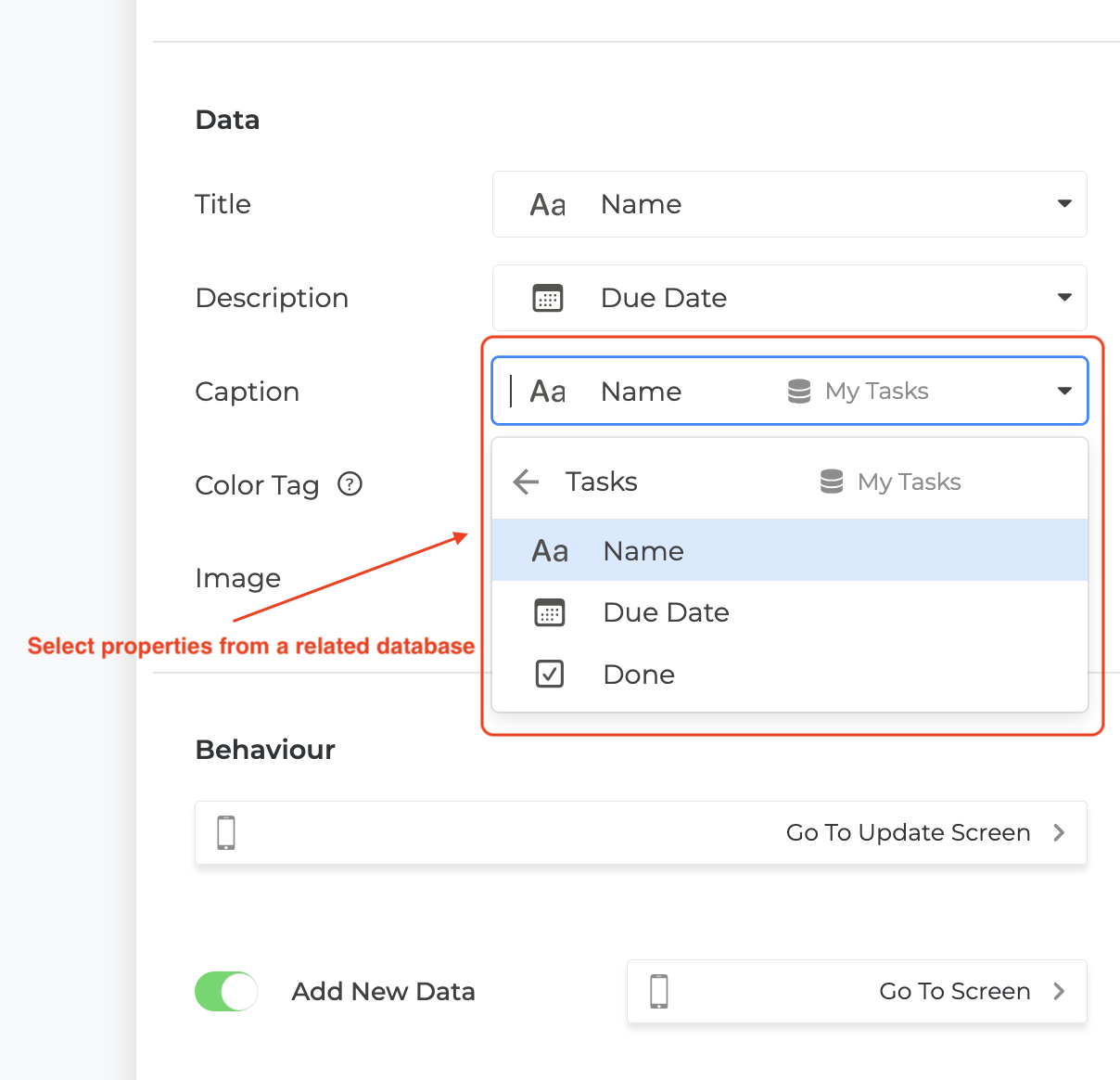
# Welcome to NotionApps
NotionApps turns Notion databases into secure, shareable apps — lists, forms, login, branding, and a published link — without giving users your Notion workspace.
## Build your first app (start here)
Do not bounce across the rest of the sidebar yet. Follow this sequence:
1. [Connect Notion](/get-started/connect-notion)
2. [Create an app](/get-started/create-an-app)
3. [Add List and Details](/get-started/add-list-and-details)
4. [Publish and share](/get-started/publish-and-share)
5. [Make it private](/get-started/make-it-private) (optional)
[Open Get started](/get-started)
## Builder map
| Builder rail | Docs |
| ------------ | ------------------------------------------------------------------------------- |
| Screens | [Screens & components](/screens-and-components/screens-and-components-overview) |
| Databases | [Databases](/databases) |
| Users | [Users](/users/users-overview) |
| Automate | [Automation](/automation) |
| Settings | [Settings](/settings) |
| Integrations | [Integrations](/integrations/integrations) |
Full map: [Builder](/builder). How to read the sidebar: [How the docs are organized](/get-started/how-the-docs-are-organized).
## What you can build
* Client and member portals — [Use Cases](/use-cases/use-cases-overview)
* Internal tools and request trackers
* Field apps with photos and signatures
* Approval and operations apps (with Automation)
## Plans & help
* [Plans and entitlements](/plans-and-entitlements)
* [How-to guides](/how-to-guides/how-to-guides-overview)
* [Troubleshooting](/troubleshooting/troubleshooting-overview)
* [Community](https://community.notionapps.com)
* [Release Notes](/release-notes)
# Get started
First app, in order. How-tos and encyclopedias come later.
1. [How the docs are organized](https://docs.notionapps.com/get-started/how-the-docs-are-organized)
2. [Connect Notion](https://docs.notionapps.com/get-started/connect-notion) → full: [workspace Connect Notion](https://docs.notionapps.com/workspace-and-account/connect-notion)
3. [Create an app](https://docs.notionapps.com/get-started/create-an-app) or [Start from a template / clone](https://docs.notionapps.com/get-started/start-from-a-template)
4. [Add List and Details](https://docs.notionapps.com/get-started/add-list-and-details)
5. [Publish checklist](https://docs.notionapps.com/get-started/publish-and-share) → [Publish & share](https://docs.notionapps.com/publish-and-share)
6. [Make it private](https://docs.notionapps.com/get-started/make-it-private)
# How the docs are organized
Read this page once. Then follow the sidebar from top to bottom for your first app. Depth is one click off that path. You should never need two homes for the same screen.
## The maker path
Build in this order. Skip a section only when you already finished that job.
| Order | Section | What you do here | What you do not do here |
| ----- | ----------------------------------- | -------------------------------------------------------------------------------------------------- | ---------------------------------------------------------------- |
| 1 | **Get started** | Connect Notion, create the first app, add a list and details, publish a checklist, make it private | Full Settings or Automation books |
| 2 | **Builder** | A short map of the left rail | A second Screens or Databases manual |
| 3 | **Screens & components** | Every screen type, view, component, and action | Billing, SSO, or webhook catalogs |
| 4 | **Databases** | Link, field types, sync, rollback, restriction | User login methods |
| 5 | **Users** | Privacy, login, signup, identity, view-as | Data sync steps (those live under Databases) |
| 6 | **Settings** | Brand, comments, versions, data, advanced | Publish URL and custom domain (Publish & share) |
| 7 | **Publish & share** | One hub: link, domain, collaborators | Builder rail tour |
| 8 | **Automation** | When you are ready: wizard → first approval → catalogs → screens | Re-teaching Work Queue (that guide stays under Types of Screens) |
| 9 | **Integrations** | Login and chat providers | Workflow webhooks (Automation) |
| 10 | **Plans and entitlements** | What each plan unlocks | How to build a screen |
| 11 | **How-to guides** | A 5-minute job | A second encyclopedia |
| 12 | **Troubleshooting** | One symptom, one answer, then back to the canonical page | A third copy of Automation |
| 13 | **Use cases** | End-to-end stories that reuse the same canonical pages | Re-teaching screen types |
| 14 | **Video / Release notes / Archive** | Watch, changelog, retired topics | Current setup steps |
## Four kinds of page
**Start-here** (Get started, most how-tos). One or two screens. Numbered steps. Then a “Full reference →” link into the canonical page. If a how-to needs more than about 400 words of “why,” that why belongs on the canonical page.
**Canonical** (one URL per topic). The long page. Every builder control, every shipped option, end-user behavior, plan gates, limits, a worked example, and troubleshooting. Gold standard: the Work Queue / Decision / Conversation screen guides and Comments.
**Index / rail stub** (Builder → Screens, Databases, Users, Settings, Automate; Automation native-screen index). About ten lines. A table of links. Never a third explanation of Work Queue or Sync.
**Redirect**. The old URL dies. It does not 404 and it does not retell the topic.
## In-page shape (every canonical page)
1. What this is / when to use it (and when not to)
2. Before you start
3. Build it (steps)
4. Every control (tables)
5. What users see
6. Limits and plans
7. Example
8. Fix problems
9. Related (the next page on the maker path)
## Rules that keep the sidebar short
* One Work Queue page: the long Types of Screens guide. The Automation index links to it. There is no second Work Queue book.
* One sync page: [Reload and sync](https://docs.notionapps.com/databases/reload-and-sync). Get started and Workspace reload pages point there.
* One publish hub: [Publish & share](https://docs.notionapps.com/publish-and-share). Get started publish is a short checklist that links to it.
* New features land in the existing slot. Select Items goes under Types of Screens. Field map goes under Databases. Trigger catalog goes under Automation → Advanced Reference. Do not add a 15th top-level section.
* How-tos do not grow into a second manual.
## Where to go next
If this is your first app, start at [Connect Notion](https://docs.notionapps.com/get-started/connect-notion), then [Create an app](https://docs.notionapps.com/get-started/create-an-app). If you already have an app and need a specific control, open Screens & components or Databases and stay on the canonical page for that topic.
# Connect Notion (start-here)
Numbered path for the first workspace connection. The canonical page is [Connect Notion](https://docs.notionapps.com/workspace-and-account/connect-notion). This page does not retell that manual.
## Steps
1. Sign in to the NotionApps builder.
2. Open **Workspaces** (or the Connect Notion prompt on first run).
3. Click **Connect Notion** and finish the Notion OAuth screen.
4. Share the databases your app will use with the NotionApps integration inside Notion.
5. Return to the builder and confirm the workspace shows as connected.
## Full reference →
[Connect Notion](https://docs.notionapps.com/workspace-and-account/connect-notion) — reconnect, multiple workspaces, “I can’t see my databases.”
## Related
Next: [Create an app](https://docs.notionapps.com/get-started/create-an-app).
# Create an app (start-here)
Numbered path for the first blank app. The canonical pages are [Create an app](https://docs.notionapps.com/workspace-and-account/create-an-app) and [Start from a template / clone an app](https://docs.notionapps.com/get-started/start-from-a-template).
## Steps
1. Connect Notion if you have not already.
2. On builder home, click **Create app**.
3. Pick the Notion workspace and the first database (or start from a template).
4. Wait until the builder opens with a default list screen.
5. Rename the app in **Settings → General** so you can find it later.
## When to clone instead
If you want Sample Apps, a marketplace template, or a copy of an app you already own, stop here and open [Start from a template / clone an app](https://docs.notionapps.com/get-started/start-from-a-template).
## Full reference →
[Create an app](https://docs.notionapps.com/workspace-and-account/create-an-app)
## Related
Next: [Add List and Details](https://docs.notionapps.com/get-started/add-list-and-details).
# Start from a template / clone an app
Use a Sample App, marketplace template, or a clone of an app you already own when you want a working first app instead of a blank builder. This page is the canonical reference for **clone app**, **clone template**, and **preflight**. Get started [Create an app](https://docs.notionapps.com/get-started/create-an-app) stays the short start-here and links here.
## What this is / when to use it
| Job | Use this | Do not use this |
| ------------------------------------------------- | -------------------------------------------- | ---------------------------------------------- |
| Copy an app you already own into the same account | **Clone app** (`POST /:accountId/clone_app`) | Recreating screens by hand |
| Start from a Sample App or marketplace template | **Clone template** + **preflight** | Importing a Notion export as if it were an app |
| Throw away a draft you no longer need | [Delete app](#delete-an-app) on this page | Archiving the Notion database |
Clone copies the NotionApps app definition (screens, settings, automation bindings) and points the new app at Notion databases. It does not duplicate every Notion row unless the template flow says it will provision sample data.
When **not** to clone:
* You only need one extra screen on an existing app. Add a screen instead.
* You want a second brand on the same data. Prefer one app plus [roles and navigation](https://docs.notionapps.com/users/roles-and-navigation), or a linked app exchange if you are in Automation.
* You are debugging a save failure. Fix the original app first. Cloning a broken field map copies the break.
## Before you start
1. You can sign in to the builder for the account that will own the new app.
2. Notion is connected. See [Connect Notion](https://docs.notionapps.com/workspace-and-account/connect-notion).
3. For a template: you can open the Sample Apps / marketplace card and you have room on your plan for one more app. See [Plans and entitlements](https://docs.notionapps.com/plans-and-entitlements).
4. For a clone of your own app: you know which app is the source, and you accept that the clone gets its own app id, URL slug, and publish state (draft until you publish).
## Build it
### Clone an app you already own
1. Open the builder home (your app list).
2. On the source app card, open the overflow menu and choose **Clone** / **Duplicate app**.
3. Confirm the destination workspace if the account has more than one.
4. Wait for the clone to finish. The new app appears in the list with a new name (usually “Copy of …”).
5. Open the clone. Check **Databases** — every linked database should resolve. If a database is missing, reconnect it from [Manage linked databases](https://docs.notionapps.com/databases/manage-linked-databases).
6. Open **Users** if the source was private. The clone does not silently share the live user list until you link the Users database again.
7. **Publish** when the clone is ready. Publishing the clone does not unpublish the source.
### Start from a Sample App or marketplace template
1. Open **Sample Apps** (or the marketplace card on builder home).
2. Pick a template that matches the job (Client Approval Hub, inspection ops, lead capture). Prefer a live-apps story you can also open as a guest so you know the end state.
3. Click **Use template** / **Start from template**.
4. Connect or confirm the Notion workspace the template will write into.
5. Run **Preflight** when the UI offers it. Preflight checks that required databases, properties, relations, and automation entitlements exist before the app is marked ready.
6. If preflight reports missing properties, add them in Notion (or let the provisioner create them when the template says it will), then run preflight again.
7. Open the new app. Walk the first-app path: list → details → one form → publish checklist.
8. Replace sample copy and sample users before you share the link with customers.
### Delete an app
1. Open the app in the builder.
2. Go to **Settings → Advanced** (or the app card overflow → **Delete**).
3. Confirm the app name. Deletion removes the NotionApps app, its published URL, and builder history. It does **not** delete the Notion databases.
4. If you only need to hide the app, archive / unpublish instead. Delete is for apps you will not restore.
## Every control
| Control | Where | What it does |
| ----------------- | ------------------------------------ | -------------------------------------------------------------------------------------------------- |
| Clone / Duplicate | App card overflow | Calls clone app. New app id. Draft until you publish. |
| Use template | Sample Apps / marketplace | Provisions screens + optional Notion schema. |
| Preflight | Template / Automation template setup | Read-only check: databases, properties, relations, entitlements. |
| Repair | Template setup (when shown) | Attempts to create missing template pieces. Use after you understand what it will write to Notion. |
| Delete app | Settings → Advanced | Removes the NotionApps app only. |
| App name | Settings → General | Rename the clone so makers do not edit the source by mistake. |
## What users see
End users never see “clone” or “preflight.” They see whatever you publish on the new app URL. Until you publish the clone, they keep using the source app.
If the template includes sample rows (demo clients, demo requests), those rows are visible to anyone who can open the published app. Remove or replace them before a customer launch.
## Limits and plans
* Each clone counts as an **app** on your plan. If you are at the app cap, clone fails until you delete or upgrade. See [Plans and entitlements](https://docs.notionapps.com/plans-and-entitlements).
* Template automation (Workflow, Messaging, Approvals) is entitlement-gated. Preflight fails closed when the account cannot use those families. Request access from Automation Home rather than forcing a JSON import.
* Clone does not copy custom domain bindings. Re-add the domain on [Publish & share](https://docs.notionapps.com/publish-and-share).
* Clone does not copy collaborator invites. Re-add collaborators on the new app.
* File upload and two-way sync meters stay on the account. A clone that writes files still consumes the same upload quota.
## Example
A maker has a working private portal **App A** and wants a second portal for another audience.
1. Clone **App A**.
2. Rename the clone **App B**.
3. In Databases, point lists at App B’s Notion databases (or keep the same databases and tighten [data restriction](https://docs.notionapps.com/users/data-restriction)).
4. In Users, link App B’s Users database and confirm login method.
5. Publish App B. Leave App A published.
## Fix problems
| Symptom | Likely cause | What to do |
| ----------------------------- | ---------------------------------------------------------------- | ------------------------------------------------------------------------------------------------------------------------------- |
| Clone button missing | Plan app cap, or you are a collaborator without clone permission | Check plan meters. Ask the account owner. |
| Preflight fails on a property | Template expects a Notion property that is missing or renamed | Restore the property name/type in Notion, or map the field in the builder, then re-run preflight. |
| Clone opens with empty lists | Databases not shared with the Notion integration | Share the databases with the NotionApps integration. Then [sync](https://docs.notionapps.com/databases/reload-and-sync). |
| Save failed after first edit | Field map points at a property the clone no longer has | See [Save failed / field missing after Sync](https://docs.notionapps.com/troubleshooting/save-failed-field-missing-after-sync). |
| Automation screens empty | Entitlement not granted on the new app | Open Automation Home → Request access. |
## Related
Next on the maker path: [Create an app](https://docs.notionapps.com/get-started/create-an-app) if you are still on a blank app, or [Add List and Details](https://docs.notionapps.com/get-started/add-list-and-details) once the clone exists. When you are ready to share, use the [first-app publish checklist](https://docs.notionapps.com/get-started/publish-and-share) and then the [Publish & share](https://docs.notionapps.com/publish-and-share) hub.
# Add List and Details
Most apps start with a **List (View Items)** screen and a **Details (View One Item)** screen so users can browse records and open one item.
## Steps
1. In the builder, open **Screens**.
2. Click **+ New Screen** and add **List (View Items)** for your database.
3. In **Content**, map **Title** (and optional description / color tag) to Notion properties.
4. Add **Details (View One Item)** for the same database.
5. On the List screen, set the open action to go to Details (Open Item / navigate to details).
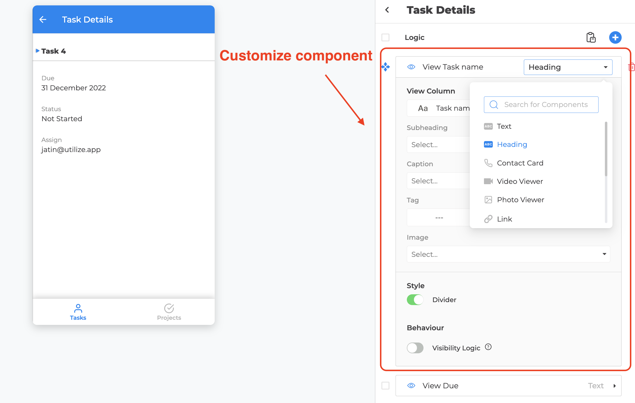
6. On Details, add **View** components for the fields users should read (Status, Owner, dates, etc.).
7. Open **Edit Navigation** and keep both screens reachable (or Details hidden and opened only from the list).
## Preview
Use the phone/desktop preview in the center of the builder. Tap a row and confirm Details opens with the right fields.
## Learn more
* [List (View Items)](https://docs.notionapps.com/screens-and-components/types-of-screens/list-view-items)
* [Details (View One Item)](https://docs.notionapps.com/screens-and-components/types-of-screens/details-view-one-item)
* [Types of Screens](https://docs.notionapps.com/screens-and-components/types-of-screens)
## Next
[Publish and share](https://docs.notionapps.com/get-started/publish-and-share)
# First-app publish checklist
Start-here only. After you can tick every box, use the full [Publish & share](https://docs.notionapps.com/publish-and-share) hub for domains, collaborators, and white-label.
This page replaces the old Get started link to `/basics/share-app/publish` (that URL 404s).
## What this is
A short path from “the builder looks right” to “someone else can open the app.” Publishing writes a version users can load. Autosave in the builder is not publish.
## Before you start
* You have at least one screen in navigation.
* Notion data you care about has been [synced](https://docs.notionapps.com/databases/reload-and-sync) once.
* If the app is private, [Users](https://docs.notionapps.com/users/private-apps) has a login method and at least one test user.
## Checklist
1. Open the app in the builder.
2. Use **View as** (when the app is private) to confirm the first user can see the home screen. See [View as any user](https://docs.notionapps.com/users/view-as-any-user).
3. Click **Publish** (top of the builder).
4. Wait until the publish toast succeeds. A 409 conflict means another tab saved first — see [Save conflict (409)](https://docs.notionapps.com/troubleshooting/save-conflict-409-multi-tab).
5. Copy the app link from [Publish & share](https://docs.notionapps.com/publish-and-share).
6. Open the link in a private window. Confirm login (if private) and the first list.
7. Only then send the link to a real user.
## Full reference →
[Publish & share](https://docs.notionapps.com/publish-and-share) — link, custom domain, collaborators, Remove NotionApps label, and what happens to users after a new version.
## Related
Next: [Make it private](https://docs.notionapps.com/get-started/make-it-private) if guests should not see the data. Or stay on the hub if you need a custom domain.
# Make it private
When the app should not be open to anyone with the link, switch to a **Private** app, choose a login method, and (usually) restrict which Notion rows each user can see.
## Steps
1. Open **Users** in the builder rail.
2. Set the app to **Private** (see [Private apps](https://docs.notionapps.com/users/private-apps)).
3. Create or link a **Users** database and add at least one test user.
4. Choose a login method that is available today (email OTP is always available; [Email & password](/integrations/email-and-password), [Google](/integrations/google-login), [Auth0](/integrations/auth0-login), and [Okta](/integrations/okta-login) are entitlement-gated).
5. Configure [Data Restriction](https://docs.notionapps.com/users/data-restriction) / personalization so users only see their rows.
6. **Publish** again, then open the app while signed out — you should hit login.
## Auth overview
See the full matrix: [Auth and access](https://docs.notionapps.com/users/auth-and-access)
## Related
* [App Users](https://docs.notionapps.com/users/app-users)
* [Sign up](https://docs.notionapps.com/users/sign-up)
* [Identity admin](/users/identity-admin)
* [Integrations](/integrations/integrations)
## What’s next after your first private app
* Add a **Form (Add Item)** or **Form (Update One Item)**
* Try [Board layouts](https://docs.notionapps.com/guides/board-list-view)
* Explore [Automation](https://docs.notionapps.com/automation) if you need approvals or routing
# Builder
Map of the NotionApps **builder left rail**. Use after [Get started](/get-started).
## Rail → docs
| Rail | Opens in product | Docs |
| ---------------- | -------------------------------------------------------------------------- | ------------------------------------------------------------------------------- |
| **Screens** | Screen list, layouts, navigation, components | [Screens & components](/screens-and-components/screens-and-components-overview) |
| **Databases** | Linked Notion databases, reload, recovery | [Databases](/databases) |
| **Users** | Public/Private, login, App Users, Identity, Analytics, signup | [Users](/users/users-overview) |
| **Settings** | General, Appearance, Comments, Version History, Data, Advanced | [Settings](/settings) |
| **Integrations** | Google, Email & password, Auth0, Okta, Crisp, Intercom (entitlement-gated) | [Integrations](/integrations/integrations) |
| **Automation** | One Automation entry when entitled (hub inside — not three rail icons) | [Automation](/automation) |
Help lives in the **rail footer** (docs, community, tour, zoom) — not a main rail destination.
## Recommended maker order
1. Screens — List + Details (+ Create Form when needed)
2. Databases — confirm links + reload after Notion changes
3. Settings — name, URI, theme
4. [Publish & share](/publish-and-share)
5. Users — when the app must be Private / personalized
6. Integrations — when you need extra login buttons or chat widgets
7. Automation — only after the data path works
8. [Plans and entitlements](/plans-and-entitlements) — when a control is missing
## Also useful
* [Find your way around the builder nav rail](/how-to-guides/find-your-way-around-the-builder-nav-rail)
* [How-to guides overview](/how-to-guides/how-to-guides-overview)
* [Troubleshooting](/troubleshooting/troubleshooting-overview)
# Screens (builder rail)
Short map of the **Screens** item in the builder left rail. This is not a second screen manual.
| Open this in the rail | Then read |
| ---------------------------- | ------------------------------------------------------------------------------------------- |
| Screen list | [Add New Screen](https://docs.notionapps.com/screens-and-components/add-new-screen) |
| A list or details screen | [Types of Screens](https://docs.notionapps.com/screens-and-components/types-of-screens) |
| View type, filters, actions | [Customize a screen](https://docs.notionapps.com/screens-and-components/customize-a-screen) |
| Fields on a form or details | [Type of Components](https://docs.notionapps.com/screens-and-components/type-of-components) |
| Tabs, drawer, hidden screens | [App Navigation](https://docs.notionapps.com/screens-and-components/app-navigation) |
**Full reference →** [Screens & components overview](https://docs.notionapps.com/screens-and-components/screens-and-components-overview)
# Databases (builder rail)
Short map of the **Databases** item in the builder left rail. This is not a second sync manual.
| Open this in the rail | Then read |
| ---------------------------------- | ------------------------------------------------------------------------------------------------- |
| Linked databases | [Manage linked databases](https://docs.notionapps.com/databases/manage-linked-databases) |
| Sync, auto-sync, refresh, rollback | [Reload and sync](https://docs.notionapps.com/databases/reload-and-sync) |
| What each Notion property becomes | [Notion property types](https://docs.notionapps.com/databases/notion-property-types) |
| Who can see which rows | [Data restriction vs filters](https://docs.notionapps.com/databases/data-restriction-and-filters) |
**Full reference →** [Databases](https://docs.notionapps.com/databases)
# Users (builder rail)
Short map of the **Users** item in the builder left rail. This is not a second identity manual.
| Open this in the rail | Then read |
| ---------------------- | -------------------------------------------------------------------------------- |
| Public vs private | [Private apps](https://docs.notionapps.com/users/private-apps) |
| Users database | [Create Users Database](https://docs.notionapps.com/users/create-users-database) |
| Signup, domains, terms | [Sign up](https://docs.notionapps.com/users/sign-up) |
| Roles, identity fields | [Identity admin](https://docs.notionapps.com/users/identity-admin) |
| Row visibility | [Data Restriction](https://docs.notionapps.com/users/data-restriction) |
**Full reference →** [Users overview](https://docs.notionapps.com/users/users-overview)
# Settings (builder rail)
Short map of the **Settings** item in the builder left rail. Expand the pane pages, not this stub.
| Pane | Canonical page |
| --------------- | ---------------------------------------------------------------------------------- |
| General | [Settings → General](https://docs.notionapps.com/settings/general) |
| Appearance | [Settings → Appearance](https://docs.notionapps.com/settings/appearance) |
| Comments | [Settings → Comments](https://docs.notionapps.com/settings/comments) |
| Version History | [Settings → Version History](https://docs.notionapps.com/settings/version-history) |
| Data | [Settings → Data](https://docs.notionapps.com/settings/data) |
| Advanced | [Settings → Advanced](https://docs.notionapps.com/settings/advanced) |
Publish URL, custom domain, and collaborators live on [Publish & share](https://docs.notionapps.com/publish-and-share), not here.
# Automate (builder rail)
Short map of the **Automate** / **Automation** item in the builder left rail. Native screen guides stay under Types of Screens.
| Job | Canonical page |
| ---------------------------------- | ------------------------------------------------------------------------------------------------------------------------------------------------------------------------------------ |
| Which system to use | [Which automation](https://docs.notionapps.com/automation/which-automation) |
| First live success | [Start From a Wizard](https://docs.notionapps.com/automation/start-from-a-wizard) |
| Triggers and steps | [Trigger catalog](https://docs.notionapps.com/automation/advanced-reference/trigger-catalog), [Step catalog](https://docs.notionapps.com/automation/advanced-reference/step-catalog) |
| Work Queue, Decision, Conversation | [Native screen guides](https://docs.notionapps.com/screens-and-components/types-of-screens/native-automation-and-operational-screen-guides) |
| Legacy email / SMS / webhook | [Which automation](https://docs.notionapps.com/automation/which-automation#legacy-automate) |
**Full reference →** [Automation](https://docs.notionapps.com/automation)
# Screens & components overview
Builder **Screens** rail: layouts, navigation, and field components.
Branding (icon, color, URL) and custom domains live under **Settings** and **Publish & share**, not here.
## Core screen types
* [Types of Screens](/screens-and-components/types-of-screens)
* [Add New Screen](/screens-and-components/add-new-screen)
* [Customize a screen](/screens-and-components/customize-a-screen)
* [View Types (List / Grid / Calendar / Board)](/screens-and-components/customize-a-screen/view-types-list-grid-calendar-board)
## Navigation & chrome
* [App Navigation](/screens-and-components/app-navigation)
* [Navigation Groups](/screens-and-components/navigation-groups)
* [Desktop View](/screens-and-components/desktop-view)
## Components
* [Type of Components](/screens-and-components/type-of-components)
## Branding and domain (moved)
* [Settings → Appearance](/settings/appearance) — theme, icon, fonts, custom code
* [Settings → General](/settings/general) — name and URL
* [Publish & share](/publish-and-share) — publish, share, custom domain
* [Custom Domain](/screens-and-components/custom-domain) (hidden from this sidebar; URL kept)
Map back to the builder: [Builder](/builder).
# App Navigation
One page for how users move through the app: mobile bottom tabs vs drawer, desktop top tabs vs drawer, role-specific nav, and screens hidden from navigation (deep links only).
[Navigation Groups](https://docs.notionapps.com/screens-and-components/navigation-groups) and [Screen Navigation Visibility](https://docs.notionapps.com/workspace-and-account/screen-navigation-visibility) stay as short pointers to this page. Do not grow a second nav book.
## What this is / when to use it
Navigation is the chrome around your screens: the tab bar, the drawer, and the desktop top tabs. It is not the same as [screen visibility](https://docs.notionapps.com/screens-and-components/customize-a-screen/screen-visibility) (who may open a screen) or [data restriction](https://docs.notionapps.com/users/data-restriction) (which rows they see).
Use this page when you are deciding:
* Tabs vs a drawer on phones
* Top tabs vs a drawer on desktop
* Different menus per role
* A screen that should exist but not appear in the menu (Select Items, a success content page, a deep-linked form)
When **not** to use navigation as a security control: hiding a screen from the menu does not hide it from a crafted URL if the user is allowed to open it. Use screen visibility and private apps for access.
## Before you start
1. You have more than one screen.
2. You know the primary role’s “home” screen.
3. You have decided public vs private. Public apps still have nav; they just have no login chrome.
## Build it
1. Open **Edit Navigation** (builder, Screens rail or the nav editor).
2. Choose the **mobile** pattern: bottom tabs or drawer.
3. Choose the **desktop** pattern: `TOP_TABS` or `DRAWER` (`DesktopNavigationType`).
4. Drag screens into the order users should see. First item is what most users treat as home unless you set a Profile landing screen.
5. Optionally create **navigation groups** (section labels in the drawer).
6. For each role that needs a different menu, configure that role’s visible screens. See [Roles and navigation](https://docs.notionapps.com/users/roles-and-navigation).
7. For picker / success / wizard screens, turn **Hide from navigation** on. Give them an opener (button, form redirect, relation). See the how-to [Open Screens That Are Hidden From Navigation](https://docs.notionapps.com/how-to-guides/open-screens-that-are-hidden-from-navigation).
8. Preview phone and desktop. Publish.
## Every control
| Control | Options | What it does |
| ----------------------- | ----------------------- | ----------------------------------------------------------------------------------------------------------------------------------------------- |
| Mobile nav | Bottom tabs / drawer | Phones and the “show mobile view on desktop” preview. |
| Desktop nav | `TOP_TABS` / `DRAWER` | Large-device chrome. |
| Large device view | `DESKTOP` / `MOBILE` | Force the mobile layout on desktop. See [Desktop view](https://docs.notionapps.com/screens-and-components/desktop-view). |
| Screen order | Drag list | Tab / drawer order. |
| Navigation group | Label + member screens | Drawer section headings. |
| Hide from navigation | On / off | Screen stays in the app, omitted from chrome. |
| Role menu | Per-role screen set | Different tabs for Client vs Staff. |
| Profile landing | Everyday chrome Profile | User-chosen default screen. See [Profile](https://docs.notionapps.com/screens-and-components/types-of-screens/everyday-chrome-screens/profile). |
| App icon / colour / URL | Brand | Not nav structure. See [App Icon, Colour, URL](https://docs.notionapps.com/screens-and-components/app-icon-colour-url). |
Bottom tabs work with a small set of top-level screens (about 3–5). More than that belongs in a drawer, or in tabs plus hidden deep links.
## Hide from navigation
Turn **Hide from navigation** on for picker, success, and wizard screens. The screen stays in the app and is omitted from the tab bar and drawer. Users reach it from a button, a form redirect, a relation picker, or a published URL. Hiding a screen is not access control — use screen visibility and private apps for that.
## What users see
**Mobile bottom tabs.** A bar at the bottom. Extra screens go into an overflow if you add too many — prefer fewer tabs.
**Mobile drawer.** A menu icon. Groups appear as headings.
**Desktop top tabs.** A horizontal bar. Long lists wrap or overflow; prefer a drawer when you have many roles and many screens.
**Desktop drawer.** Persistent or hamburger, matching the mobile mental model.
**Hidden screens.** No tab. Users reach them from a button (`go_to_screen`), a form submit redirect, a relation picker, or a published URL that includes the screen slug.
## Limits and plans
* Hide-from-nav is not access control.
* Role menus still require the user to be in that role in the Users database.
* Custom domain and slug changes do not reset nav, but they do change deep-link URLs. See [Publish & share](https://docs.notionapps.com/publish-and-share).
* Everyday chrome screens (Home, Search, My Queue, Activity, Profile) are normal nav citizens. Put Home first and Profile last unless you have a reason not to.
## Example
A mixed portal:
| Screen | Nav | Who |
| ---------------------------- | ---------------------- | ----------------------------- |
| Home | First tab | All signed-in roles |
| My requests | Tab | Client |
| Work queue | Tab | Staff |
| Add request | Hidden | Opened from Home primary CTA |
| Choose scopes (Select Items) | Hidden | Opened from the form relation |
| Legal (Content) | Drawer group “Account” | All, also marked public |
Staff and Client do not share the same tab set.
## Fix problems
| Symptom | Likely cause | What to do |
| -------------------------------------------- | ----------------------------------- | ------------------------------------------- |
| Screen missing from tabs | Hidden, or role menu excludes it | Check hide-from-nav and role config. |
| Users open a hidden screen from a stale link | Visibility still allows them | Tighten screen visibility if that is wrong. |
| Desktop looks like a phone | Large device view is `MOBILE` | Set `DESKTOP`. |
| Two nav docs disagree | Groups / visibility pages are stubs | This page is canonical. |
## Related
Next: [Add New Screen](https://docs.notionapps.com/screens-and-components/add-new-screen) or [Types of Screens](https://docs.notionapps.com/screens-and-components/types-of-screens). Screen who-can-open rules: [Screen Visibility](https://docs.notionapps.com/screens-and-components/customize-a-screen/screen-visibility).
# Navigation Groups
Short pointer. The canonical page is [App Navigation](https://docs.notionapps.com/screens-and-components/app-navigation).
Navigation groups are drawer section labels. Configure them in **Edit Navigation**, then read the controls table on App Navigation. Do not add a second explanation here.
# App Icon, Colour, URL
NotionApps allows you to customize your app's icon, colour, and URL to create a unique look and feel for your app. You can customize these attributes by following these steps:
1. Open your app in the app builder.
2. Click on the "Settings" button in the left side panel of the app builder.
3. To customize the app icon, scroll to the "App Icon" section inside the settings. You can choose an icon from our library or upload a custom icon from your system.
4. To customize the app colour, scroll to the "App Color Theme" section. You can choose from our pre-defined colour themes.
5. To customize your app's URL, scroll to the "URL" section. Your app's URL can only contain letters, numbers, and hyphens. If the URL you want is already taken, you'll need to choose a different URL. Once you've chosen your URL, you will need to publish the app for the app to be available at the desired URL.
{% hint style="info" %}
You can also customize the app's name and description.
{% endhint %}
By following these simple steps, you can easily customize your NotionApp's icon, colour, and URL. Whether you want to create a unique look and feel for your app or make it easier for users to identify your brand, the app builder makes it easy to customize your app to your liking.
## Related
These controls also live under **Settings**:
* [Settings → Appearance](/settings/appearance) — theme, icon, fonts, custom code
* [Settings → General](/settings/general) — name and URL
* [Publish & share](/publish-and-share)
* [Custom Domain](/screens-and-components/custom-domain)
# Custom Domain
You can link your own custom domain to the apps. This means that the app will be available on *app.mydomain.com* instead of *app.notionapps.com,* making it easier to promote the app with your branding when sharing it with others.
{% hint style="info" %}
Subdomains under a root domain count as a single custom domain. For example, blog.mydomain.com and sales.mydomain.com will be counted as one custom domain.
However, if you have two apps, one linked with mydomain.com and the other with myseconddomain.com, these will be counted as two custom domains.
{% endhint %}
{% embed url="" %}
### Update your DNS Settings
Below you can find the DNS settings that need to be included on your domain registrar's (GoDaddy, Namecheap, Google Domains, etc) or DNS provider's (Cloudflare, Netlify, etc) website.
### Root domain records
For a root domain like `example.com` you'll need to add the following records:
| Type | Name | Value |
| ----- | ---- | -------------------- |
| A | @ | 76.76.21.21 |
| CNAME | www | cname.notionapps.com |
{% hint style="warning" %}
Make sure to remove any old A records or AAAA records for your root domain or old CNAME entries for www in your DNS settings if your provider does not do this automatically.
{% endhint %}
### Subdomain records
For a subdomain like `blog.example.com` add this record:
| Type | Name | Value |
| ----- | ---------------- | -------------------- |
| CNAME | (your subdomain) | cname.notionapps.com |
{% hint style="warning" %}
Make sure to remove any old A records for your subdomain or CNAME entries for the subdomain in your DNS settings if your provider does not do this automatically.
{% endhint %}
### Adding your custom domain to your app
To add a domain to your app,
1. Open the NotionApps app builder
2. Go to App Settings
3. Add your custom domain to the input in the *Custom Domain* section
After entering your own domain address in the popup, if you haven’t already done so, you'll then need to make some changes to the DNS settings through your hosting provider.
You would need to change your DNS records through your domain registrar's (GoDaddy, Namecheap, Google Domains, etc) or DNS provider's (Cloudflare, Netlify, etc) website. For specific instructions, view the content inside the blocks above.
{% hint style="info" %}
**If you run into issues, please make sure that you have:**
* Added new DNS records to your domain provider
* Removed old DNS records
* Waited up to 24 hours for new settings to propagate
{% endhint %}
## Troubleshooting
***Problem***
My custom domain shows an empty screen and I use CloudFlare as my DNS Provider/Proxy.
***Solution***
When Cloudflare proxy is on your site may show an error `err_too_many_redirects`.
This issue occurs when your Cloudflare SSL/TLS configuration is set to "Flexible". This will have Cloudflare send requests to NotionApps over HTTP and in response, NotionApps will send data back over HTTPS.
To keep all our connections secure you must request Cloudflare to only send requests over HTTPS. To fix this issue, the "SSL/TLS" option in Cloudflare needs to be set to "Full (strict)".
***Problem***
My custom domain is configured and it's been some time but the browser still shows an SSL error.
***Solution***
NotionApps uses Vercel to provide you with custom domains. If you use another service that may be using Vercel as their domain provider, you can see such as SSL error.
To resolve this, please reach out to us at and we will help you resolve this quickly.
# Buy Additional Custom Domains
## **How to purchase additional custom domains:**
1. **Subscribe to a paid NotionApps plan:** This feature is not available on the FREE plan. Upgrade to a paid plan that best suits your needs. Go to the [Pricing](https://www.notionapps.com/pricing) page to upgrade.
2. **Access your account settings:** On the NotionApps [homepage](https://www.notionapps.com/home), click on **Settings** in the side navigation bar.
3. **Locate the "Buy More" option:** Under the **Usage** section, click the **"Buy more usage"** button.
4. **Manage your plan through Stripe:** You'll be redirected to a secure Stripe customer portal. Click **"Update Plan"** to manage your subscriptions.
5. **Add "Extra Custom Domain" add-on:** Look for the new option **"Extra Custom Domain"** under available add-ons.
6. **Choose the quantity and confirm:** Select the number of additional custom domains you want to purchase and confirm your selection.
## **Important notes:**
* This feature is not currently available on free plans.
* For custom solutions or bulk purchases, please contact NotionApps support at `help@notionapps.com`.
* Remember to update your DNS settings with the provided information after purchasing your additional domains.
## **Additional resources:**
* Learn more about custom domains in our documentation:
* Watch a video tutorial on configuring custom domains:
# Add New Screen
## Add New Screen
Adding a new screen to your NotionApp is a simple process that allows you to customize the look and functionality of your app. Follow these steps to add a new screen to your app:
1. Open your app in the app builder.
2. Click on the "+ New Screen" button in the bottom-right corner of the app builder. This will open a popup that allows you to add a new screen to your app.
3. Select the Notion database whose items you want to view, update, or add from the drop-down menu.
4. Select the type of screen you want to add. There are four types of screens available: List (View Items), Details (View One Item), List (Update Items), Form (Update Item), and Form (Add Item). Each type of screen has different functionality, so choose the one that best fits your needs.
5. Press the "Done" button to add the screen to your app.
After adding the screen, you can customize its appearance and functionality. You can customize the look of the screen by changing its row configuration, title, and icon. You can also filter and sort the screen items to display the data in the way that makes the most sense for your app.
#### Other Screen Actions
You can delete or duplicate a screen on NotionApps using the buttons provided right next to the screen name.
{% hint style="info" %}
The option to delete or duplicate a screen is only available on the top-level screens in the bottom tabs or the side drawer.
{% endhint %}
### When this app needs automation
Use the normal instructions on this page when users only need to view, add, or update data. Use automation when the app needs to do something after that data changes, such as submit for approval, notify a reviewer, route work to a queue, start a conversation, update workflow status, or show a recoverable failure.
Good next steps:
* Automation Overview explains the full maker journey.
* Start From a Wizard is the safest way to create a guided workflow.
* Create your first approval workflow walks through a complete approval setup.
* Native Automation Screens explains Decision, Work Queue, Notification Center, Conversation, Workflow Status, Exception Resolution, Automation Launcher, Linked App Exchange, and Operator Console.
# Types of Screens
Index. Add new types here, not as a 15th top-level section.
| Screen | Canonical page |
| -------------------------- | ----------------------------------------------------------------------------------------------------------------------------- |
| List (View Items) | [list-view-items](https://docs.notionapps.com/screens-and-components/types-of-screens/list-view-items) |
| Details | [details-view-one-item](https://docs.notionapps.com/screens-and-components/types-of-screens/details-view-one-item) |
| List (Update Items) + bulk | [update-items-form](https://docs.notionapps.com/screens-and-components/types-of-screens/update-items-form) |
| Form (Update One Item) | [form-update-one-item](https://docs.notionapps.com/screens-and-components/types-of-screens/form-update-one-item) |
| Form (Add Item) | [add-new-item-form](https://docs.notionapps.com/screens-and-components/types-of-screens/add-new-item-form) |
| Select Items | [select-items](https://docs.notionapps.com/screens-and-components/types-of-screens/select-items) |
| Content | [content](https://docs.notionapps.com/screens-and-components/types-of-screens/content) |
| Native automation | [guides](https://docs.notionapps.com/screens-and-components/types-of-screens/native-automation-and-operational-screen-guides) |
| Everyday chrome | [everyday-chrome-screens](https://docs.notionapps.com/screens-and-components/types-of-screens/everyday-chrome-screens) |
View modes for list-family screens: [View types](https://docs.notionapps.com/screens-and-components/customize-a-screen/view-types-list-grid-calendar-board).
# List (View Items)
The **List (View Items)** screen shows many records from a Notion database in one place. It is the main browsing surface for apps: users scan rows, search or filter, and open a details screen when they need more.
{% hint style="info" %}
**Who this guide is for**\
Makers configuring a list of Notion records. This guide explains every List builder option across the **Content**, **Behaviour**, and **Appearance** tabs, including when each control appears.
{% endhint %}
## What the screen is for
### Use List (View Items) when
* Users need to browse many records from one database
* You want search, sorting, grouping, or end-user filters
* Row click should open a **Details** screen
* You may also want an **Add** path into a Create Form
### Do not use it when
* Users only submit new records with no browsing: use **Form (Add Item)**
* Users edit one existing record: use **Form (Update One Item)** or **List (Update Items)**
* Work is claim-and-complete workflow items: use **Work Queue**
* The page is static HTML: use **Content**
## What users see in the live app
* A list, grid, calendar, or board of records (View Type)
* Mapped Title / Description / Caption / Tag / Image fields (depending on layout)
* Optional search, scanner, and in-app filters
* Optional add button when Add New Item is enabled
* Row tap opens the configured Details screen when Open Item On Click is on
## Add List (View Items) in the builder
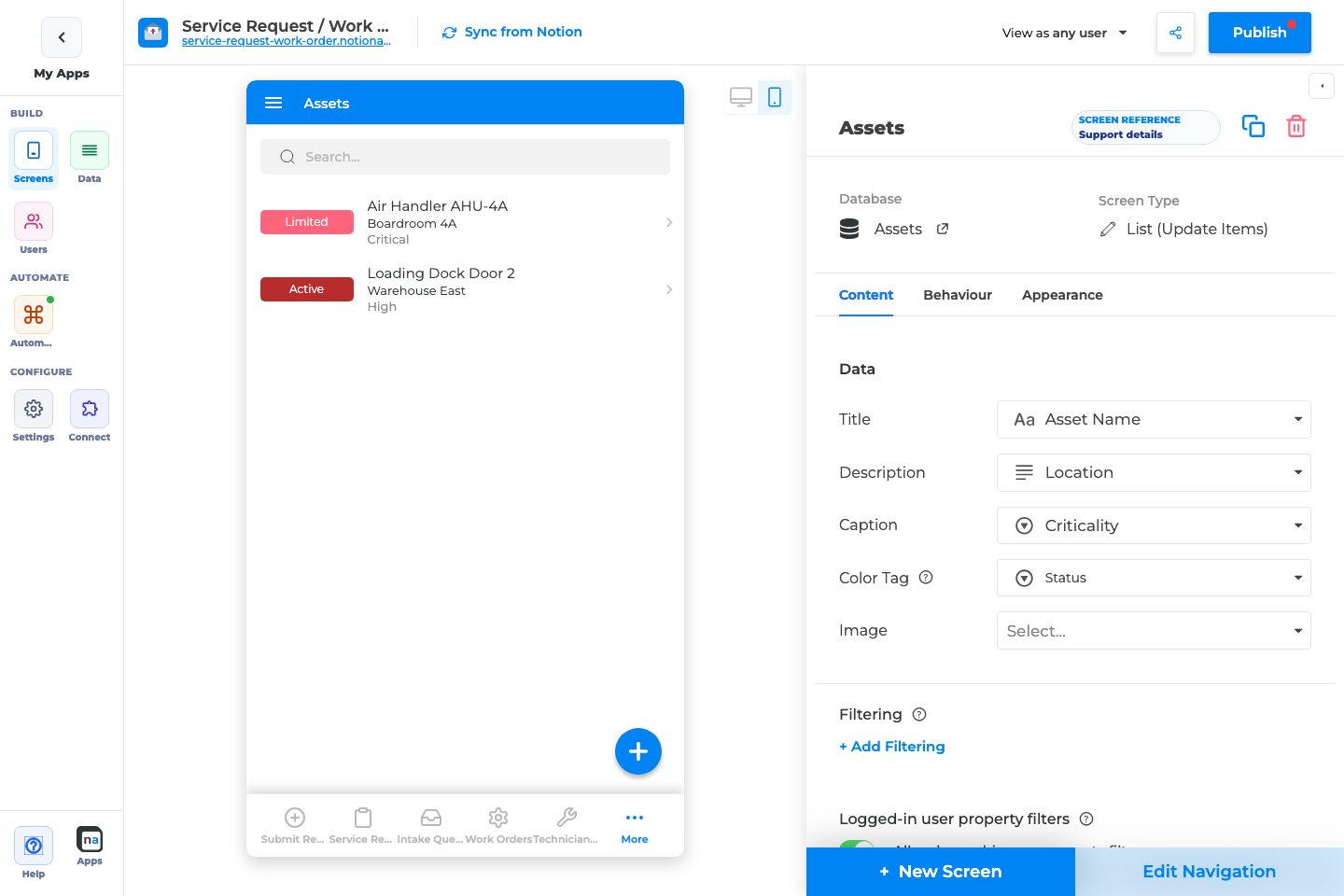
1. Open **Screens → + New Screen**.
2. Choose the Notion database to list.
3. Under **Data screens**, select **List (View Items)**.
4. Click **Done**.
5. Map Title (required) and other Data fields.
6. On **Behaviour**, point **Go to Screen** at a Details screen.
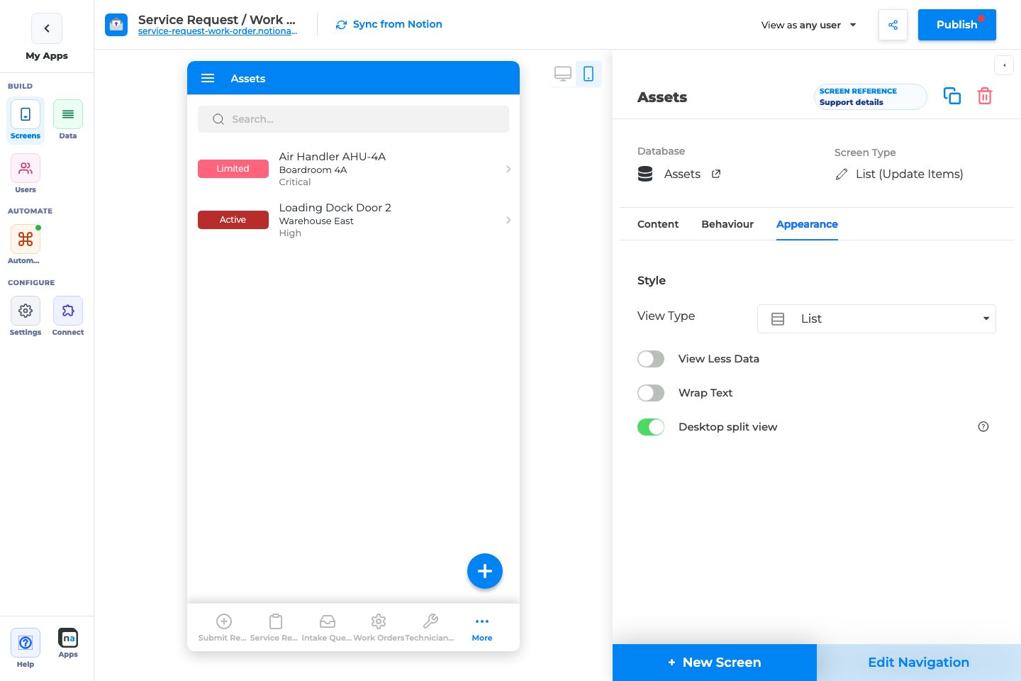
7. On **Appearance**, pick List / Grid / Calendar / Board.
8. Publish and test on phone and desktop.
## Complete Builder Options Reference
List configuration uses three inspector tabs: **Content**, **Behaviour**, and **Appearance**. Per-field styling and validation are edited in the field inspector after you open a Details/Form field — not on these list tabs.
### Content tab
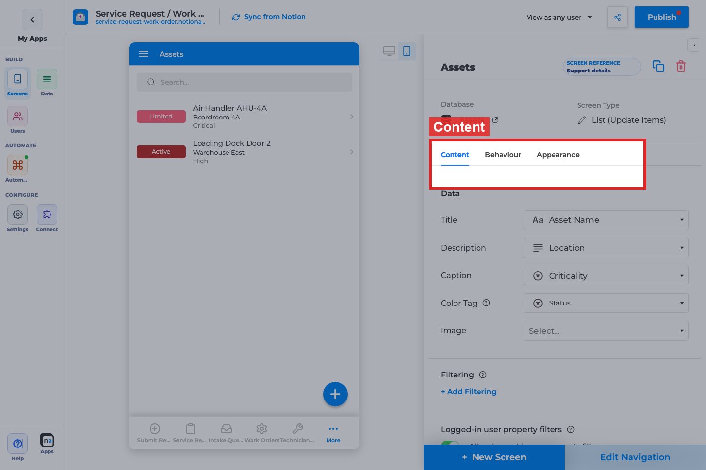
#### Data
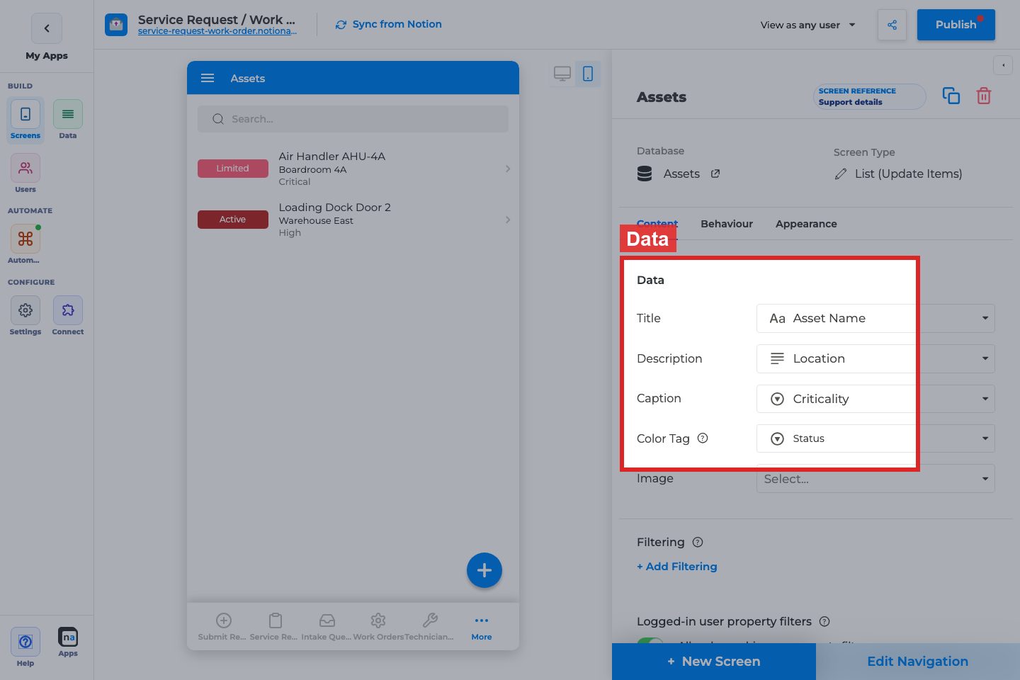
**Title**
**What it does:**\
Sets the primary property shown as each row’s title. Required for a usable list.
**How to use it:**\
Pick the field users recognize first (name, request summary, ticket title). Avoid IDs unless users search by ID.
**Why / recommended default:**\
Title is the scan target. A common mistake is mapping a weak or empty property, which makes every row look identical.
**Description / Caption**
**What it does:**\
Optional secondary and tertiary text under the title. Hidden in compact List layouts and unavailable in Calendar mode.
**How to use it:**\
Use Description for status or owner; Caption for dates or short metadata. Keep both short for mobile.
**Why / recommended default:**\
Leave blank until the title alone is not enough. Overloading description text makes dense lists hard to scan.
**Color Tag**
**What it does:**\
Maps a select/status-style property to a colored tag on each row, with optional per-option colors.
**How to use it:**\
Point it at Status or Priority. Set colors that match your app theme.
**Why / recommended default:**\
Use for one high-signal status field. A common mistake is tagging a field with too many options, which becomes noisy.
**Image**
**What it does:**\
Shows an image property on each row (List/Grid styles vary).
**How to use it:**\
Map a file/image property. On Appearance, tune Image Style / Fill / Grid Image Style.
**Why / recommended default:**\
Only enable when images add recognition value. Empty image slots waste space.
**Date (Calendar only)**
**What it does:**\
When View Type is Calendar, Date replaces Description/Caption/Tag/Image and places items on the calendar.
**How to use it:**\
Map the date property that should position events. Pair with Title only.
**Why / recommended default:**\
Required for Calendar to be useful. Wrong date fields scatter items incorrectly.
#### Filtering

**Filter rows / + Add Filtering**
**What it does:**\
Maker-defined filters that permanently limit which rows appear on this screen (separate from Data Restriction and In-App Filtering).
**How to use it:**\
Add conditions that define this list’s job (for example Status is Open). Use AND/OR as needed.
**Why / recommended default:**\
Prefer a clear fixed filter over teaching users to filter everything manually. A common mistake is duplicating Data Restriction here.
#### Logged-in user property filters

**Allow logged-in user property filters**
**What it does:**\
Lets filters compare list properties to the signed-in user’s Users-sheet properties (for example Owner equals Me).
**How to use it:**\
Enable when each user should see “my” rows. Requires a linked Users sheet and matching properties. May be plan-gated.
**Why / recommended default:**\
Excellent for private portals. Do not enable for public guest lists — guests have no user profile.
#### Grouping
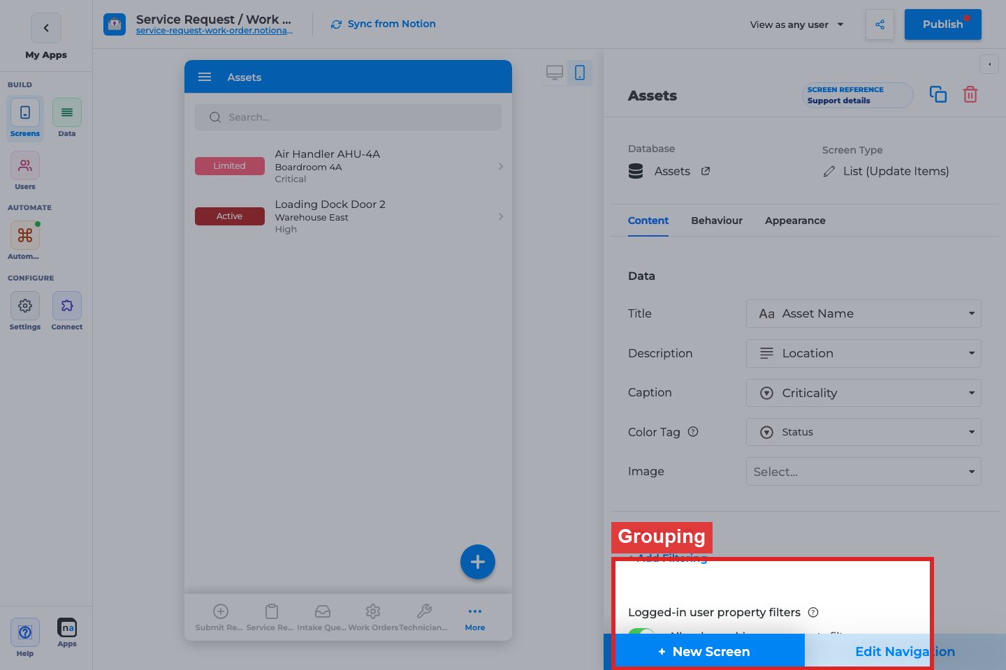
**Group By / Order / + Add Grouping**
**What it does:**\
Groups rows by a property (feature/beta may apply). Hidden for Calendar. Typically one group level.
**How to use it:**\
Group by Status or Category when users triage by buckets. Choose A→Z or Z→A order.
**Why / recommended default:**\
Skip grouping until the list is long enough that buckets help. Grouping empty or unique fields adds clutter.
#### Sorting
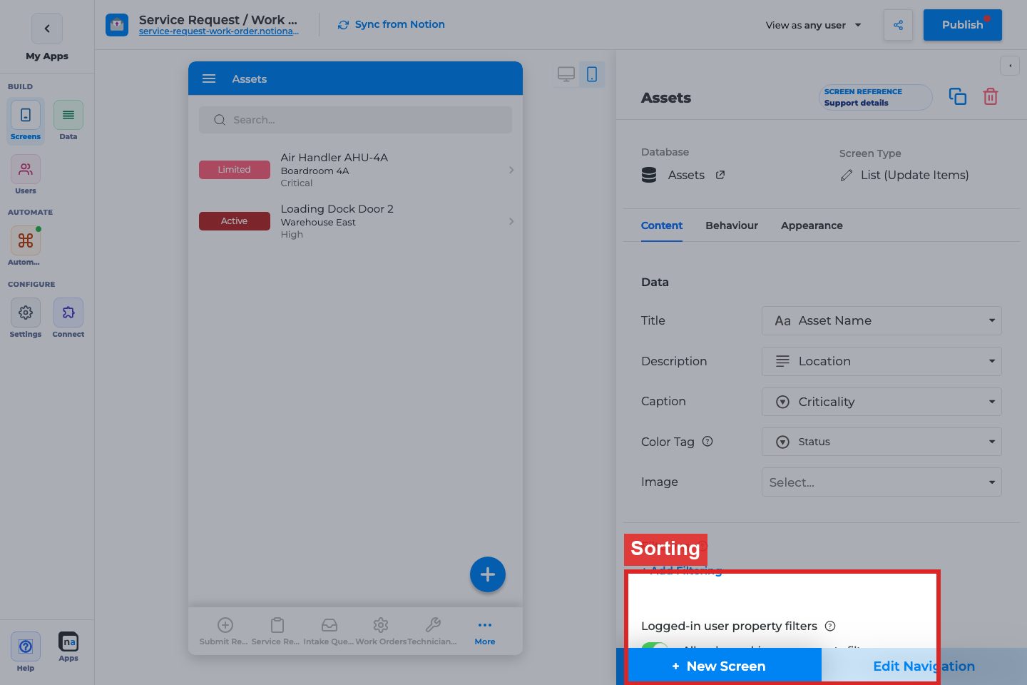
**Sort By / Order / + Add Sorting**
**What it does:**\
Default sort for the list. Hidden for Calendar.
**How to use it:**\
Sort by newest date or priority. Add multiple levels only when needed.
**Why / recommended default:**\
Default to newest-first for operational lists. Unsorted lists feel unfinished.
#### In-App Filtering

**Filter Name / Filter Columns / + Add Filter Property**
**What it does:**\
Defines filters end users can change while browsing (distinct from maker Filtering).
**How to use it:**\
Expose 1–3 useful columns (Status, Category, Owner). Name filters clearly.
**Why / recommended default:**\
Use for exploratory browsing. Do not expose every column — mobile filter UIs get heavy.
### Behaviour tab
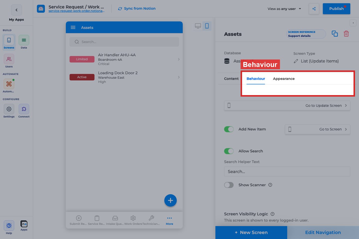
#### Open Item On Click / Go to Screen
{% hint style="info" %}
On **List (View Items)**, this control is labeled **Open Item On Click**. The annotated screenshot below is taken from the same Behaviour panel position on a List (Update Items) screen, where the twin control is **Go to Update Screen**.
{% endhint %}
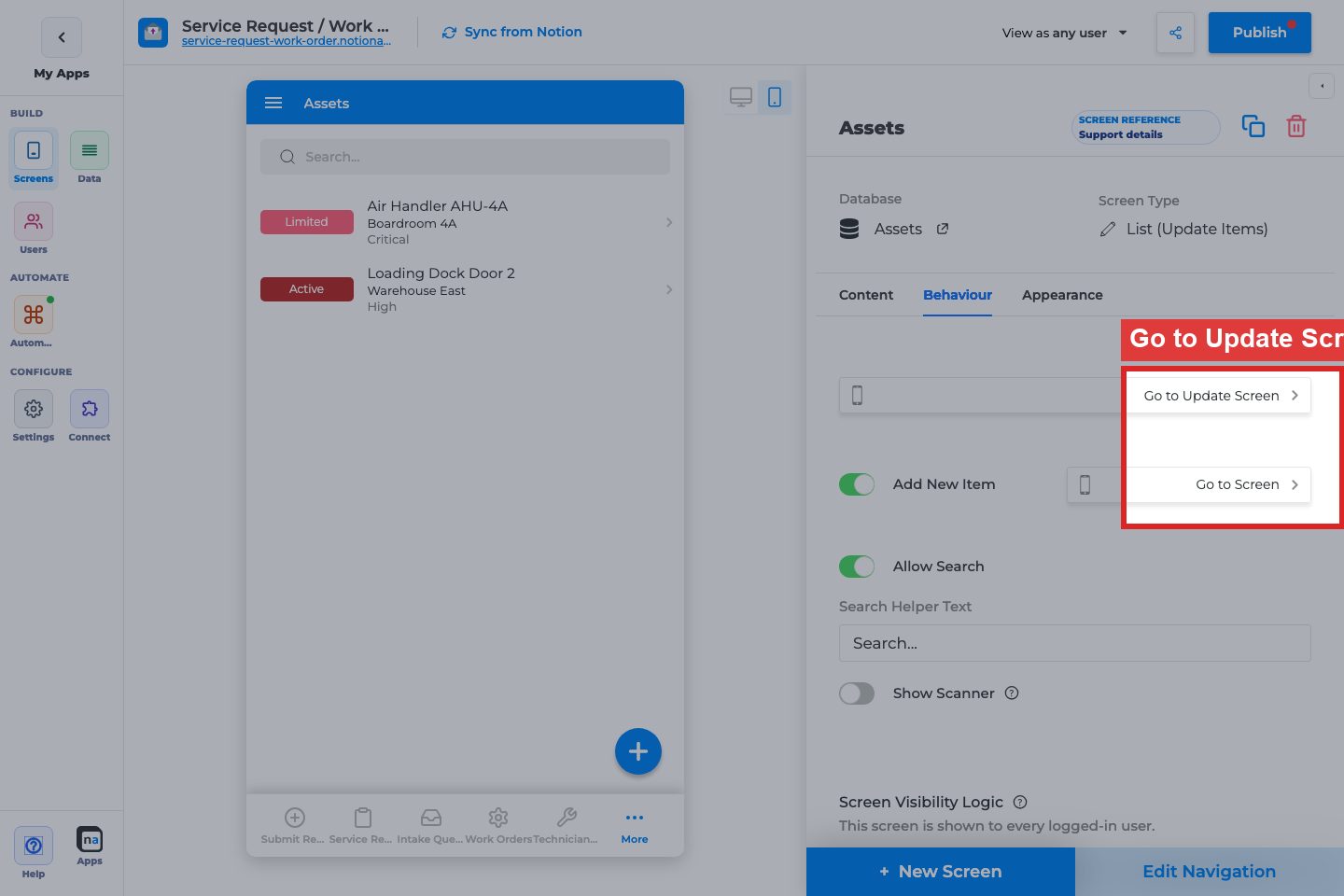
**What it does:**\
When on, tapping a row opens the selected Details (or other) screen.
**How to use it:**\
Turn on for browse→details flows. Pick the Details screen for the same database.
**Why / recommended default:**\
On for almost every View List. Leaving it off makes the list feel dead.
#### Add New Item
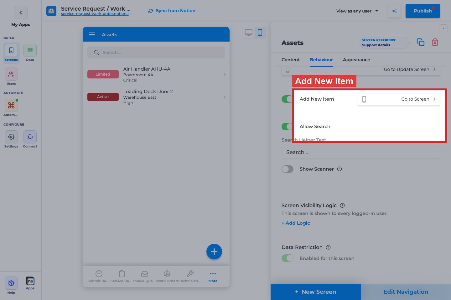
**Add New Item / Go to Screen**
**What it does:**\
Shows an add affordance that opens a Create Form screen.
**How to use it:**\
Enable when users should create records from this list. Point to the matching Form (Add Item).
**Why / recommended default:**\
On for operational intake lists; off for read-only directories.
#### Allow Search
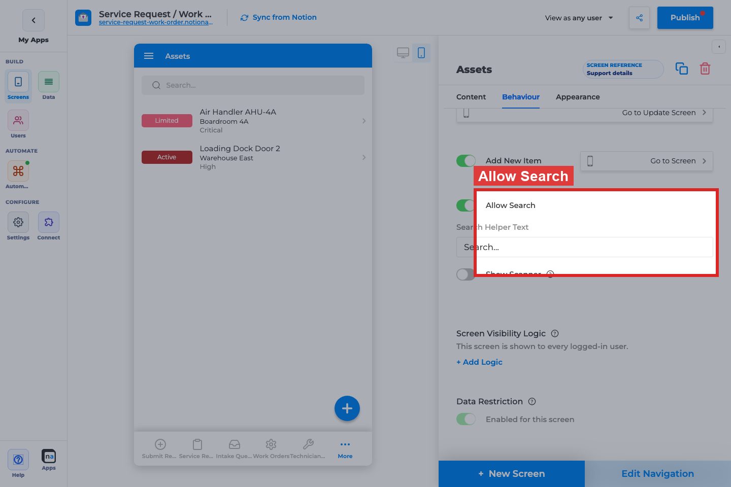
**Allow Search / Search Helper Text / Show Scanner / Scan Type**
**What it does:**\
Adds a search bar; optional barcode/QR scanner with type Barcode or QR Code.
**How to use it:**\
Enable search for large lists. Set helper text like “Search requests”. Enable scanner only when users scan codes into the same properties.
**Why / recommended default:**\
Search on for lists over \~20 rows. Scanner off unless the workflow is scan-driven.
#### Screen Visibility Logic

**Status / + Add Logic**
**What it does:**\
Controls who can open this screen (restricted vs unrestricted). Logic filters use the Users sheet on private apps.
**How to use it:**\
Keep unrestricted for shared team lists. Add user-sheet logic when only certain roles should see the screen.
**Why / recommended default:**\
Unrestricted unless the screen is role-sensitive. Do not confuse this with Filtering (which rows) or Data Restriction (which rows per user).
#### Data Restriction

**Enabled for this screen**
**What it does:**\
Applies database personalization so each user only sees rows they are allowed to access. Disabled on public apps or when the sheet is not personalized.
**How to use it:**\
Enable for customer/partner portals. Keep off for shared staff desks that should see all open work.
**Why / recommended default:**\
Match the database’s personalization strategy. Enabling without a Users mapping looks like an empty list bug.
### Appearance tab
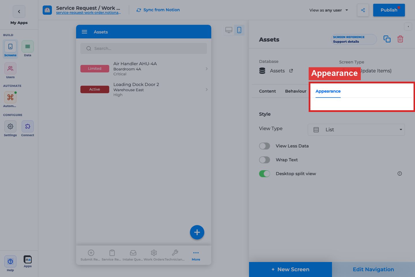
#### View Type

**View Type**
**What it does:**\
Chooses List, Grid, Calendar, or Board presentation.
**How to use it:**\
List for dense ops queues; Grid for image-heavy catalogs; Calendar for dated work; Board for status columns.
**Why / recommended default:**\
List is the safest default. Calendar requires a Date mapping; Board needs a useful status/select property.
#### Style controls (conditional)
**Grid Column Size / Grid Image Style**
**What it does:**\
Grid density and image crop style when View Type is Grid.
**How to use it:**\
Large for marketing-style cards; Small for denser catalogs.
**Why / recommended default:**\
Large when images matter; Small when titles matter more.
**Image Style / Image Fill**
**What it does:**\
Shape and fit for list/grid images (not Calendar).
**How to use it:**\
Match brand (square vs round). Use Fit for logos; Fill for photos.
**Why / recommended default:**\
Square + Fill is a solid default for photos.
**Default Mode / Allow Mode Change (Calendar)**
**What it does:**\
Calendar starts in Day/Week/Month/Agenda; optional user mode switching.
**How to use it:**\
Month for overview; Week for scheduling teams. Allow Mode Change when users need flexibility.
**Why / recommended default:**\
Month + Allow Mode Change on for most calendar lists.
**View Less Data / Wrap Text / Desktop split view**
**What it does:**\
Compact list density; wrap long text; show list+details side-by-side on wide desktops.
**How to use it:**\
View Less Data for long operational lists. Desktop split view when desktop users triage quickly.
**Why / recommended default:**\
View Less Data on for dense queues; Desktop split view on for staff desktop apps.
### Related setup outside the inspector
#### Edit Navigation
**What it does:**\
Controls nav label, icon, and whether the list appears in guest/signed-in navigation (and Public access on private apps via the screen accordion).
**How to use it:**\
Put primary lists in navigation. Keep secondary lists hidden and open them from buttons.
**Why / recommended default:**\
One primary list in nav beats five competing lists.
#### Field inspector on Details/Form
**What it does:**\
Per-field labels, required, validation, visibility, defaults — configured on Details/Form screens, not on List Data mapping.
**How to use it:**\
After list→details navigation works, polish field-level options on the Details/Form screens.
**Why / recommended default:**\
Do not expect list Data mapping to replace field inspector setup.
## Recommended default setup
| Setting | Recommended value |
| ------------------ | ------------------------------------------------------- |
| Title | Primary human-readable property |
| Open Item On Click | On → Details screen |
| Add New Item | On only if users create from this list |
| Allow Search | On for larger lists |
| View Type | List |
| Filtering | Match the list’s job (e.g. open items only) |
| Data Restriction | On for personalized portals; off for shared staff desks |
## Testing checklist
* [ ] Title mapping is readable on mobile
* [ ] Row click opens the intended Details screen
* [ ] Add button opens the intended Create Form (if enabled)
* [ ] Maker Filtering shows the expected subset
* [ ] In-app filters work for end users
* [ ] Search finds known records
* [ ] Calendar/Board/Grid layouts render with required fields
* [ ] Data Restriction / visibility behave correctly per persona (`View as user`)
## Troubleshooting
| Symptom | Likely cause | What to check |
| ---------------------- | ---------------------------------------------- | ----------------------------------- |
| List is empty | Filtering, Data Restriction, or empty DB | Relax filters; test as another user |
| Row click does nothing | Open Item On Click off or missing Go to Screen | Behaviour tab |
| Calendar empty/wrong | Date not mapped or wrong field | Content → Data → Date |
| Search missing | Allow Search off | Behaviour tab |
| Users see others’ rows | Data Restriction off | Behaviour → Data Restriction |
## Best practices
* One list job per screen (Open requests, Closed archive) instead of one mega-list.
* Always pair View List with a Details destination.
* Keep in-app filters few and meaningful.
* Prefer maker Filtering for permanent scope; In-App Filtering for exploration.
# Details (View One Item)
The **Details (View One Item)** screen shows one Notion record at a time. It is the destination users open from a List row when they need the full record, related fields, and optional edit/delete actions.
{% hint style="info" %}
**Who this guide is for**\
Makers wiring browse→details flows. This guide covers every Details builder option on **Content**, **Behaviour**, and **Appearance**, plus how field-level options work in the field inspector.
{% endhint %}
## What the screen is for
### Use Details when
* Users open one record from a List
* You need a read-focused record page with optional Edit / Delete
* Field order and visibility matter more than bulk browsing
### Do not use it when
* Users primarily create records: use **Form (Add Item)**
* Users edit in place across many rows: use **List (Update Items)** or **Form (Update One Item)**
* The page is marketing/help HTML: use **Content**
## What users see in the live app
* Field components in the order you configure under Logic
* Optional Edit control that opens an Update Form
* Optional Delete (when the screen is not primary and Allow Delete is on)
* Maker Filtering only applies when this Details screen is a primary screen
## Add Details in the builder
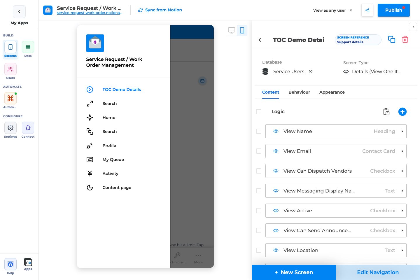
1. **Screens → + New Screen** → choose the database → **Details (View One Item)**.
2. Add and order fields under **Content → Logic**.
3. On **Behaviour**, enable **Allow Editing** and point to an Update Form if users should edit.
4. From the List screen, set **Open Item On Click → Go to Screen** to this Details screen.
5. Publish and test list→details navigation.
## Complete Builder Options Reference
### Content tab
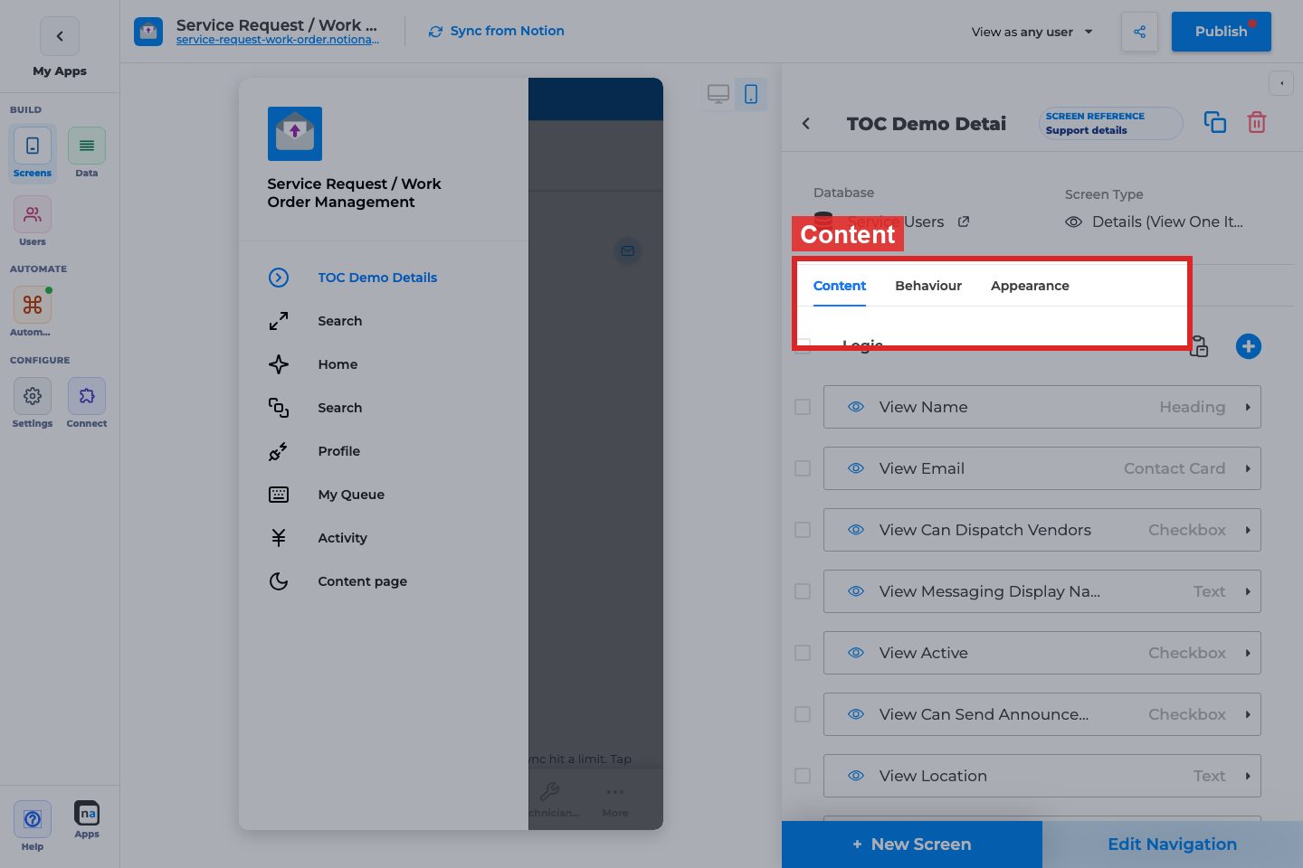
#### Logic
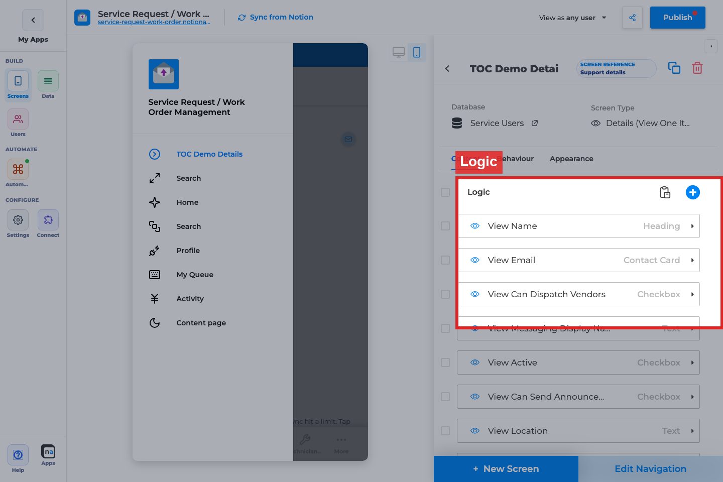
**Field / component list**
**What it does:**\
Defines which properties appear and in what order (add, reorder, remove comps).
**How to use it:**\
Add only fields users need. Put identity fields first (title, status), then details, then attachments.
**Why / recommended default:**\
A short, ordered Details page beats dumping every Notion property. Empty Logic shows “Add Logic to edit the screen”.
#### Filtering (primary screens only)

**Filter rows**
**What it does:**\
Limits which records this primary Details screen can show when opened as a standalone primary route.
**How to use it:**\
Usually leave empty when Details is only opened from a List with its own filters. Use when Details is primary and must be scoped.
**Why / recommended default:**\
Off/empty for typical list→details apps. Prefer list Filtering for browse scope.
### Behaviour tab
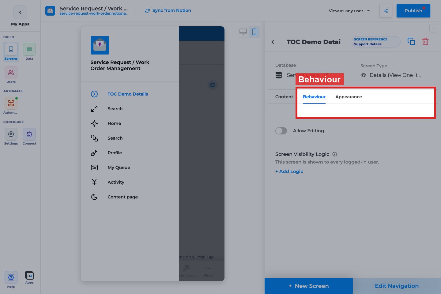
#### Allow Editing
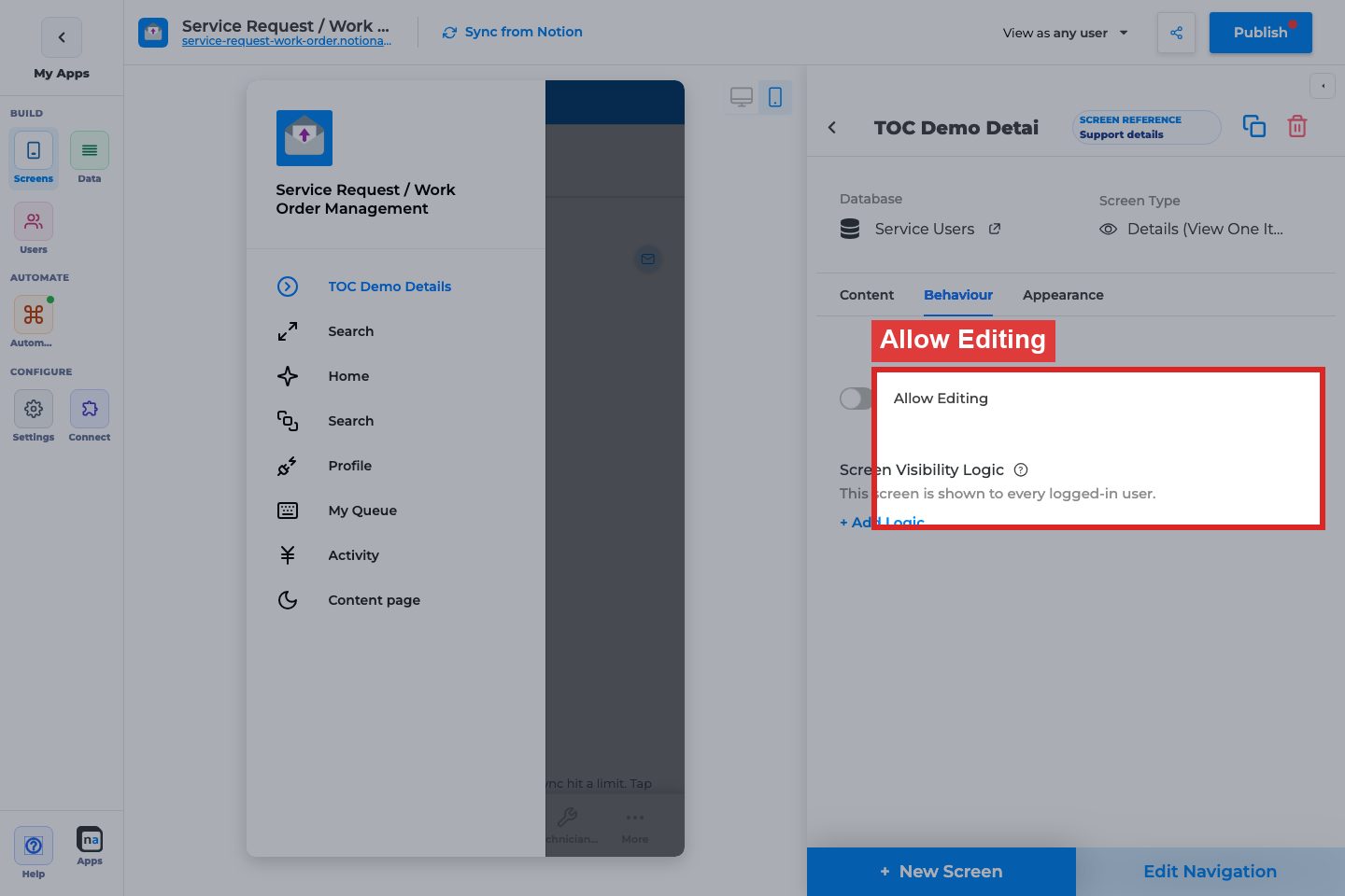
**Allow Editing / Go to Update Screen**
**What it does:**\
Shows an edit path into a Form (Update One Item) for the same database.
**How to use it:**\
Enable for staff/customer edit flows. Select the Update Form screen.
**Why / recommended default:**\
On when users should change records; off for read-only portals.
#### Allow Delete (non-primary only)

**Allow Delete / Button Text / Ask for confirmation / Delete Confirmation Text**
**What it does:**\
Lets users delete the open record. Available when the Details screen is not the app’s primary screen. Success message is typically hidden for Notion.
**How to use it:**\
Enable only for trusted roles. Keep confirmation on. Use clear button text like “Delete request”.
**Why / recommended default:**\
Off by default. Destructive actions should be rare and confirmed.
#### Screen Visibility Logic (primary)
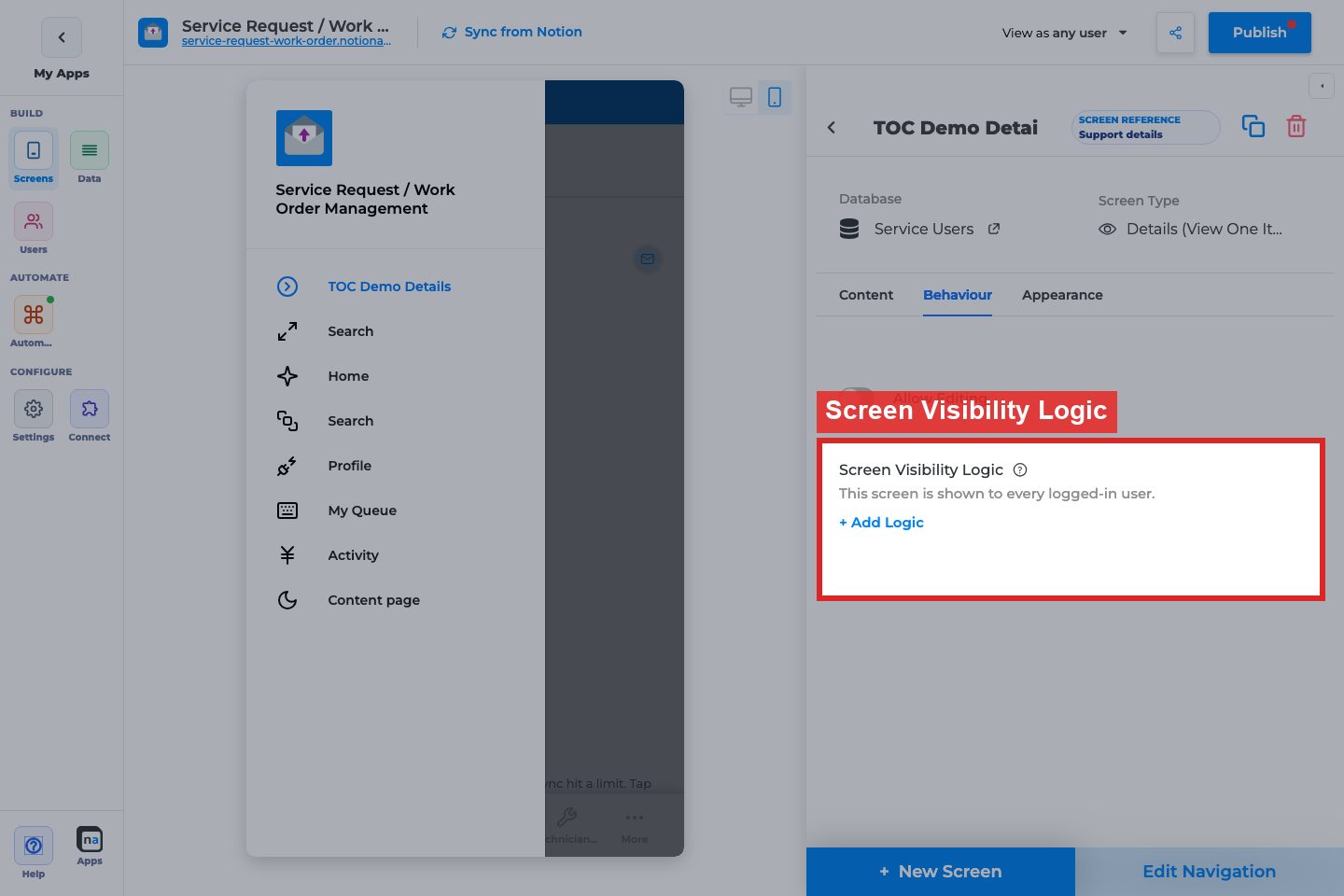
**Visibility status / + Add Logic**
**What it does:**\
Controls who can open this Details screen when it is primary (Users-sheet logic on private apps).
**How to use it:**\
Restrict when Details is a landing surface for a role. Otherwise leave unrestricted and rely on list navigation.
**Why / recommended default:**\
Unrestricted for standard secondary Details screens.
### Appearance tab
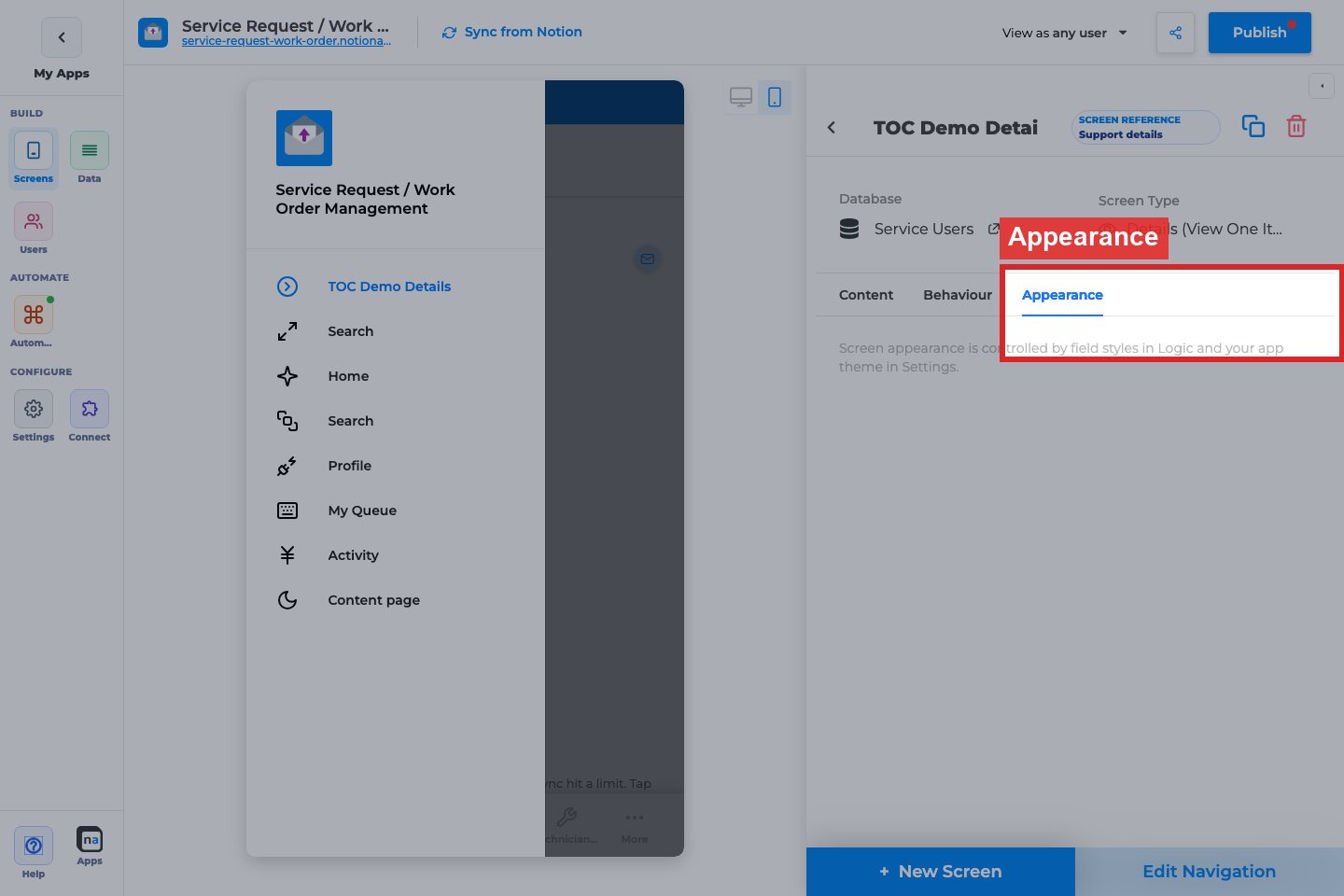
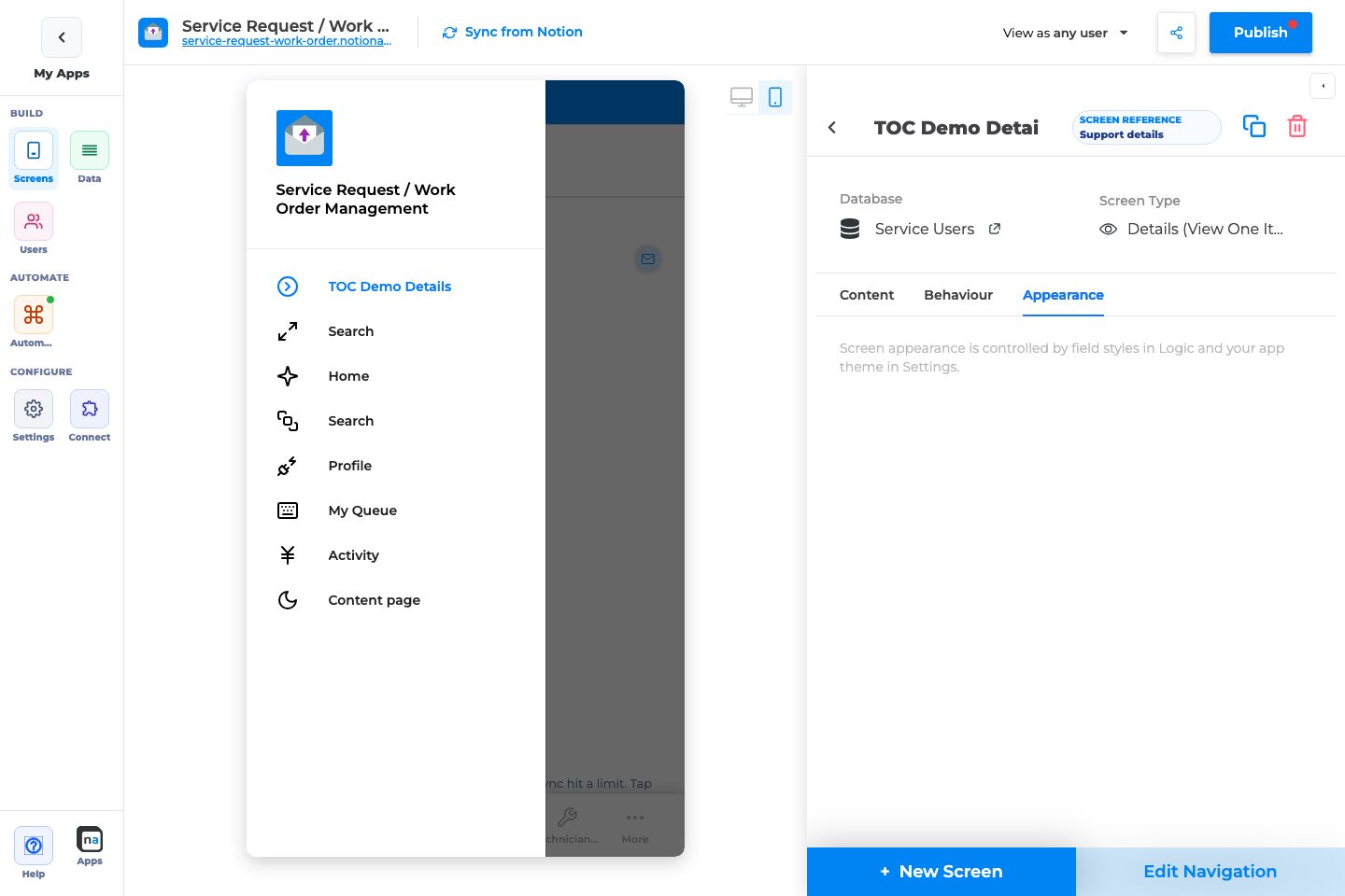
Details Appearance is intentionally empty: field styles live in the field inspector and app theme lives in Settings.
### Field inspector (not screen tabs)
When you select a field in Logic, makers commonly set:
* Label, Helper Text
* Visibility Logic (when the field shows)
* View/style options for read-only display
* For linked edit forms: required, validation, defaults (on the Update Form fields)
**Why / recommended default:**\
Treat Details as layout + navigation; treat the field inspector as copy and visibility polish.
### Related setup outside the inspector
#### List Open Item On Click
Wire the List Behaviour tab to this Details screen or users cannot open records.
#### Edit Navigation
Details is often hidden from navigation and reached only from lists. Mark primary only if users should land here.
## Recommended default setup
| Setting | Recommended value |
| ------------- | ------------------------------------- |
| Logic fields | Title, status, key details, files |
| Allow Editing | On → Update Form (if edits allowed) |
| Allow Delete | Off unless trusted role + non-primary |
| Filtering | Empty for secondary Details |
| Navigation | Usually hidden; open from List |
## Testing checklist
* [ ] List row opens this Details screen with the correct record
* [ ] Field order reads well on mobile
* [ ] Edit opens the Update Form with the same record
* [ ] Delete (if enabled) confirms and removes the Notion page
* [ ] Hidden fields respect visibility logic
* [ ] `View as user` confirms role-appropriate access
## Troubleshooting
| Symptom | Likely cause | What to check |
| -------------------------- | --------------------------------------- | --------------- |
| List does not open Details | List Go to Screen wrong / Open Item off | List Behaviour |
| Blank Details | No Logic comps or wrong record context | Content → Logic |
| Edit missing | Allow Editing off | Behaviour |
| Delete missing | Screen is primary or Allow Delete off | Behaviour |
## Best practices
* Keep Details scannable; push rare fields lower or hide with visibility logic.
* Always pair with List Open Item On Click.
* Prefer Update Form for editing instead of overloading Details.
# List (Update Items)
List (Update Items) is the screen whose layout is `UPDATE_LIST` / feature `UPDATE_RECORD_LIST`. Users see a list of Notion rows and edit them without opening a separate update form. This page is also the canonical reference for **bulk / multi-row update** (`UPDATE_MULTIPLE`, cap **150** rows).
How-tos that mention “edit several rows” should link here. Do not create a second bulk-update URL.
## What this is / when to use it
Use this screen when the job is **change fields on rows that already exist**, either one row at a time in the list or many rows at once.
Good examples:
* Staff change Status and Owner on a work queue of requests without opening each details page.
* A warehouse marks 40 items Received in one submit.
* An approver updates a date on several line items after a decision.
When **not** to use it:
* Users should only read rows. Use [List (View Items)](https://docs.notionapps.com/screens-and-components/types-of-screens/list-view-items).
* Users should fill a long create form. Use [Form (Add Item)](https://docs.notionapps.com/screens-and-components/types-of-screens/add-new-item-form).
* Users should pick rows and return them. Use [Select Items](https://docs.notionapps.com/screens-and-components/types-of-screens/select-items).
* Users should edit one rich record with sections and a stepper. Use [Form (Update One Item)](https://docs.notionapps.com/screens-and-components/types-of-screens/form-update-one-item).
```
View list = read.
Update list = edit in the list.
Bulk update = same values onto many selected rows, max 150.
```
## Before you start
1. The database is linked and [synced](https://docs.notionapps.com/databases/reload-and-sync).
2. The properties you will edit are writable. Formula, rollup, created\_time, last\_edited\_time, created\_by, and last\_edited\_by are display-only. See [Notion property types](https://docs.notionapps.com/databases/notion-property-types).
3. You know which fields belong on the row vs which belong only in the bulk modal.
4. If guests can open the app, decide whether this screen is visible. Most update lists are private.
## Build it
### Create the update list
1. **Screens → + New Screen**.
2. Pick the database.
3. Choose **List (Update Items)**.
4. Add input components for the fields users may change (status, owner, date, toggle).
5. Add view components for fields they should see but not edit (title, unique id).
6. Set filters so the list is the working set (for example `Status ≠ Done`).
7. Place the screen in navigation for the role that may edit.
8. Publish and edit one row as a test user.
### Turn on bulk update
1. On the same screen, open **Screen Actions** / record actions.
2. Enable **Update multiple** (`UPDATE_MULTIPLE`).
3. Choose which fields appear in the bulk modal. Only include fields that are safe to stamp onto many rows (Status, Owner, a date). Do not include title or files unless you mean it.
4. Set the confirm label (“Update selected”).
5. Publish. In the live app, select two rows, open bulk update, set Status, submit. Confirm both Notion pages changed.
## Every control
### Screen
| Control | Options | What it does |
| ---------------- | ----------------------------------------------- | ---------------------------------------------------------------------------------------------------------------------------------------------- |
| Feature / layout | `UPDATE_RECORD_LIST` / `UPDATE_LIST` | Update list screen. |
| View type | `LIST`, `GRID`, `CALENDAR`, `BOARD` | Same as other lists. Bulk select is most reliable on `LIST`. |
| Record actions | `CREATE`, `UPDATE`, `DELETE`, `UPDATE_MULTIPLE` | Which row actions appear. |
| Delete | On / off | Deletes the Notion page. Keep off unless the role may destroy rows. |
| Filters / sorts | Builder | Working set. |
| In-app filters | `DYNAMIC` / `PRE_DEFINED` | End-user narrowing. |
| Scan | `BARCODE` / `QR` / `MULTI` | Find a row by code. |
| Desktop split | Master-detail | List on the left, the selected row’s fields on the right. See [Desktop view](https://docs.notionapps.com/screens-and-components/desktop-view). |
### Bulk update
| Control | What it does |
| ---------------------- | ---------------------------------------------------------------------------------------------------------------------------------------------------------------------- |
| Enable Update multiple | Shows a select-rows + bulk editor affordance. |
| Fields in the modal | Only these properties are written on submit. Empty fields in the modal mean “leave this property alone,” not “clear it,” unless the control explicitly supports clear. |
| Confirm / cancel | Writes all selected rows in one request, or discards. |
| Cap | **150 rows** per submit (`MAX_ROWS_FOR_MULTI_UPDATE`). |
### Field-level (each input on the list)
| Control | Options | What it does |
| --------------- | --------------------------------------------- | ---------------------------------------------------------------------------------------------------- |
| Required | On / off | Blocks row save / bulk save when empty. |
| Disable editing | On / off | Display the value on the update list without allowing change. |
| Default value | `NONE` / `EXACT` / `DYNAMIC` (`CURRENT_USER`) | Used when creating from this screen, not when bulk-updating existing rows. |
| Visibility | `ROW` / `USER_INPUT` / `LOGGED_IN_USER` | See [Component visibility](https://docs.notionapps.com/screens-and-components/component-visibility). |
## What users see
**Single-row edit.** The list shows editable controls on each row (or in the desktop split). Changing a value and leaving the field (or tapping Save, depending on the screen) writes that row to Notion.
**Bulk update.**
1. The user turns on selection (checkboxes).
2. They select up to 150 rows. Selecting more is blocked or the submit fails with a clear cap error.
3. They open **Update selected**.
4. The modal shows only the bulk fields. They set Status = Received.
5. They confirm. The app writes `UPDATE_MULTIPLE`. Each selected page gets that Status. Other properties stay as they were.
6. The list refreshes.
## Limits and plans
* **150 rows** per bulk submit. Split the work if the working set is larger.
* Each write counts as a Notion page update. Large bulks can hit Notion rate limits; wait and retry the remaining rows.
* Files, images, and signatures in a bulk modal are a bad idea: the same file would attach to every selected row.
* People properties are stored as text in NotionApps (comma-separated names/ids). Bulk-stamping people is brittle. Prefer a User field or a relation. See [Notion property types](https://docs.notionapps.com/databases/notion-property-types).
* Data restriction still applies. Users cannot bulk-update rows they cannot see.
* Autosave of the builder is unrelated to bulk update. If the builder itself fails to save, see [Save failed](https://docs.notionapps.com/troubleshooting/save-failed-field-missing-after-sync).
## Example
A warehouse list **Receiving** is an Update Items screen on Items.
1. Visible fields: SKU (view), Location (input), Received (toggle).
2. Bulk modal fields: Received, Location.
3. A clerk scans three boxes (`MULTI`), selects those rows, opens Update selected, sets Received = on and Location = Dock A, confirms.
4. Three Notion pages update. The list filter `Received = off` drops them from the working set.
## Fix problems
| Symptom | Likely cause | What to do |
| ------------------------------------------ | --------------------------------------- | ----------------------------------------- |
| Update multiple missing | Record action not enabled | Enable `UPDATE_MULTIPLE` on the screen. |
| Submit errors at 151+ rows | Cap | Select 150 or fewer. Filter first. |
| Some rows did not change | Row not selected, or property read-only | Check selection. Check field map. |
| Modal overwrote a field you meant to leave | You set a value on that control | Leave bulk fields untouched to skip them. |
| Builder help still opens Tawk | Old help URL | Product help now points at this heading. |
## Related
Next: [Form (Update One Item)](https://docs.notionapps.com/screens-and-components/types-of-screens/form-update-one-item) for a full-page edit, or [View types](https://docs.notionapps.com/screens-and-components/customize-a-screen/view-types-list-grid-calendar-board) to change how the list looks. Button vs form submit actions: [Button component](https://docs.notionapps.com/screens-and-components/type-of-components/button-component) and [Form submit redirection](https://docs.notionapps.com/screens-and-components/form-submit-redirection-and-other-submit-actions).
# Form (Update One Item)
The **Form (Update One Item)** screen edits an existing Notion record. It is usually opened from Details (**Allow Editing**) or from **List (Update Items)**.
{% hint style="info" %}
**Who this guide is for**\
Makers configuring edit forms. This guide covers Content/Behaviour options for Update Form, including how it differs from Create Form (no Public access, no section stepper).
{% endhint %}
## What the screen is for
### Use Form (Update One Item) when
* Users change fields on an existing record
* Details should stay read-focused while edit lives on a separate form
* You need after-save Actions or delete from the edit surface
### Do not use it when
* Users only create records: use **Form (Add Item)**
* Users only view: use **Details**
* Guests should submit new intake: use Create Form + Public access (Update Form has no public panel)
## What users see in the live app
* Editable fields for the open record
* Submit button (when editable comps exist) with placement settings
* Optional Delete (non-primary screens)
* Optional after-save Actions
## Add Form (Update One Item) in the builder
1. **Screens → + New Screen** → database → **Form (Update One Item)**.
2. Add editable fields under **Content → Logic**.
3. On Details, enable **Allow Editing → Go to Update Screen** pointing here.
4. Configure Save Button Text, Success Message, and Actions.
5. Publish and test edit→save→Notion sync.
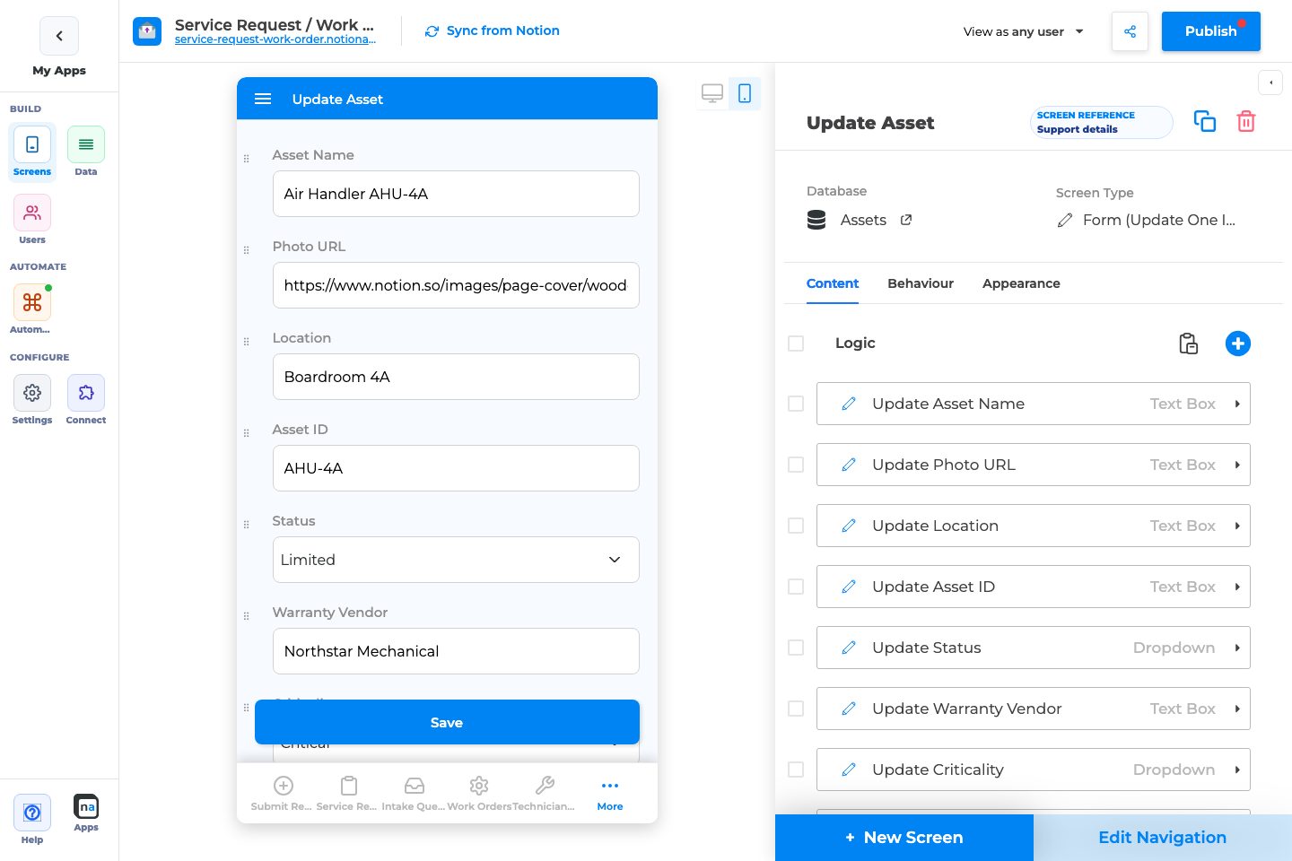
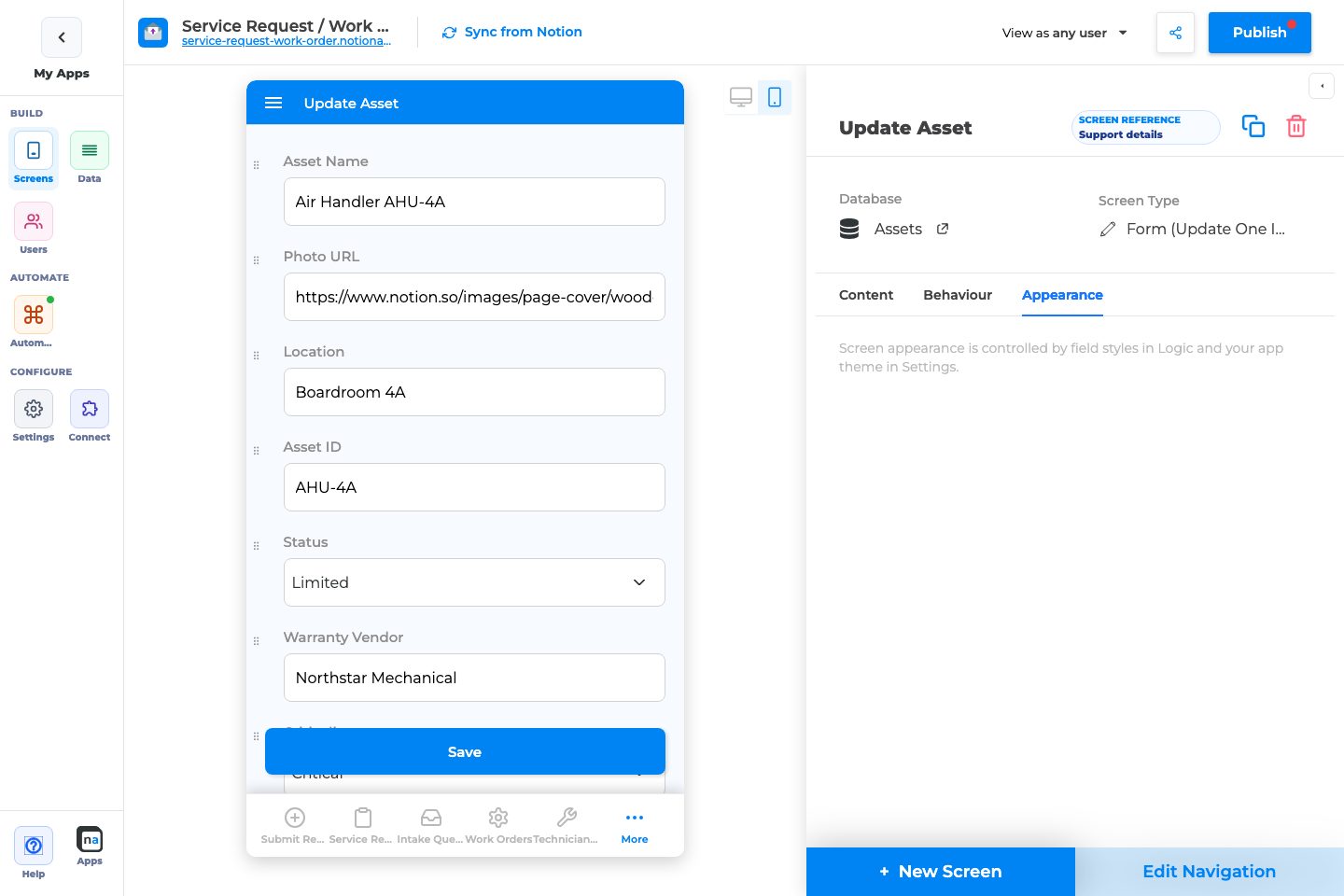
## Complete Builder Options Reference
### Content tab
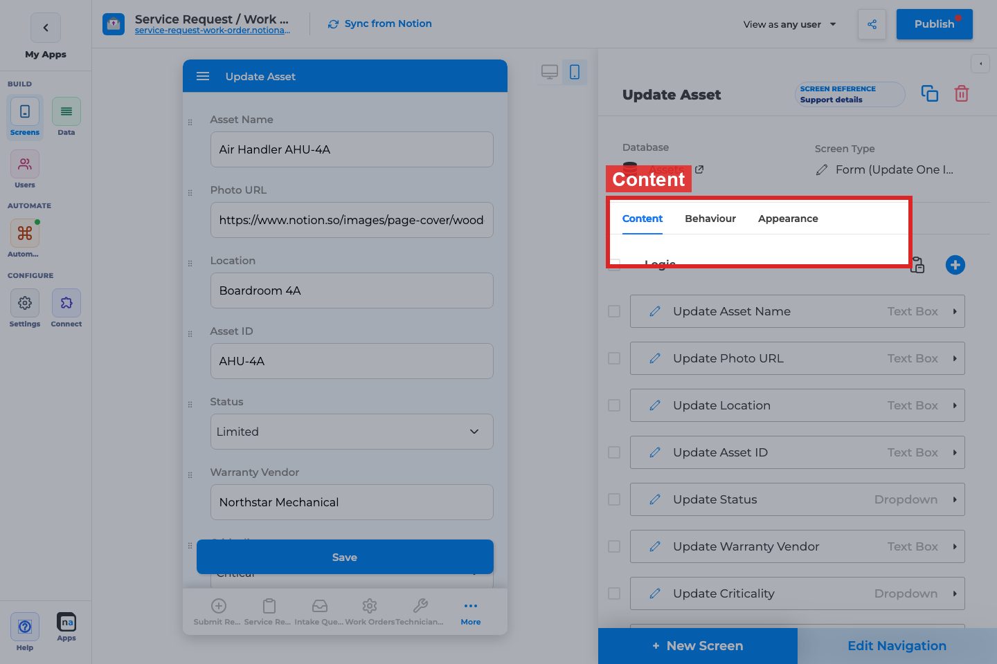
#### Logic
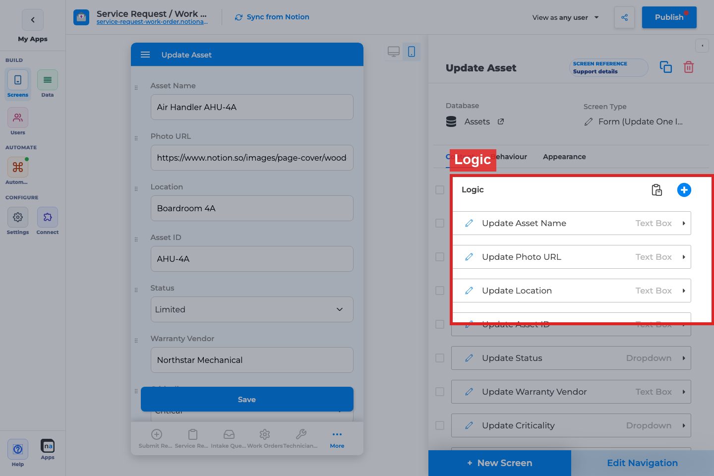
**Field / component list**
**What it does:**\
Defines which properties users can edit (and read-only comps if included).
**How to use it:**\
Include fields users actually change. Hide system fields. Use visibility logic for role-specific edits.
**Why / recommended default:**\
Keep edit forms tighter than Details. A common mistake is allowing edits to fields that workflows own.
#### Filtering (primary only)

**Filter rows**
**What it does:**\
Scopes records when this Update Form is used as a primary screen.
**How to use it:**\
Usually empty when opened from Details/List with context. Use when Update Form is a primary gated editor.
**Why / recommended default:**\
Empty for secondary edit forms.
### Behaviour tab
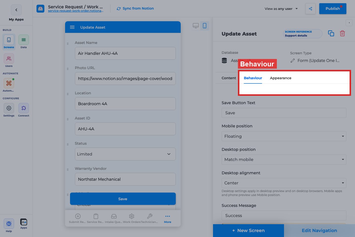
#### Save Button Text / positions / Success Message
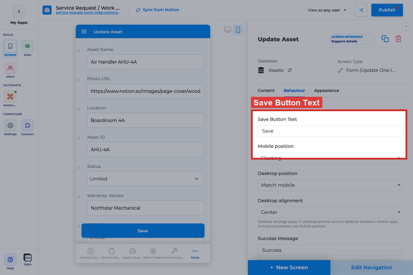
**What it does:**\
Submit chrome for saving changes. Hidden if the layout has no explicit editable comps.
**How to use it:**\
Label as “Save changes”. Match mobile/desktop placement to Create Form patterns your users already know.
**Why / recommended default:**\
Always provide a clear save label and success message.
#### Actions
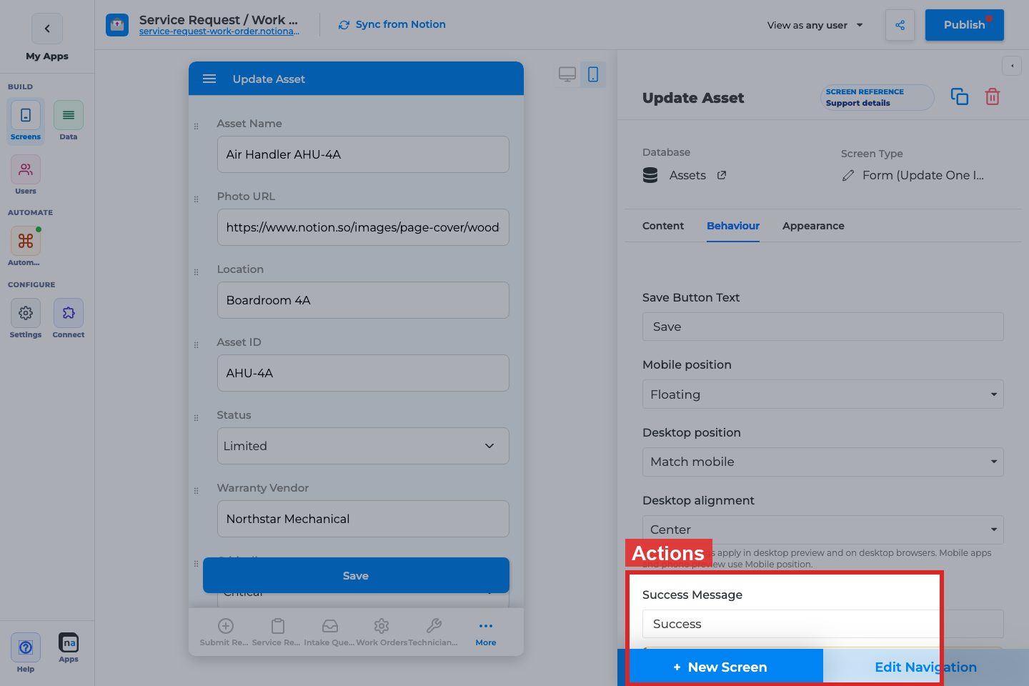
**Action Type / + Add Action**
**What it does:**\
After-save Change Data / Go to Screen / Open Link.
**How to use it:**\
Often Go to Screen back to Details or List after save.
**Why / recommended default:**\
Return users to the record they edited.
#### Allow Delete (non-primary)

**What it does:**\
Delete the current record from the edit form (with confirmation options).
**How to use it:**\
Enable only for trusted editors. Prefer confirmation on.
**Why / recommended default:**\
Off unless delete is a real product requirement.
#### Screen Visibility Logic (primary)
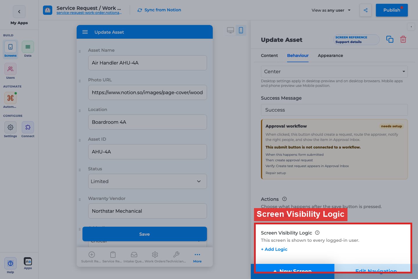
**What it does:**\
Who can open the Update Form when it is primary.
**How to use it:**\
Restrict to roles that may edit. Secondary edit forms usually inherit access via Details navigation.
**Why / recommended default:**\
Unrestricted secondary; restrict if primary.
### Appearance tab
Empty — use field inspector + app theme.
### Differences from Create Form
| Option | Create Form | Update Form |
| ------------------------------ | ----------- | -------------------------------------- |
| Public access / Copy form link | Yes | No |
| Use sections as steps | Yes | No |
| Filtering | Never | Primary only |
| Delete | No | Non-primary yes |
| URL default prefills | Common | Less common; still available per field |
### Field inspector highlights
* Is Required, Validate input
* Disable Changes (lock fields)
* Visibility When: current row vs user inputs
* Default Value (use carefully on updates)
## Recommended default setup
| Setting | Recommended value |
| --------------- | --------------------- |
| Opened from | Details Allow Editing |
| Fields | Editable subset only |
| Success Message | “Changes saved” |
| Actions | Return to Details |
| Delete | Off |
## Testing checklist
* [ ] Details Edit opens this form with the same record
* [ ] Save writes to Notion
* [ ] Required/validation rules work
* [ ] Actions return to the expected screen
* [ ] Delete (if on) confirms correctly
* [ ] Role visibility works with `View as user`
## Troubleshooting
| Symptom | Likely cause | What to check |
| -------------------- | ---------------------- | -------------------------------- |
| No submit button | No editable comps | Logic fields |
| Opens blank | Missing record context | Navigation from Details/List |
| Public link expected | Wrong screen type | Use Create Form for guest intake |
## Best practices
* Keep Update Form focused on mutable fields.
* Let workflows own status fields when automation sets them.
* Always provide a return path after save.
# Form (Add Item)
Canonical form page for **Create Form** (`ADD_RECORD` / `CREATE_FORM`): required fields, defaults, sections, stepper, validation, and URL prefill. Update Form shares the same field model; differences are called out.
How-tos (validation, prefill, sections/stepper, reorder, desktop submit) stay short and link here.
## What this is / when to use it
Use Add Item when users should **create a Notion row** from the app.
When **not** to: editing existing rows (Update Form or Update List), picking existing rows (Select Items), or a static page (Content).
## Before you start
1. The database is linked and writable properties exist.
2. You know which fields are required in the business process (not only in Notion).
3. If you need a thank-you page, create that Content screen first.
## Build it
1. **+ New Screen → Form (Add Item)**.
2. Add inputs from [Add/Update data components](https://docs.notionapps.com/screens-and-components/type-of-components/add-update-data-components).
3. Mark required fields. Add email/phone validation where needed.
4. Set defaults: `EXACT` for a status, `DYNAMIC` `CURRENT_USER` for owner.
5. Optionally group fields in **Sections**. Turn on the **stepper** when the form is long (one section per step).
6. Map URL prefill param names on fields you will share in links.
7. Set [submit actions](https://docs.notionapps.com/screens-and-components/form-submit-redirection-and-other-submit-actions).
8. Hide from nav if the form should only open from a button.
9. Publish. Submit one test row. Confirm Notion.
## Every control
| Control | Options | What it does |
| --------------- | ----------------------------------------------- | ----------------------------------------- |
| Required | On / off | Blocks submit when empty. |
| Default | `NONE` / `EXACT` / `DYNAMIC` | Prefill on load. |
| Disable editing | Update forms | Lock a field after create. |
| Validate input | Email / Phone | Format check. Empty optional fields pass. |
| URL prefill | Param name | Create Form only. |
| Section | Title, members | Layout group. |
| Stepper | On / off | One section per step; Next/Back. |
| Submit label | 1–50 chars | Save button text. |
| Submit actions | `change_data` / `go_to_screen` / `redirect_url` | After save. |
| Visibility | Per component | Show/hide fields. |
Update Form (`UPDATE_RECORD` / `UPDATE_FORM`) loads one row, has no URL prefill, and can disable editing. List (Update Items) is the multi-row alternative.
## Sections and stepper
Group fields into **Sections**. Turn on the **stepper** when the form is long so each section is a step with Next/Back. Update Form can use sections too; URL prefill stays Create Form only.
## What users see
A form. Stepper shows progress. Errors appear under fields. Submit writes the page, then runs submit actions. Workflow `form_submitted` may also run.
## Limits and plans
* Prefill is Create Form only; supported types are listed on the prefill how-to.
* Stepper does not submit until the last step.
* File uploads consume plan file meters.
## Example
**Submit service request**: Section 1 Contact (name, email validated), Section 2 Request (title required, priority dropdown, details), Section 3 Files. Stepper on. Prefill `priority`. Submit → `go_to_screen` Thanks + workflow notify.
## Fix problems
| Symptom | Likely cause | What to do |
| -------------------------- | ------------------------- | ----------------------------------------- |
| Prefill ignored | Update form or wrong slug | Create Form; match screen slug and param. |
| Next disabled | Required empty or invalid | Fill or fix validation. |
| Row missing after redirect | Save failed | Check required and field map. |
## Related
[Type of Components](https://docs.notionapps.com/screens-and-components/type-of-components). [Form submit redirection](https://docs.notionapps.com/screens-and-components/form-submit-redirection-and-other-submit-actions). How-tos: validation, prefill, sections, reorder.
# Content
Learn how to use Content screens for landing pages, help pages, public entry points, and static app content.
Content (`CONTENT_PAGE`) is a screen for landing pages, help, legal, and public entry points. It is not a Notion list. This page is the canonical reference for HTML, per-screen CSS, guest vs signed-in, and table of contents.
## What this is / when to use it
Use Content when the screen **is the message**: a welcome page, a public marketing page inside the app, a thank-you page, or a help article.
When **not** to use it:
* Showing a Notion page body on a details record — use [Show Page Content](https://docs.notionapps.com/screens-and-components/show-page-content) on a details screen.
* A list of records — use a list screen.
* A form — use a form screen, then `go_to_screen` to a Content thank-you.
## Before you start
1. You know whether guests may open it ([Per-screen public access](https://docs.notionapps.com/how-to-guides/per-screen-public-access) / mixed portal how-to).
2. You have the copy. Content screens are maker-authored HTML/blocks, not a live Notion database.
## Build it
1. **+ New Screen → Content**.
2. Add Heading, Label, HTML block, images, buttons, and optional Show page content if you embed one Notion page.
3. Optionally add a [table of contents](https://docs.notionapps.com/how-to-guides/add-a-table-of-contents-to-page-content) when the page is long.
4. Add per-screen CSS only for this screen’s layout (spacing, hero). Account-wide CSS stays in Settings / Custom CSS how-to.
5. Set screen visibility: public for guests, or signed-in only.
6. Place it first in nav for a landing page, or hide it and open it from submit.
7. Publish. Open as guest and as a signed-in user.
## Every control
| Control | What it does |
| ----------------------------- | ----------------------------------- |
| HTML block | Maker HTML. No Notion property. |
| Per-screen CSS | Scoped styles for this screen. |
| Show page content | Embeds a Notion page; TOC optional. |
| Guest vs signed-in visibility | Who can open the screen. |
| Buttons | `OPEN_URL` and friends. |
| Hide from nav | Thank-you / legal deep links. |
## What users see
A static (or Notion-embedded) page. Guests who are allowed see only this screen’s public chrome. Signed-in users see the same content plus the private nav if the screen is in their menu.
## Limits and plans
* HTML is not a full CMS. Do not paste untrusted scripts. Custom JS is a separate, plan-gated how-to.
* Per-screen CSS does not replace [Appearance](https://docs.notionapps.com/settings/appearance) theme presets.
* Page content embed freshness follows [sync](https://docs.notionapps.com/databases/reload-and-sync#page-content).
## Example
A mixed portal: public Content **Welcome** with a Button `OPEN_URL` to login and a second Button to a public Add-lead form. After login, Home (everyday chrome) replaces Welcome in the client’s tabs.
## Fix problems
| Symptom | Likely cause | What to do |
| -------------------------- | ----------------------- | ------------------------------------------------ |
| Guest sees login first | Screen not public | Per-screen public access. |
| CSS leaks | Selector too broad | Scope to this screen’s classes. |
| Embedded Notion page empty | Not shared / not synced | Share with the integration. Reload page content. |
## Related
Next: [Show Page Content](https://docs.notionapps.com/screens-and-components/show-page-content). Mixed portals: [Build a Mixed Public–Private Portal](https://docs.notionapps.com/how-to-guides/build-a-mixed-public-private-portal).
# Select Items
Select Items is the screen type whose feature flag is `SELECT_RECORDS`. Users pick one or more Notion rows and return that selection to the screen that opened it — usually a form field or a workflow step — instead of opening a normal list.
This page is the canonical reference. It lives under **Types of Screens**, next to List and Details. Do not look for a second Select Items book under Automation.
## What this is / when to use it
Use Select Items when the user must **choose existing rows** and the app needs those ids back.
Good examples:
* A Create Form “Related projects” field opens Select Items so the user can pick projects from another database.
* A Work Queue action needs the operator to attach existing records before Complete.
* A multi-step form asks “which contract line items apply?” and must write a relation.
When **not** to use it:
* Users should browse and open a details page. Use [List (View Items)](https://docs.notionapps.com/screens-and-components/types-of-screens/list-view-items).
* Users should edit many rows in place. Use [List (Update Items)](https://docs.notionapps.com/screens-and-components/types-of-screens/update-items-form) and [bulk update](https://docs.notionapps.com/screens-and-components/types-of-screens/update-items-form#bulk-update).
* Users should create a new row. Use [Form (Add Item)](https://docs.notionapps.com/screens-and-components/types-of-screens/add-new-item-form).
* Users should claim automation work. Use [Work Queue](https://docs.notionapps.com/screens-and-components/types-of-screens/native-automation-and-operational-screen-guides/work-queue-screen).
```
List = browse rows.
Select Items = return a selection.
Update list = edit rows.
```
## Before you start
1. The source Notion database is linked. See [Manage linked databases](https://docs.notionapps.com/databases/manage-linked-databases).
2. You know which screen or component will **open** Select Items (a relation field, a button, or a screen action).
3. You know whether users may pick **one** row or **many**.
4. If the app is private, [screen visibility](https://docs.notionapps.com/screens-and-components/customize-a-screen/screen-visibility) and [data restriction](https://docs.notionapps.com/users/data-restriction) are already decided — Select Items respects both.
## Build it
1. Open **Screens → + New Screen**.
2. Choose the Notion database users will pick from.
3. Select the **Select Items** card (`SELECT_RECORDS`). Confirm.
4. Set the screen title users will see (“Choose projects”, not the database name).
5. Choose the [view type](https://docs.notionapps.com/screens-and-components/customize-a-screen/view-types-list-grid-calendar-board): list is the default; grid helps when the title image matters.
6. Add the columns users need to decide (title, status, owner). Do not add every property.
7. Turn on [in-app filters](https://docs.notionapps.com/screens-and-components/customize-a-screen/in-app-filtering) if the database is large. Prefer `PRE_DEFINED` chips for the two or three statuses people actually pick from.
8. In **Edit Navigation**, hide this screen from the tab bar / drawer unless users should open it on its own. Most Select Items screens are opened from a field and should be [hidden from nav](https://docs.notionapps.com/screens-and-components/app-navigation#hide-from-navigation).
9. On the form or button that should open it, set the reference / selection target to this screen.
10. Publish and test: open the form, tap the field, pick rows, confirm, and check the relation wrote back to Notion.
## Every control
| Control | Options | What it does |
| -------------------- | ----------------------------------- | ----------------------------------------------------------------------------------------------------------------------------------- |
| Feature type | `SELECT_RECORDS` | Builder card: Select Items. |
| Source database | Linked sheet | Rows the user can pick. |
| View type | `LIST`, `GRID`, `CALENDAR`, `BOARD` | Same view engine as other lists. Calendar/board are rarely useful for picking. |
| Selection mode | Single / multiple | Multiple writes a relation or multi-value; single writes one page. |
| Confirm button label | Text | What the user taps to return the selection. |
| Empty state | Title + description | Shown when filters hide every row. |
| Filters / sorts | Builder filters | Restrict the pick list (for example only `Status = Active`). |
| In-app filters | `DYNAMIC` / `PRE_DEFINED` | End-user narrowing. See [In-app Filtering](https://docs.notionapps.com/screens-and-components/customize-a-screen/in-app-filtering). |
| Scan | `BARCODE` / `QR` / `MULTI` | Jump to a row by scanning. See [Barcode/QR](https://docs.notionapps.com/screens-and-components/barcode-qr-code-scanner). |
| Screen visibility | Role / user rules | Who can open the picker. |
| Hide from nav | On / off | Keep the picker off the main nav. |
| Data restriction | Inherit / disable on this screen | Same rules as other lists. See [Data restriction vs filters](https://docs.notionapps.com/databases/data-restriction-and-filters). |
Reference field modes that open this screen (on the form, not on Select Items itself):
| Reference add type | Meaning |
| ------------------ | ------------------------------------------------------------- |
| `NONE` | Show related pages only. No picker. |
| `DIRECT` | User types / picks inline without a full Select Items screen. |
| `SELECTION` | Opens this Select Items screen and returns the chosen pages. |
## What users see
1. They tap a relation or “Select items” control.
2. Select Items opens as a full screen (mobile) or a panel / split (desktop).
3. They search, filter, or scan, then tap rows. Selected rows stay highlighted.
4. They tap Confirm. The picker closes. The form shows the selected titles.
5. Submit on the form writes the relation (or the workflow step consumes the ids).
Cancel / back discards the in-progress selection and leaves the form unchanged.
## Limits and plans
* Select Items is a screen. It counts toward the app’s screen list like any other screen.
* The pick list is capped by the same list page size as other views. Use filters for large databases; do not expect the user to scroll thousands of rows.
* Users only see rows allowed by data restriction and screen visibility.
* Formula, rollup, created\_by, and last\_edited\_by can display on the picker but cannot be edited there. See [Notion property types](https://docs.notionapps.com/databases/notion-property-types).
* Hidden-from-nav screens still need a way in (field, button, or `go_to_screen`). A picker with no opener is a dead screen.
## Example
A delivery portal form **Add delivery** has a relation **Contracted scope**.
1. Add Select Items on the Scopes database. Title: **Choose scopes**. Hide from nav.
2. Builder filter: `Active = true`.
3. On the form, set the relation component to `SELECTION` and point it at **Choose scopes**.
4. Publish. A client opens Add delivery, taps Contracted scope, picks two scopes, confirms, and submits. Notion stores both related pages.
## Fix problems
| Symptom | Likely cause | What to do |
| -------------------------------------- | --------------------------------------------------------- | ---------------------------------------------------------------------------------------------------- |
| Select Items missing from + New Screen | Older app cache, or you are looking under Everyday chrome | Scroll the data screen group. Feature type is `SELECT_RECORDS`. |
| Picker opens empty | Filters too tight, or data restriction hides every row | Relax builder filters. Test with View as. |
| Confirm does nothing | No opener mapped the return target | Re-bind the form relation to this screen. |
| Users find the picker in the tab bar | Hide from nav is off | Turn it on. See [App Navigation](https://docs.notionapps.com/screens-and-components/app-navigation). |
| Relation stays empty after submit | Property is read-only in Notion, or field map is wrong | Check [Notion property types](https://docs.notionapps.com/databases/notion-property-types). Re-sync. |
## Related
Next: [List (Update Items)](https://docs.notionapps.com/screens-and-components/types-of-screens/update-items-form) if the job is edit-in-place, or [Relations](https://docs.notionapps.com/screens-and-components/relations) for the field that opens this screen.
# Native Automation And Operational Screen Guides
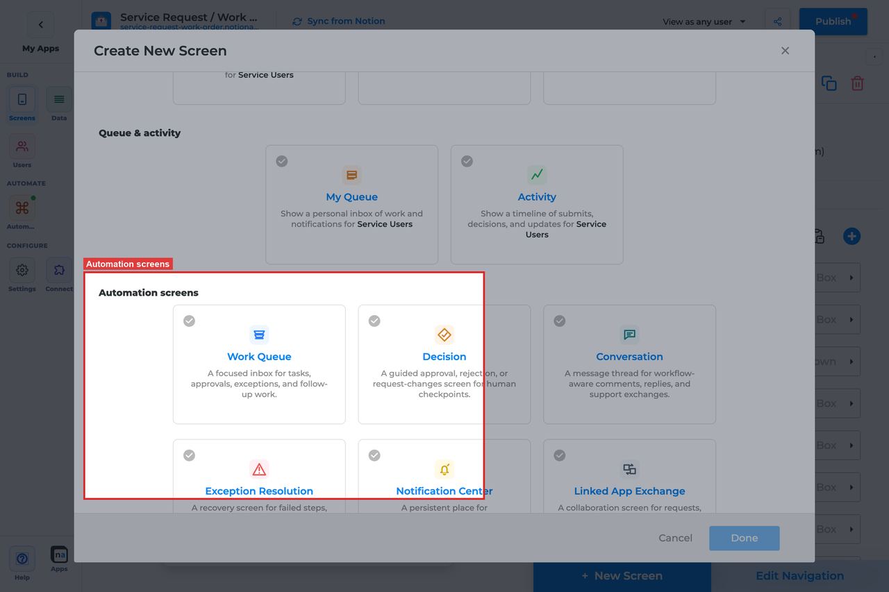
> Current state: native Automation and Operational screens are entitlement-gated surfaces inside **Automation**. They use the same broad app-screen model as data screens, but they read NotionApps runtime state instead of ordinary Notion database rows.
NotionApps native automation screens expose workflow, messaging, queue, decision, notification, exchange, and operational state inside a live app. A normal data screen reads Notion records. A native automation screen reads platform-owned runtime activity.
Each screen guide below includes a **complete builder options reference**. The sections follow the builder order, and every option is explained in prose so makers can quickly understand what the control does, how to set it up, and which default or mistake matters most.
## Screen Guide Index
| Screen | Builder group | Primary job | Primary foundation |
| -------------------- | ------------- | ------------------------------------------------------------------------------------------------------------------------------- | ---------------------------- |
| Work Queue | Automation | A focused inbox for tasks, approvals, exceptions, and follow-up work that needs a person to claim and finish | Workflow, optional Messaging |
| Decision | Automation | A guided approval, rejection, or request-changes checkpoint where automation pauses until a person records a structured outcome | Workflow |
| Conversation | Automation | A workflow-aware message thread for comments, replies, and support exchanges tied to a record, route, or conversation | Messaging, optional Workflow |
| Exception Resolution | Automation | A recovery screen for failed steps, missing data, blocked routes, retries, and manual fixes | Workflow, optional Messaging |
| Notification Center | Automation | A persistent place for announcements, alerts, unread notices, and acknowledgements | Messaging, optional Workflow |
| Linked App Exchange | Automation | A collaboration screen for requests, messages, payloads, and acknowledgements exchanged between linked NotionApps applications | Messaging, optional Workflow |
| Workflow Status | Operational | A live timeline of workflow runs, steps, waits, retries, and outcomes so requesters and operators can see where work stands | Workflow |
| Automation Launcher | Operational | A controlled launchpad for manual workflow starts, service requests, and operator announcements | Workflow |
| Operator Console | Operational | A high-level operational dashboard for runs, queue depth, failures, messages, and audit activity | Workflow and Messaging |
## Shared Builder Sections (all nine screens)
| Section | What the maker controls |
| ----------------------------------- | -------------------------------------------------------------------- |
| Header and screen type | Native type, category, title, description |
| Automation source | Listen scope + workflow/form/channel/topic/linked app bindings |
| App audience and notification prefs | Tenant mode, tenant/role fields, notification categories (app-level) |
| Template setup state | Provisioned / Needs review / No setup report |
| Related context | Read-only discovery counts |
| Visibility and access | Visibility rules, allowed roles, allowed users |
| Display and action policy | Title, description, payload visibility, density, timeline, claim |
| Available actions | Action buttons, after-action screen, target workflow |
| Preview scenario | Device, persona, state, simulated vs live test |
| Empty state and sample data | Empty copy and sample runtime references |
## Screen-specific sections
| Section | Screens |
| ----------------------------------------------------- | -------------------- |
| Include sheets | Work Queue, Decision |
| Submission review (Overview / Submission / Documents) | Work Queue, Decision |
| Decision outcomes + Notion status writeback | Decision |
| Inbox modes Active / History / All | Work Queue, Decision |
## Choosing The Right Screen
| User job | Best screen |
| ---------------------------------- | -------------------- |
| Claim and complete work | Work Queue |
| Approve / reject / request changes | Decision |
| Discuss a request | Conversation |
| Recover failed automation | Exception Resolution |
| Read durable notices | Notification Center |
| Inspect app-to-app handoffs | Linked App Exchange |
| Track a run’s progress | Workflow Status |
| Manually start automation | Automation Launcher |
| Monitor overall health | Operator Console |
## Safe Defaults
* Prefer **Specific workflow** over **Entire app** for user-facing desks.
* Prefer **Redacted preview** or **Metadata only** unless the audience is trusted ops.
* Restrict Operator Console, Exception Resolution, and Automation Launcher to Admin/Operator roles.
* Turn **Require claim before action** on for shared Decision desks.
* Bind **Submission review** on Decision/Work Queue before governed go-live.
* Test empty, claimed-by-other, mobile, and blocked-user paths before publish.
## Related screen families
* [Everyday Chrome Screens](https://docs.notionapps.com/screens-and-components/types-of-screens/everyday-chrome-screens) — Home, Search, My Queue, Activity, Profile (app shell, not runtime desks)
* Operational screens in this index: Workflow Status, Automation Launcher, Operator Console
# Work Queue Screen
> Current state: this native screen is part of **Automation**. It is entitlement-gated, uses NotionApps runtime state instead of ordinary Notion data controls, and should be tested with realistic workflow or messaging activity before a maker relies on it in production.
The **Work Queue** screen is a focused inbox for tasks, approvals, exceptions, and follow-up work that needs a person to claim and finish.
Think of this screen as **A shared desk of work items that people claim, complete, or escalate.**
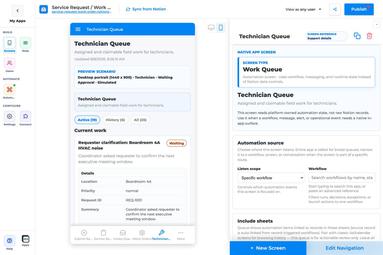
## Who This Guide Is For
This guide is for makers configuring a **Work Queue** screen in the app builder. It lists every builder option available on the screen and explains how to use each one.
Use this guide when:
* A team needs an inbox of workflow-created work.
* Users must claim ownership before completing an item.
* Operators need one place for mixed human work (tasks, follow-ups, some decisions).
## What The Screen Is For
### Use Work Queue when
* A team needs an inbox of workflow-created work.
* Users must claim ownership before completing an item.
* Operators need one place for mixed human work (tasks, follow-ups, some decisions).
### Do not use it when
* A single approve/reject checkpoint — use Decision.
* Free-form discussion — use Conversation.
* Operational health dashboards — use Operator Console or Workflow Status.
## What Users See In The Live App
* Active / History / All segments (Active default).
* Work cards with title, status, summary, and ownership.
* Claim, Complete, and optional Release when claim is required.
* Review modal for Submission / Documents / Overview when Submission review is configured.
| Default | Value |
| ------------------------------- | ----------------------------------------------------------------------------- |
| Default listen scope | Entire app |
| Require claim before action | Off |
| Default preview persona / state | Technician / Waiting approval |
| Empty title | No work is waiting |
| Empty description | New tasks and decisions appear here when workflows or messages need a person. |
## Required Foundations
| Requirement | Why it matters |
| ------------------------------------------ | ------------------------------------------------------------ |
| Automation screen entitlement | Work Queue appears in the Automation / Operational group. |
| Workflow, optional Messaging | Primary foundation for this screen’s runtime state. |
| Private app + Users database (recommended) | Role/tenant visibility and audience policy need user fields. |
## Complete Builder Options Reference
The sections below match the builder order. Read them from top to bottom when you configure the screen: each option explains what the control changes in the live app, how to set it up in practice, and which default or mistake matters most for a queue that people actually use.
### Header and screen type
This section tells the builder which native screen you are editing and gives the live screen its basic label. Makers often rush through it, but the title and description are what users rely on when they decide whether this queue is for them.
#### Screen type
**What it does:** Sets the native runtime behavior to **Work Queue**, which means the screen renders claimable work items instead of normal Notion rows.\
**How to use it:** Leave the screen type as Work Queue once you create the screen. If you need approvals, conversation threads, or read-only operations status, create the matching native screen instead of trying to repurpose this one.\
**Why / recommended default:** The screen type is the foundation for everything else in the panel. A common mistake is expecting ordinary list controls here; this screen is for automation runtime items only.
#### Category
**What it does:** Places the screen in the Automation or Operational family inside the builder so makers can find it again later.\
**How to use it:** Keep the existing category that the native screen ships with. Use navigation labels and grouping elsewhere in the app to decide where users discover the queue.\
**Why / recommended default:** This is mostly organizational, but it helps teams keep native screens separated from everyday data screens.
#### Title
**What it does:** Sets the end-user title shown in navigation and at the top of the live queue.\
**How to use it:** Name the job, not the implementation. Good examples are `Manager approvals`, `Ops follow-up`, or `Intake work queue`. Avoid titles like `workflow_17_queue` or internal project names.\
**Why / recommended default:** Clear titles reduce training and mis-clicks. If users cannot tell who owns the queue, they will either ignore it or open the wrong desk.
#### Description
**What it does:** Adds helper copy under the title so users know what they are expected to do on the screen.\
**How to use it:** Write one short sentence that tells people what belongs here and what action they should take, such as "Claim new intake tasks and complete follow-up work."\
**Why / recommended default:** A good description reduces hesitation, especially when you have multiple automation desks in one app. The common mistake is leaving a generic description that says nothing about ownership.
### Automation source
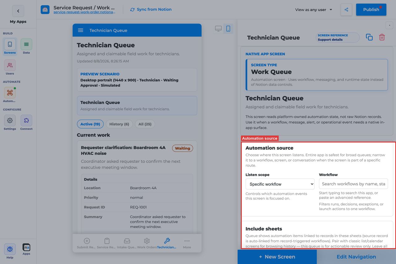
This section decides which runtime items are allowed to appear in the queue. It is one of the most important sections because a Work Queue only feels trustworthy when users understand why an item showed up there and why something else did not.
| Listen scope | Best for | Common mistake |
| ------------------------------ | --------------------------------------------- | --------------------------------------------------------- |
| Entire app | A shared operations queue covering many flows | Showing too much mixed work to one team |
| Specific screen or form | Queues that start from one intake surface | Forgetting to update the binding after replacing the form |
| Specific workflow | A focused queue for one process | Pointing at the wrong published workflow version |
| Conversation or message thread | Message-driven follow-up work | Expecting it to behave like a general chat screen |
| Linked application | Cross-app handoff work | Using it when no linked app route exists |
#### Listen scope
**What it does:** Chooses the top-level source of work items the queue listens to.\
**How to use it:** Start with **Specific workflow** when the queue exists for one business process. Use **Entire app** only when you intentionally want a cross-process shared desk. Choose **Specific screen or form** when one intake form is the natural boundary.\
**Why / recommended default:** The safest default for most maker-built queues is **Specific workflow**, not Entire app, because it keeps the desk understandable. A common mistake is leaving the queue too broad and then wondering why unrelated work keeps appearing.
#### Source screen or form
**What it does:** Appears when the listen scope is **Specific screen or form** and binds the queue to that intake surface.\
**How to use it:** Pick the form or screen that creates the work. After cloning or replacing a form, revisit this picker and confirm it still points at the new source.\
**Why / recommended default:** This is useful when teams think in terms of one intake experience rather than one workflow. The most common mistake is assuming the builder will automatically follow a renamed or swapped form.
#### Workflow
**What it does:** Appears when the listen scope is **Specific workflow** and filters the queue to items created by that workflow.\
**How to use it:** Select the published workflow users should work from. If the workflow has sibling versions for staging or demos, double-check that you picked the production one.\
**Why / recommended default:** This is the recommended default for a focused team queue. It keeps visibility understandable and makes troubleshooting much easier when a task does not appear.
#### Messaging channel
**What it does:** Narrows message-driven queue activity to one messaging channel.\
**How to use it:** Set this only when your queue is fed by messaging routes or conversation-linked work. Match the channel name used by the workflow or route that emits the item.\
**Why / recommended default:** Channel filtering is powerful, but it is also easy to misconfigure. If the screen looks empty, a channel mismatch is one of the first things to check.
#### Topic
**What it does:** Narrows the source further to one topic within the selected channel, such as `approval.requested` or another stable route label.\
**How to use it:** Use the exact topic the route publishes. Keep topic naming consistent across automations so makers can reason about filters without reading backend details.\
**Why / recommended default:** Topic filters are best when you want one queue per type of work. A common mistake is using slightly different topic strings between environments and creating "mysteriously empty" queues.
#### Conversation or correlation
**What it does:** Binds the queue to one specific thread or correlation context when the process is case-based.\
**How to use it:** Use this only when the queue should follow one ongoing case, request, or thread. Leave it broader for a shared team desk.\
**Why / recommended default:** Most Work Queue screens should not hard-code a single correlation. Over-filtering here can make a perfectly healthy queue look broken.
#### Linked application
**What it does:** Appears for linked-app listening and binds the queue to one external NotionApps application.\
**How to use it:** Pick the linked app only when work truly enters the queue from an app-to-app exchange. Otherwise leave the queue on workflow or form scope.\
**Why / recommended default:** This option is usually not the right starting point for Work Queue. Use it only when the work really originates outside the current app.
### Include sheets
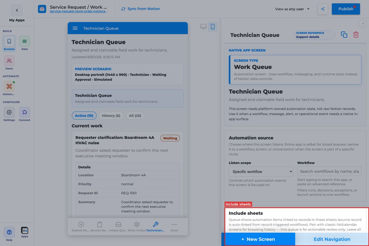
This screen-specific section lets makers limit the queue to work tied to selected Notion sheets. It is most helpful when one workflow touches several sheets but only some of them should surface in this desk.
#### Included sheets
**What it does:** Limits the queue to items associated with the checked sheets. If nothing is checked, the queue can show work from every eligible sheet in scope.\
**How to use it:** Check only the sheets that produce work for this specific team. For a true cross-sheet operations inbox, leave every sheet unchecked so the queue stays broad.\
**Why / recommended default:** Use sheet filters when teams own different parts of the data model. The common mistake is checking a sheet during testing and forgetting that the filter is still active in production.
### App audience and notification prefs
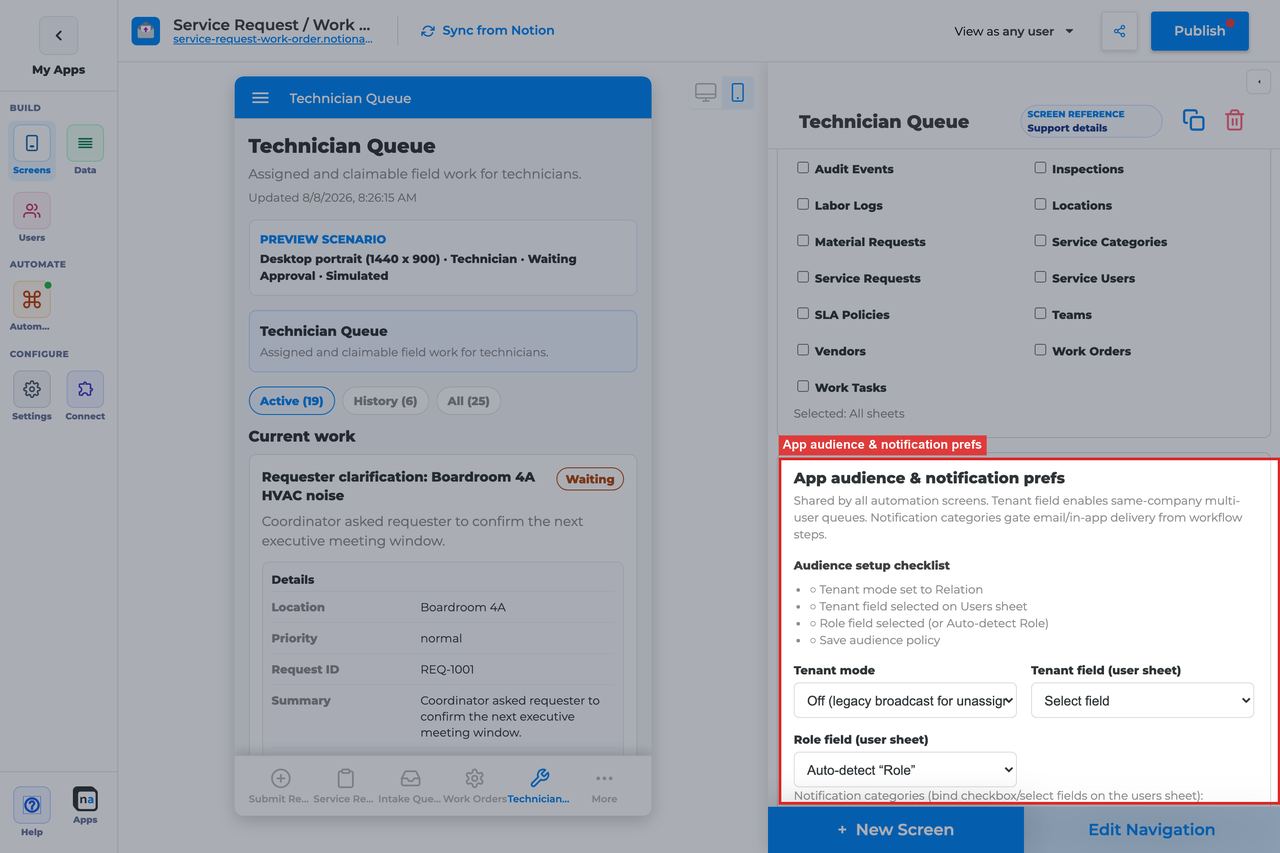
These controls are app-level policy even though they appear on the screen config. Work Queue respects the same tenant boundaries and notification-category rules as the rest of the automation surfaces, so this section is where you keep the queue aligned with who should see shared work.
#### Tenant mode
**What it does:** Defines whether runtime items are broadcast broadly or partitioned by tenant relationship.\
**How to use it:** Choose **Off** only for simple single-tenant apps. Choose **Relation** when users should only see work for their own client, company, branch, or account.\
**Why / recommended default:** For most multi-user production apps, **Relation** is the safer default. Leaving tenant mode off in a multi-tenant queue is one of the highest-risk visibility mistakes a maker can make.
#### Tenant field
**What it does:** Identifies which relation field on the Users sheet tells the platform how to group users into tenants.\
**How to use it:** Pick the company, client, account, or workspace relation field from the Users sheet. Use the field that already powers other tenant-aware parts of the app.\
**Why / recommended default:** Consistency matters more than cleverness here. If you point the queue at a different tenant field than the rest of the app, users will see inconsistent visibility.
#### Role field
**What it does:** Tells the platform which Users-sheet field stores each person's role if it is not the default `Role` field.\
**How to use it:** Leave it blank when your user role property is already named `Role`. Set it explicitly when your app uses a custom name such as `Team Role` or `Access Level`.\
**Why / recommended default:** This is a small setting with big consequences. If the wrong field is chosen, your visibility rules can look correct in the builder while failing at runtime.
#### Notification categories
**What it does:** Maps category keys and labels to preference fields so users can opt into or out of notice types.\
**How to use it:** Add only the categories your automations truly send, then bind each one to the matching preference field on the Users sheet.\
**Why / recommended default:** Even though Work Queue is not a notification screen, these categories often shape how people discover follow-up work. Too many unused categories create policy clutter and confuse future makers.
#### Add notification category
**What it does:** Adds another category row, typically with in-app and email delivery defaults.\
**How to use it:** Create a new category only when you have a real sender and a real user preference to connect to it.\
**Why / recommended default:** Fewer, well-named categories are easier to govern. The common mistake is creating categories "just in case" and never wiring them consistently.
#### Save audience policy
**What it does:** Persists tenant and notification preference changes at the app level.\
**How to use it:** Click it after every tenant or category update before leaving the screen. If you are testing with several personas, save first and then retest.\
**Why / recommended default:** Unsaved audience policy is a classic source of false debugging. Makers often think the queue is wrong when the real issue is simply that the policy changes were never saved.
### Template setup state
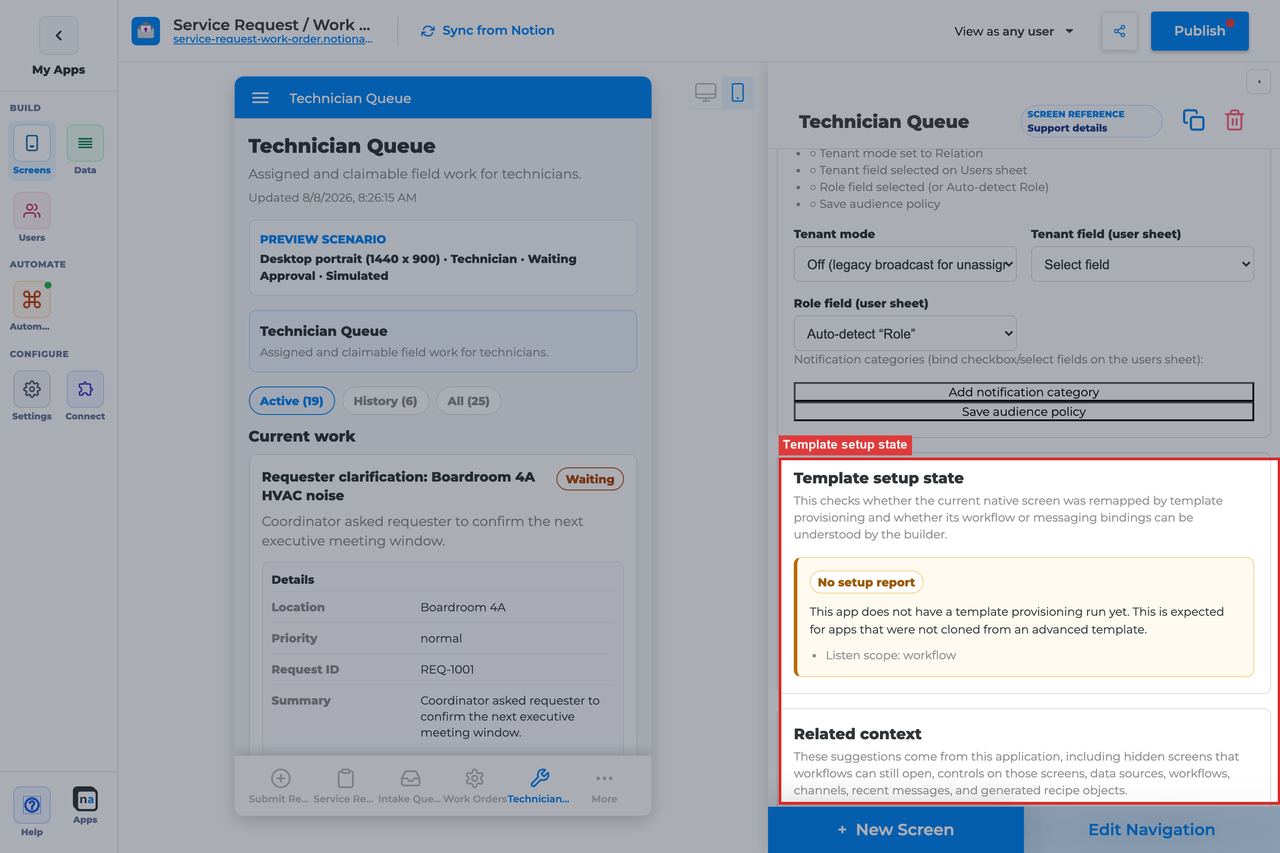
This section is diagnostic rather than interactive. It helps makers understand whether a template clone or repaired demo still has healthy automation bindings behind the queue.
#### Setup state indicator
**What it does:** Reports whether the automation screen setup looks provisioned, needs review, or has no setup report.\
**How to use it:** Treat **Provisioned** as the happy path. Treat **Needs review** as a prompt to re-check your workflow, form, and channel bindings. Treat **No setup report** as normal for hand-built apps.\
**Why / recommended default:** This indicator can save a lot of time after cloning a template. The common mistake is ignoring a `Needs review` badge and then troubleshooting the wrong layer for hours.
### Related context
This section gives read-only discovery context so you can find the other objects that matter to the queue. It is especially useful in mature apps where builders may not remember which form, workflow, or follow-up screen was originally intended.
#### Related context panel
**What it does:** Shows discovery counts and related references for screens, forms, workflows, channels, and other nearby runtime objects.\
**How to use it:** Use the panel to jump to likely bindings, review what already exists, and locate candidate after-action screens or detail screens before creating duplicates.\
**Why / recommended default:** This panel reduces guesswork. The common mistake is copying raw IDs around when the builder already provides safer pickers and discovery cues.
### Visibility and access
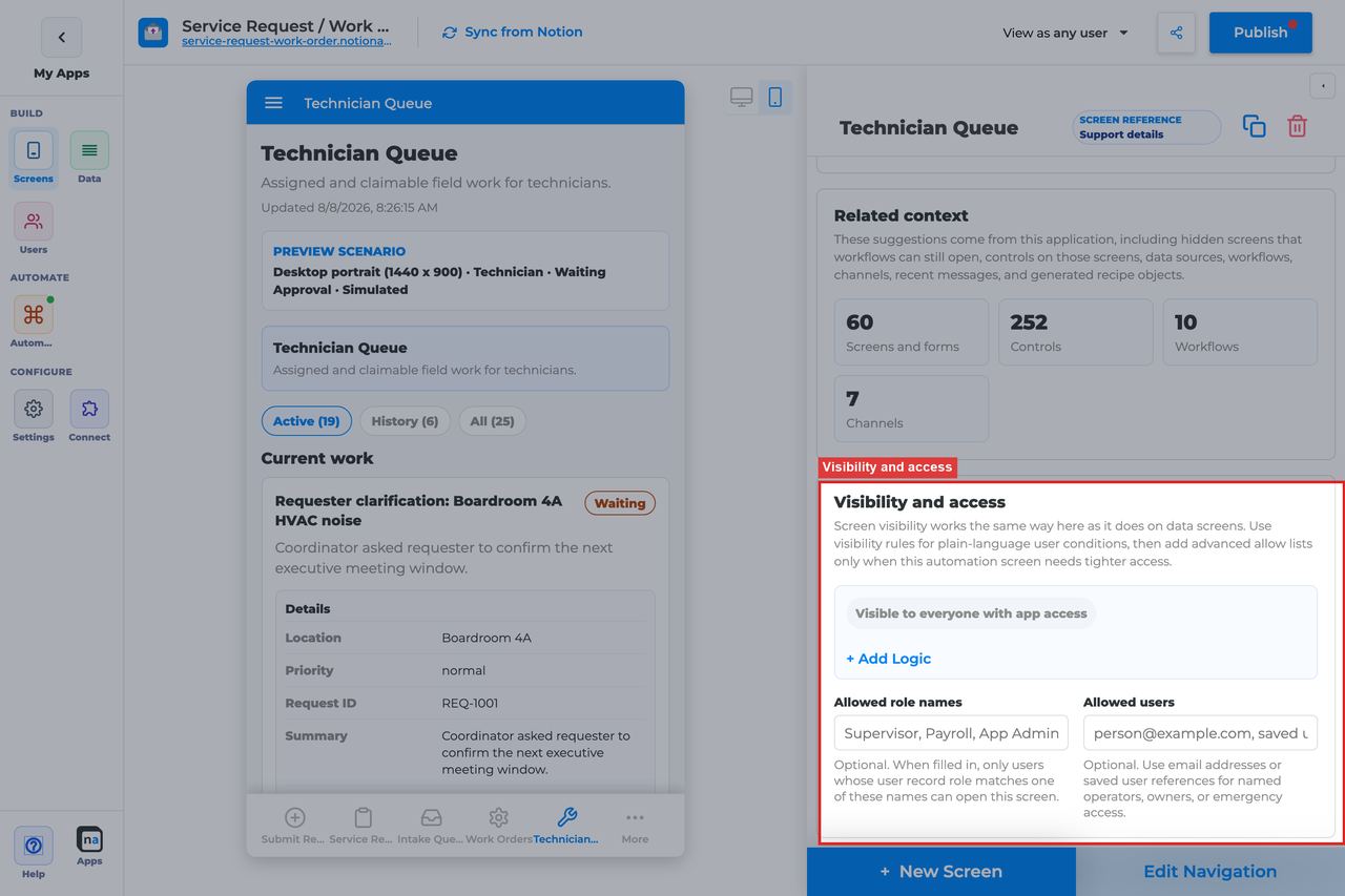
This section controls who can open the queue at all. A Work Queue often contains shared operational work, so visibility design matters as much as the source filter design.
#### Visibility rules
**What it does:** Applies the same visibility-condition model used by other private-app screens.\
**How to use it:** Build conditions around stable user fields such as role, team, location, or tenant membership. Keep the logic readable so another maker can audit it later.\
**Why / recommended default:** Role- and tenant-based rules are usually safer than broad access. A common mistake is making the queue visible to everyone and relying on source filters alone to keep people out of the wrong work.
#### Allowed role names
**What it does:** Adds a direct allow list of role names for this queue.\
**How to use it:** Enter a concise CSV list such as `Technician, Supervisor, Admin` when a simple role gate is enough.\
**Why / recommended default:** This is often the fastest reliable access control for team desks. The common mistake is adding too many near-duplicate role names and creating hidden access drift.
#### Allowed users
**What it does:** Allows individual people by email or user reference even if they are not part of the main role-based rule.\
**How to use it:** Use this for named operators, pilot users, or emergency backstops. Keep the list short and review it after launches.\
**Why / recommended default:** Per-user overrides are useful, but they do not scale well. The common mistake is quietly building the whole access model out of exceptions.
### Submission review
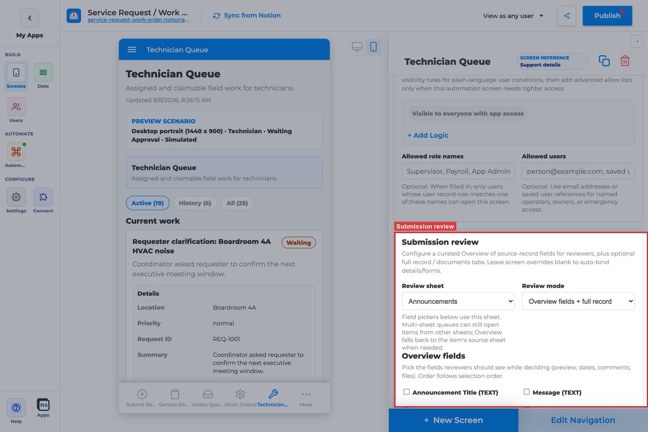
This screen-specific section controls the in-place review modal that opens before a user completes work. It is the main way to let someone inspect the submission without navigating away from the queue.
| Review mode | Best for | Default guidance |
| ----------------------------- | --------------------------------------------------------------- | -------------------- |
| Overview fields + full record | Governed review with quick summary plus full detail | Recommended default |
| Overview fields only | Short, structured queues where the important fields are obvious | Good for speed |
| Full record only (legacy) | Older setups that still rely on the full form view alone | Use only when needed |
#### Review sheet
**What it does:** Defines which sheet powers the curated Overview field pickers.\
**How to use it:** Leave it blank to auto-detect from the source item when that works cleanly. Set it explicitly when the queue can receive mixed items and you want a stable review configuration.\
**Why / recommended default:** Auto-detect is convenient, but explicit binding is safer in more complex queues. The common mistake is pointing the review at the wrong sheet and then wondering why the field picker looks incomplete.
#### Review mode
**What it does:** Chooses whether reviewers see curated overview fields, the full submission, or both in the modal.\
**How to use it:** Pick **Overview fields + full record** for most governed work. Choose **Overview fields only** when the full record is noisy and you want a faster operational flow. Use **Full record only** mainly for compatibility with older setups.\
**Why / recommended default:** The recommended default is **Overview fields + full record** because it balances speed and confidence. A common mistake is offering only the full record, which makes simple work items harder to scan.
#### Overview fields
**What it does:** Defines the ordered shortlist of fields shown in the Overview tab.\
**How to use it:** Select the minimum set a user needs to decide whether to claim, complete, or escalate the work. Put the most decision-relevant fields first.\
**Why / recommended default:** A curated overview makes queues much more usable. The common mistake is checking every field and recreating the clutter of the full form.
#### Submission screen override
**What it does:** Replaces the automatically chosen full-record tab target with a specific screen.\
**How to use it:** Bind the exact details or update screen you want reviewers to open in the Submission tab. Leave it blank only when the auto-selected target already matches the real source experience.\
**Why / recommended default:** This is the safest way to make the modal predictable. A common mistake is assuming auto-selection will still be correct after screens are renamed or replaced.
#### Documents screen override
**What it does:** Binds the Documents tab in the review modal to a specific document or photo screen.\
**How to use it:** Point it at the related documents list or upload surface users actually need during review. Leave it blank when the automatic document target is already correct.\
**Why / recommended default:** This matters most in document-heavy queues. The common mistake is configuring Submission review but forgetting to wire the documents experience that operators rely on.
### Inbox modes
These modes are what end users switch between in the live app, but makers should still understand them while configuring the screen because they affect testing, training, and expectations around where finished work goes.
#### Active, History, and All
**What it does:** Splits the queue into currently actionable items, past terminal items, and the combined full record.\
**How to use it:** Train users to work from **Active** by default, check **History** when they need proof an item was handled, and use **All** for audits or support investigations.\
**Why / recommended default:** The default live segment is **Active** because it keeps the desk focused. A common mistake is thinking a completed item disappeared when it actually moved to History.
### Display and action policy
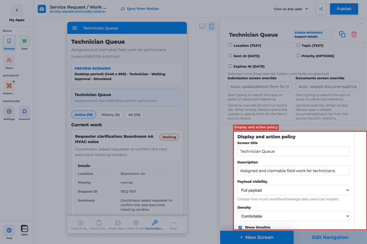
These controls shape how much context people see on each item and how the queue behaves when multiple people share it. For Work Queue, this section is where you tune the balance between speed, safety, and operational density.
#### Screen title override
**What it does:** Lets you override or refine the title shown in the live queue.\
**How to use it:** Use the end-user wording your team already uses day to day. If the queue is process-specific, include the process name rather than internal workflow terminology.\
**Why / recommended default:** Consistent language matters more than clever labels. If a user has to translate the title mentally, the queue will feel less reliable.
#### Description
**What it does:** Controls the helper copy shown under the title in the live view.\
**How to use it:** Tell users exactly what they should do here, for example "Claim open cases, review the submission, and complete work when finished."\
**Why / recommended default:** Specific instructions reduce mistakes for infrequent users. The common mistake is leaving a vague description that sounds like every other operations screen.
#### Payload visibility
**What it does:** Chooses how much of the runtime payload the queue reveals.\
**How to use it:** Use **Metadata only** for broad or external audiences, **Redacted preview** for most internal team queues, and **Full payload** only for trusted operators who genuinely need raw detail.\
**Why / recommended default:** **Redacted preview** is the usual default for Work Queue because it gives people enough context without oversharing. Full payload is the most common over-permissioning mistake.
#### Density
**What it does:** Controls the spacing and compactness of cards and list rows.\
**How to use it:** Choose **Comfortable** when reviewers need to read summaries carefully. Choose **Compact** when experienced operators are working high volume and know the process well.\
**Why / recommended default:** Comfortable is safer for mixed audiences; Compact is better for mature ops desks. The common mistake is using Compact too early and making new users miss important context.
#### Show timeline
**What it does:** Shows workflow, messaging, and audit history alongside the work item.\
**How to use it:** Turn it on when operators need to see how the item got here or whether someone already touched it. Turn it off only for extremely simple, high-speed queues.\
**Why / recommended default:** For most Work Queue screens, **On** is the recommended default because it reduces back-and-forth debugging. The common mistake is hiding the timeline and then opening another screen just to answer basic history questions.
#### Require claim before action
**What it does:** Decides whether a user must claim an item before they can act on it.\
**How to use it:** Leave it **Off** when items are already effectively assigned or when speed matters more than ownership locks. Turn it **On** for shared team desks where two people might otherwise complete the same item.\
**Why / recommended default:** The registry default for Work Queue is **Off**. That is a good default for lighter-weight follow-up queues, but shared operations teams should consider turning it on once parallel handling becomes a problem.
### Available actions
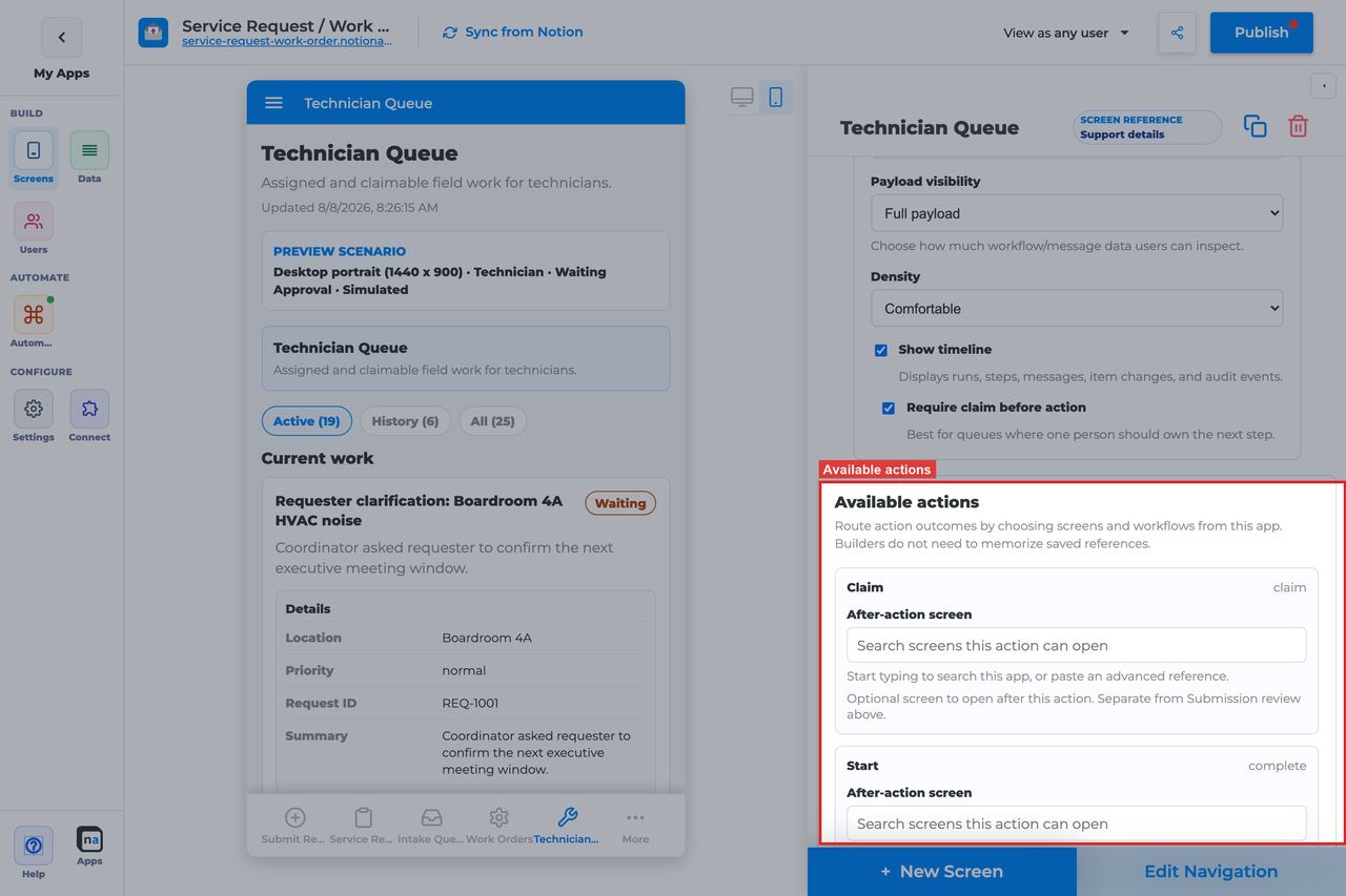
This section controls what users can actually do from the queue. For Work Queue the action set is intentionally small: claim the work if needed, then complete it when the human step is finished.
#### Claim
**What it does:** Takes ownership of an unclaimed item so other users can see who is handling it.\
**How to use it:** Keep Claim available on any shared queue where ownership matters. Pair it with `Require claim before action` when you need a strict handoff model.\
**Why / recommended default:** Claim makes shared desks safer and easier to coordinate. The common mistake is hiding Claim while still expecting teams to avoid duplicate work manually.
#### Complete
**What it does:** Marks the work item done and lets the workflow or runtime state move forward when applicable.\
**How to use it:** Keep Complete on the screen unless the work should always branch into another action such as approve or escalate. Make sure operators understand what "done" means in the business process.\
**Why / recommended default:** Complete is the core action for this screen. A common mistake is using Work Queue for work that really needs structured outcomes, in which case Decision is a better fit.
#### After-action screen
**What it does:** Opens another screen after a queue action succeeds.\
**How to use it:** Send users to **Workflow Status** when they need proof the route continued, to **Conversation** when discussion usually follows, or to a confirmation/content screen for a cleaner finish.\
**Why / recommended default:** This is optional, not required. The common mistake is confusing after-action routing with Submission review, which happens before the action and stays in the modal.
#### Target workflow
**What it does:** Supplies the destination workflow for actions that launch or escalate into another process.\
**How to use it:** Work Queue usually does not need this for Claim or Complete, but it becomes important if you add escalation-style actions later. Pick the exact published workflow that should start next.\
**Why / recommended default:** Leave it unset unless an action explicitly needs it. Unnecessary workflow bindings create confusion during maintenance.
### Preview scenario

Preview controls let makers test the queue with realistic device sizes, personas, and runtime states before publishing. For operational screens, preview is where you catch most empty-state and claimed-by-other problems early.
#### Device and orientation
**What it does:** Changes the preview frame to desktop, tablet, or mobile in portrait or landscape.\
**How to use it:** Always check mobile even if the queue is mainly desktop-facing, because field teams and approvers often open operational screens on phones. Use landscape only when you know tablets or kiosks are part of the workflow.\
**Why / recommended default:** Responsive failures are easy to miss in a desktop-only preview. Mobile verification is one of the highest-value final checks.
#### Test persona
**What it does:** Simulates the user role viewing the queue.\
**How to use it:** Preview as the real worker, not just as Admin. For this screen the default persona is **Technician**, which is a good starting point when the queue is meant for doers rather than system owners.\
**Why / recommended default:** Admin previews can hide role-based problems. The common mistake is validating only as an all-powerful user and shipping a queue that ordinary staff cannot use.
#### Preview state
**What it does:** Simulates states such as Empty, Loading, Error, Waiting approval, Claimed by me, and Claimed by someone else.\
**How to use it:** Walk through the blocked and claimed-by-other states deliberately. Those are the states where queue policy problems become obvious.\
**Why / recommended default:** The default preview state for Work Queue is **Waiting approval**, which is useful because it resembles a real actionable item. Makers often forget to check the failure states until after launch.
#### Test mode
**What it does:** Switches between simulated preview and live runtime testing.\
**How to use it:** Use simulated preview for layout and copy checks, then use a live test with a real workflow item before publishing.\
**Why / recommended default:** Simulated preview is fast, but only live testing proves that bindings and permissions are correct.
### Empty state and sample data

Even healthy queues are empty sometimes. This section controls whether the screen feels calmly idle or accidentally broken when there is nothing to work on.
#### Empty title
**What it does:** Sets the headline shown when no items match the current queue filters.\
**How to use it:** Keep the default `No work is waiting` unless you have a clearer phrase for your audience. Prefer language that sounds complete rather than alarming.\
**Why / recommended default:** A good empty title reassures users that the queue is simply clear. Titles that sound like errors make people file unnecessary support requests.
#### Empty description
**What it does:** Adds supporting text that explains what users should expect when the queue is empty.\
**How to use it:** Keep or adapt the default `New tasks and decisions appear here when workflows or messages need a person.` If needed, add where users should go next while they wait.\
**Why / recommended default:** Helpful empty copy reduces "is this broken?" confusion. The common mistake is leaving a generic sentence that does not explain why the queue is empty.
#### Sample item, run, or conversation
**What it does:** Provides builder-only references for previewing realistic runtime data.\
**How to use it:** Attach representative items before taking screenshots, testing review tabs, or validating compact layouts. Swap them out if they no longer reflect the live process.\
**Why / recommended default:** Good sample data prevents false confidence. A toy sample can hide long titles, missing documents, or unusual statuses that appear in production.
## Topics that fill this screen
This inbox is not a Notion table. Cards appear when a workflow **Publish Message** uses a request topic with item type **task** — usually `client.intake.submitted` or `checklist.ready`.
Use the same channel as reviews if you want one bus, but keep **item type** as `task`. A `client.review.requested` **decision** lands on the Decision screen, not here.
The topic must be allowed on the channel. A nearby invented name does not create a card.
Notification Center is the ping. Preference checkboxes can mute the notice; the Work Queue card still sits here.
Named catalog: [Topics that perform work](https://docs.notionapps.com/automation/messaging-and-notifications#topics-that-perform-work).
## Recommended Default Setup
| Setting | Recommended value |
| --------------------------- | -------------------------------------------------------- |
| Listen scope | Specific workflow (or Entire app for a shared ops inbox) |
| Visibility | Technician, Supervisor, or Ops role |
| Payload visibility | Redacted preview |
| Show timeline | On |
| Require claim before action | On for shared teams; Off for personal queues |
| Submission review | Overview fields + full record |
| Actions | Claim, Complete |
## Common Configuration Patterns
### Team intake queue
Listen to a specific workflow. Require claim. Bind Submission review to the intake details form.
### Personal my-work queue
Listen to Entire app or Specific workflow. Claim off if items are already assigned. Compact density.
## Testing Checklist
* [ ] Create a workflow item and confirm it appears under Active.
* [ ] Claim as user A; confirm user B cannot complete it while claimed.
* [ ] Complete and confirm the item moves to History.
* [ ] Open Review and confirm Submission / Documents tabs resolve.
* [ ] Verify a disallowed role cannot see the screen.
## Troubleshooting
### Queue is empty but workflows ran
Listen scope is too narrow, Include sheets excludes the source sheet, or visibility hides the items.
### Complete is disabled
Require claim before action is on and the item is unclaimed or claimed by someone else.
### Review opens blank
Submission screen override is missing or the item has no source\_record\_id.
## Best Practices
* Configure **Work Queue** for one clear user job.
* Prefer the narrowest listen scope that still shows the right work.
* Keep payload visibility conservative for broad audiences.
* Test as an allowed user and a blocked user before publish.
* Pair related screens (Decision + Conversation + Workflow Status + Notification Center) instead of overloading one screen.
# Decision Screen
> Current state: this native screen is part of **Automation**. It is entitlement-gated, uses NotionApps runtime state instead of ordinary Notion data controls, and should be tested with realistic workflow or messaging activity before a maker relies on it in production.
The **Decision** screen is a guided approval, rejection, or request-changes checkpoint where automation pauses until a person records a structured outcome.
Think of this screen as **A controlled approval desk for one clear question that records one structured outcome.**
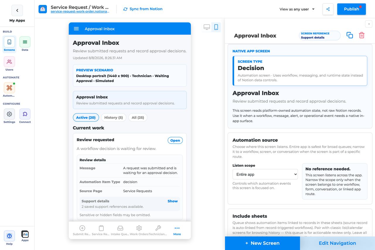
## Who This Guide Is For
This guide is for makers configuring a **Decision** screen in the app builder. It lists every builder option available on the screen and explains how to use each one.
Use this guide when:
* A workflow needs Approve / Reject / Request changes.
* Reviewers must inspect the real submission before deciding.
* Only one reviewer should own the decision at a time.
## What The Screen Is For
### Use Decision when
* A workflow needs Approve / Reject / Request changes.
* Reviewers must inspect the real submission before deciding.
* Only one reviewer should own the decision at a time.
### Do not use it when
* A general task list — use Work Queue.
* Long discussion before deciding — pair with Conversation.
* Run health dashboards — use Workflow Status or Operator Console.
## What Users See In The Live App
* Active / History / All segments (Active default).
* Decision title, status, summary, and due date.
* Review modal with Overview, Submission, and Documents tabs when configured.
* Claim / Release when claim is required (default on).
* Approve, Reject, and Request changes with optional reason and attachments.
| Default | Value |
| ------------------------------- | -------------------------------------------------------------- |
| Default listen scope | Entire app |
| Require claim before action | On |
| Default preview persona / state | Technician / Waiting approval |
| Empty title | No decisions are waiting |
| Empty description | Workflow decisions appear here when a route pauses for review. |
## Required Foundations
| Requirement | Why it matters |
| ------------------------------------------ | ------------------------------------------------------------ |
| Automation screen entitlement | Decision appears in the Automation / Operational group. |
| Workflow | Primary foundation for this screen’s runtime state. |
| Private app + Users database (recommended) | Role/tenant visibility and audience policy need user fields. |
## Complete Builder Options Reference
The sections below follow the builder order. Every option is explained in prose so a maker can tell what the setting changes, how to configure it for a real approval flow, and which defaults or mistakes matter most before publishing.
### Header and screen type
This opening section identifies the native screen and defines the basic language reviewers will see. Even though it is short, it sets the tone for the whole experience: a Decision screen should feel like one clear checkpoint with one clear question.
#### Screen type
**What it does:** Locks the screen into **Decision** behavior so the live app renders structured outcomes instead of a general task list or data table.\
**How to use it:** Leave the screen type as Decision once the screen is created. If the step is really open-ended work, use Work Queue; if it is only discussion, use Conversation.\
**Why / recommended default:** Decision is best when the workflow is waiting for a formal answer. Trying to stretch another screen type into approval behavior is a common source of confusing action labels and missing outcome logic.
#### Category
**What it does:** Places the screen in the native Automation or Operational grouping inside the builder.\
**How to use it:** Keep the built-in category and use app navigation to decide where reviewers discover the screen.\
**Why / recommended default:** This setting is mainly organizational, but it helps large apps keep approval desks separate from ordinary data screens.
#### Title
**What it does:** Sets the live title shown in navigation and at the top of the approval desk.\
**How to use it:** Name the review job, such as `Manager approval`, `Compliance review`, or `Client sign-off`. Avoid internal workflow names that only makers understand.\
**Why / recommended default:** Good titles reduce accidental approvals from the wrong desk. A common mistake is giving every screen a vague name like `Review`.
#### Description
**What it does:** Adds the helper sentence beneath the title so reviewers know what decision they are making.\
**How to use it:** Write one sentence that tells reviewers what to inspect and what outcome to record, such as "Review the submission, then approve, reject, or request changes."\
**Why / recommended default:** Clear description text is especially important when the same audience has several approval desks. It reduces hesitation and prevents guesswork.
### Automation source
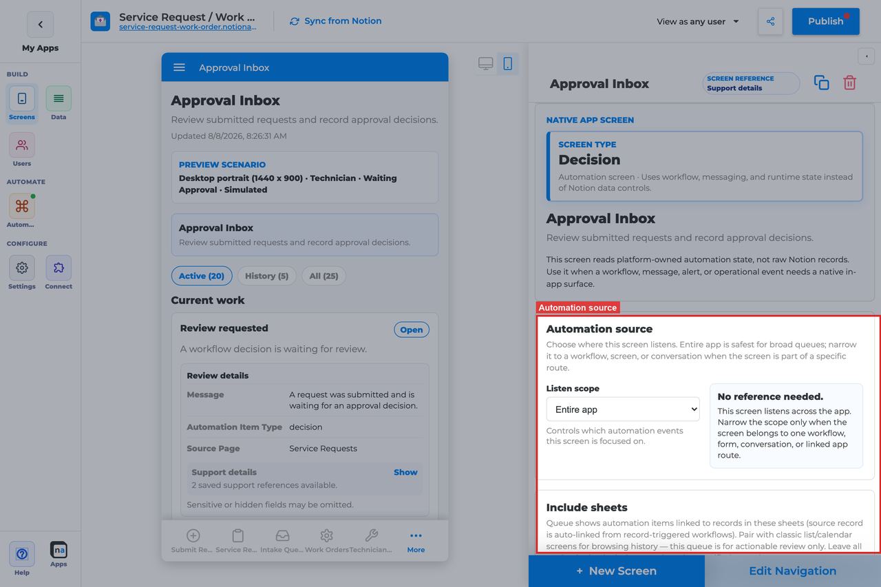
This section controls which workflow-generated decisions appear on the screen. The correct source is what makes the desk feel focused and trustworthy instead of becoming a mixed pile of unrelated approvals.
| Listen scope | Best for | Common mistake |
| ------------------------------ | ------------------------------------------------- | ----------------------------------------------------- |
| Entire app | A shared admin approval center | Pulling in too many unrelated decisions |
| Specific screen or form | One intake experience that always leads to review | Forgetting to update the binding after swapping forms |
| Specific workflow | One defined approval process | Pointing at the wrong workflow version |
| Conversation or message thread | Message-driven review flows | Expecting it to behave like a chat screen |
| Linked application | Cross-app approval handoffs | Using it when the approval is still local to one app |
#### Listen scope
**What it does:** Decides the high-level runtime source the screen listens to for decision items.\
**How to use it:** Start with **Specific workflow** for most approval desks. Use **Entire app** only when trusted admins need one shared review center. Choose **Specific screen or form** when one intake surface is the natural source boundary.\
**Why / recommended default:** **Specific workflow** is the recommended default for most makers because it keeps the approval queue understandable. Overly broad scope is the most common reason a Decision desk feels noisy.
#### Source screen or form
**What it does:** Appears when the scope is **Specific screen or form** and binds the desk to that submission surface.\
**How to use it:** Pick the exact create or update form that triggers the approval step. Revisit this binding any time you replace or duplicate the intake screen.\
**Why / recommended default:** This is useful when business owners think in terms of "submissions from this form." The common mistake is assuming the binding will follow a renamed or rebuilt form automatically.
#### Workflow
**What it does:** Appears when the scope is **Specific workflow** and filters the desk to decisions emitted by that workflow.\
**How to use it:** Select the published workflow that contains the decision step. If the workflow has staging or archived versions, verify you picked the live one.\
**Why / recommended default:** This is the safest default for a clear approval desk. It makes debugging much easier when a decision does not appear or appears in the wrong place.
#### Messaging channel
**What it does:** Narrows decision-related activity to a specific messaging channel when the workflow and approval route also emit messages.\
**How to use it:** Set it only when your approval model depends on channel-bound messaging. Otherwise leave the Decision screen centered on workflow scope.\
**Why / recommended default:** Channel filters are powerful but easy to mismatch. Use them deliberately, not by habit.
#### Topic
**What it does:** Filters channel-driven activity to one topic inside that channel.\
**How to use it:** Use stable topic names and match them exactly to the route that creates the approval context.\
**Why / recommended default:** Topic mismatch is a common cause of empty screens. Consistent topic naming across environments prevents subtle drift.
#### Conversation or correlation
**What it does:** Limits the desk to one specific conversation thread or correlation context.\
**How to use it:** Use this only for a tightly scoped case review or a single-request follow-up experience. Leave it broader for a reusable approval desk.\
**Why / recommended default:** Hard-coding a correlation is usually too narrow for a general approval queue, so use it only when that narrowness is intentional.
#### Linked application
**What it does:** Binds the decision desk to a linked external NotionApps application when approvals are exchanged across apps.\
**How to use it:** Select the linked app only when the approval context really originates there. Most Decision screens stay on workflow scope inside the same app.\
**Why / recommended default:** Cross-app review can be powerful, but it adds another layer to troubleshoot. Do not choose this unless the architecture truly needs it.
### Include sheets
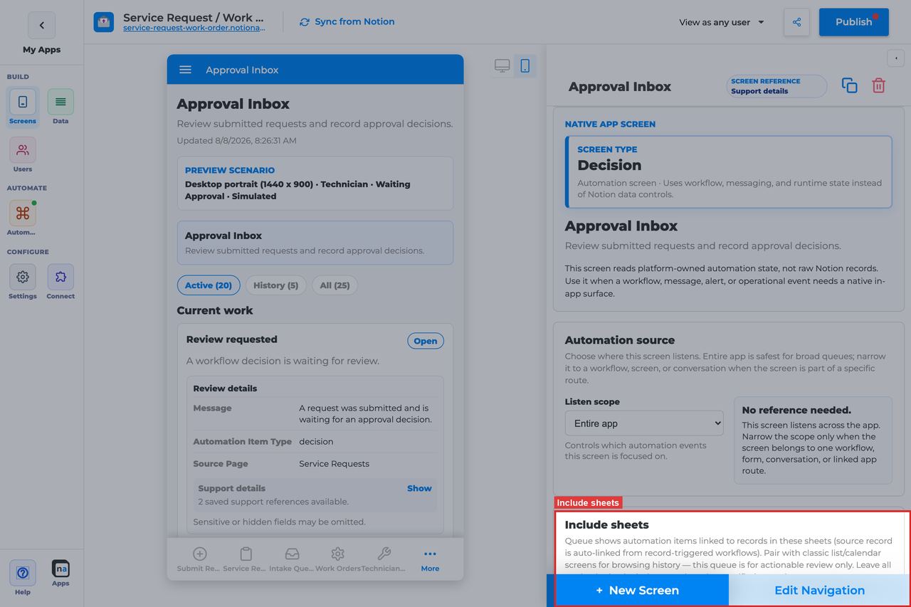
This section lets you narrow a Decision desk to the sheets that matter. It is useful when one workflow handles several record types but only some of them should come to a particular reviewer group.
#### Included sheets
**What it does:** Limits visible decision items to the selected sheets. Leaving everything unchecked allows all eligible sheets in scope.\
**How to use it:** Check only the sheets that should feed this desk. If the same approver group handles multiple sources, leave them unchecked for a broader review center.\
**Why / recommended default:** Sheet filtering is helpful for routing, but it is also easy to forget during testing. A hidden sheet filter is a common reason reviewers insist approvals are missing.
### Decision outcomes
## Topics that fill this screen and resume the workflow
This inbox is not a Notion table. Cards appear when a workflow **Publish Message** uses a request topic with item type **decision** — usually `client.review.requested` or `supervisor.review.requested`.
When the reviewer submits an outcome, Messaging publishes a **reply topic**. The waiting workflow only continues if **Wait for message** lists those exact names:
| Outcome | Reply topic |
| --------------- | ----------------------------------- |
| Approve | `client.decision.approve` |
| Request changes | `client.decision.changes_requested` |
| Reject | `client.decision.reject` |
Use the builder presets or **Use all client decision topics**. A homemade topic (`client.approved`, `review.done`) will not wake a Wait that lists the presets.
Notification Center is the ping. Preference checkboxes can mute the notice; the Decision card still sits here.
Named catalog: [Topics that perform work](https://docs.notionapps.com/automation/messaging-and-notifications#topics-that-perform-work).
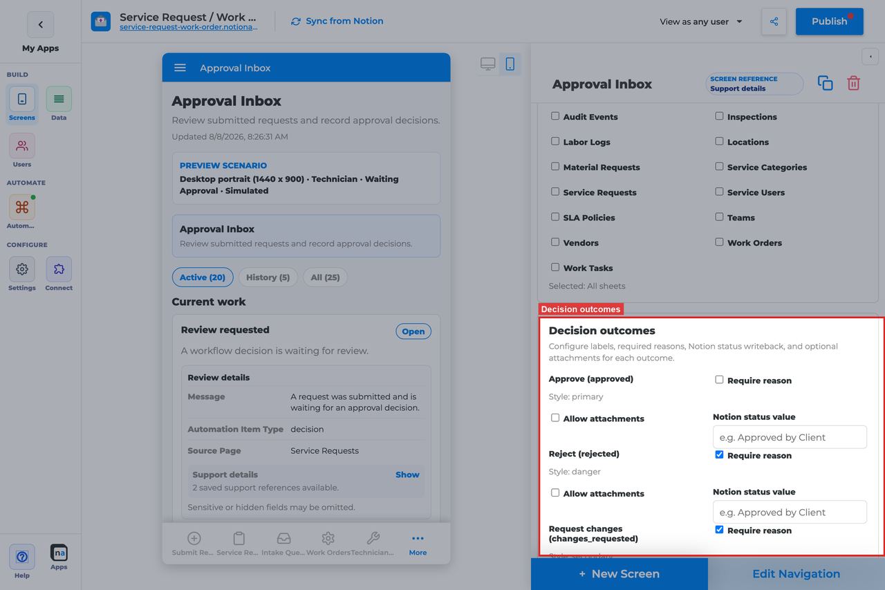
This section is the heart of the screen. It defines the structured answers the reviewer can submit and how those answers behave, including whether a reason is required, whether attachments are allowed, and whether the source record should receive a Notion status writeback.
| Outcome | Default key | Default behavior |
| --------------- | ------------------- | ------------------------------------------------------ |
| Approve | `approved` | Primary action, reason optional |
| Reject | `rejected` | Danger action, reason required |
| Request changes | `changes_requested` | Secondary action, reason required, attachments allowed |
#### Approve
**What it does:** Records the positive decision outcome and submits the decision key `approved`.\
**How to use it:** Keep Approve available whenever the workflow has a successful review branch. Verify the workflow branch expects the `approved` key or its mapped equivalent.\
**Why / recommended default:** Approve should be the clearest action on the screen when acceptance is a normal path. A common mistake is relabeling the button in a way that no longer matches the workflow outcome logic.
#### Reject
**What it does:** Records a negative outcome using the `rejected` decision key.\
**How to use it:** Keep Reject available when the workflow needs a formal stop or denial path. Make sure the corresponding workflow branch and any downstream notifications expect a rejected outcome.\
**Why / recommended default:** Reject should be explicit, not hidden. Reviewers need a clean way to say "no" without using Request changes as a workaround.
#### Request changes
**What it does:** Records the `changes_requested` outcome so the workflow can loop back for edits instead of fully approving or rejecting.\
**How to use it:** Keep this action when the process supports revision cycles. Pair it with a clear submission review setup and, when useful, a Conversation screen for back-and-forth clarification.\
**Why / recommended default:** This action is valuable because it preserves nuance. The common mistake is leaving it enabled even when the workflow has no branch for changes requested, which makes the screen look capable of something the route cannot handle.
#### Require reason
**What it does:** Forces the reviewer to enter a comment before submitting a selected outcome.\
**How to use it:** Leave **Require reason** on for **Reject** and **Request changes**. Approve can stay optional unless policy or regulation requires written approval notes.\
**Why / recommended default:** Rejections and change requests should nearly always explain themselves. The common mistake is making reasons optional everywhere and losing the audit trail people need later.
#### Allow attachments
**What it does:** Lets the reviewer attach files to the selected outcome.\
**How to use it:** Enable attachments where evidence matters, especially on **Request changes** for annotated documents or screenshots. Only enable them on Approve or Reject when there is a real business need.\
**Why / recommended default:** Attachments are helpful, but they introduce more complexity. The default pattern of using them mainly for Request changes is usually the right balance.
#### Notion status value
**What it does:** Maps each outcome to a status value written back to the source record.\
**How to use it:** Enter the exact source-record status value you want for each outcome, such as `Approved by Client`, `Rejected`, or `Needs Revision`. Populate every meaningful path rather than relying on memory or convention.\
**Why / recommended default:** Explicit writeback mappings make the app and Notion stay aligned. The common mistake is assuming people will infer decision state from runtime history alone.
#### Attachment Notion field
**What it does:** Points outcome attachments to a files/uploads field on the source record when attachments are enabled.\
**How to use it:** Choose the files property that should store review evidence. Confirm that the field exists on the relevant sheet and is appropriate for long-term retention.\
**Why / recommended default:** If attachments matter, they should land somewhere predictable. The common mistake is enabling attachments but forgetting to point them at a usable record field.
#### Outcome labels and styles
**What it does:** Shows the maker-facing labels, keys, and styles for each outcome.\
**How to use it:** Keep labels short and business-readable, and make sure any workflow branching still matches the underlying decision keys. Treat styles as meaning cues: primary for forward progress, danger for hard stop, secondary for revision.\
**Why / recommended default:** These defaults are already sensible. Changing labels without checking workflow branch expectations is one of the easiest ways to create a subtle mismatch.
#### Writeback behavior
**What it does:** Applies the configured Notion status mapping after the decision is submitted.\
**How to use it:** Prefer explicit mappings for all important outcomes, including `changes_requested`. Use fallback behavior only when you are maintaining older setups.\
**Why / recommended default:** Explicit mapping is more predictable than legacy fallback. That predictability matters when other screens, filters, or notifications depend on the status field.
### App audience and notification prefs
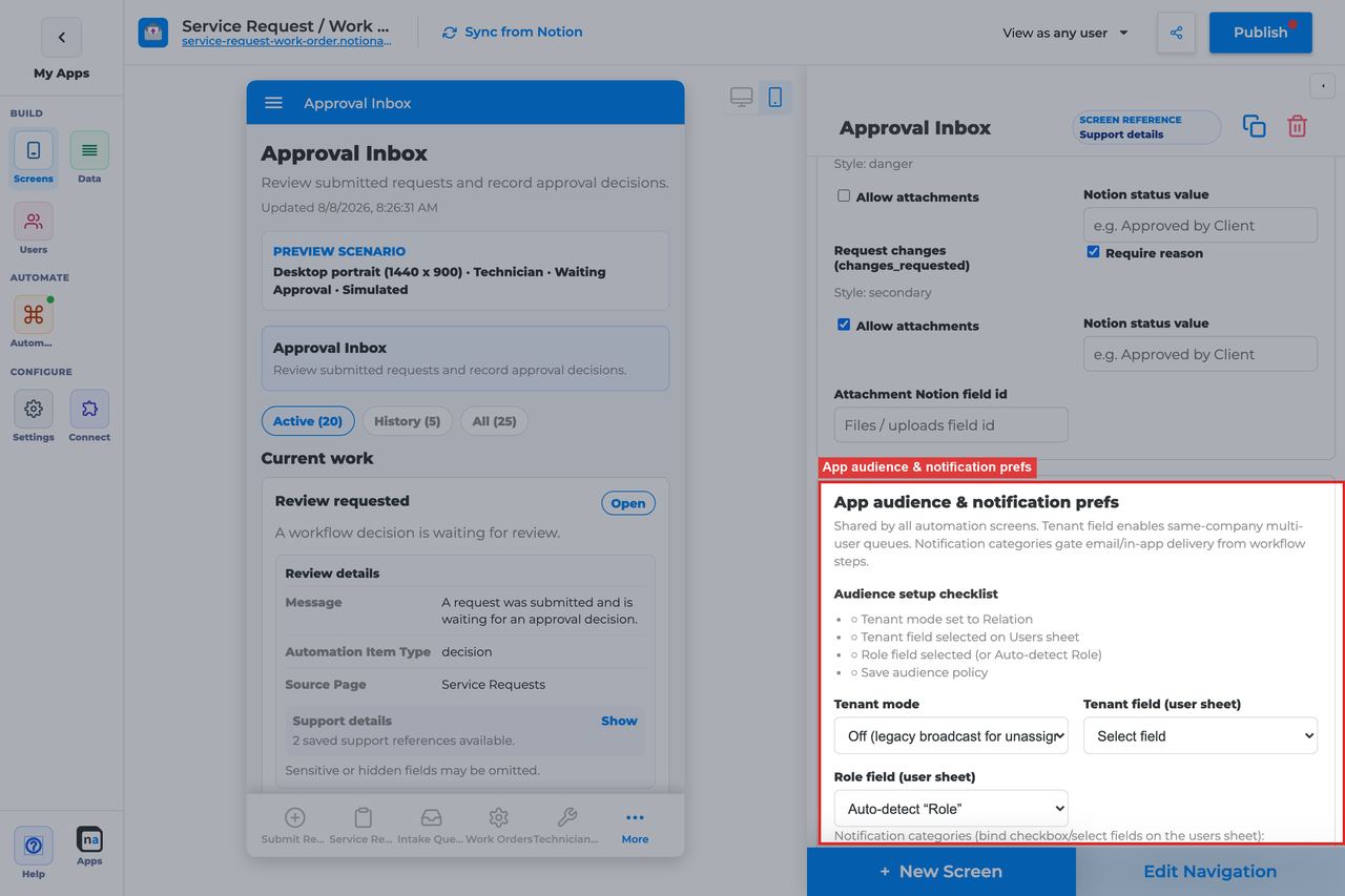
These controls are app-wide policy, but they matter for Decision because approvals often carry sensitive payloads and should only be visible to the right tenant and reviewer population.
#### Tenant mode
**What it does:** Decides whether decisions are isolated by tenant relation or treated more broadly.\
**How to use it:** Choose **Relation** for multi-tenant approval apps so reviewers only see decisions for their own client or company. Use **Off** only in genuinely single-tenant setups.\
**Why / recommended default:** Tenant isolation is usually the safer default. Decision desks often surface sensitive content, so getting this wrong is especially costly.
#### Tenant field
**What it does:** Selects the Users-sheet relation that represents tenant membership.\
**How to use it:** Point this at the same company, client, or workspace field used elsewhere in the app.\
**Why / recommended default:** Consistency across screens is more important than creative modeling. If this field differs from the rest of the app, reviewer visibility will feel random.
#### Role field
**What it does:** Identifies the field holding a user's role when it is not named `Role`.\
**How to use it:** Leave blank for the default field name or set it to your custom role property.\
**Why / recommended default:** Role-based access only works if the builder is reading the correct field. This is easy to overlook when importing or cloning user schemas.
#### Notification categories
**What it does:** Connects notification types to user preferences so people can control how approval-related notices reach them.\
**How to use it:** Add only the categories the approval flow actually sends, such as review requests or escalation notices, and map each one to a real preference field.\
**Why / recommended default:** Lean, real categories are easier to maintain. Too many categories create policy drift and make notification behavior harder to explain.
#### Add notification category
**What it does:** Adds another category row to the audience policy.\
**How to use it:** Create a new category only when you also have a sending route and a user preference to bind it to.\
**Why / recommended default:** Categories should represent actual user choices, not future possibilities.
#### Save audience policy
**What it does:** Saves tenant and category settings at the app level.\
**How to use it:** Save immediately after policy changes and before retesting approval visibility or notifications.\
**Why / recommended default:** Unsaved policy changes are a common source of false debugging, especially when several makers are testing with different personas.
### Template setup state
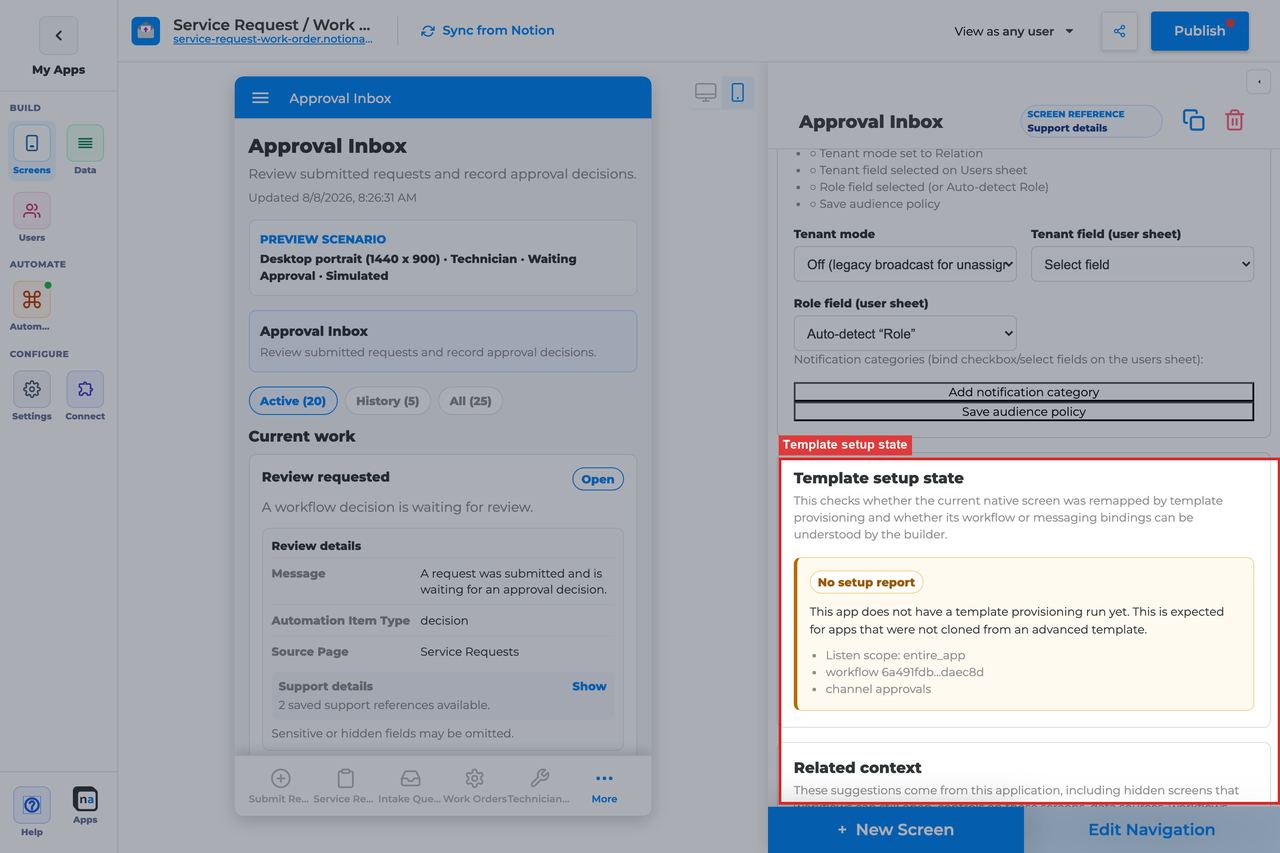
This section tells you whether a cloned template or repaired demo still has healthy bindings behind the Decision screen.
#### Setup state indicator
**What it does:** Reports whether the native screen is provisioned, needs review, or has no setup report.\
**How to use it:** Treat **Provisioned** as healthy, treat **Needs review** as a signal to re-check workflow and review-tab bindings, and treat **No setup report** as normal for manual builds.\
**Why / recommended default:** This status can point you to configuration drift before users ever notice a broken approval desk.
### Related context

This read-only panel helps you locate nearby forms, workflows, channels, and other screens that influence the decision experience.
#### Related context panel
**What it does:** Shows discovery counts and related objects connected to the current native screen.\
**How to use it:** Use it to find the right detail screen, documents screen, or after-action destination rather than recreating them from scratch.\
**Why / recommended default:** Discovery is safer than copying IDs around, especially in larger builder setups.
### Visibility and access
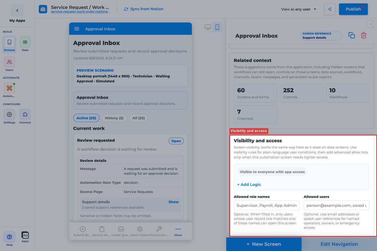
This section controls who is allowed to open the Decision screen at all. Approval desks should be tighter than general task lists because the payload and outcome power are usually more sensitive.
#### Visibility rules
**What it does:** Applies rule-based screen visibility using the same private-app model as other screens.\
**How to use it:** Build conditions using stable fields such as role, team, tenant, or region. Keep the logic easy to read and test.\
**Why / recommended default:** Simpler access rules are easier to audit. A common mistake is opening the desk too broadly and relying on reviewers to self-select.
#### Allowed role names
**What it does:** Adds a direct role allow list for the approval desk.\
**How to use it:** Use clear roles such as `Manager, Approver, Admin` when role gating is sufficient.\
**Why / recommended default:** This is often the clearest and safest access model for approvals. The common mistake is accumulating similar role names until no one remembers which one actually unlocks the screen.
#### Allowed users
**What it does:** Grants access to specific people by email or user reference.\
**How to use it:** Use this sparingly for pilot reviewers, emergency approvers, or executive overrides.\
**Why / recommended default:** Per-person overrides are useful but hard to scale. They should supplement the role model, not replace it.
### Submission review
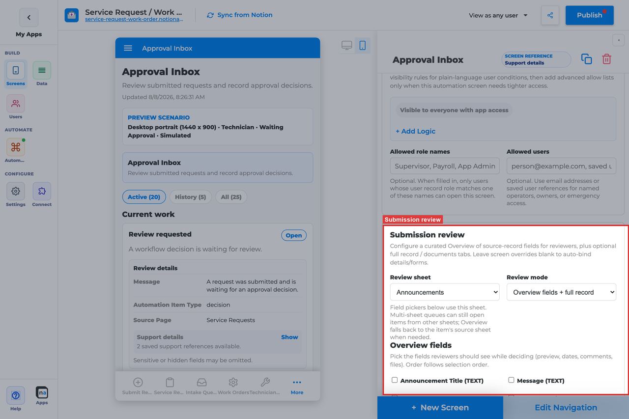
Submission review is the pre-decision inspection experience inside the review modal. It is separate from after-action routing and is one of the most important parts of a trustworthy approval desk.
| Review mode | Best for | Recommendation |
| ----------------------------- | -------------------------------------------------- | ------------------------- |
| Overview fields + full record | Most governed approvals | Recommended default |
| Overview fields only | Fast, repetitive reviews | Good for simple approvals |
| Full record only (legacy) | Older setups that rely on the full submission view | Use only when needed |
#### Review sheet
**What it does:** Chooses which sheet powers the Overview field picker.\
**How to use it:** Leave it blank to auto-detect when the decision items always come from one reliable source. Set it explicitly when you want the review configuration to stay stable across similar items.\
**Why / recommended default:** Explicit binding is safer in complex approvals. Auto-detect is convenient, but it can hide differences between item types.
#### Review mode
**What it does:** Decides whether reviewers see overview fields, the full submission, or both.\
**How to use it:** Choose **Overview fields + full record** for most regulated or high-confidence approval flows. Use **Overview fields only** when the review is simple and speed matters. Keep **Full record only** mainly for older compatibility cases.\
**Why / recommended default:** **Overview fields + full record** is the best default because it lets a reviewer scan first and drill in only when needed.
#### Overview fields
**What it does:** Defines the short list of fields shown in the Overview tab.\
**How to use it:** Include only the fields needed to answer the review question. Put the most decision-relevant facts first, such as amount, requester, due date, or risk flags.\
**Why / recommended default:** A tight overview reduces decision time. Including every field turns the summary tab into a second full form and defeats the point.
#### Submission screen override
**What it does:** Forces the Submission tab to open a specific detail screen instead of relying on auto-selection.\
**How to use it:** Bind the canonical review or detail screen that the approver should inspect.\
**Why / recommended default:** This is one of the most valuable safety settings for mature approval flows because it keeps the review experience predictable even after screens are renamed.
#### Documents screen override
**What it does:** Binds the Documents tab to a chosen document screen for the decision item.\
**How to use it:** Point it at the related documents or uploads experience reviewers actually need.\
**Why / recommended default:** This matters whenever attachments or supporting files are part of the approval standard. Forgetting it is a common reason the review modal feels incomplete.
### Inbox modes
Decision screens still use inbox-style segmentation even though the action is structured. Makers should understand these modes because reviewers often use History to confirm that a decision was already made.
#### Active, History, and All
**What it does:** Separates actionable open decisions from completed history and the full combined audit list.\
**How to use it:** Tell reviewers to work from **Active**, check **History** when they need to confirm a completed outcome, and use **All** for support or audit work.\
**Why / recommended default:** The default live segment is **Active** because it keeps the desk focused. A common mistake is assuming a handled decision vanished when it simply moved to History.
### Display and action policy
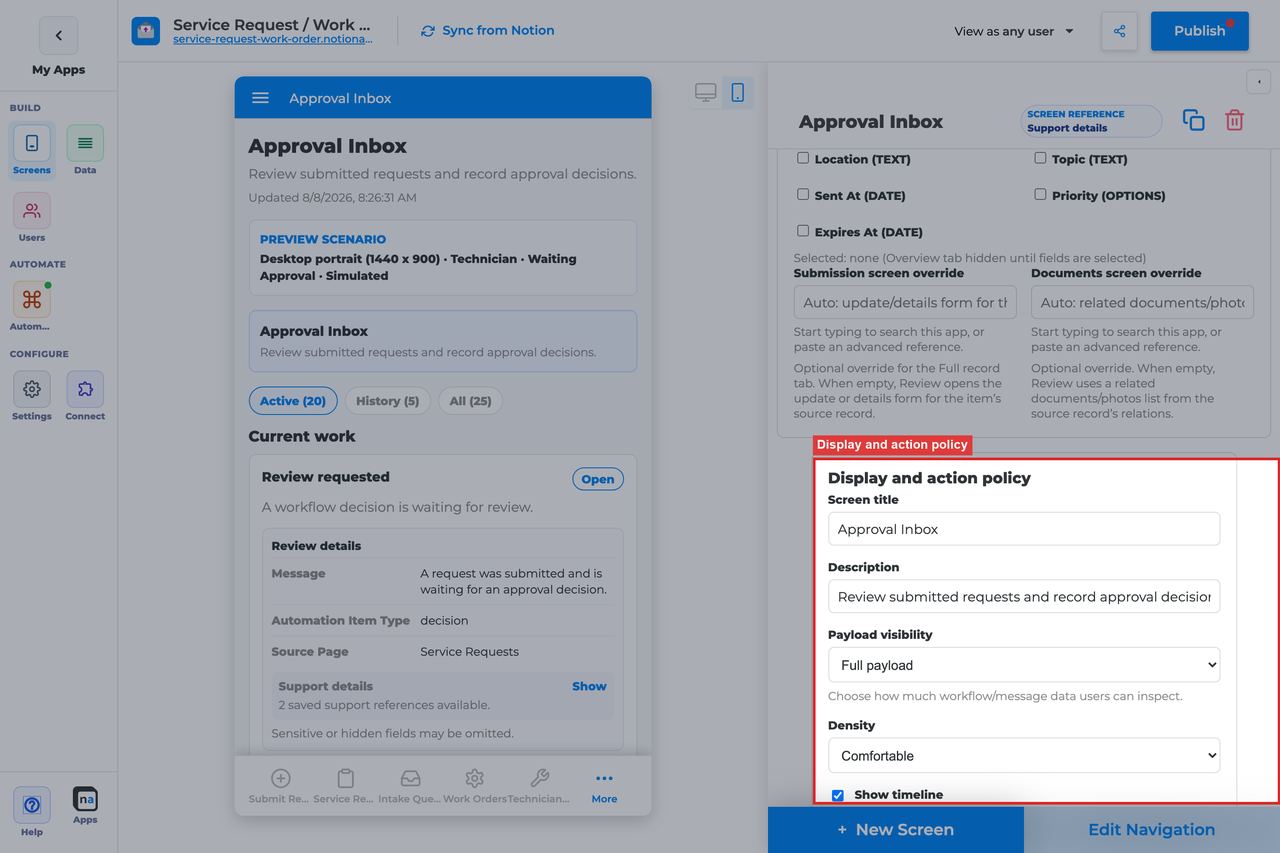
This section controls how much context reviewers see and whether ownership is enforced before a decision can be submitted. For Decision, this section is where safety defaults matter most.
#### Screen title override
**What it does:** Refines the live title for the approval desk.\
**How to use it:** Use the business-friendly name reviewers already recognize, such as `Client approval` or `Finance review`.\
**Why / recommended default:** Clear names reduce the risk of making the right decision in the wrong place.
#### Description
**What it does:** Sets the helper text shown under the title.\
**How to use it:** Tell reviewers exactly what they must do, for example "Inspect the request, then approve, reject, or request changes."\
**Why / recommended default:** Specific guidance helps occasional reviewers stay consistent without extra training.
#### Payload visibility
**What it does:** Controls how much runtime payload detail is visible during review.\
**How to use it:** Choose **Metadata only** for broad or external audiences, **Redacted preview** for most internal approval desks, and **Full payload** only for trusted operators or sensitive back-office reviewers who genuinely need it.\
**Why / recommended default:** **Redacted preview** is the usual default because it balances context and safety. Full payload should be intentional, not automatic.
#### Density
**What it does:** Changes how much visual space each item and detail block uses.\
**How to use it:** Keep **Comfortable** for most approval work where careful reading matters. Switch to **Compact** only for experienced, high-volume review teams.\
**Why / recommended default:** Comfortable spacing lowers reviewer error rates. Compact works best only after the process is mature.
#### Show timeline
**What it does:** Displays steps, messages, and audit events around the decision item.\
**How to use it:** Leave it **On** for most Decision screens so reviewers can see what happened before the item reached them.\
**Why / recommended default:** Timeline visibility reduces back-and-forth and improves auditability. Hiding it often makes borderline cases harder to judge.
#### Require claim before action
**What it does:** Requires the reviewer to claim the decision item before using Approve, Reject, or Request changes.\
**How to use it:** Leave this **On** for shared approval desks unless the screen is truly personal and already assigned to one person.\
**Why / recommended default:** The registry default for Decision is **On**, and that is the recommended default in almost every shared review workflow. The common mistake is turning it off too early and letting two reviewers act on the same item.
### Available actions
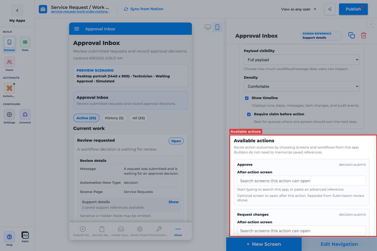
These are the live actions reviewers see at the decision point. Together they should cover the full policy of the approval step without forcing the reviewer into side-channel workarounds.
#### Approve action
**What it does:** Submits the positive approval outcome.\
**How to use it:** Keep it enabled when the workflow can continue forward after a successful review. Pair it with an after-action screen such as Workflow Status if users need confirmation.\
**Why / recommended default:** Approve is the default forward path in most review flows. Make sure its label and workflow branch still match after any process rename.
#### Reject action
**What it does:** Submits the negative denial outcome.\
**How to use it:** Keep the default reason requirement so denials are explained. Route users to a follow-up screen only when there is a real post-rejection task.\
**Why / recommended default:** A documented rejection is safer than an undocumented one. The common mistake is treating reject like a shortcut instead of a governed outcome.
#### Request changes action
**What it does:** Sends the item back for revision with the `changes_requested` outcome.\
**How to use it:** Keep the default reason requirement and attachment support when reviewers may need to explain missing information or mark up documents.\
**Why / recommended default:** This action is most useful when the process expects iterative improvement. It is the right place for evidence-backed feedback, not a second version of Reject.
#### After-action screen
**What it does:** Sends the reviewer to another screen after a decision submits successfully.\
**How to use it:** Route to **Workflow Status** for confirmation, to **Conversation** when clarification usually follows, or to a confirmation screen when you want a clean finish.\
**Why / recommended default:** This is optional. Do not confuse it with Submission review, which happens before the outcome is chosen.
#### Target workflow
**What it does:** Provides the target workflow for actions that launch or escalate into another workflow.\
**How to use it:** Decision usually does not need this for normal Approve, Reject, or Request changes actions, but use it deliberately if you add escalation-style follow-up behavior.\
**Why / recommended default:** Leave it empty unless an action truly needs it. Unused workflow bindings make maintenance harder.
### Preview scenario
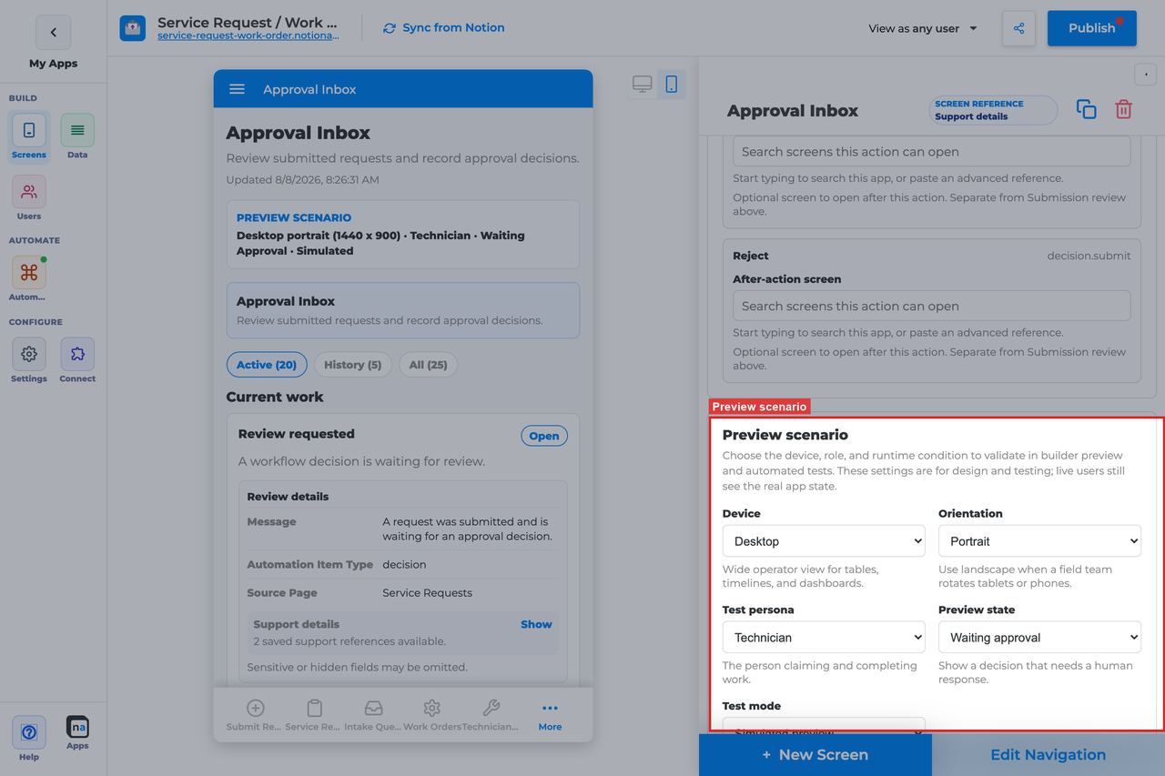
Preview controls let you test not just layout but policy. For Decision, you should always check claimed and blocked states before publish because that is where shared-ownership mistakes show up.
#### Device and orientation
**What it does:** Changes the preview frame to desktop, tablet, or mobile in portrait or landscape.\
**How to use it:** Always inspect the review modal on mobile, even if most reviewers work on desktop.\
**Why / recommended default:** Mobile approval is common for managers and approvers. If the modal or action footer breaks there, the workflow will feel broken.
#### Test persona
**What it does:** Simulates who is using the desk.\
**How to use it:** Test with the real reviewer role, not only with Admin. The default preview persona is **Technician**, but you should switch to the actual approver persona your app uses.\
**Why / recommended default:** Admin previews hide permission mistakes. Persona testing is the fastest way to catch visibility errors before launch.
#### Preview state
**What it does:** Simulates runtime states such as Waiting approval, Claimed by me, Claimed by someone else, Empty, and Error.\
**How to use it:** Test **Waiting approval**, **Claimed by me**, and **Claimed by someone else** in particular.\
**Why / recommended default:** The default preview state is **Waiting approval**, which is the right starting point, but it does not reveal concurrency problems by itself.
#### Test mode
**What it does:** Switches between simulated preview and live runtime testing.\
**How to use it:** Use simulated mode for copy and layout, then verify a real workflow run in live test mode before publishing.\
**Why / recommended default:** Only a live decision test proves that outcome keys, writeback, and permissions all work together.
### Empty state and sample data
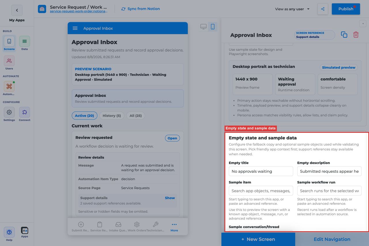
Even an approval desk should have a calm idle state. Empty-state settings help users understand that there is simply nothing waiting, not that the review process failed.
#### Empty title
**What it does:** Sets the headline shown when no decision items match.\
**How to use it:** Keep the default `No decisions are waiting` unless your reviewers use clearer team-specific language.\
**Why / recommended default:** The default is strong because it sounds complete, not broken.
#### Empty description
**What it does:** Explains why the desk is empty and what users should expect next.\
**How to use it:** Keep or adapt the default `Workflow decisions appear here when a route pauses for review.` Add a secondary hint only if your users truly need it.\
**Why / recommended default:** Good empty copy prevents unnecessary support questions from reviewers who are new to the process.
#### Sample item, run, or conversation
**What it does:** Provides builder-only runtime references for realistic previewing and screenshots.\
**How to use it:** Use a representative approval item with documents, a real summary, and meaningful status values so the review modal reflects production conditions.\
**Why / recommended default:** Weak sample data can hide exactly the cases that make approvals fail in production, such as long titles, missing documents, or required reasons.
## Recommended Default Setup
| Setting | Recommended value |
| --------------------------- | -------------------------------------------------------------- |
| Listen scope | Specific workflow |
| Visibility | Manager, Supervisor, Approver, or Admin |
| Payload visibility | Redacted preview |
| Show timeline | On |
| Require claim before action | On |
| Submission review | Overview fields + full record with Submission screen bound |
| Decision outcomes | Approve / Reject / Request changes with Notion status mappings |
## Common Configuration Patterns
### Manager approval
Specific workflow, claim on, redacted preview, after-action to Workflow Status.
### Request-changes loop
Require reason on Reject and Request changes; bind Documents screen; optional Conversation for clarification.
### Admin approval center
Entire app listen scope, Admin-only visibility, compact density.
## Testing Checklist
* [ ] Run the workflow until a decision item appears under Active.
* [ ] Confirm claim enables decision buttons.
* [ ] Approve and verify the approved workflow branch.
* [ ] Reject and Request changes with reasons; verify writeback status values.
* [ ] Open Review and confirm Overview / Submission / Documents.
* [ ] Confirm History shows completed decisions.
## Troubleshooting
### Approve/Reject disabled
Claim is required and the item is unclaimed or owned by someone else.
### Workflow does not continue
Outcome key does not match a workflow branch, or submit failed — check Workflow Status.
### Wrong users can approve
Visibility / allowed roles are too broad — tighten roles and retest as requester.
## Best Practices
* Configure **Decision** for one clear user job.
* Prefer the narrowest listen scope that still shows the right work.
* Keep payload visibility conservative for broad audiences.
* Test as an allowed user and a blocked user before publish.
* Pair related screens (Decision + Conversation + Workflow Status + Notification Center) instead of overloading one screen.
# Workflow Status Screen
> Current state: this native screen is part of **Automation**. It is entitlement-gated, uses NotionApps runtime state instead of ordinary Notion data controls, and should be tested with realistic workflow or messaging activity before a maker relies on it in production.
The **Workflow Status** screen is a live timeline of workflow runs, steps, waits, retries, and outcomes so requesters and operators can see where work stands.
Think of this screen as **A progress board for automation runs — read-only by default.**
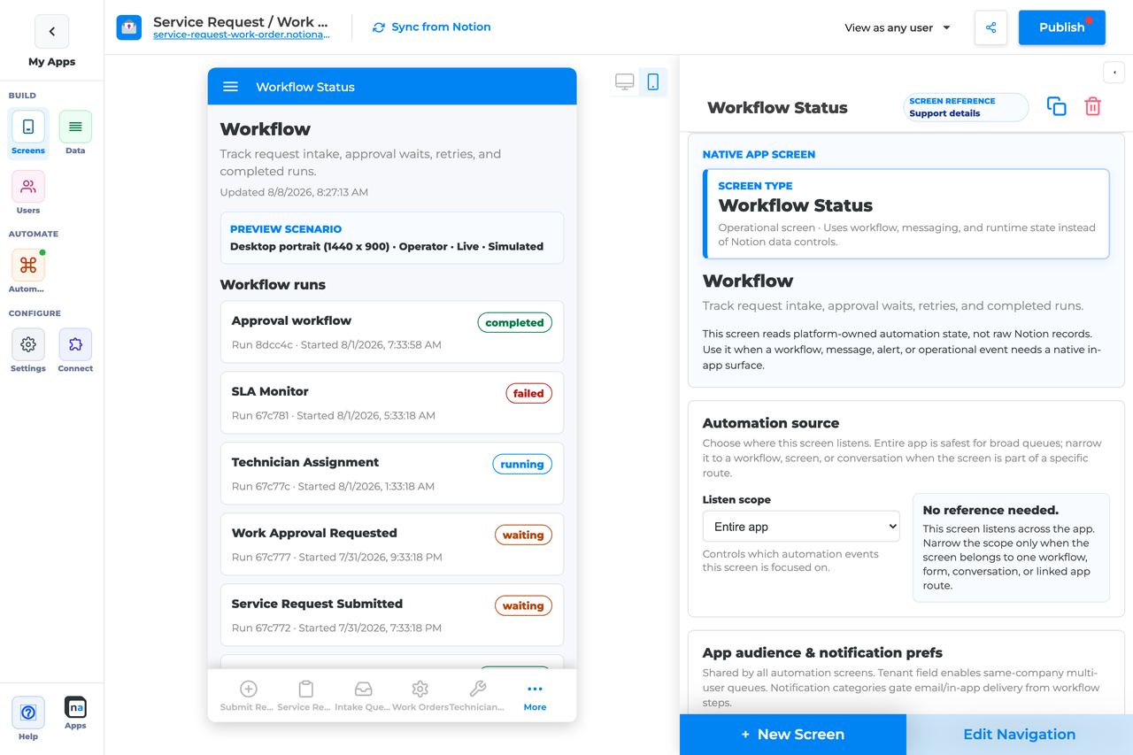
## Who This Guide Is For
This guide is for makers configuring a **Workflow Status** screen in the app builder. It lists every builder option available on the screen and explains how to use each one.
Use this guide when:
* Requesters need to see whether their submission is waiting, approved, or failed.
* Operators need run timelines without opening backend logs.
## What The Screen Is For
### Use Workflow Status when
* Requesters need to see whether their submission is waiting, approved, or failed.
* Operators need run timelines without opening backend logs.
### Do not use it when
* Acting on approvals — use Decision or Work Queue.
* Recovering failures — use Exception Resolution.
* High-level ops metrics across many surfaces — use Operator Console.
## What Users See In The Live App
* Run cards with status, current step, and timestamps.
* Timeline of waits, retries, completions, and failures when Show timeline is on.
* Safe payload preview based on Payload visibility.
| Default | Value |
| ------------------------------- | ------------------------------------------------------------------------------ |
| Default listen scope | Entire app |
| Require claim before action | Off (not used) |
| Default preview persona / state | Operator / Live |
| Empty title | No workflow runs yet |
| Empty description | Runs appear after a workflow starts from a form, button, webhook, or schedule. |
## Required Foundations
| Requirement | Why it matters |
| ------------------------------------------ | -------------------------------------------------------------- |
| Automation screen entitlement | Workflow Status appears in the Automation / Operational group. |
| Workflow | Primary foundation for this screen’s runtime state. |
| Private app + Users database (recommended) | Role/tenant visibility and audience policy need user fields. |
## Complete Builder Options Reference
The sections below match the builder order. Each option is explained in plain language so makers can decide how much run detail to show, who should see it, and how narrow or broad the status view should be.
### Header and screen type
This first section labels the read-only status board. Workflow Status works best when the name clearly tells users whether they are looking at their own request progress or an operator-facing run inspector.
#### Screen type
**What it does:** Sets the native behavior to **Workflow Status**, which renders workflow run state instead of ordinary data rows or claimable tasks.\
**How to use it:** Leave the type as Workflow Status. If users need to take action on an item, pair this screen with Decision, Work Queue, or Exception Resolution instead of trying to make Workflow Status do everything.\
**Why / recommended default:** This screen is meant to explain where work stands, not to complete the work. Makers commonly get better results when they keep it read-only and focused.
#### Category
**What it does:** Places the screen in the native Automation or Operational grouping.\
**How to use it:** Keep the built-in category and use navigation structure to decide whether users see the screen as a self-service tracker or an operator tool.\
**Why / recommended default:** Clear separation between operational runtime screens and ordinary app screens makes the builder easier to maintain.
#### Title
**What it does:** Sets the live title shown in navigation and at the top of the page.\
**How to use it:** Use names like `Request status`, `Workflow progress`, or `Ops run status` so people immediately know this screen is informational.\
**Why / recommended default:** Good titles reduce the chance that users open this screen expecting action buttons.
#### Description
**What it does:** Adds helper text under the title.\
**How to use it:** Explain what users are looking at, such as "Track the current step, timeline, and final outcome of this workflow."\
**Why / recommended default:** A clear description prevents confusion between a status board and a queue.
### Automation source

This section decides which runs are visible. It is the main control for whether the screen feels like a focused customer status page or a broad operational run log.
#### Listen scope
**What it does:** Chooses the top-level source of workflow runs shown on the screen.\
**How to use it:** Use **Specific workflow** for a single-process status page, especially for requesters. Use **Entire app** for operators who need one consolidated view. Use **Specific screen or form** when one intake surface is the clearest source boundary.\
**Why / recommended default:** For requester-facing status, **Specific workflow** is usually the safest default. For operational oversight, Entire app is reasonable if the audience is trusted and the screen still feels readable.
#### Source screen or form
**What it does:** Binds the screen to one form or screen when that scope is selected.\
**How to use it:** Choose the intake surface that starts the workflow runs you want to track. Re-check it after cloning or replacing that screen.\
**Why / recommended default:** This is useful when users think in terms of "the thing I submitted from this page." The common mistake is forgetting to update the binding after a rebuild.
#### Workflow
**What it does:** Filters the screen to one workflow when **Specific workflow** is selected.\
**How to use it:** Choose the published workflow whose runs should appear. Be careful in apps with staging, demo, or duplicate workflows.\
**Why / recommended default:** Workflow-specific binding keeps status pages easy to reason about and is the best default for end-user progress tracking.
#### Messaging channel
**What it does:** Narrows message-linked runtime context when workflow status is combined with messaging signals.\
**How to use it:** Use it only when your run tracking depends on a particular messaging route. Otherwise, keep the screen centered on workflow scope.\
**Why / recommended default:** Extra filters are only helpful when they match the actual runtime design. Unnecessary channel filtering is an easy way to hide runs by accident.
#### Topic
**What it does:** Filters channel-linked context to one topic.\
**How to use it:** Match the topic exactly when a status view should only follow one class of routed events.\
**Why / recommended default:** Topic mismatch commonly looks like "no runs visible," so use it only when the screen really needs that precision.
#### Conversation or correlation
**What it does:** Limits the screen to one case, request, or thread context.\
**How to use it:** Use this when the screen is embedded in a specific case experience. Leave it broader for reusable status boards.\
**Why / recommended default:** Hard-coding one correlation is powerful but very narrow. Most standalone status screens should avoid it.
#### Linked application
**What it does:** Binds the screen to a linked NotionApps application when runs are part of an app-to-app handoff.\
**How to use it:** Select it only when the workflow context truly spans apps.\
**Why / recommended default:** Most Workflow Status screens stay local to one app, which keeps troubleshooting simpler.
### App audience and notification prefs
These controls are app-level policy. They still matter here because run visibility should align with the same tenant boundaries and role expectations used elsewhere in the app.
#### Tenant mode
**What it does:** Decides whether run visibility is partitioned by tenant relationship.\
**How to use it:** Use **Relation** when customers or departments should only see their own workflow progress. Use **Off** only in simple single-tenant apps.\
**Why / recommended default:** Tenant isolation is usually the right default for requester-facing status pages. It prevents status leakage across clients or teams.
#### Tenant field
**What it does:** Selects the Users-sheet relation that defines tenant membership.\
**How to use it:** Point at the same company, client, or workspace field the rest of the app already uses.\
**Why / recommended default:** Consistency matters. A status page that uses a different tenant model from the rest of the app will feel broken even when the workflow is healthy.
#### Role field
**What it does:** Tells the platform which field stores a user's role if it is not named `Role`.\
**How to use it:** Leave blank for the default or set it explicitly for a custom role field.\
**Why / recommended default:** Role-driven visibility depends on the right field. This is easy to miss in cloned apps.
#### Notification categories
**What it does:** Maps notification categories to user preference fields.\
**How to use it:** Keep only real categories that matter to the workflows shown on the status screen.\
**Why / recommended default:** Clean policy mapping makes the whole automation experience easier to understand, even when this screen itself is read-only.
#### Add notification category
**What it does:** Adds another category row to the app-wide audience policy.\
**How to use it:** Add one only when a workflow actually sends that category and users have a matching preference field.\
**Why / recommended default:** Unused categories add policy noise without improving the status experience.
#### Save audience policy
**What it does:** Saves the audience and notification policy at the app level.\
**How to use it:** Save after policy changes before retesting with another persona.\
**Why / recommended default:** Unsaved policy changes often look like runtime bugs when they are not.
### Template setup state
This section is a health hint for cloned or repaired apps.
#### Setup state indicator
**What it does:** Shows whether automation bindings are provisioned, need review, or have no setup report.\
**How to use it:** Treat **Needs review** as a prompt to re-check the workflow binding before trusting the status board.\
**Why / recommended default:** It is a quick way to catch broken template remaps before users start reporting empty screens.
### Related context
This panel helps you find nearby forms, workflows, and follow-up screens without hunting manually.
#### Related context panel
**What it does:** Shows read-only counts and related runtime objects.\
**How to use it:** Use it to locate the forms that start the workflow, the screens you may route to next, and the neighboring automation surfaces that belong with this status page.\
**Why / recommended default:** Discovery tools reduce guesswork and help makers avoid duplicate screens.
### Visibility and access
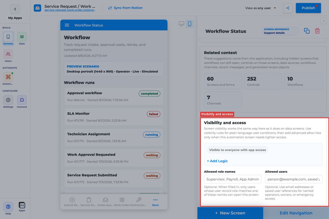
Visibility matters here because Workflow Status is often shared with broader audiences than the action screens it sits beside.
#### Visibility rules
**What it does:** Applies condition-based screen visibility.\
**How to use it:** Build simple conditions using role, tenant, or team membership.\
**Why / recommended default:** Requesters and operators often need different status boards. Clear rules prevent accidental oversharing.
#### Allowed role names
**What it does:** Adds a direct role allow list.\
**How to use it:** Use roles like `Requester`, `Operator`, or `Admin` depending on the purpose of the page.\
**Why / recommended default:** A short, explicit role list is usually easier to audit than complex nested rules.
#### Allowed users
**What it does:** Grants access to named people.\
**How to use it:** Use sparingly for pilots, executives, or break-glass support access.\
**Why / recommended default:** Individual exceptions are useful, but they should not become the main access model.
### Display and action policy
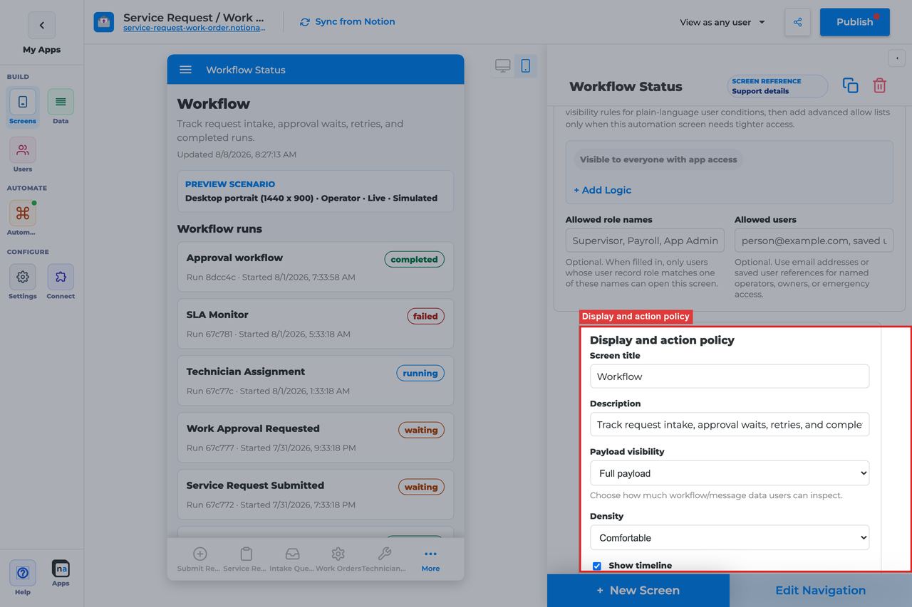
For Workflow Status, this section mostly decides how much detail the screen shows. Because the screen is read-only, payload visibility and timeline design matter more than action configuration.
#### Screen title override
**What it does:** Refines the user-facing title.\
**How to use it:** Name the exact job of the page, such as `Track your request` or `Operations run status`.\
**Why / recommended default:** Clear wording helps users understand this is a status view, not an action desk.
#### Description
**What it does:** Sets the helper text under the title.\
**How to use it:** Explain what the timeline shows and what users should do if they need to take action elsewhere.\
**Why / recommended default:** One sentence of guidance can prevent a lot of navigation confusion.
#### Payload visibility
**What it does:** Controls whether the run shows metadata only, a redacted preview, or fuller payload detail.\
**How to use it:** Use **Metadata only** for customer-facing status pages, **Redacted preview** for most internal visibility, and **Full payload** only for trusted operators who really need the raw run data.\
**Why / recommended default:** The right setting depends on audience, but **Metadata only** and **Redacted preview** are usually the safest defaults. Full payload should be rare and intentional.
#### Density
**What it does:** Chooses comfortable or compact spacing for the run list and detail layout.\
**How to use it:** Use **Comfortable** for requester-friendly status pages and **Compact** for operator-heavy boards.\
**Why / recommended default:** Dense layouts are useful for ops, but they can make a self-service tracker feel harder to read.
#### Show timeline
**What it does:** Shows the run timeline, including waits, retries, and outcome transitions.\
**How to use it:** Leave **On** for most Workflow Status screens. It is the main reason people open this screen.\
**Why / recommended default:** Timeline visibility is one of the most valuable parts of the status experience. Turning it off usually removes the very context people need.
#### Require claim before action
**What it does:** Exists in the shared policy panel, but this screen does not use claim behavior by default.\
**How to use it:** Leave it **Off**. Workflow Status is read-only in the default registry configuration.\
**Why / recommended default:** This setting is not meaningful for the standard screen, so changing it usually adds confusion without changing behavior.
### Available actions
Workflow Status is read-only by default. That is a feature, not a gap: the screen is designed to answer "what is happening?" rather than "what should I click next?"
#### Default action set
**What it does:** The registry ships this screen with no claim, complete, or decision actions.\
**How to use it:** Keep it that way for most builds. Pair the screen with Work Queue, Decision, or Exception Resolution elsewhere in navigation if users need to act.\
**Why / recommended default:** Read-only behavior makes the screen safe for broader audiences and prevents accidental edits from a page meant for monitoring.
#### After-action screen
**What it does:** Exists only if you later add custom actions.\
**How to use it:** Most makers leave this unused. If you extend the screen later, route users to the next logical operational page, not back into a loop.\
**Why / recommended default:** Leaving it blank is the normal default. Workflow Status does not need forced navigation after read-only viewing.
#### Target workflow
**What it does:** Supplies a workflow binding for custom launch or escalation actions if you add them later.\
**How to use it:** Leave it empty on the standard read-only screen.\
**Why / recommended default:** Adding a target workflow without a matching action only creates maintenance noise.
### Preview scenario
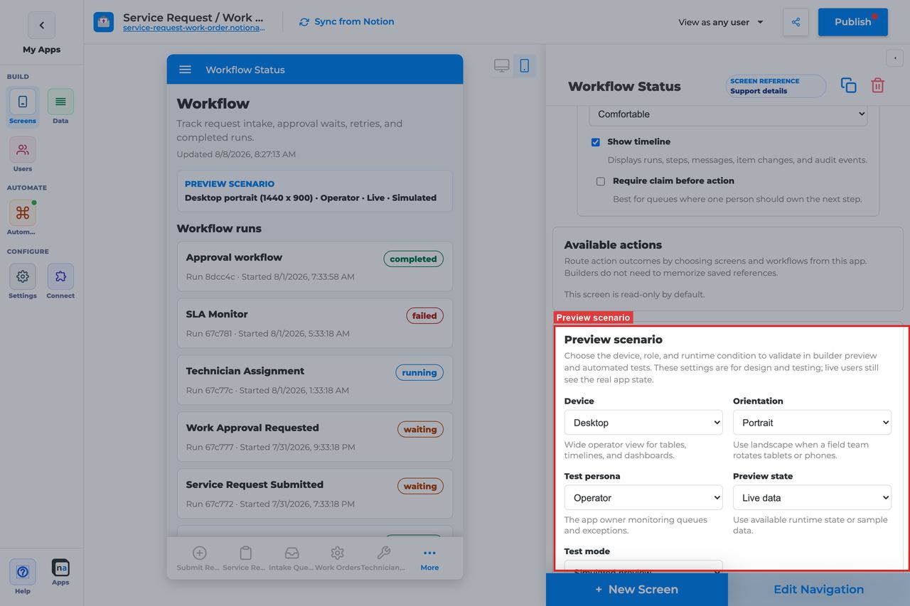
Preview controls help you check both audience fit and state coverage.
#### Device and orientation
**What it does:** Changes the preview frame across desktop, tablet, and mobile sizes.\
**How to use it:** Always check mobile if requesters may track progress from a phone.\
**Why / recommended default:** A status page is often opened on the go, so mobile readability matters even when other automation screens are desktop-first.
#### Test persona
**What it does:** Simulates who is viewing the status board.\
**How to use it:** Use **Operator** for ops-focused screens and switch to requester-like personas when building self-service tracking experiences.\
**Why / recommended default:** Persona testing helps you catch when the payload or timeline is appropriate for one audience but too detailed for another.
#### Preview state
**What it does:** Simulates states like Live, Empty, Loading, or Error.\
**How to use it:** Check **Live**, **Empty**, and **Error** at minimum. Those three states tell you whether the page feels useful, calm, and trustworthy.\
**Why / recommended default:** The default preview state is **Live**, which is good for checking the core timeline, but the empty state deserves equal attention.
#### Test mode
**What it does:** Switches between simulated preview and live runtime testing.\
**How to use it:** Use simulated mode for layout, then confirm with a real run in live mode.\
**Why / recommended default:** Only live testing proves that the source binding and visibility rules are correct.
### Empty state and sample data
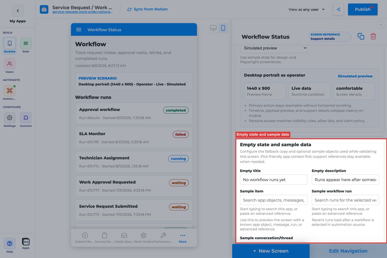
Read-only status screens are often empty in new apps or quiet periods, so the empty experience should feel informative rather than alarming.
#### Empty title
**What it does:** Sets the headline shown when no runs match the current scope.\
**How to use it:** Keep the default `No workflow runs yet` unless your audience uses more familiar language.\
**Why / recommended default:** The default is clear and calm. It signals inactivity, not failure.
#### Empty description
**What it does:** Explains when runs will appear.\
**How to use it:** Keep or adapt the default `Runs appear after a workflow starts from a form, button, webhook, or schedule.`\
**Why / recommended default:** This text answers the first question new users ask when the page is empty.
#### Sample item, run, or conversation
**What it does:** Lets you preview with realistic runtime references.\
**How to use it:** Use a sample run that includes multiple timeline events so you can verify the page is actually useful before publishing.\
**Why / recommended default:** Rich sample data is especially important on a read-only screen because the timeline itself is the product.
## Recommended Default Setup
| Setting | Recommended value |
| ------------------ | ---------------------------------------------------------------- |
| Listen scope | Specific workflow for requester status; Entire app for operators |
| Visibility | Requester role for self-status; Operator/Admin for ops |
| Payload visibility | Metadata only for customers; Redacted for internal |
| Show timeline | On |
| Actions | None (read-only) |
## Common Configuration Patterns
### Requester status page
Specific workflow, Metadata only, visible to requesters.
### Ops run inspector
Entire app or Specific workflow, Redacted/Full payload, Operator role.
## Testing Checklist
* [ ] Start a workflow and confirm a run card appears.
* [ ] Wait for a decision step and confirm Waiting state shows.
* [ ] Complete the run and confirm Completed state.
* [ ] Force a failure and confirm failure appears (or is routed to Exception Resolution).
## Troubleshooting
### No runs visible
Listen scope excludes the workflow, or the user lacks visibility.
### Timeline missing
Show timeline is off.
## Best Practices
* Configure **Workflow Status** for one clear user job.
* Prefer the narrowest listen scope that still shows the right work.
* Keep payload visibility conservative for broad audiences.
* Test as an allowed user and a blocked user before publish.
* Pair related screens (Decision + Conversation + Workflow Status + Notification Center) instead of overloading one screen.
# Conversation Screen
> Current state: this native screen is part of **Automation**. It is entitlement-gated, uses NotionApps runtime state instead of ordinary Notion data controls, and should be tested with realistic workflow or messaging activity before a maker relies on it in production.
The **Conversation** screen is a workflow-aware message thread for comments, replies, and support exchanges tied to a record, route, or conversation.
Think of this screen as **A chat surface backed by Messaging channels, topics, and correlation — not Notion page comments.**
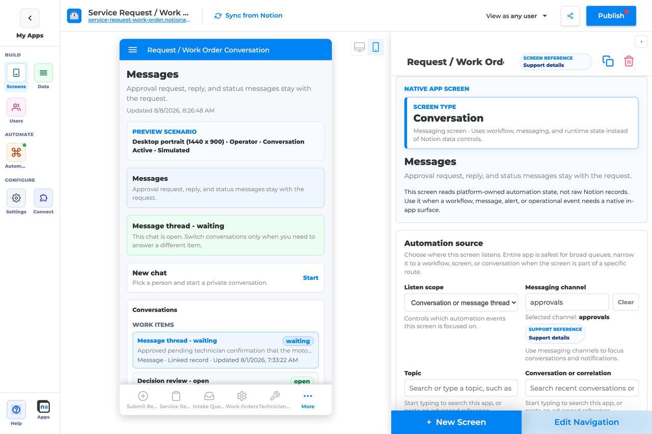
## Who This Guide Is For
This guide is for makers configuring a **Conversation** screen in the app builder. It lists every builder option available on the screen and explains how to use each one.
Use this guide when:
* Users need to discuss a request or work item in-app.
* Approvers need clarification before deciding.
* Support needs a durable thread tied to a workflow or record.
## What The Screen Is For
### Use Conversation when
* Users need to discuss a request or work item in-app.
* Approvers need clarification before deciding.
* Support needs a durable thread tied to a workflow or record.
### Do not use it when
* Durable announcements only — use Notification Center.
* Recording an approve/reject outcome — use Decision.
* Ordinary Notion comments on database pages.
## What Users See In The Live App
* Message thread for the bound conversation/correlation.
* Send reply composer when the reply action is enabled.
* Context from the linked workflow or record when available.
| Default | Value |
| ------------------------------- | --------------------------------------------------------------------------- |
| Default listen scope | Conversation or message thread |
| Require claim before action | Off |
| Default preview persona / state | Operator / Conversation active |
| Empty title | No messages yet |
| Empty description | Messages appear when a workflow, user, or linked app starts a conversation. |
## Required Foundations
| Requirement | Why it matters |
| ------------------------------------------ | ------------------------------------------------------------ |
| Automation screen entitlement | Conversation appears in the Automation / Operational group. |
| Messaging, optional Workflow | Primary foundation for this screen’s runtime state. |
| Private app + Users database (recommended) | Role/tenant visibility and audience policy need user fields. |
## Complete Builder Options Reference
The sections below follow the builder order. Each option is explained in prose so makers can tell how the conversation is bound, who can participate, and how reply behavior should feel in the live app.
### Header and screen type
This section gives the messaging surface its identity. Conversation screens work best when the title tells users what thread they are joining and the description tells them why that thread exists.
#### Screen type
**What it does:** Sets the native behavior to **Conversation**, which renders a runtime-backed thread instead of a general list or data screen.\
**How to use it:** Keep the screen type as Conversation. If you need durable notices, use Notification Center instead; if you need structured approvals, use Decision.\
**Why / recommended default:** Keeping the messaging job focused helps the thread stay understandable. Makers often get into trouble when they try to combine chat, approvals, and notifications in one place.
#### Category
**What it does:** Places the screen in the native Automation or Operational grouping.\
**How to use it:** Keep the default grouping and use your app navigation to position the screen near related review or support flows.\
**Why / recommended default:** Clear organization helps makers maintain message-driven surfaces over time.
#### Title
**What it does:** Sets the end-user title shown for the thread.\
**How to use it:** Use a label like `Case conversation`, `Approval discussion`, or `Support thread` so users know the purpose immediately.\
**Why / recommended default:** A clear title prevents users from mistaking this for general app chat or ordinary Notion comments.
#### Description
**What it does:** Adds helper text beneath the title.\
**How to use it:** Explain who should reply here and what kind of updates belong in the thread.\
**Why / recommended default:** Good description text keeps the conversation focused and reduces off-topic replies.
### Automation source
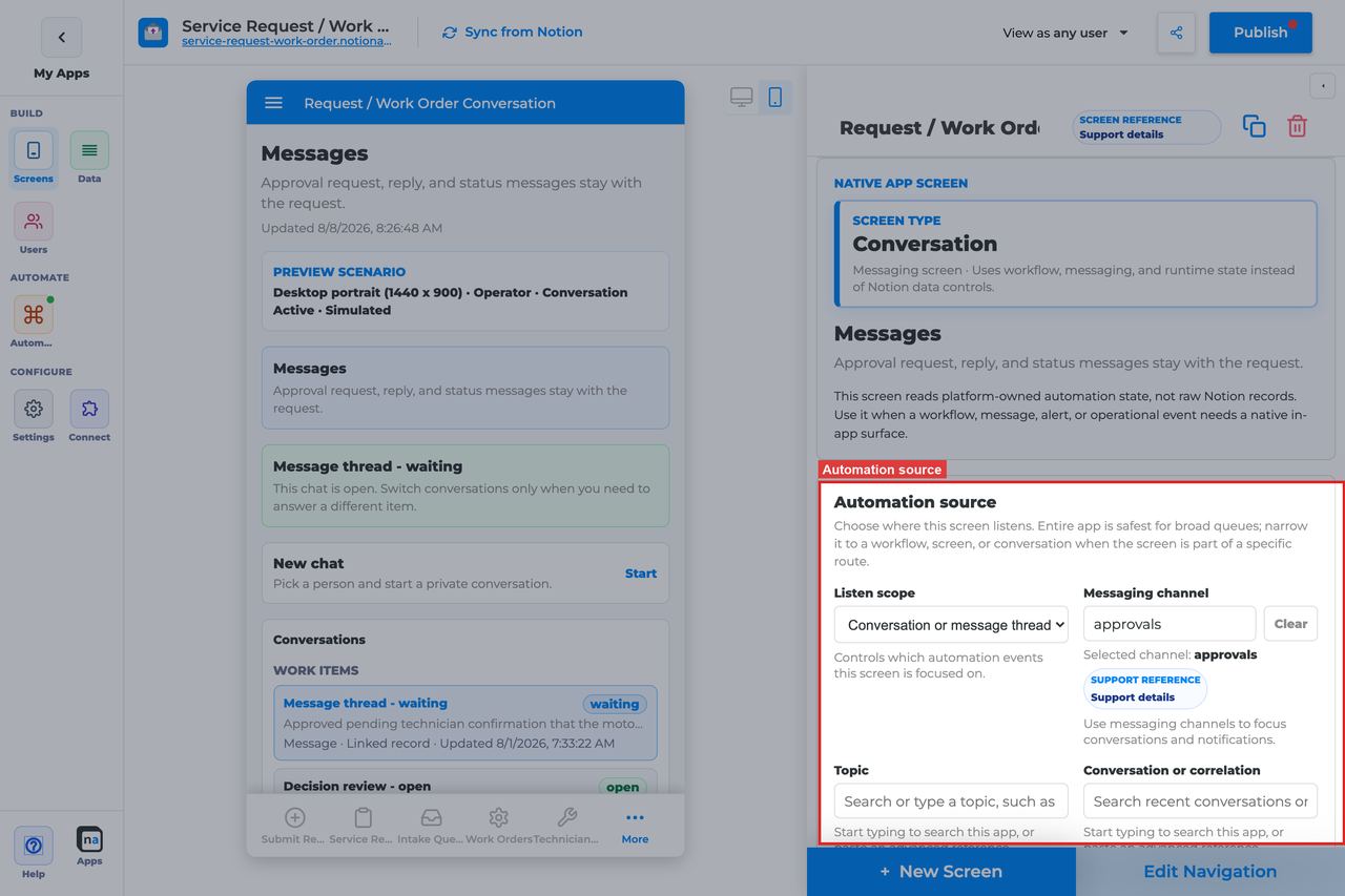
This section is the most important part of the screen because it decides which thread users are actually seeing. Conversation screens are very sensitive to source mismatches, especially around channel, topic, and correlation.
#### Listen scope
**What it does:** Chooses the top-level runtime source for the thread.\
**How to use it:** For most Conversation screens, start with **Conversation or message thread**. Use **Specific workflow** only when the thread is tightly coupled to one workflow, and use **Entire app** only for broad internal support or admin use cases.\
**Why / recommended default:** The recommended default for this screen is **Conversation or message thread** because it matches how users think about a durable thread. A common mistake is choosing a broader scope and then expecting a single clean thread.
#### Source screen or form
**What it does:** Binds the conversation to one screen or form when that scope is selected.\
**How to use it:** Choose the exact intake surface that starts the message flow if the thread should always originate there.\
**Why / recommended default:** This is useful when each form submission should own its own discussion thread. Forgetting to update the binding after replacing the form is a common cause of empty conversations.
#### Workflow
**What it does:** Filters the thread to one workflow when **Specific workflow** is selected.\
**How to use it:** Pick the published workflow that creates or participates in the conversation.\
**Why / recommended default:** Workflow scope is useful when the thread is just one part of a larger process, but it is still broader than a direct conversation binding.
#### Messaging channel
**What it does:** Filters messages to a particular channel.\
**How to use it:** Choose the channel used by the messaging route that should feed this thread. Use the exact channel name your runtime emits.\
**Why / recommended default:** Channel is one of the first things to check when a thread looks empty. A near-match is still a mismatch.
#### Topic
**What it does:** Narrows the selected channel to a specific topic.\
**How to use it:** Use topic values consistently, especially in environments where the same channel handles several message types.\
**Why / recommended default:** Topic filtering is excellent for keeping one thread type clean, but it is also a common place for subtle configuration drift.
#### Conversation or correlation
**What it does:** Binds the screen to a specific conversation thread or correlation key.\
**How to use it:** Use correlation when replies must stay attached to one case, request, or approval cycle. Leave it broader only if the screen is meant to show a wider inbox-like view.\
**Why / recommended default:** This is usually the key setting that makes the screen feel like a real thread instead of a stream of unrelated messages.
#### Linked application
**What it does:** Binds the conversation to a linked external NotionApps app when the thread crosses app boundaries.\
**How to use it:** Choose a linked app only when messages genuinely travel between apps.\
**Why / recommended default:** Most conversation threads stay inside one app. Linked-app scope adds complexity and should be used only when the architecture needs it.
### App audience and notification prefs
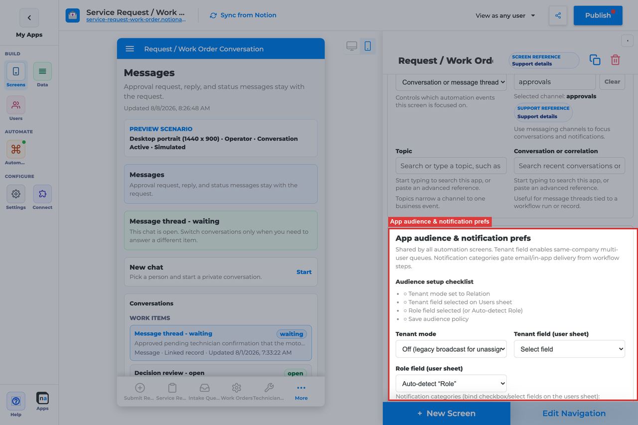
These app-level controls still matter for messaging because a conversation may be tenant-specific and may coexist with notification preference policy elsewhere in the app.
#### Tenant mode
**What it does:** Controls whether conversation visibility is isolated by tenant relationship.\
**How to use it:** Use **Relation** when clients or departments should only see their own threads. Use **Off** only for simple single-tenant or fully internal apps.\
**Why / recommended default:** Tenant-aware messaging is usually the safer default. A thread that crosses customer boundaries is a serious privacy problem.
#### Tenant field
**What it does:** Selects the Users-sheet relation that defines tenant membership.\
**How to use it:** Choose the same client, company, or workspace field used elsewhere in the app.\
**Why / recommended default:** Consistency keeps access behavior predictable across screens.
#### Role field
**What it does:** Tells the platform which field stores a user's role if it is not the default `Role`.\
**How to use it:** Set it only when your user model uses a different property name.\
**Why / recommended default:** Correct role-field mapping is essential if support, approver, or requester audiences should see different threads.
#### Notification categories
**What it does:** Maps message-related categories to preference fields so users can control what notices or follow-up signals they receive.\
**How to use it:** Keep categories limited to real message types you plan to send around the conversation flow.\
**Why / recommended default:** Cleaner category design makes it easier to explain why someone received a thread-related alert.
#### Add notification category
**What it does:** Adds another category row.\
**How to use it:** Add only categories with a real sender and a real user preference field behind them.\
**Why / recommended default:** Unused categories create policy clutter without helping the conversation experience.
#### Save audience policy
**What it does:** Saves tenant and category policy at the app level.\
**How to use it:** Save before testing with another persona or tenant.\
**Why / recommended default:** Unsaved policy is a very common reason one user can see a thread while another cannot.
### Template setup state
This section is a quick health check after cloning or repairing an app.
#### Setup state indicator
**What it does:** Reports whether the screen setup is provisioned, needs review, or has no setup report.\
**How to use it:** Treat **Needs review** as a sign to re-check the conversation binding, especially channel, topic, and correlation.\
**Why / recommended default:** Messaging routes are easy to remap incorrectly in templates, so this hint can save time.
### Related context
This read-only panel helps you discover nearby workflows, screens, and channels.
#### Related context panel
**What it does:** Shows discovery counts and related runtime objects connected to the screen.\
**How to use it:** Use it to locate the originating form, related Decision screen, or follow-up Workflow Status page before creating new duplicates.\
**Why / recommended default:** Seeing the existing context helps makers keep thread-based experiences cohesive.
### Visibility and access
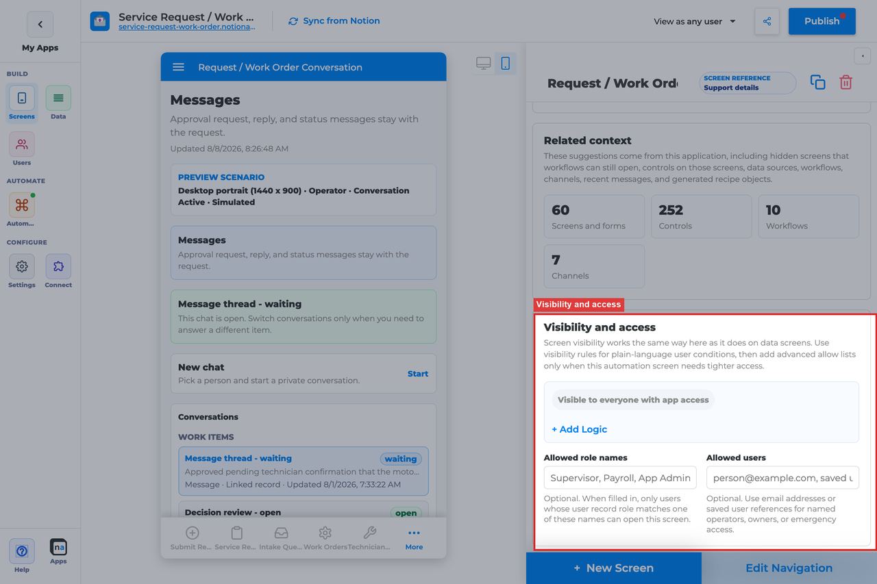
This section controls who can open the conversation at all. It should mirror the real participants in the workflow or support process.
#### Visibility rules
**What it does:** Applies condition-based screen visibility.\
**How to use it:** Use role, tenant, team, or case-ownership conditions so only relevant participants can open the thread.\
**Why / recommended default:** Messaging is often more sensitive than it looks. Broad access creates unnecessary exposure.
#### Allowed role names
**What it does:** Adds a direct role allow list.\
**How to use it:** Use simple roles like `Requester, Support, Approver, Admin` when that matches the process.\
**Why / recommended default:** A short role list is usually easier to maintain than a patchwork of per-user exceptions.
#### Allowed users
**What it does:** Allows named people by email or user reference.\
**How to use it:** Use sparingly for pilots, executive participants, or named escalation owners.\
**Why / recommended default:** Per-user access is useful for edge cases, but it should not become the default access model.
### Display and action policy
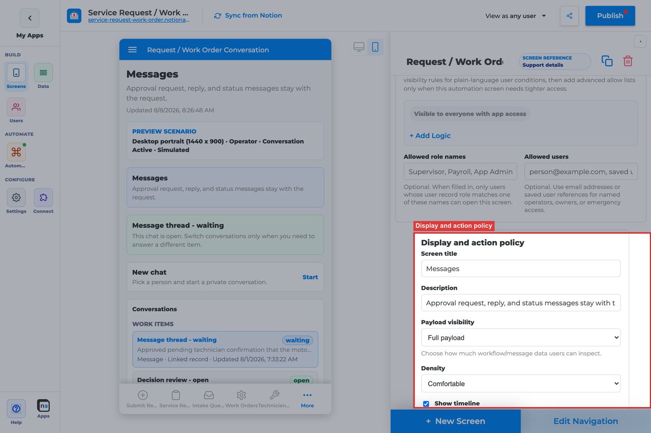
These settings shape how much thread context is visible and whether the screen behaves like a simple chat surface or a more audited workflow conversation.
#### Screen title override
**What it does:** Refines the live thread title.\
**How to use it:** Choose wording that matches the business context of the thread rather than technical channel names.\
**Why / recommended default:** Users should never need to understand backend route labels to know where they are.
#### Description
**What it does:** Sets the helper copy beneath the title.\
**How to use it:** Tell users what kind of message belongs in the thread and whether replies should move the process forward.\
**Why / recommended default:** Clear description text reduces noise and off-thread coordination.
#### Payload visibility
**What it does:** Decides how much linked runtime context or payload detail is shown next to the conversation.\
**How to use it:** Use **Redacted preview** for most internal threads, **Metadata only** for broader or customer-facing audiences, and **Full payload** only when trusted operators need raw detail.\
**Why / recommended default:** **Redacted preview** is the common default because it gives context without overexposing backend details.
#### Density
**What it does:** Chooses comfortable or compact spacing for messages and surrounding context.\
**How to use it:** Use **Comfortable** for most participant-facing threads. Use **Compact** only for high-volume support or operator views.\
**Why / recommended default:** Comfortable spacing improves readability in message-heavy screens.
#### Show timeline
**What it does:** Shows related audit and workflow activity alongside the thread.\
**How to use it:** Turn it on when participants need to understand how the conversation relates to workflow state changes.\
**Why / recommended default:** Timeline visibility is often helpful in approval or support flows, but it can be unnecessary for lightweight chat experiences.
#### Require claim before action
**What it does:** Exists in the shared policy section, but Conversation does not use claim behavior as part of its default reply flow.\
**How to use it:** Leave it **Off** for standard conversation behavior.\
**Why / recommended default:** Claim-based ownership is a queue concept, not a conversation concept, so turning this on usually adds confusion.
### Available actions
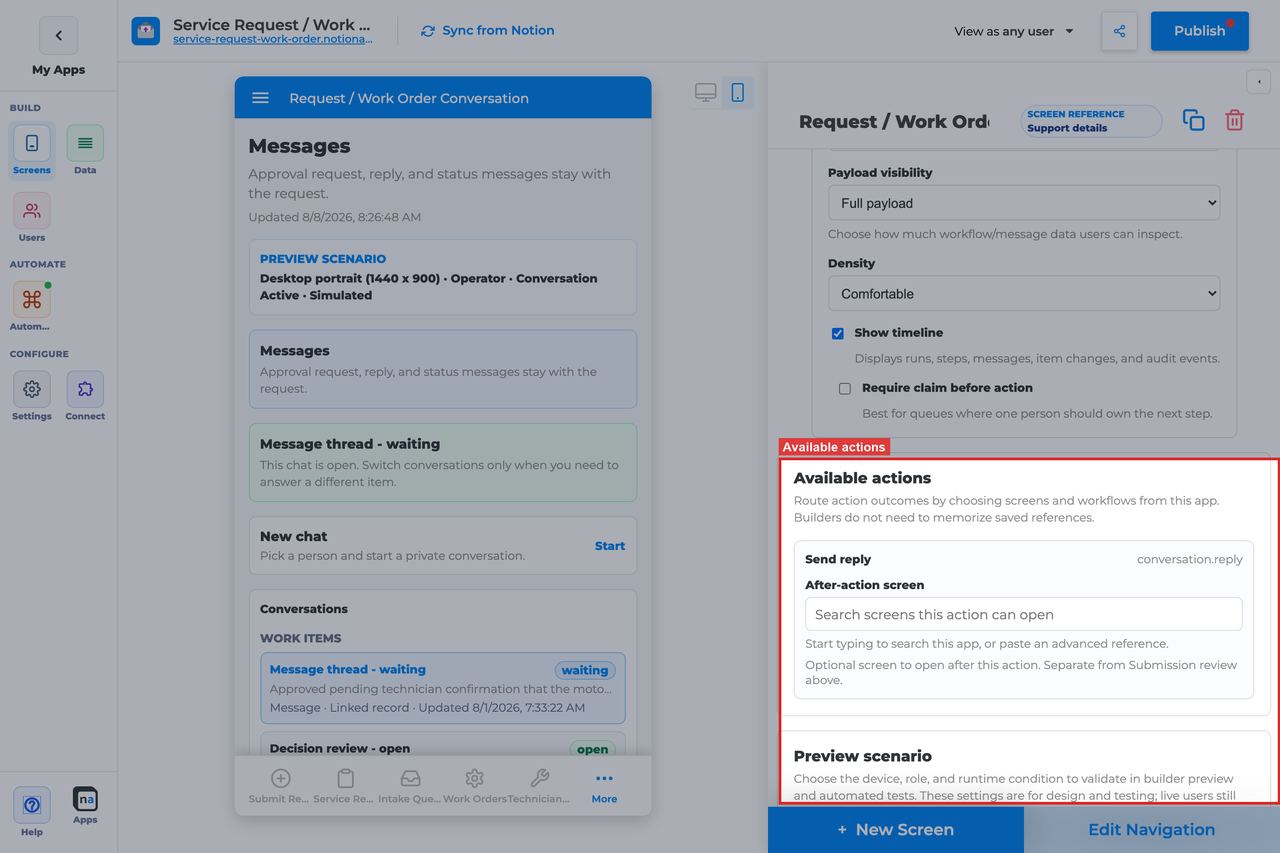
Conversation keeps the action model intentionally simple. The main question is whether users should be able to reply from this thread or only read it.
#### Send reply
**What it does:** Adds the composer action that lets users post into the active conversation thread.\
**How to use it:** Keep **Send reply** enabled when the screen is meant to be interactive. Remove or avoid it only when the thread should be read-only for that audience.\
**Why / recommended default:** Reply capability is usually the whole point of the screen. A common mistake is binding the thread correctly but forgetting to expose the reply action.
#### After-action screen
**What it does:** Routes users to another screen after they send a reply.\
**How to use it:** Most makers leave users on the Conversation screen, but you can route to Workflow Status or a related review screen when the process usually continues somewhere else.\
**Why / recommended default:** Leaving people in the thread is often the least surprising default. Automatic redirects after a reply can feel abrupt.
#### Target workflow
**What it does:** Supplies a workflow binding for custom launch or escalation actions if you add them later.\
**How to use it:** Leave it empty for a standard Conversation screen focused on replies.\
**Why / recommended default:** Extra workflow bindings are unnecessary unless you intentionally extend the action model.
### Preview scenario
Preview controls are especially helpful for verifying thread readability and ensuring the right personas can actually reply.
#### Device and orientation
**What it does:** Changes the preview frame across desktop, tablet, and mobile sizes.\
**How to use it:** Always check mobile because conversation threads are commonly used on phones.\
**Why / recommended default:** Message composition is one of the first things to break on smaller layouts.
#### Test persona
**What it does:** Simulates the viewer role.\
**How to use it:** Test as both the likely sender and the likely reader, such as requester and support agent or approver and submitter.\
**Why / recommended default:** Reply permissions and payload visibility often vary by persona, so one-persona testing is not enough.
#### Preview state
**What it does:** Simulates states such as Conversation active, Empty, Loading, and Error.\
**How to use it:** Check **Conversation active** for normal thread behavior and **Empty** to ensure the page does not look broken before the first message arrives.\
**Why / recommended default:** The default preview state is **Conversation active**, which is right for testing the thread, but empty state quality matters just as much.
#### Test mode
**What it does:** Switches between simulated preview and live testing.\
**How to use it:** Use live testing before publish to verify the real route, channel, topic, and correlation all match.\
**Why / recommended default:** Messaging screens are notoriously easy to "almost configure" correctly. Live testing is what proves the binding is actually real.
### Empty state and sample data
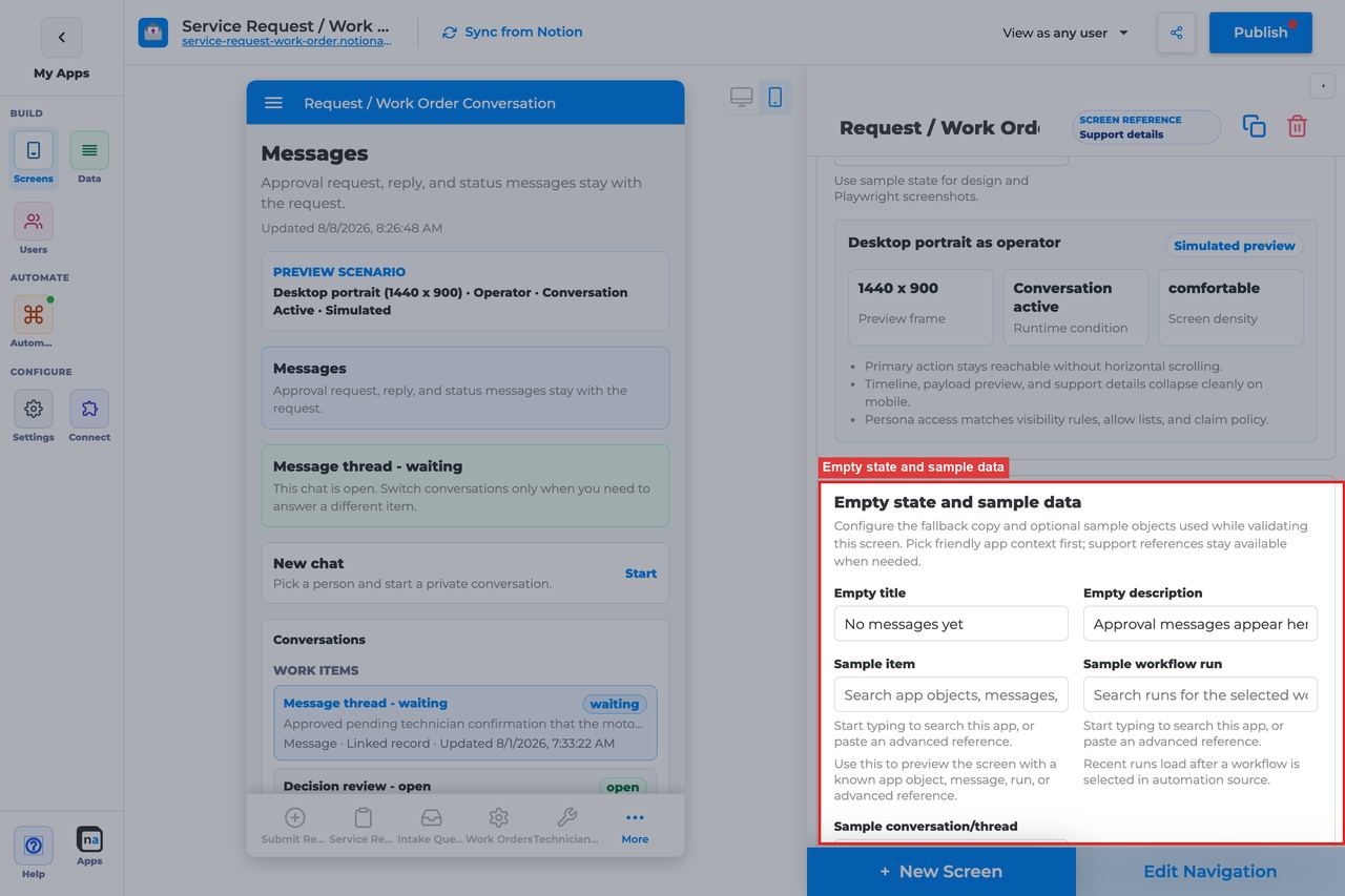
New or quiet threads should feel calm, not broken.
#### Empty title
**What it does:** Sets the empty-state headline.\
**How to use it:** Keep the default `No messages yet` unless your audience uses more specific language like `No conversation yet`.\
**Why / recommended default:** The default is short and familiar, which works well for most thread experiences.
#### Empty description
**What it does:** Explains when messages will appear.\
**How to use it:** Keep or adapt the default `Messages appear when a workflow, user, or linked app starts a conversation.`\
**Why / recommended default:** Helpful empty copy reduces false bug reports from users who are opening the thread before any route has posted.
#### Sample item, run, or conversation
**What it does:** Supplies preview references for realistic screenshots and QA.\
**How to use it:** Use a representative thread with several message turns so you can validate the layout, composer, and any linked context.\
**Why / recommended default:** Thin sample data can make a conversation screen look fine right up until a real customer sends a long message or a thread picks up extra context.
## Recommended Default Setup
| Setting | Recommended value |
| ------------------ | -------------------------------------------------------------------------- |
| Listen scope | Conversation or message thread (set channel + topic; optional correlation) |
| Visibility | Participants / Support / Approver roles |
| Payload visibility | Redacted preview |
| Show timeline | On if you want delivery/audit events |
| Actions | Send reply |
## Common Configuration Patterns
### Approval clarification thread
Channel/topic matching the approval messaging route; pair with Decision.
### Support inbox thread
Broader conversation scope for operators; redacted payload.
## Testing Checklist
* [ ] Start a messaging route and confirm the thread appears.
* [ ] Send a reply and confirm it is visible to the other persona.
* [ ] Confirm empty state copy when no thread exists.
## Troubleshooting
### No messages
Channel/topic/correlation do not match the messaging route, or listen scope is wrong.
### Cannot reply
Send reply action missing, or user lacks access.
## Best Practices
## Topics vs conversation threads
Conversation follows the **workflow channel** so replies stay on the asset. Work-creating topics (`client.review.requested`, `client.intake.submitted`) and wait-waking reply topics (`client.decision.approve`, `client.decision.changes_requested`, `client.decision.reject`) are a separate contract. Do not invent a second topic for the same decision loop.
Named catalog: [Topics that perform work](https://docs.notionapps.com/automation/messaging-and-notifications#topics-that-perform-work).
* Configure **Conversation** for one clear user job.
* Prefer the narrowest listen scope that still shows the right work.
* Keep payload visibility conservative for broad audiences.
* Test as an allowed user and a blocked user before publish.
* Pair related screens (Decision + Conversation + Workflow Status + Notification Center) instead of overloading one screen.
# Exception Resolution Screen
> Current state: this native screen is part of **Automation**. It is entitlement-gated, uses NotionApps runtime state instead of ordinary Notion data controls, and should be tested with realistic workflow or messaging activity before a maker relies on it in production.
The **Exception Resolution** screen is a recovery screen for failed steps, missing data, blocked routes, retries, and manual fixes.
Think of this screen as **A repair desk for broken automation — diagnose, resolve, or escalate.**
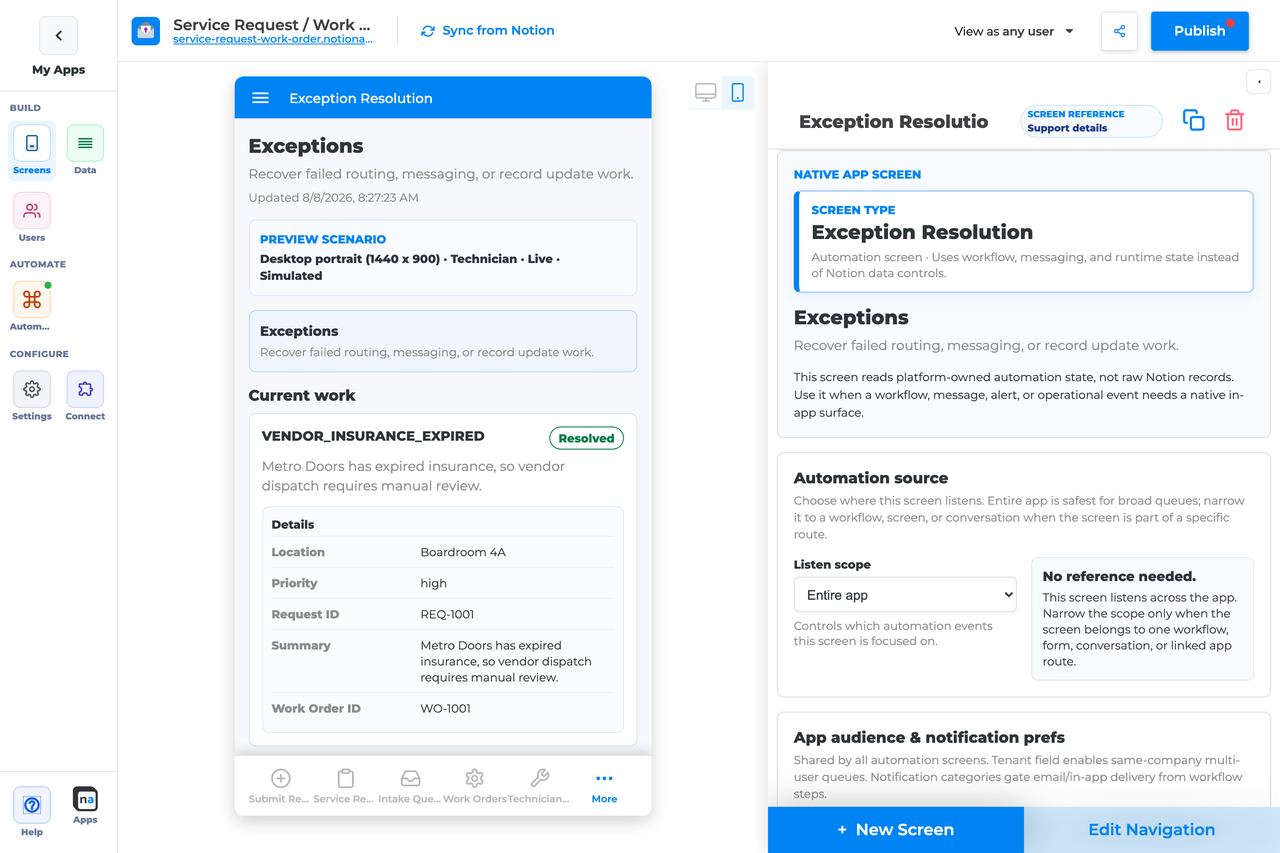
## Who This Guide Is For
This guide is for makers configuring an **Exception Resolution** screen in the app builder. It lists every builder option available on the screen and explains how to use each one.
Use this guide when:
* Operators must clear failed workflow steps.
* Blocked routes need a human fix before continuing.
* Failed work should escalate into another workflow.
## What The Screen Is For
### Use Exception Resolution when
* Operators must clear failed workflow steps.
* Blocked routes need a human fix before continuing.
* Failed work should escalate into another workflow.
### Do not use it when
* Normal approvals — use Decision.
* Ordinary task completion — use Work Queue.
* Passive monitoring only — use Operator Console / Workflow Status.
## What Users See In The Live App
* Exception cards with failure reason and related run context.
* Mark resolved and Escalate actions.
* Timeline of failure and recovery events when enabled.
| Default | Value |
| ------------------------------- | ----------------------------------------------------------- |
| Default listen scope | Entire app |
| Require claim before action | Off |
| Default preview persona / state | Technician / Live |
| Empty title | No exceptions need attention |
| Empty description | Failed workflow work and unresolved exceptions appear here. |
## Required Foundations
| Requirement | Why it matters |
| ------------------------------------------ | ------------------------------------------------------------------- |
| Automation screen entitlement | Exception Resolution appears in the Automation / Operational group. |
| Workflow, optional Messaging | Primary foundation for this screen’s runtime state. |
| Private app + Users database (recommended) | Role/tenant visibility and audience policy need user fields. |
## Complete Builder Options Reference
The sections below follow the builder order. Each option is explained in prose so makers can configure an exception desk that is safe for operators, narrow enough to be useful, and clear about what recovery actions are allowed.
### Header and screen type
This section defines the repair desk at a glance. Exception Resolution works best when the name tells operators they are fixing blocked automation, not handling ordinary intake work.
#### Screen type
**What it does:** Sets the native behavior to **Exception Resolution**, which renders workflow failures, blocked steps, and manual recovery state.\
**How to use it:** Keep the screen type as Exception Resolution. Use Work Queue for normal human work and Decision for structured approvals.\
**Why / recommended default:** Exception desks should stay focused on recovery. Mixing them with general work makes the most urgent problems harder to spot.
#### Category
**What it does:** Places the screen in the native Automation or Operational grouping.\
**How to use it:** Keep the default grouping and locate the screen near other operator tools in navigation.\
**Why / recommended default:** Good organization helps makers keep operational recovery surfaces distinct from day-to-day desks.
#### Title
**What it does:** Sets the live title.\
**How to use it:** Use clear names like `Exception resolution`, `Automation recovery`, or `Ops repair desk`.\
**Why / recommended default:** A clear title helps users understand that the items here are broken states that need intervention.
#### Description
**What it does:** Adds the helper sentence below the title.\
**How to use it:** Tell operators what they should do, such as "Review blocked automation, mark resolved after a manual fix, or escalate when deeper recovery is needed."\
**Why / recommended default:** Good description text helps distinguish this screen from a normal queue.
### Automation source
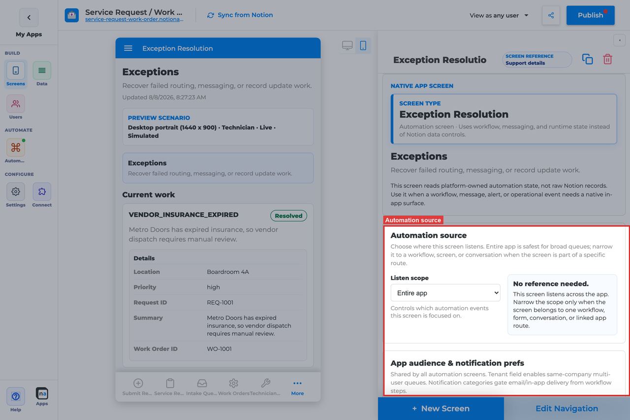
This section controls which failures appear on the desk. A well-scoped exception screen should make urgent issues obvious without flooding operators with every event in the app.
#### Listen scope
**What it does:** Chooses the top-level source of exceptions shown on the screen.\
**How to use it:** Use **Specific workflow** when one team owns recovery for one process. Use **Entire app** only for a shared operations desk covering many workflows.\
**Why / recommended default:** **Specific workflow** is usually the clearest default. Entire app is valuable for central ops teams, but it gets noisy quickly.
#### Source screen or form
**What it does:** Binds the screen to one intake surface when that scope is selected.\
**How to use it:** Choose the form or screen whose downstream automation may fail and should route to this desk.\
**Why / recommended default:** This is helpful when support teams think in terms of the entry point users touched rather than the internal workflow name.
#### Workflow
**What it does:** Filters the desk to exceptions from one workflow.\
**How to use it:** Pick the published workflow your operators are responsible for recovering.\
**Why / recommended default:** This setting is the simplest way to keep a recovery desk understandable.
#### Messaging channel
**What it does:** Narrows exception-related context to one messaging channel when recovery is paired with routed messages.\
**How to use it:** Set it only when messaging is part of the failure-handling design.\
**Why / recommended default:** Extra channel filtering is only useful when it reflects the actual route design. Otherwise it just creates one more way to hide the exceptions you need.
#### Topic
**What it does:** Narrows message-linked activity to one topic.\
**How to use it:** Match the exact topic when recovery messages or alerts are topic-specific.\
**Why / recommended default:** Topic mismatch is a common reason a repair desk looks empty even though the workflow failed.
#### Conversation or correlation
**What it does:** Limits the desk to one case or thread context.\
**How to use it:** Use this only for case-specific recovery experiences, not for a reusable ops desk.\
**Why / recommended default:** Most exception desks should remain reusable. Over-filtering by correlation makes them too brittle.
#### Linked application
**What it does:** Binds the desk to a linked NotionApps app when failures happen in an app-to-app exchange.\
**How to use it:** Choose the linked app only when cross-app recovery really matters.\
**Why / recommended default:** Cross-app recovery is valid, but it is not the normal starting point for this screen.
### App audience and notification prefs
Exception desks should almost always be restricted, and they often intersect with tenant boundaries and operator-notification policy. These app-level settings help keep recovery work visible to the right people only.
#### Tenant mode
**What it does:** Decides whether runtime visibility is partitioned by tenant relation.\
**How to use it:** Use **Relation** when support teams should only see failures for their own client or operating group. Use **Off** only when the app is truly single-tenant or internally shared.\
**Why / recommended default:** Tenant isolation is often safer than people expect, especially when exception payloads contain sensitive business details.
#### Tenant field
**What it does:** Selects the Users-sheet relation that defines tenant membership.\
**How to use it:** Pick the same client, company, or workspace field used across the rest of the app.\
**Why / recommended default:** Consistent tenant modeling keeps recovery screens aligned with every other protected surface.
#### Role field
**What it does:** Tells the platform which field holds a user's role when it is not named `Role`.\
**How to use it:** Set it only for custom user schemas.\
**Why / recommended default:** A wrong role-field mapping can quietly open the desk to the wrong audience or hide it from the right one.
#### Notification categories
**What it does:** Maps operator-facing notification categories to user preference fields.\
**How to use it:** Use only real categories, such as recovery alerts or escalation notices, that the automation system actually sends.\
**Why / recommended default:** Clean category design makes exception handling more predictable and easier to support.
#### Add notification category
**What it does:** Adds another category row.\
**How to use it:** Add one only when you also have a sender and preference field to connect to it.\
**Why / recommended default:** Unused categories make policy harder to understand without improving recovery.
#### Save audience policy
**What it does:** Saves tenant and notification preference policy at the app level.\
**How to use it:** Save after every policy change and before testing with another operator persona.\
**Why / recommended default:** Unsaved policy often looks like a screen bug when it is really just a missed save.
### Template setup state
This diagnostic section matters most after templates are cloned or demos are repaired.
#### Setup state indicator
**What it does:** Reports whether bindings look provisioned, need review, or have no setup report.\
**How to use it:** Treat **Needs review** as a prompt to verify the recovery workflow bindings before trusting the desk.\
**Why / recommended default:** Template drift is a common cause of missing exceptions, and this indicator gives you an early warning.
### Related context
This panel helps you find the forms, workflows, and follow-up screens that belong to the same recovery flow.
#### Related context panel
**What it does:** Shows discovery counts and related runtime objects.\
**How to use it:** Use it to locate the originating workflow, a related status screen, or a Conversation screen operators may need during triage.\
**Why / recommended default:** Context discovery reduces guesswork and helps you wire a coherent recovery experience.
### Visibility and access
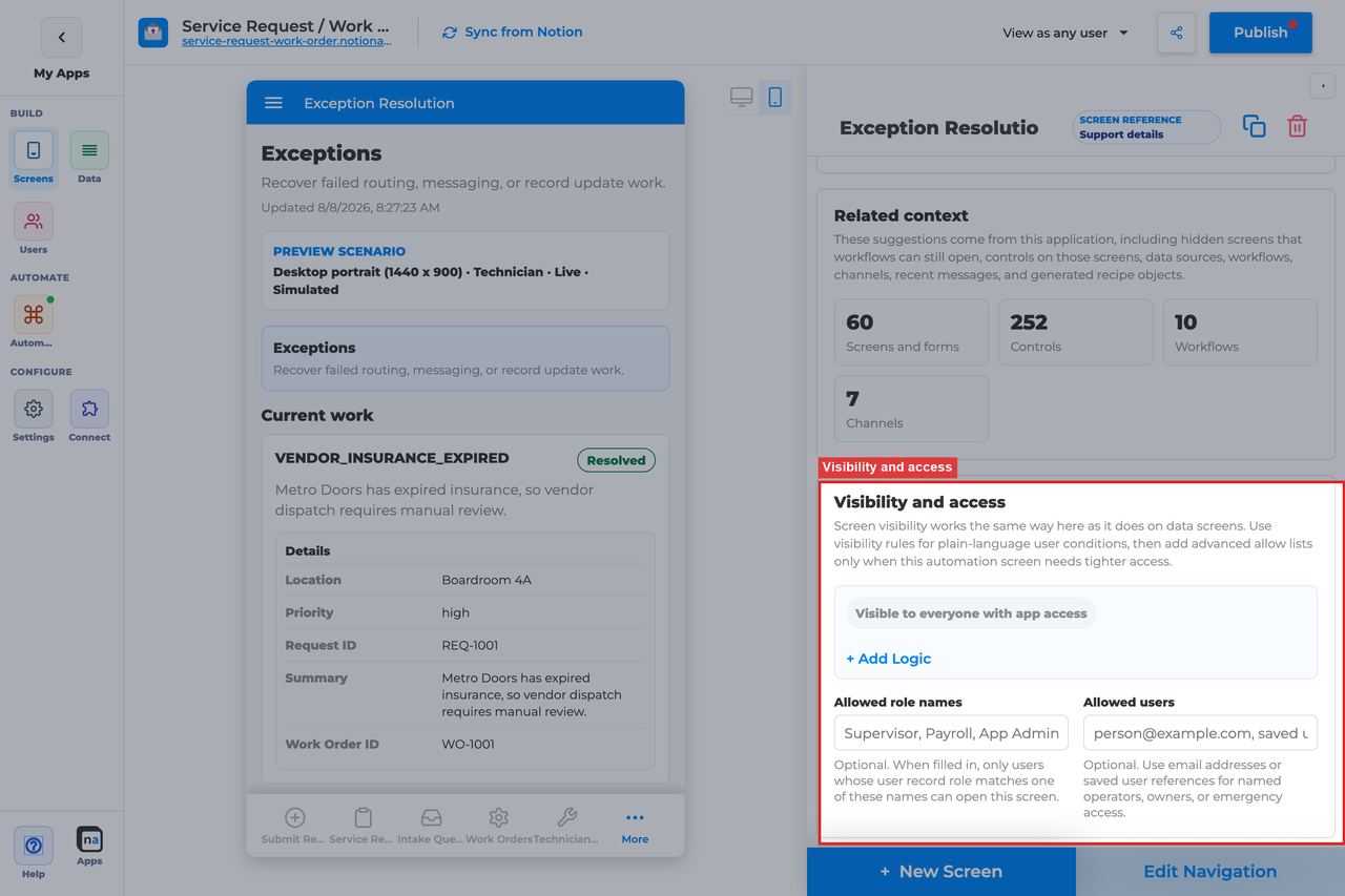
Exception desks should be tightly controlled. The screen may expose failure details, payloads, or operational clues that ordinary users should never see.
#### Visibility rules
**What it does:** Applies condition-based visibility logic.\
**How to use it:** Restrict the screen by role, team, and tenant so only support, operations, or admin users can open it.\
**Why / recommended default:** Broad access is almost always a mistake here. Exception data is operationally sensitive.
#### Allowed role names
**What it does:** Adds a role allow list.\
**How to use it:** Use concise roles such as `Operator, Support, Admin`.\
**Why / recommended default:** A direct role list is usually the cleanest access model for repair desks.
#### Allowed users
**What it does:** Grants access to named people.\
**How to use it:** Use for temporary pilots or break-glass operators only.\
**Why / recommended default:** Per-user overrides are useful, but they should stay exceptional.
### Display and action policy

These settings control how much failure detail operators can see and whether the desk behaves like a lean triage list or a more investigative recovery console.
#### Screen title override
**What it does:** Refines the user-facing title.\
**How to use it:** Use wording that clearly signals operational repair work.\
**Why / recommended default:** Operators should understand at a glance that the screen is about broken automation, not normal throughput.
#### Description
**What it does:** Sets the helper copy below the title.\
**How to use it:** Tell operators to diagnose, resolve, or escalate as appropriate.\
**Why / recommended default:** A precise description helps teams use the right recovery path instead of improvising.
#### Payload visibility
**What it does:** Controls whether operators see metadata only, a redacted preview, or full payload detail.\
**How to use it:** Use **Redacted preview** for most operator desks and **Full payload** only for the trusted teams who truly need the underlying detail to recover failures.\
**Why / recommended default:** Recovery often needs more context than requester screens, but **Full payload** should still be deliberate, not automatic.
#### Density
**What it does:** Chooses comfortable or compact spacing.\
**How to use it:** Use **Comfortable** when failures are complex and need careful reading. Use **Compact** when an experienced ops team is handling high volume.\
**Why / recommended default:** Comfortable layouts reduce missed clues; compact layouts support speed once the process is stable.
#### Show timeline
**What it does:** Shows the sequence of workflow, message, and audit events around the exception.\
**How to use it:** Leave **On** for most Exception Resolution screens. Operators usually need the history to understand what actually failed.\
**Why / recommended default:** Timeline context is one of the highest-value tools in recovery. Turning it off usually slows triage.
#### Require claim before action
**What it does:** Controls whether someone must claim an exception before acting on it.\
**How to use it:** The registry default is **Off**. Leave it off when the desk is already owned by a small trusted team, or turn it on if duplicate recovery work becomes a real problem.\
**Why / recommended default:** Off is a reasonable default for many ops desks because speed matters, but shared larger teams may benefit from explicit ownership locks.
### Available actions

This section defines how operators move an exception out of the unresolved state. The two core actions are different on purpose: one clears the issue after a fix, and the other starts a deeper recovery route.
#### Mark resolved
**What it does:** Clears the exception after the operator has handled the manual fix.\
**How to use it:** Use this when the operator corrected the underlying issue outside the screen or confirmed the workflow can be considered resolved. Train the team on what evidence is required before marking something resolved.\
**Why / recommended default:** Mark resolved should be the clean path for ordinary recoveries. The common mistake is using it too early, before the real cause is actually addressed.
#### Escalate
**What it does:** Starts a deeper recovery or incident workflow from the exception item.\
**How to use it:** Keep Escalate available when failures sometimes require a second-line process, another team, or a more formal response.\
**Why / recommended default:** Escalate is valuable because not every failure should be closed locally. It turns an unresolved exception into an auditable recovery handoff.
#### After-action screen
**What it does:** Routes the operator to another screen after resolving or escalating.\
**How to use it:** Send operators to **Workflow Status** when they need to confirm the route recovered, or to **Conversation** when follow-up communication is standard.\
**Why / recommended default:** This is optional. Use it only when the next step is predictable enough to justify an automatic redirect.
#### Target workflow
**What it does:** Supplies the destination workflow for **Escalate**.\
**How to use it:** Bind the published recovery workflow that should start when the operator escalates.\
**Why / recommended default:** This setting matters a lot. If Escalate exists but no target workflow is set, the action will not do the job operators expect.
### Preview scenario
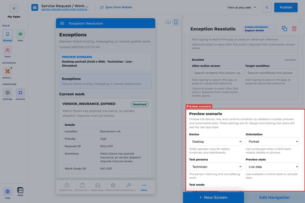
Preview controls help makers test whether the desk feels useful when something is actually broken.
#### Device and orientation
**What it does:** Changes the preview frame across desktop, tablet, and mobile sizes.\
**How to use it:** Test the screen on desktop first, then check mobile if field operators or support staff may use it on the go.\
**Why / recommended default:** Recovery work often happens under time pressure, so layout problems matter more than usual.
#### Test persona
**What it does:** Simulates the viewer role.\
**How to use it:** Test with the real operator or support persona rather than only as Admin.\
**Why / recommended default:** Admin preview can hide access problems that would block the actual recovery team.
#### Preview state
**What it does:** Simulates states such as Live, Empty, Error, or Overdue.\
**How to use it:** Check **Live**, **Error**, and **Empty** so you know the desk still feels understandable under pressure.\
**Why / recommended default:** The default preview state is **Live**, which is good for core behavior, but recovery screens also need a strong empty and failure presentation.
#### Test mode
**What it does:** Switches between simulated preview and live testing.\
**How to use it:** Use live testing with a real failed run before publish so you can verify the action buttons and timeline against actual exception data.\
**Why / recommended default:** Simulated preview is useful, but live failure testing is what proves the desk is ready.
### Empty state and sample data
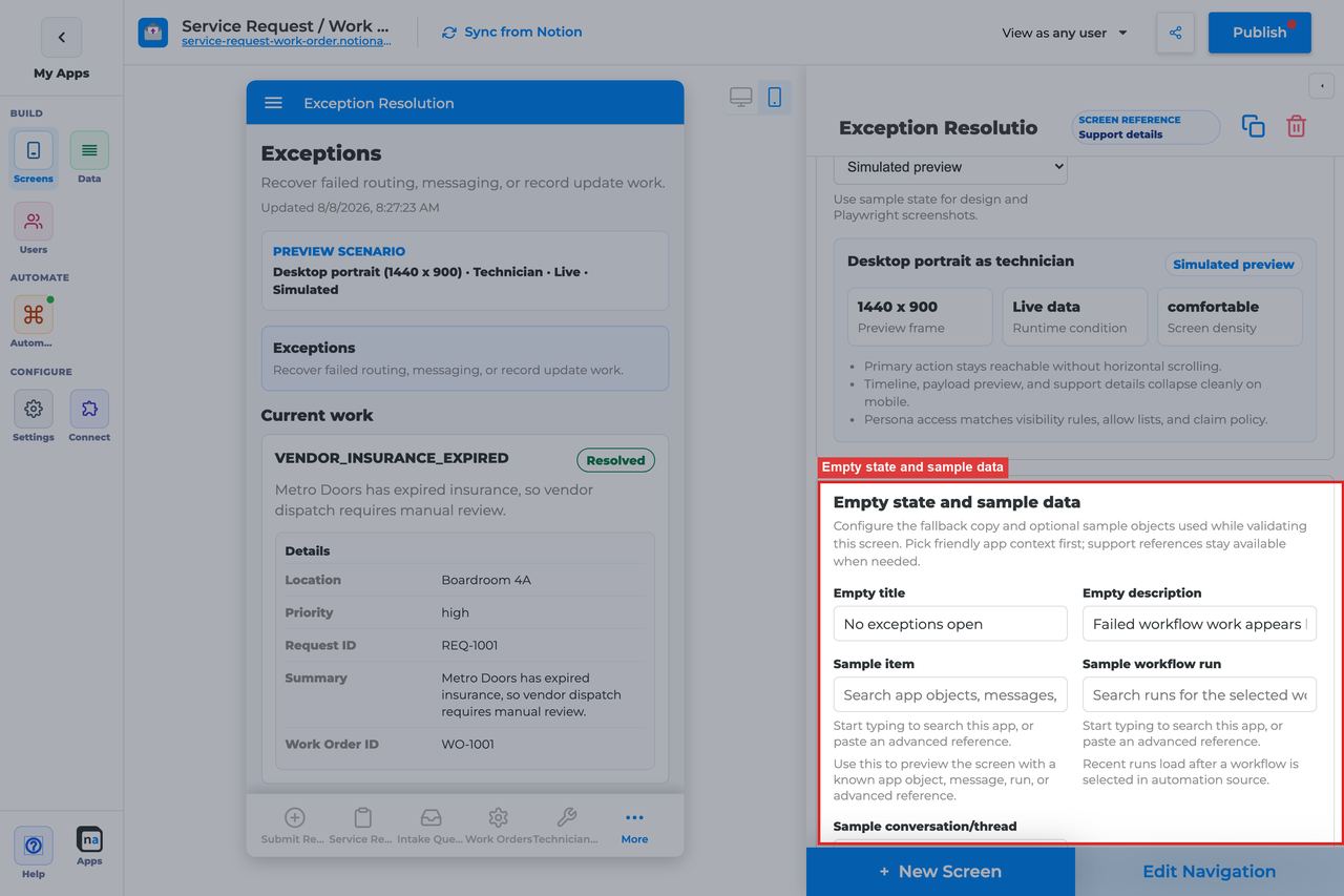
Even operator desks should look intentional when there is nothing to fix.
#### Empty title
**What it does:** Sets the headline shown when no unresolved exceptions match the current scope.\
**How to use it:** Keep the default `No exceptions need attention` unless your team uses a clearer phrase.\
**Why / recommended default:** The default sounds healthy and complete, which is ideal for a recovery desk.
#### Empty description
**What it does:** Explains what kinds of failures would appear here.\
**How to use it:** Keep or adapt the default `Failed workflow work and unresolved exceptions appear here.`\
**Why / recommended default:** Helpful empty copy reassures operators that the system is quiet, not broken.
#### Sample item, run, or conversation
**What it does:** Provides builder-only sample references for realistic preview.\
**How to use it:** Use a sample with an actual failure reason and timeline context so you can confirm the desk is useful before a real incident happens.\
**Why / recommended default:** Exception screens are hard to judge with toy data. Good samples make the preview much more trustworthy.
## Recommended Default Setup
| Setting | Recommended value |
| ------------------------ | ----------------------------------------------------- |
| Listen scope | Specific workflow for one process; Entire app for ops |
| Visibility | Operator, Support, Admin |
| Payload visibility | Redacted or Full for trusted operators |
| Show timeline | On |
| Escalate target workflow | Bind a recovery/escalation workflow |
## Common Configuration Patterns
### Process-specific recovery
Specific workflow + Mark resolved.
### Ops escalation desk
Entire app + Escalate bound to an incident workflow.
## Testing Checklist
* [ ] Force a workflow failure and confirm the exception appears.
* [ ] Mark resolved and confirm it leaves the open list.
* [ ] Escalate and confirm the target workflow starts.
## Troubleshooting
### Exceptions never appear
Failures are not producing exception items, or listen scope excludes them.
### Escalate does nothing
Target workflow is not set on the Escalate action.
## Best Practices
* Configure **Exception Resolution** for one clear user job.
* Prefer the narrowest listen scope that still shows the right work.
* Keep payload visibility conservative for broad audiences.
* Test as an allowed user and a blocked user before publish.
* Pair related screens (Decision + Conversation + Workflow Status + Notification Center) instead of overloading one screen.
# Notification Center Screen
> Current state: this native screen is part of **Automation**. It is entitlement-gated, uses NotionApps runtime state instead of ordinary Notion data controls, and should be tested with realistic workflow or messaging activity before a maker relies on it in production.
The **Notification Center** screen is a persistent place for announcements, alerts, unread notices, and acknowledgements.
Think of this screen as **A durable inbox for notices — not a chat thread and not a work queue.**
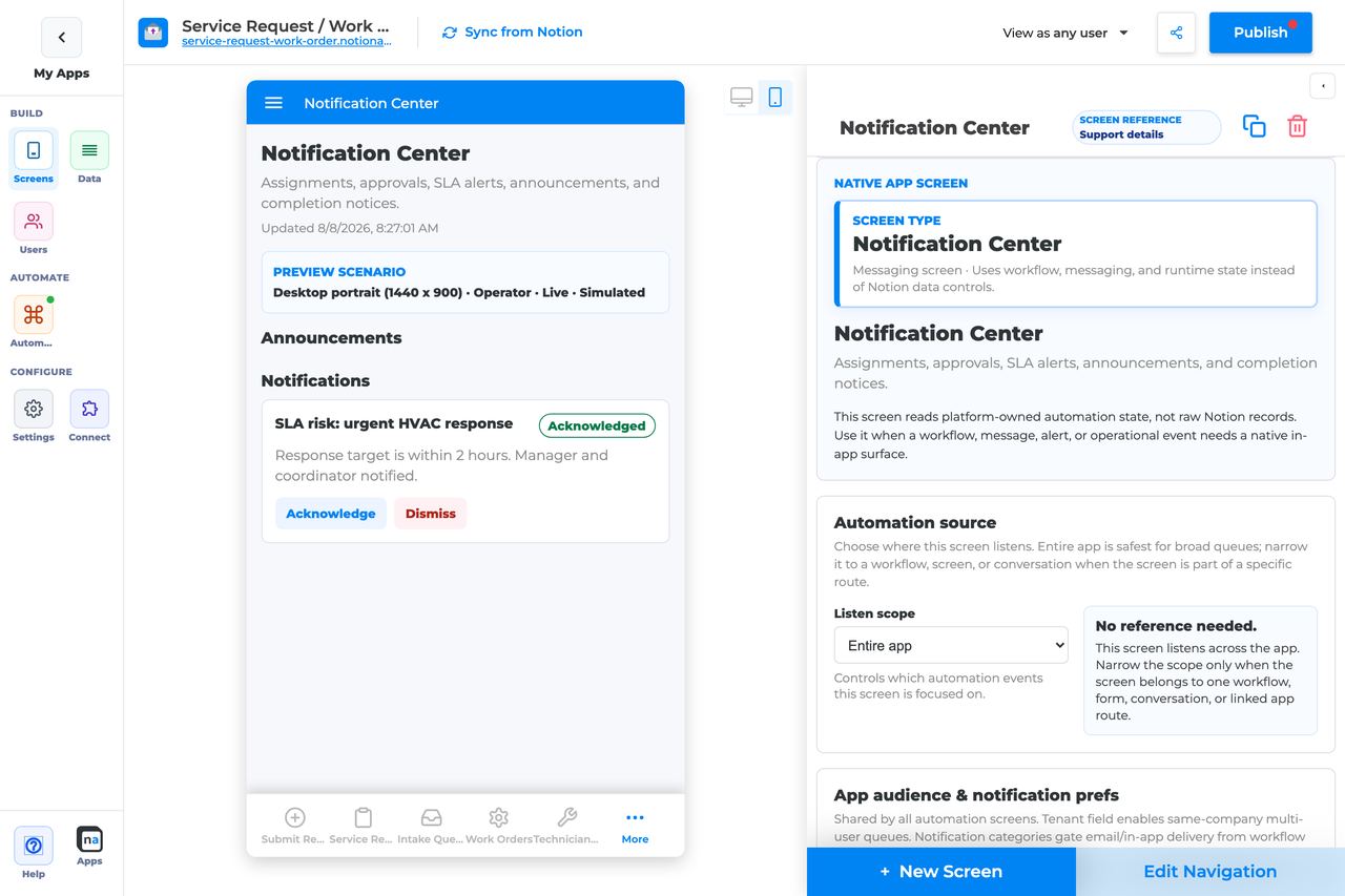
## Who This Guide Is For
This guide is for makers configuring a **Notification Center** screen in the app builder. It lists every builder option available on the screen, and it tells you **how to put cards on the screen**. Adding the screen is not enough.
Use this guide when:
* Users need lasting alerts or announcements.
* Acknowledgements or dismissals should be recorded.
* Category preferences should gate which notices a user receives.
* The live screen is empty and you need the working populate path.
## What The Screen Is For
### Use Notification Center when
* Users need lasting alerts or announcements.
* Acknowledgements or dismissals should be recorded.
* Category preferences should gate which notices a user receives.
### Do not use it when
* Threaded discussion — use Conversation.
* Claimable work — use Work Queue. Named topics such as `client.intake.submitted` create those cards; this screen only shows the ping. See [Topics that perform work](https://docs.notionapps.com/automation/messaging-and-notifications#topics-that-perform-work).
* Transient toast-only messages with no history.
* You only created a Messaging channel and pointed this screen at it as a subscriber. That does not fill this inbox.
## What Users See In The Live App
The live screen has **two separate lists**. They are filled by two different jobs.
* **Announcements** — title, message, and severity from a published broadcast.
* **Notifications** — cards with Acknowledge and Dismiss, created by a workflow **Send notification** step with channel **in\_app**.
* Category-filtered notices based on app audience prefs, when you configured categories.
| Default | Value |
| ------------------------------- | --------------------------------------------------- |
| Default listen scope | Entire app |
| Require claim before action | Off |
| Default preview persona / state | Operator / Live |
| Empty title | No notifications |
| Empty description | Announcements and routed notifications appear here. |
Adding Notification Center, creating a channel named `notification` or `notifications`, and attaching this screen as a subscriber **does not put a card in either list**.
## How this screen gets populated
Do **not** start in Messaging Foundation and build Channel → Contract → Publisher → Subscriber. That route looks finished and then does nothing here.
### What fills each list
| Live section | What actually fills it | What does not fill it |
| ----------------- | --------------------------------------------------------------------------------------------------------------------------------------------------------------------------------------------- | ----------------------------------------------------------------------------------------------------------------- |
| **Announcements** | Messaging → **Announcements** → title and message → **Publish broadcast**. Leave the announcement **active**. | A custom channel. A paused announcement. A form Save. |
| **Notifications** | Automation Home → **Create your first automation: Notify someone**, or a workflow **Form submitted** → **Send notification** with channel **in\_app**. Then publish the workflow and the app. | A Messaging channel, contract, publisher, or this screen as a subscriber. Email-only notify. Form Save by itself. |
Users must be **signed in** on the **live** app. Builder preview sample data is not a live notice.
### Populate Notifications after a form Save
This is the path makers should use when they want the inbox to update after someone hits Save.
1. Publish the app. The form must exist on the live app.
2. If the form is an **update** form, add at least one record. Save on an empty list does not run.
3. Add a **Notification Center** screen if it is missing. Publish the app again.
4. Open **Automation** → **Create your first automation: Notify someone**.
5. Set **When this happens** to the form people save.
6. Set **Who receives it** to the record owner / people field, a role, or a specific email.
7. Set **Notification channel** to **In-app Notification Center**, or **In-app and email**.
8. Click **Run live test**. Confirm a card appears under **Notifications**.
9. Publish the workflow and the app.
10. On the live app, signed in as the recipient, submit the form. Open Notification Center. Refresh if needed — the screen polls about every 30 seconds.
Leave Messaging channels, contracts, publishers, and subscribers alone for this job.
### Populate Announcements for everyone
1. Confirm Notification Center is on the live app and Messaging live publish is enabled (Intra or higher).
2. Open **Automation** → **Messaging** → **Announcements**.
3. Enter a title and message. Set severity if needed.
4. Click **Publish broadcast**. Leave the announcement **active**.
5. Open the live app signed in. The item appears under **Announcements**.
Do not create a `notifications` channel for a broadcast.
### Why a channel subscription stays empty
A Messaging **EVENT** from a form or button publisher is not a Notification Center card. This screen reads:
* active **announcements**, and
* automation items of type **notification**.
Only a workflow **Send notification** step with channel **in\_app** creates those items. Email-only or webhook-only notify does not. Form Save can try to publish to a channel, but if the contract requires a `message` field the form never sends, publish fails silently and the Notion row still saves.
If you already built Channel → Contract → Publisher → this screen as subscriber, do not keep testing Save. Use **Notify someone** above, or add a **Send notification** / **in\_app** step to a form-submitted workflow.
Full Messaging reference: [Messaging and Notifications](https://docs.notionapps.com/automation/messaging-and-notifications). Named topics that create Decision or Work Queue cards (not this inbox): [Topics that perform work](https://docs.notionapps.com/automation/messaging-and-notifications#topics-that-perform-work). First-win wizard: [Start from a wizard](https://docs.notionapps.com/automation/start-from-a-wizard).
## Required Foundations
| Requirement | Why it matters |
| ------------------------------------------ | -------------------------------------------------------------------------------------------------------------- |
| Automation screen entitlement | Notification Center appears in the Automation / Operational group. |
| Messaging | Required for **Announcements** (broadcast). Intra live publish must be on. |
| Workflow | Required for the **Notifications** list. Use **Notify someone** or a **Send notification** / **in\_app** step. |
| Private app + Users database (recommended) | Role/tenant visibility, assignment, and audience policy need signed-in users. |
## Complete Builder Options Reference
The sections below follow the builder order. Every option is explained in prose so makers can configure a durable notice center with the right audience, the right categories, and the right read/clear behavior.
### Header and screen type
This section defines the notice inbox at a glance. Notification Center works best when users can tell immediately that it is for durable alerts and announcements, not chat and not claimable work.
#### Screen type
**What it does:** Sets the native behavior to **Notification Center**, which renders persistent notices tied to automation and messaging runtime state.\
**How to use it:** Keep the type as Notification Center. Use Conversation for threaded back-and-forth and Work Queue for claimable tasks.\
**Why / recommended default:** Each screen family has a distinct job. Mixing them together makes the notice center harder to trust.
#### Category
**What it does:** Places the screen in the native Automation or Operational grouping.\
**How to use it:** Keep the default grouping and place the screen where users expect to look for durable alerts.\
**Why / recommended default:** Clear structure helps makers keep notice surfaces separate from action surfaces.
#### Title
**What it does:** Sets the live title shown in navigation and at the top of the screen.\
**How to use it:** Use clear labels like `Notifications`, `Alerts`, or `Company notices` depending on the audience.\
**Why / recommended default:** Familiar naming helps users discover the screen naturally without training.
#### Description
**What it does:** Adds helper text beneath the title.\
**How to use it:** Explain what kind of notices appear here and what users should do with them, such as acknowledge or dismiss.\
**Why / recommended default:** Good description text keeps the screen from being mistaken for a support inbox or conversation thread.
### Automation source
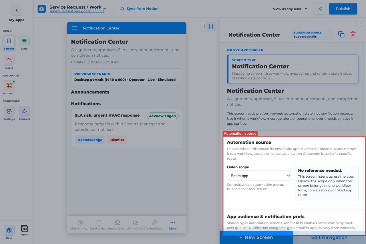
This section decides which notices the center listens to. Notification Center can be broad, but it still works best when makers are intentional about scope.
#### Listen scope
**What it does:** Chooses the top-level runtime source for notifications.\
**How to use it:** Use **Entire app** for a global notice center. Use **Specific workflow** when the page should only show notices from one process, such as a regulated approval flow.\
**Why / recommended default:** The common default for a shared Notification Center is **Entire app**, but narrower scope is often better when the app has several unrelated automation systems.
#### Source screen or form
**What it does:** Binds the screen to one intake surface when that scope is selected.\
**How to use it:** Choose the screen or form that should own the resulting notices if one intake experience is the natural boundary.\
**Why / recommended default:** This is useful for targeted portals, but broad notice centers usually do not need it.
#### Workflow
**What it does:** Filters the screen to notices associated with one workflow.\
**How to use it:** Pick the published workflow when users only need process-specific alerts.\
**Why / recommended default:** Workflow scope helps prevent alert fatigue by keeping a notice center focused.
#### Messaging channel
**What it does:** Narrows listen scope when you selected Conversation or linked-app scope.\
**How to use it:** Leave this empty for a normal inbox. Do not create a `notifications` channel and bind this screen to it expecting cards to appear. Channel events do not populate this list.\
**Why / recommended default:** An empty inbox is almost never a channel-name typo. It usually means you have not run **Notify someone** or published an announcement. See [How this screen gets populated](#how-this-screen-gets-populated).
#### Topic
**What it does:** Further filters a selected channel.\
**How to use it:** Leave it empty unless you already have a working notify workflow or announcement and you are narrowing a busy inbox.\
**Why / recommended default:** Topic filters hide items. They do not create them.
#### Conversation or correlation
**What it does:** Limits the center to a specific case or correlation context.\
**How to use it:** Use this only when the notice center is meant to accompany one request or one thread.\
**Why / recommended default:** Most Notification Center screens should stay broader than a single correlation so they behave like a true inbox.
#### Linked application
**What it does:** Binds the notice center to a linked NotionApps application when notices are exchanged across apps.\
**How to use it:** Choose a linked app only when cross-app notices are part of the product design.\
**Why / recommended default:** Most notice centers remain local to one app, which keeps governance simpler.
### App audience and notification prefs
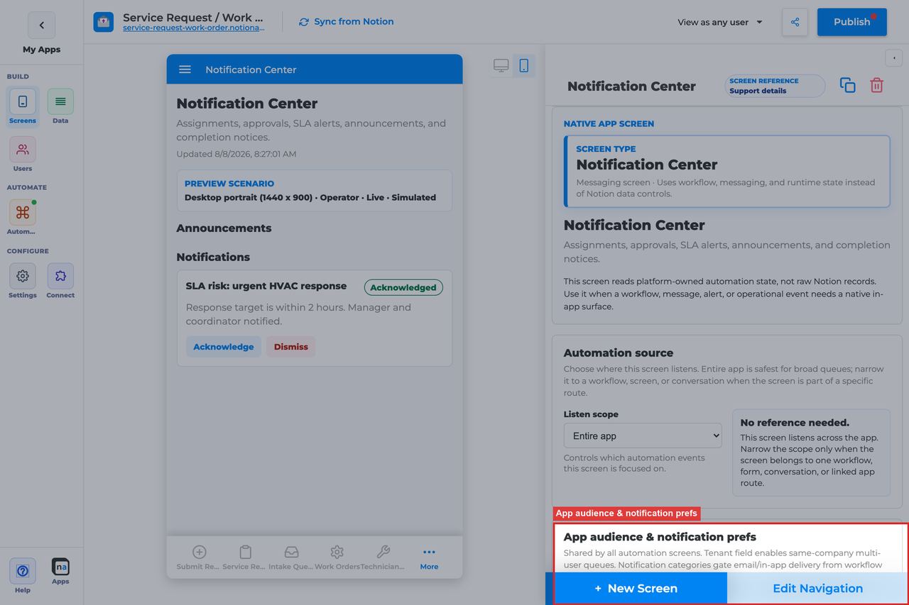
This section matters more on Notification Center than on any other screen because it defines who is eligible to see notices and which notice categories they have opted into.
#### Tenant mode
**What it does:** Decides whether notices are isolated by tenant relation.\
**How to use it:** Use **Relation** when each client or company should only see its own notices. Use **Off** only for truly single-tenant or fully internal apps.\
**Why / recommended default:** Tenant-aware notice delivery is usually the safer default. Broadcast-style notice visibility is a common source of unintended exposure.
#### Tenant field
**What it does:** Selects the Users-sheet relation that defines tenant membership.\
**How to use it:** Point at the same client, company, or workspace field used elsewhere in the app.\
**Why / recommended default:** Consistent tenant modeling keeps notice visibility predictable across screens and channels.
#### Role field
**What it does:** Tells the platform which field stores a user's role if it is not named `Role`.\
**How to use it:** Leave it blank for the default field name or set it explicitly for a custom schema.\
**Why / recommended default:** Role-sensitive notice delivery only works if the builder is reading the right role field.
#### Notification categories
**What it does:** Maps category keys and labels to user preference fields so people can opt into or out of notice types.\
**How to use it:** Add only categories you really send, such as announcements, approvals, service alerts, or reminders, then map each to a real preference field on the Users sheet.\
**Why / recommended default:** This is the most important policy section on the screen. Users who opt out of a category should not see those notices even if the screen itself is visible, so sloppy category setup leads directly to confusing inbox behavior.
#### Add notification category
**What it does:** Adds another category row, usually with in-app and email delivery defaults.\
**How to use it:** Create a category only when you have a real sending route and a real user preference to bind it to.\
**Why / recommended default:** A small set of meaningful categories is better than a long list of theoretical ones.
#### Save audience policy
**What it does:** Saves tenant and category policy at the app level.\
**How to use it:** Save after every category or tenant change before testing as another persona.\
**Why / recommended default:** Unsaved audience policy is one of the easiest ways to misread a notice-visibility test.
### Template setup state
This is a diagnostic section for cloned or repaired apps.
#### Setup state indicator
**What it does:** Reports whether the screen setup is provisioned, needs review, or has no setup report.\
**How to use it:** Treat **Needs review** as a sign to re-check the notice source bindings, especially after template remaps or channel renames.\
**Why / recommended default:** Notification screens can look healthy in the builder while still pointing at the wrong underlying routes. This indicator helps you catch that earlier.
### Related context
This panel helps you discover the forms, workflows, and messaging objects that shape the notice experience.
#### Related context panel
**What it does:** Shows read-only discovery counts and related runtime objects.\
**How to use it:** Use it to find the Automation Launcher that publishes announcements, the workflows that emit alerts, or neighboring screens like Workflow Status and Conversation.\
**Why / recommended default:** Discovery tools make it easier to build a coherent notice experience instead of scattering alerts across unrelated pages.
### Visibility and access
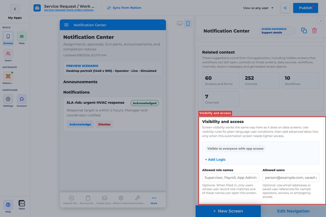
This section controls who can open the notice center at all. That is separate from category opt-in, which decides which notices appear after a user is already allowed onto the screen.
#### Visibility rules
**What it does:** Applies condition-based screen visibility.\
**How to use it:** Use role, tenant, or audience conditions to define which users can open the screen.\
**Why / recommended default:** Visibility and category preferences solve different problems. A common mistake is trying to use categories instead of real screen access rules.
#### Allowed role names
**What it does:** Adds a direct role allow list.\
**How to use it:** Use simple role sets like `All Users`, `Staff`, or `Admin` depending on the scope of the notice center.\
**Why / recommended default:** Clear role access is easier to audit than a mix of hidden exceptions.
#### Allowed users
**What it does:** Grants access to specific people by email or user reference.\
**How to use it:** Use for pilots, named stakeholders, or executive-only announcement centers.\
**Why / recommended default:** Per-user access is fine for special cases, but it should not be the main access model in a production notice center.
### Display and action policy
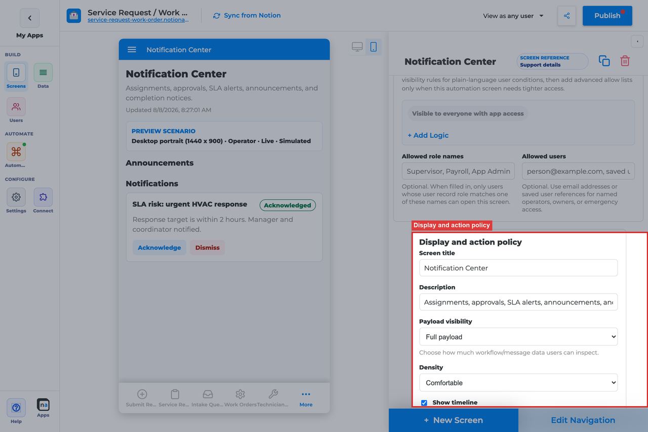
These settings define how much notice detail is visible and how heavy or lightweight the center feels in the live app.
#### Screen title override
**What it does:** Refines the user-facing title.\
**How to use it:** Use wording that matches the audience, such as `My notifications` for end users or `Operations alerts` for internal teams.\
**Why / recommended default:** The title should set expectations before a user even opens the list.
#### Description
**What it does:** Sets the helper copy under the title.\
**How to use it:** Explain whether users should read, acknowledge, or dismiss notices here.\
**Why / recommended default:** This small bit of guidance prevents uncertainty about what the actions mean.
#### Payload visibility
**What it does:** Controls how much detail from the runtime payload is shown with each notice.\
**How to use it:** Use **Metadata only** for broad or customer-facing audiences, **Redacted preview** for most internal use, and **Full payload** only for trusted operator contexts.\
**Why / recommended default:** Notice centers often reach wider audiences than other automation screens, so conservative payload visibility is usually the right default.
#### Density
**What it does:** Chooses comfortable or compact list spacing.\
**How to use it:** Use **Comfortable** for general audiences and **Compact** for high-volume operator alert lists.\
**Why / recommended default:** Comfortable spacing makes long notice lists easier to scan for most users.
#### Show timeline
**What it does:** Shows related audit or workflow activity with each notice.\
**How to use it:** Turn it on when users need extra delivery or history context. Turn it off when the center should stay very simple.\
**Why / recommended default:** Many notice centers work well without a heavy timeline, but it can be useful for operational alerts.
#### Require claim before action
**What it does:** Exists in the shared policy section, but Notification Center does not use claim behavior in its default model.\
**How to use it:** Leave it **Off**. Notices are acknowledged or dismissed, not claimed.\
**Why / recommended default:** Claim-based ownership is not part of the standard notification experience, so turning it on usually creates confusion.
### Available actions

This section controls how users clear or record notice state. The two core actions have different meanings and should both be explained clearly in maker-facing docs.
#### Acknowledge
**What it does:** Marks the notice as seen or acknowledged while preserving its history.\
**How to use it:** Keep Acknowledge when users should formally record that they read an alert or announcement.\
**Why / recommended default:** Acknowledge is especially useful for compliance, policy, and important service updates where "read" matters.
#### Dismiss
**What it does:** Removes the notice from the active list after the user decides it no longer needs attention.\
**How to use it:** Keep Dismiss when the notice center should stay tidy and users may want to clear informational items after reading them.\
**Why / recommended default:** Dismiss is helpful for reducing noise, but makers should use it carefully on notices that must remain easy to audit.
#### After-action screen
**What it does:** Routes the user to another screen after acknowledging or dismissing a notice.\
**How to use it:** Most makers leave users on the notice center, but you can send them to Workflow Status, Conversation, or another follow-up page when a notice naturally points somewhere specific.\
**Why / recommended default:** Staying in the notice center is the least surprising default. Redirects are best only when the next step is obvious.
#### Target workflow
**What it does:** Supplies a workflow target for custom actions that launch or escalate into another process.\
**How to use it:** Leave it empty for the standard Acknowledge and Dismiss actions.\
**Why / recommended default:** Unused workflow bindings add complexity without improving the notice experience.
### Preview scenario
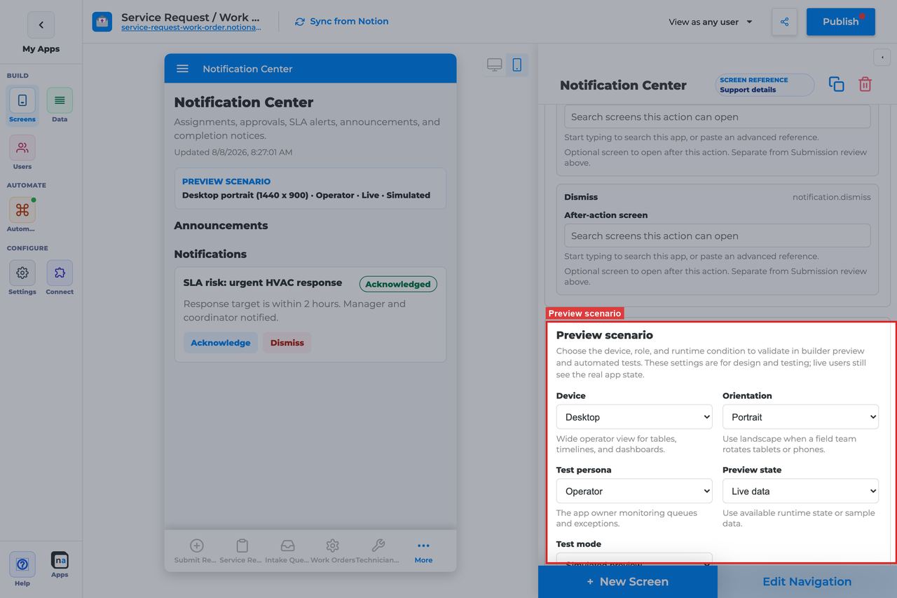
Preview settings help makers check whether the notice list stays readable across devices and whether the empty state feels intentional.
#### Device and orientation
**What it does:** Changes the preview frame across desktop, tablet, and mobile sizes.\
**How to use it:** Always check mobile because notices are commonly consumed on phones.\
**Why / recommended default:** A notice center that breaks on mobile will often be ignored even if the alerts themselves are important.
#### Test persona
**What it does:** Simulates the viewer role.\
**How to use it:** Test with the real audience, not only as Admin, especially when categories or tenant policy differ across user groups.\
**Why / recommended default:** Persona testing is critical because notification gating is often policy-driven rather than visually obvious.
#### Preview state
**What it does:** Simulates states such as Live, Empty, Loading, and Error.\
**How to use it:** Check **Live** for the normal list, **Empty** for calm idle behavior, and **Error** to ensure the screen still feels trustworthy under failure conditions.\
**Why / recommended default:** The default preview state is **Live**, but the empty state is often what new users see first.
#### Test mode
**What it does:** Switches between simulated preview and live testing.\
**How to use it:** Use live testing before publish to confirm notice routing and category gating with real personas.\
**Why / recommended default:** Simulation helps with layout, but only live testing proves the notice policy is correct.
### Empty state and sample data
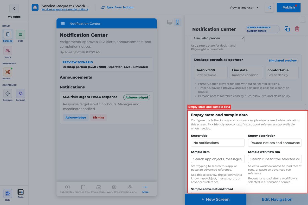
Quiet inboxes should feel calm, not broken.
#### Empty title
**What it does:** Sets the headline shown when no notices match.\
**How to use it:** Keep the default `No notifications` unless your audience uses a more specific label like `No alerts`.\
**Why / recommended default:** The default is short, familiar, and easy to understand.
#### Empty description
**What it does:** Explains when notices will appear.\
**How to use it:** Keep or adapt the default `Announcements and routed notifications appear here.`\
**Why / recommended default:** Simple empty copy reassures users that the center is just quiet.
#### Sample item, run, or conversation
**What it does:** Provides builder-only sample references for preview and screenshots.\
**How to use it:** Use representative notices from a few categories so you can validate list density, action labels, and payload visibility before publish.\
**Why / recommended default:** Good sample data helps you catch problems such as overly long titles or confusing category presentation before real users do.
## Recommended Default Setup
| Setting | Recommended value |
| ------------------------------------ | --------------------------------------------------------------------- |
| Listen scope | Entire app for a global center; Specific workflow for process notices |
| Visibility | All signed-in users or role-scoped groups |
| Payload visibility | Metadata only or Redacted |
| App audience notification categories | Map categories to user-sheet preference fields |
| Actions | Acknowledge, Dismiss |
## Common Configuration Patterns
### Company announcements
Entire app listen scope. Messaging → **Announcements** → **Publish broadcast**. Leave it active.
### Process alerts after Save
Entire app or Specific workflow. Automation → **Notify someone** on that form, channel **In-app Notification Center**. Do not use a Messaging subscriber for this.
## Testing Checklist
* [ ] Run **Notify someone** live test and confirm a card under **Notifications**.
* [ ] Publish a broadcast and confirm it under **Announcements** (status **active**).
* [ ] On the live app, signed in as the recipient, submit the form and see the card.
* [ ] Acknowledge and confirm unread state clears.
* [ ] Dismiss and confirm it leaves the active list.
* [ ] Toggle a notification category preference and confirm gating.
* [ ] Confirm a channel + this screen as subscriber does **not** count as a passing test.
## Troubleshooting
### User sees no notices
Most common: the screen exists, but nothing has created an announcement or an **in\_app** notification item.
What to check:
* Did you use **Notify someone** or a **Send notification** / **in\_app** step? A Messaging channel + subscriber is not enough.
* Is the announcement **active**, not paused?
* Is the user signed in on the **live** app (not only builder preview)?
* If this is an update form, did they select a row before Save?
* Did category prefs opt them out, or does visibility hide the screen?
* Email-only notify will not create a card here.
### Save succeeded and Notification Center still did nothing
Form Save writes the Notion row first. A channel publish can fail silently (often a contract that requires `message`, which the form does not send). Even a successful channel EVENT does not become a Notification Center card. Use **Notify someone**.
### Too many notices
Listen scope is Entire app — narrow to one workflow, or tighten categories.
## Best Practices
* Populate the screen with **Notify someone** or **Announcements** before you edit listen scope, channels, or categories.
* Do not send makers into Channel / Contract / Publisher / Subscriber for this inbox.
* Prefer the narrowest listen scope that still shows the right work.
* Keep payload visibility conservative for broad audiences.
* Test as the recipient on the live app, not only as the maker in preview.
* Pair related screens (Decision + Conversation + Workflow Status + Notification Center) instead of overloading one screen.
## Related
[Start from a wizard](https://docs.notionapps.com/automation/start-from-a-wizard). [Messaging and Notifications](https://docs.notionapps.com/automation/messaging-and-notifications). [Conversation screen](https://docs.notionapps.com/screens-and-components/types-of-screens/native-automation-and-operational-screen-guides/conversation-screen).
# Automation Launcher Screen
> Current state: this native screen is part of **Automation**. It is entitlement-gated, uses NotionApps runtime state instead of ordinary Notion data controls, and should be tested with realistic workflow or messaging activity before a maker relies on it in production.
The **Automation Launcher** screen is a controlled launchpad for manual workflow starts, service requests, and operator announcements.
Think of this screen as **A trusted start button panel — users intentionally begin automation.**
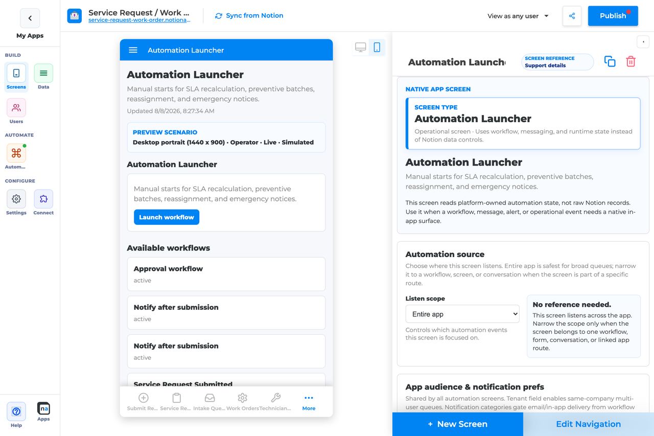
## Who This Guide Is For
This guide is for makers configuring an **Automation Launcher** screen in the app builder. It lists every builder option available on the screen and explains how to use each one.
Use this guide when:
* Operators must manually start an approved workflow.
* Staff need a safe place to publish announcements.
* Service requests should start without exposing the whole workflow builder.
## What The Screen Is For
### Use Automation Launcher when
* Operators must manually start an approved workflow.
* Staff need a safe place to publish announcements.
* Service requests should start without exposing the whole workflow builder.
### Do not use it when
* Automatic starts from form submit — configure the workflow trigger instead.
* Approving work — use Decision.
* Monitoring runs — use Workflow Status / Operator Console.
## What Users See In The Live App
* Launch actions configured on the screen.
* Publish announcement and Launch workflow buttons.
* Empty state when no launch actions are configured.
| Default | Value |
| ------------------------------- | ----------------------------------------------------------------- |
| Default listen scope | Entire app |
| Require claim before action | Off |
| Default preview persona / state | Operator / Live |
| Empty title | No launch actions configured |
| Empty description | Add workflow or messaging actions to make this screen actionable. |
## Required Foundations
| Requirement | Why it matters |
| ------------------------------------------ | ------------------------------------------------------------------ |
| Automation screen entitlement | Automation Launcher appears in the Automation / Operational group. |
| Workflow | Primary foundation for this screen’s runtime state. |
| Private app + Users database (recommended) | Role/tenant visibility and audience policy need user fields. |
## Complete Builder Options Reference
The sections below follow the builder order. Each option is explained in prose so makers can configure a launch surface that is safe, deliberate, and clear about which workflows or announcements it can start.
### Header and screen type
This section defines the launcher itself. Automation Launcher should feel like a controlled control panel, not a general-purpose workspace.
#### Screen type
**What it does:** Sets the native behavior to **Automation Launcher**, which renders manual launch actions instead of runtime items or Notion rows.\
**How to use it:** Keep the screen type as Automation Launcher. If a workflow should start automatically, configure the trigger in the workflow instead of sending users here.\
**Why / recommended default:** Launchers are best for intentional human-start actions. Using them for automatic flows usually adds extra clicks without adding control.
#### Category
**What it does:** Places the screen in the native Automation or Operational grouping.\
**How to use it:** Keep the default grouping and put the launcher near the operational tools the same audience already uses.\
**Why / recommended default:** Good grouping helps makers separate action launch surfaces from monitoring surfaces.
#### Title
**What it does:** Sets the live title shown to users.\
**How to use it:** Use names like `Operations launcher`, `Service actions`, or `Admin tools` so the audience understands this is a start point.\
**Why / recommended default:** The title should signal deliberate action. Vague titles make users unsure whether they are allowed to click.
#### Description
**What it does:** Adds helper text beneath the title.\
**How to use it:** Explain what kinds of launches belong here and whether the screen is restricted to trusted staff.\
**Why / recommended default:** One clear sentence prevents accidental misuse.
### Automation source
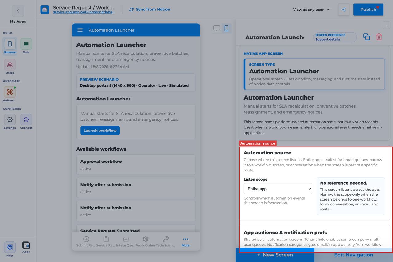
Automation Launcher does not depend on a live queue of incoming items, but it still uses the shared source section. Makers should use it to keep the launch panel aligned with the workflows or messaging systems it belongs beside.
#### Listen scope
**What it does:** Chooses the high-level automation context the launcher is associated with.\
**How to use it:** Use **Entire app** for a general admin launcher or **Specific workflow** when the launcher should only relate to one process family.\
**Why / recommended default:** Entire app is a reasonable default for trusted operations panels, but narrower workflow context can make the launcher easier to understand.
#### Source screen or form
**What it does:** Binds the launcher to one source surface when that scope is selected.\
**How to use it:** Use this when launches should be conceptually tied to one intake or one app area.\
**Why / recommended default:** This is more about clarity than necessity. Most launchers remain broad unless they support one specific process.
#### Workflow
**What it does:** Filters the launcher's context to one workflow when **Specific workflow** is selected.\
**How to use it:** Pick the workflow family the launcher belongs to, especially when the screen will be used by one team for one service flow.\
**Why / recommended default:** Workflow-specific context makes a launcher easier to explain and govern.
#### Messaging channel
**What it does:** Narrows the launcher's messaging context to one channel.\
**How to use it:** Use it when the screen also publishes announcements or other message-driven actions into a known channel.\
**Why / recommended default:** Channel binding is especially useful when Publish announcement is one of the core actions.
#### Topic
**What it does:** Filters message publishing or context to a specific topic.\
**How to use it:** Use exact, stable topic names when your launcher should publish or align with a specific announcement pattern.\
**Why / recommended default:** Topic drift can make announcements look like they disappeared into the wrong inbox.
#### Conversation or correlation
**What it does:** Limits launcher context to a specific thread or case.\
**How to use it:** Use this only when the launcher is embedded inside one case experience.\
**Why / recommended default:** Most launchers should stay reusable, so a fixed correlation is usually too narrow.
#### Linked application
**What it does:** Binds the launcher to a linked NotionApps application when launch actions are part of a cross-app workflow.\
**How to use it:** Choose it only when the action surface truly spans apps.\
**Why / recommended default:** Most manual launch surfaces stay inside one app, which is easier to manage.
### App audience and notification prefs
These app-level controls matter here because launchers are usually restricted to trusted roles and may publish announcements that respect notification category policy.
#### Tenant mode
**What it does:** Decides whether launcher visibility and related runtime context are tenant-aware.\
**How to use it:** Use **Relation** when launch actions should only be visible within a tenant boundary. Use **Off** for simple single-tenant internal tooling.\
**Why / recommended default:** Many launchers are internal-only, but tenant-aware policy still matters in portal-style apps with delegated operators.
#### Tenant field
**What it does:** Selects the Users-sheet relation that defines tenant membership.\
**How to use it:** Use the same field the rest of the app relies on.\
**Why / recommended default:** Consistency prevents one operational screen from behaving differently than the rest.
#### Role field
**What it does:** Tells the platform which field stores user roles when it is not named `Role`.\
**How to use it:** Set it only if your user model uses a different field name.\
**Why / recommended default:** Launchers often depend heavily on role gating, so this mapping needs to be correct.
#### Notification categories
**What it does:** Maps notice categories to preference fields.\
**How to use it:** Configure the categories you plan to use when **Publish announcement** sends notices into Notification Center or email.\
**Why / recommended default:** Category policy matters most when the launcher is used for communication, not just workflow starts.
#### Add notification category
**What it does:** Adds another category row to the app-level policy.\
**How to use it:** Add one only for real announcement types you expect staff to publish.\
**Why / recommended default:** A small, meaningful category set is easier for makers and users to understand.
#### Save audience policy
**What it does:** Saves tenant and category policy at the app level.\
**How to use it:** Save before testing who can see or receive launcher-driven announcements.\
**Why / recommended default:** Unsaved policy leads to confusing test results.
### Template setup state
This section is a quick health indicator for cloned or repaired apps.
#### Setup state indicator
**What it does:** Reports whether the screen bindings are provisioned, need review, or have no setup report.\
**How to use it:** Re-check the status after duplicating launch surfaces or re-pointing actions to new workflows.\
**Why / recommended default:** Manual start screens are easy to forget during remaps, so this diagnostic is useful.
### Related context
This panel helps you find the workflows, screens, and channels the launcher should coordinate with.
#### Related context panel
**What it does:** Shows read-only discovery counts and related runtime objects.\
**How to use it:** Use it to locate the target Workflow Status screen, Notification Center, or related intake forms before wiring actions.\
**Why / recommended default:** Seeing the nearby operational landscape helps you create a launch surface that feels intentional.
### Visibility and access
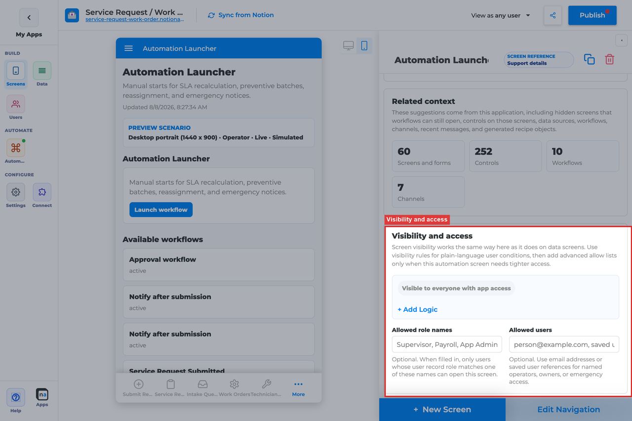
Automation Launcher should usually be one of the most restricted native screens in the app. The screen starts work on purpose, so the audience should be explicit.
#### Visibility rules
**What it does:** Applies condition-based screen visibility.\
**How to use it:** Restrict the screen by role, tenant, or team so only trusted staff can launch workflows or publish announcements.\
**Why / recommended default:** Broad access is risky here. A launcher is a power tool, not a general navigation page.
#### Allowed role names
**What it does:** Adds a direct role allow list.\
**How to use it:** Use clear roles like `Operator, Admin, Dispatcher, Support Lead` as needed.\
**Why / recommended default:** Role lists are usually the clearest way to govern a launcher.
#### Allowed users
**What it does:** Grants access to named people.\
**How to use it:** Use for pilots or named operational owners, not as the long-term main access strategy.\
**Why / recommended default:** Per-user access is convenient short term but hard to maintain at scale.
### Display and action policy
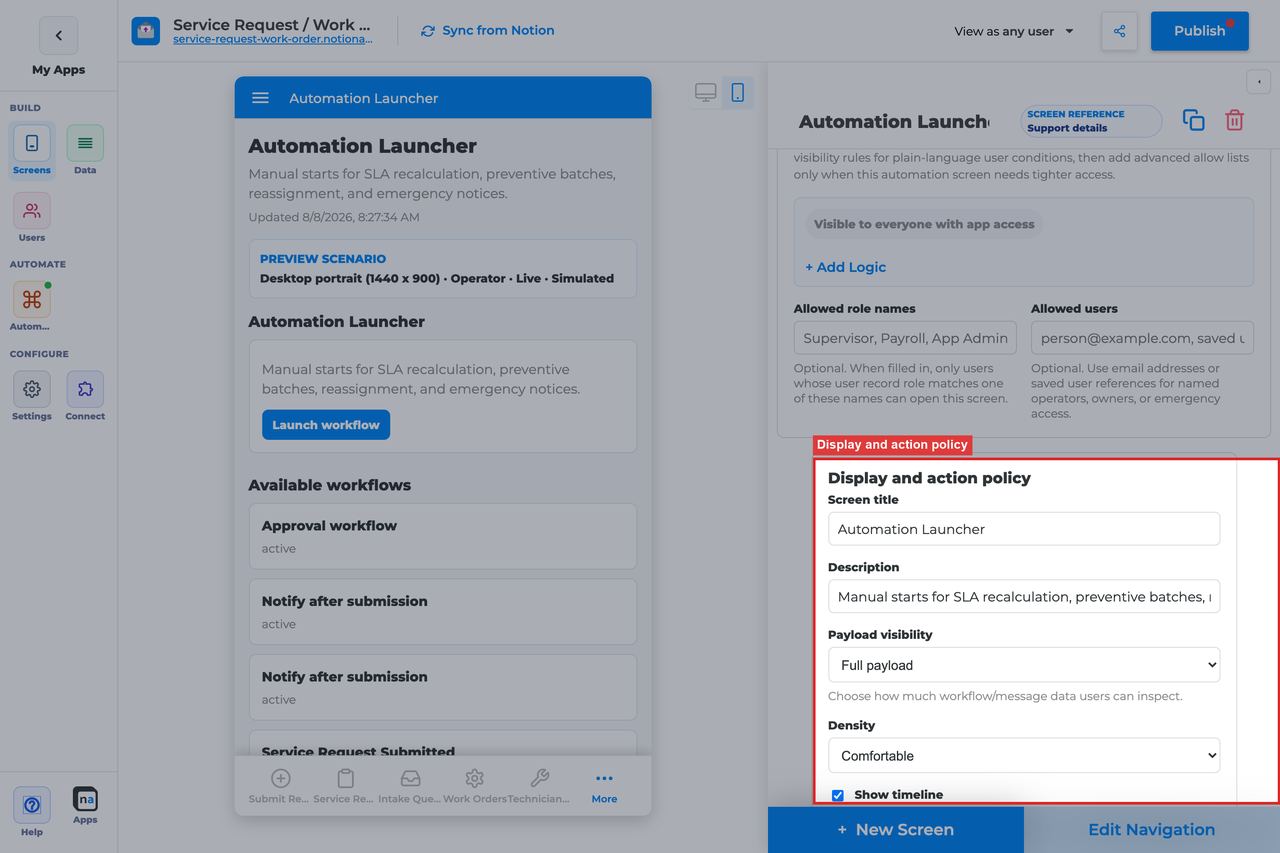
This section shapes how lightweight or intimidating the launcher feels. Since the main value is the actions, clear labels matter more than dense runtime detail.
#### Screen title override
**What it does:** Refines the user-facing title.\
**How to use it:** Use direct, job-oriented wording like `Start a workflow` or `Operations tools`.\
**Why / recommended default:** The title should tell users that clicking here has real operational consequences.
#### Description
**What it does:** Sets the helper copy under the title.\
**How to use it:** Explain what launches are allowed and when users should use this panel.\
**Why / recommended default:** A short instruction reduces accidental starts.
#### Payload visibility
**What it does:** Controls how much runtime context is shown on the launcher.\
**How to use it:** Use **Metadata only** for most launchers. Use **Redacted preview** or **Full payload** only if operators truly need extra context before launching.\
**Why / recommended default:** Launchers usually do not need heavy payload detail. Keeping them lighter makes the screen easier to scan.
#### Density
**What it does:** Chooses comfortable or compact spacing for launch actions and context.\
**How to use it:** Use **Comfortable** when you have only a few important actions. Use **Compact** when the screen is a dense internal tool panel.\
**Why / recommended default:** Comfortable spacing makes it harder to click the wrong action in a high-stakes launcher.
#### Show timeline
**What it does:** Shows related runtime history near the launcher.\
**How to use it:** Turn it on when the audience benefits from recent operational context before launching. Leave it off if the screen should stay clean and action-oriented.\
**Why / recommended default:** Many launchers do fine without much history, but some ops teams appreciate seeing recent runs before they start another one.
#### Require claim before action
**What it does:** Exists in the shared policy area, but launchers do not use claim behavior in the standard model.\
**How to use it:** Leave it **Off**. Launchers are deliberate action panels, not shared queues.\
**Why / recommended default:** Claim ownership does not add value here and usually just confuses the screen's purpose.
### Available actions
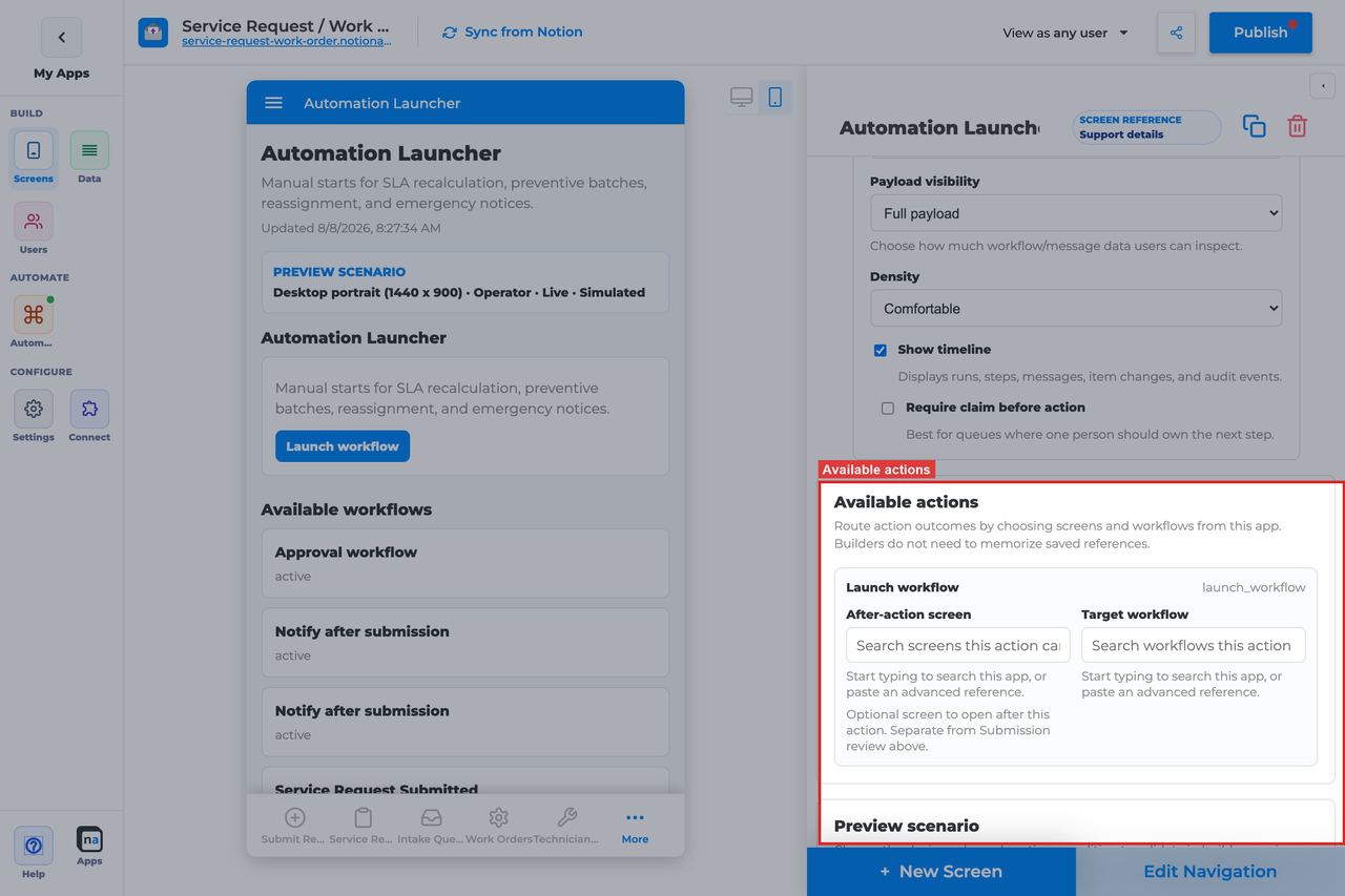
This section is the core of the screen. If the action list is empty, the launcher has no reason to exist in the live app.
#### Publish announcement
**What it does:** Sends an announcement into Notification Center or the configured messaging path.\
**How to use it:** Keep this action when staff need a controlled way to send durable notices. Pair it with well-defined notification categories so the right users receive the right message types.\
**Why / recommended default:** Publish announcement is powerful because it centralizes operational communication. The common mistake is enabling it without clear category policy or audience rules.
#### Launch workflow
**What it does:** Starts a target workflow manually from the screen.\
**How to use it:** Keep it only for workflows that should be started intentionally by a trusted human. Bind the exact target workflow and test it live.\
**Why / recommended default:** Manual launch is valuable when a process should not auto-run. The common mistake is forgetting to bind the target workflow and ending up with a button that looks ready but cannot start anything.
#### After-action screen
**What it does:** Routes the user to another screen after an action succeeds.\
**How to use it:** A strong default is **Workflow Status** after launching a workflow so operators can immediately confirm the run started.\
**Why / recommended default:** After-action routing is especially helpful on this screen because users often want immediate feedback after pressing a start button.
#### Target workflow
**What it does:** Supplies the workflow that **Launch workflow** should start.\
**How to use it:** Choose the exact published workflow for each launch action and retest after any workflow clone or rename.\
**Why / recommended default:** This is one of the most important settings on the screen. Without it, Launch workflow has no destination.
### Preview scenario
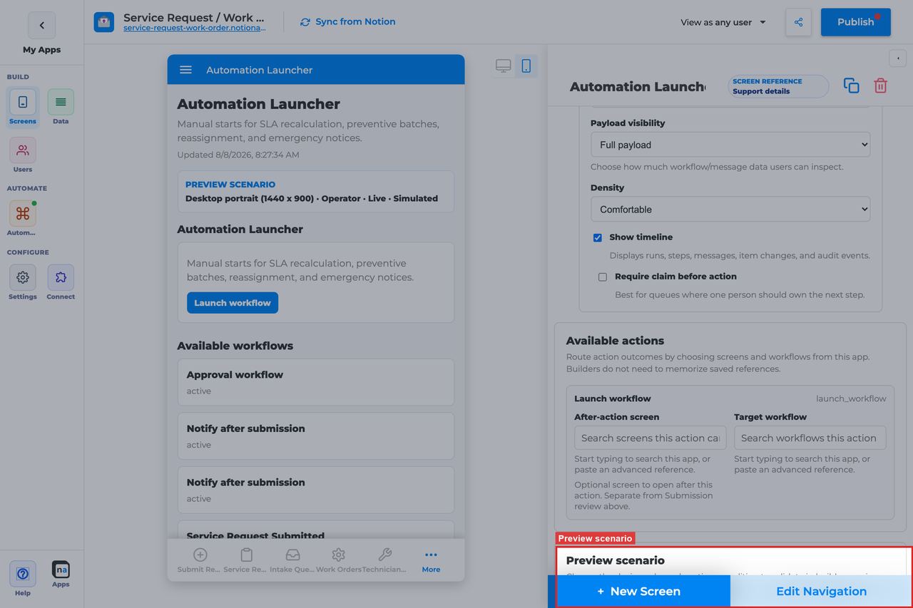
Preview controls help makers verify that the launcher is understandable and safe before it reaches real operators.
#### Device and orientation
**What it does:** Changes the preview frame across desktop, tablet, and mobile sizes.\
**How to use it:** Always check the primary device your operators use, then check mobile if launches may happen in the field.\
**Why / recommended default:** High-stakes action screens should be easy to read and hard to mis-tap.
#### Test persona
**What it does:** Simulates the viewer role.\
**How to use it:** Test with the real operator or admin persona, not only with Admin.\
**Why / recommended default:** Role gating is central to launchers, so persona testing catches access problems quickly.
#### Preview state
**What it does:** Simulates states such as Live, Empty, or Error.\
**How to use it:** Check **Live** for normal action layout and **Empty** to ensure the screen still makes sense when no launch actions are configured.\
**Why / recommended default:** The empty state matters here because it is the direct signal that the screen still needs action configuration.
#### Test mode
**What it does:** Switches between simulated preview and live runtime testing.\
**How to use it:** Always run at least one live test for Launch workflow and one live test for Publish announcement before publishing the screen.\
**Why / recommended default:** Simulation is not enough for a screen whose main value is side effects.
### Empty state and sample data
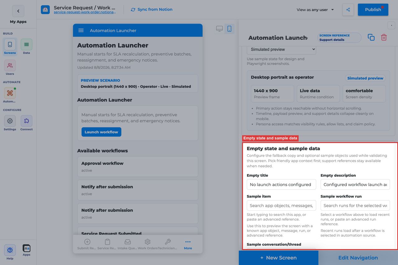
If the launcher has no configured actions, the empty state needs to make that clear instead of looking broken.
#### Empty title
**What it does:** Sets the headline shown when no launch actions are configured.\
**How to use it:** Keep the default `No launch actions configured` unless you have a clearer team-specific phrase.\
**Why / recommended default:** The default is direct and accurately describes the problem.
#### Empty description
**What it does:** Explains what the maker still needs to do for the screen to become useful.\
**How to use it:** Keep or adapt the default `Add workflow or messaging actions to make this screen actionable.`\
**Why / recommended default:** This is one of the rare empty states that is really configuration guidance, so clarity matters.
#### Sample item, run, or conversation
**What it does:** Provides preview references for screenshots and QA.\
**How to use it:** Use representative workflow and notice examples so you can validate action naming, after-action routing, and supporting context.\
**Why / recommended default:** Better sample data leads to better launch labels and fewer surprises when operators first use the screen.
## Recommended Default Setup
| Setting | Recommended value |
| --------------------------------- | ------------------------------- |
| Listen scope | Entire app or Specific workflow |
| Visibility | Operator / Admin only |
| Launch workflow → Target workflow | Required for Launch workflow |
| After-action screen | Workflow Status |
| Payload visibility | Metadata only |
## Common Configuration Patterns
### Manual service request start
Launch workflow bound to intake workflow; after-action Workflow Status.
### Ops announcement pad
Publish announcement only; Notification Center for readers.
## Testing Checklist
* [ ] Launch workflow and confirm a run appears in Workflow Status.
* [ ] Publish announcement and confirm Notification Center receives it.
* [ ] Confirm a non-operator role cannot see the launcher.
## Troubleshooting
### Launch does nothing
Target workflow is not set on the Launch workflow action.
### Empty launcher
No actions configured, or actions were removed.
## Best Practices
* Configure **Automation Launcher** for one clear user job.
* Prefer the narrowest listen scope that still shows the right work.
* Keep payload visibility conservative for broad audiences.
* Test as an allowed user and a blocked user before publish.
* Pair related screens (Decision + Conversation + Workflow Status + Notification Center) instead of overloading one screen.
# Linked App Exchange Screen
> Current state: this native screen is part of **Automation**. It is entitlement-gated, uses NotionApps runtime state instead of ordinary Notion data controls, and should be tested with realistic workflow or messaging activity before a maker relies on it in production.
The **Linked App Exchange** screen is a collaboration screen for requests, messages, payloads, and acknowledgements exchanged between linked NotionApps applications.
Think of this screen as **An app-to-app mailbox for structured handoffs.**
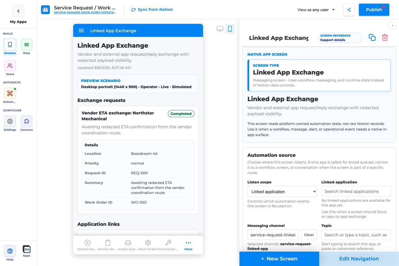
## Who This Guide Is For
This guide is for makers configuring a **Linked App Exchange** screen in the app builder. It lists every builder option available on the screen and explains how to use each one.
Use this guide when:
* Work or data must move between two NotionApps apps.
* Operators need to acknowledge linked-app payloads.
* Makers need visibility into cross-app request state.
## What The Screen Is For
### Use Linked App Exchange when
* Work or data must move between two NotionApps apps.
* Operators need to acknowledge linked-app payloads.
* Makers need visibility into cross-app request state.
### Do not use it when
* Inside-one-app chat — use Conversation.
* Human approvals — use Decision.
* External SaaS webhooks with no linked app — use webhook routes / Workflow Status.
## What Users See In The Live App
* Exchange cards for inbound/outbound linked-app activity.
* Acknowledge action for received exchanges.
* Payload preview based on visibility settings.
| Default | Value |
| ------------------------------- | ------------------------------------------------------------------------ |
| Default listen scope | Entire app (prefer Linked application in practice) |
| Require claim before action | Off |
| Default preview persona / state | Operator / Live |
| Empty title | No linked app exchanges |
| Empty description | Linked app activity appears here after an app-to-app route is connected. |
## Required Foundations
| Requirement | Why it matters |
| ------------------------------------------ | ------------------------------------------------------------------ |
| Automation screen entitlement | Linked App Exchange appears in the Automation / Operational group. |
| Messaging, optional Workflow | Primary foundation for this screen’s runtime state. |
| Private app + Users database (recommended) | Role/tenant visibility and audience policy need user fields. |
## Complete Builder Options Reference
The sections below follow the builder order. Each option is explained in prose so makers can configure a cross-app exchange surface that is clearly scoped, appropriately restricted, and easy for operators to acknowledge.
### Header and screen type
This section defines the cross-app exchange desk. The screen works best when users immediately understand that the content is coming from a linked NotionApps application, not from ordinary local workflow items.
#### Screen type
**What it does:** Sets the native behavior to **Linked App Exchange**, which renders app-to-app exchange runtime state instead of local data rows.\
**How to use it:** Keep the type as Linked App Exchange. Use Conversation for in-app messaging and Work Queue for human-owned local tasks.\
**Why / recommended default:** Cross-app handoffs are easier to operate when they have their own dedicated surface.
#### Category
**What it does:** Places the screen in the native Automation or Operational grouping.\
**How to use it:** Keep the built-in grouping and position the screen near other integration or operations tools.\
**Why / recommended default:** Clear separation helps makers and operators distinguish exchange issues from local workflow issues.
#### Title
**What it does:** Sets the live title shown to users.\
**How to use it:** Use titles like `Linked app exchange`, `Partner handoffs`, or `Integration inbox` so the source is obvious.\
**Why / recommended default:** Naming matters here because users need to know that another app is involved.
#### Description
**What it does:** Adds helper text beneath the title.\
**How to use it:** Explain what kinds of payloads arrive here and whether users should review or acknowledge them.\
**Why / recommended default:** Good description text makes the screen easier for non-builders to operate.
### Automation source
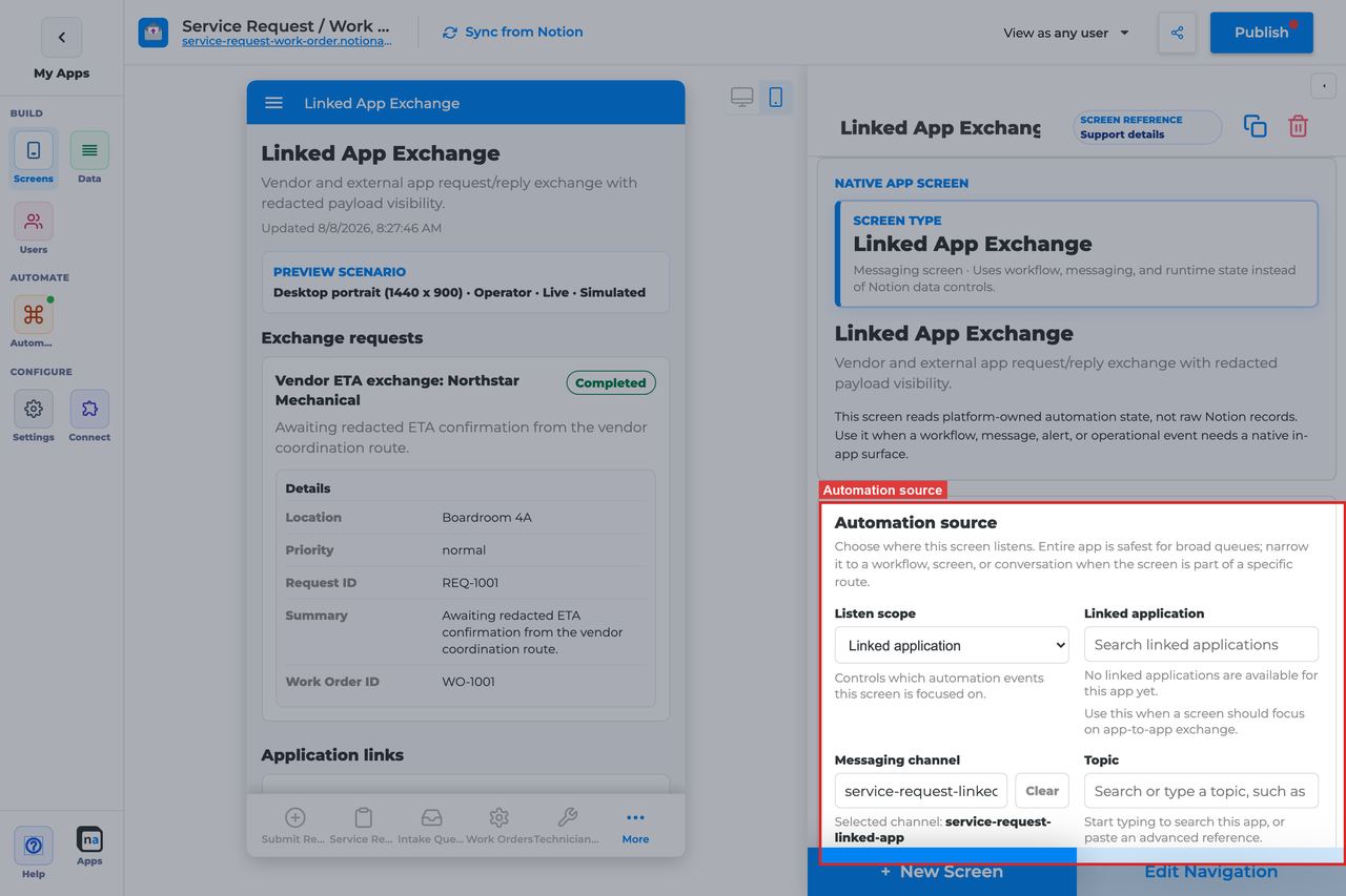
This section is the most important part of the screen. Linked App Exchange only works when it is pointed at the correct app and, when needed, the correct message context inside that app relationship.
#### Listen scope
**What it does:** Chooses the top-level source of exchange items shown on the screen.\
**How to use it:** Prefer **Linked application** for most real exchange desks. Use **Entire app** only for a broad integration oversight screen run by trusted admins.\
**Why / recommended default:** The practical default for this screen is **Linked application** even though broader scopes may exist. It keeps the screen tied to the specific partner app operators expect.
#### Source screen or form
**What it does:** Binds the screen to one local source surface when that scope is selected.\
**How to use it:** Use this only when the exchange is conceptually anchored to one intake surface in the current app.\
**Why / recommended default:** Most exchange desks are better defined by the linked app than by a local form.
#### Workflow
**What it does:** Filters exchange context to one workflow when **Specific workflow** is selected.\
**How to use it:** Use workflow scope if one integration flow is handled by a dedicated team.\
**Why / recommended default:** Workflow scope can help, but linked-app binding is usually the clearer starting point.
#### Messaging channel
**What it does:** Narrows exchange items to a particular channel.\
**How to use it:** Match the exact channel used by the app-to-app exchange route.\
**Why / recommended default:** Channel mismatch is one of the first things to check when an expected exchange never appears.
#### Topic
**What it does:** Filters the selected channel to a specific topic.\
**How to use it:** Use stable topics when one linked app sends several classes of exchange messages.\
**Why / recommended default:** Topic filtering is useful for clarity, but it can also hide items unexpectedly if names drift across environments.
#### Conversation or correlation
**What it does:** Limits the exchange desk to one case or one correlated handoff thread.\
**How to use it:** Use this only when the screen is embedded inside a specific case experience.\
**Why / recommended default:** Most exchange desks should stay reusable and broader than a single correlation.
#### Linked application
**What it does:** Binds the screen to the external NotionApps application participating in the exchange.\
**How to use it:** Choose the exact linked app that should feed this screen. Re-check the binding if you clone, relink, or rename the partner app.\
**Why / recommended default:** This is the defining setting for the screen. If the wrong linked app is selected, the desk will either be empty or show the wrong partner traffic.
### App audience and notification prefs
These app-level controls matter because cross-app exchange data can still be tenant-sensitive and role-sensitive, even when the items originate outside the current app.
#### Tenant mode
**What it does:** Decides whether exchange visibility is partitioned by tenant relation.\
**How to use it:** Use **Relation** when partner-specific or client-specific exchange data should stay isolated. Use **Off** only for simple single-tenant internal integration setups.\
**Why / recommended default:** Cross-app payloads can carry sensitive context, so tenant isolation is often the safer default.
#### Tenant field
**What it does:** Selects the Users-sheet relation that defines tenant membership.\
**How to use it:** Use the same tenant field the rest of the app already trusts.\
**Why / recommended default:** Consistency keeps access behavior predictable across internal and external runtime surfaces.
#### Role field
**What it does:** Tells the platform which field stores user roles when it is not named `Role`.\
**How to use it:** Set it only for custom user schemas.\
**Why / recommended default:** Integration desks are often restricted to specialized teams, so role mapping needs to be correct.
#### Notification categories
**What it does:** Maps notice categories to user preference fields.\
**How to use it:** Configure only the categories that matter for exchange-related alerts or follow-up notices.\
**Why / recommended default:** Clean policy makes it easier to understand who should be alerted about partner traffic.
#### Add notification category
**What it does:** Adds another category row to the app-level policy.\
**How to use it:** Add one only when the exchange system really uses it.\
**Why / recommended default:** Fewer categories are easier to govern.
#### Save audience policy
**What it does:** Saves tenant and category policy at the app level.\
**How to use it:** Save before testing linked-app visibility with another persona.\
**Why / recommended default:** Unsaved policy is a frequent cause of misleading access tests.
### Template setup state
This diagnostic section is especially useful after templates are cloned or linked apps are reconnected.
#### Setup state indicator
**What it does:** Reports whether the screen setup is provisioned, needs review, or has no setup report.\
**How to use it:** Treat **Needs review** as a sign to re-check the linked app binding and any channel or topic filters.\
**Why / recommended default:** Exchange screens depend on several bindings, so this quick health signal is valuable.
### Related context
This read-only panel helps makers locate neighboring screens, workflows, and channels connected to the exchange.
#### Related context panel
**What it does:** Shows discovery counts and related runtime objects.\
**How to use it:** Use it to find the partner-facing workflow, a related Conversation screen, or a follow-up Workflow Status page.\
**Why / recommended default:** Cross-app experiences are easier to maintain when makers can see their neighboring context.
### Visibility and access
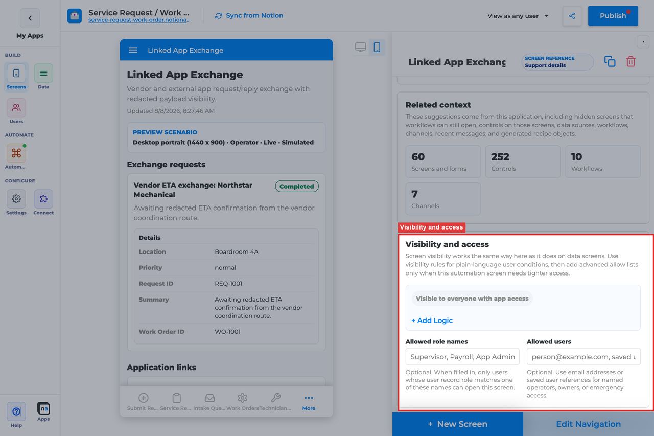
Linked App Exchange is usually an internal or partner-ops surface, so the audience should be explicit and narrow.
#### Visibility rules
**What it does:** Applies condition-based screen visibility.\
**How to use it:** Restrict the screen by role, tenant, or integration team membership.\
**Why / recommended default:** Exchange payloads often contain operational detail that ordinary users should not see.
#### Allowed role names
**What it does:** Adds a direct role allow list.\
**How to use it:** Use focused roles like `Integration, Operator, Admin`.\
**Why / recommended default:** A short role list is usually the clearest access model for exchange desks.
#### Allowed users
**What it does:** Grants access to specific named people.\
**How to use it:** Use this for pilots, partner-specific coordinators, or break-glass support.\
**Why / recommended default:** Named-user access is best kept exceptional.
### Display and action policy
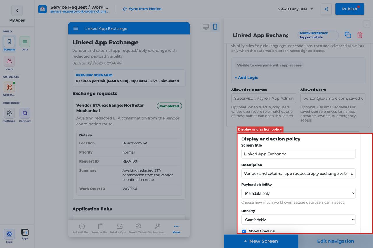
These settings control how much exchange detail operators see and whether the desk feels like a light inbox or a denser integration console.
#### Screen title override
**What it does:** Refines the live title.\
**How to use it:** Use language the operator team actually uses for the partner relationship or handoff.\
**Why / recommended default:** Clear terminology is important because "exchange" can mean different things to different teams.
#### Description
**What it does:** Sets the helper text under the title.\
**How to use it:** Explain whether users should inspect, acknowledge, or follow up on items from the linked app.\
**Why / recommended default:** Good copy reduces uncertainty about whether the desk is passive or actionable.
#### Payload visibility
**What it does:** Chooses whether users see metadata only, a redacted preview, or fuller payload detail.\
**How to use it:** Use **Redacted preview** for most operator desks and **Full payload** only when trusted integration users really need raw exchange content.\
**Why / recommended default:** Cross-app payloads can expose a lot of detail, so conservative visibility is usually the right default.
#### Density
**What it does:** Chooses comfortable or compact spacing.\
**How to use it:** Use **Comfortable** for occasional operators and **Compact** for specialized teams who monitor exchange volume all day.\
**Why / recommended default:** Comfortable layouts reduce operator error when the payload structure is unfamiliar.
#### Show timeline
**What it does:** Shows related audit and runtime history around the exchange item.\
**How to use it:** Leave **On** when users need to understand when the handoff happened, who acknowledged it, or whether a downstream step followed.\
**Why / recommended default:** Timeline context is often useful in integration work because timing and sequence matter.
#### Require claim before action
**What it does:** Exists in the shared policy section, but Linked App Exchange does not use claim behavior in its default action model.\
**How to use it:** Leave it **Off**.\
**Why / recommended default:** The standard exchange action is acknowledgement, not claiming ownership.
### Available actions
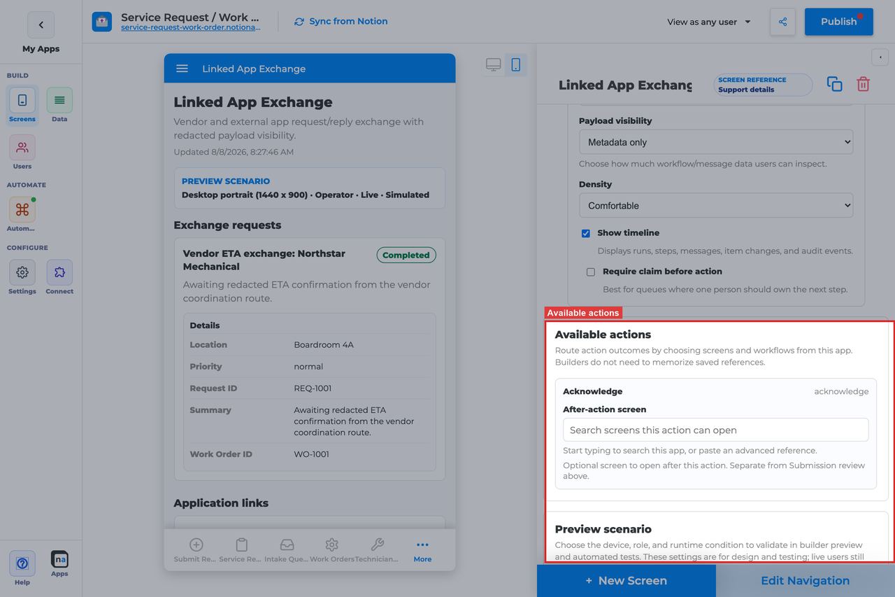
This screen intentionally keeps the action model light. In most cases, the main operator action is to acknowledge that the cross-app payload has been seen or processed.
#### Acknowledge
**What it does:** Marks the linked-app exchange item as acknowledged.\
**How to use it:** Keep Acknowledge enabled when operators need to record that they reviewed or accepted the handoff.\
**Why / recommended default:** Acknowledge is usually the right default because it adds traceability without turning the screen into a full queue.
#### After-action screen
**What it does:** Routes the user to another screen after acknowledgement.\
**How to use it:** Use Workflow Status or Conversation only when the handoff naturally leads to a next step in the same app. Otherwise leave the user on the exchange desk.\
**Why / recommended default:** Staying on the exchange desk is often least surprising, especially for teams processing several handoffs in a row.
#### Target workflow
**What it does:** Supplies a workflow target for custom launch or escalation actions if you add them later.\
**How to use it:** Leave it blank on the standard screen unless an added action truly starts another workflow.\
**Why / recommended default:** Unused workflow targets add complexity without helping operators.
### Preview scenario
Preview controls help you confirm that the linked-app context is understandable before the first real partner handoff arrives.
#### Device and orientation
**What it does:** Changes the preview frame across desktop, tablet, and mobile sizes.\
**How to use it:** Check the device your operators actually use, then validate mobile if exchange work may happen away from a desk.\
**Why / recommended default:** Payload-heavy integration screens can break more easily on smaller layouts.
#### Test persona
**What it does:** Simulates the viewer role.\
**How to use it:** Test with the actual integration or operator persona rather than only with Admin.\
**Why / recommended default:** Persona testing catches visibility issues that are especially common on restricted operational screens.
#### Preview state
**What it does:** Simulates states such as Live, Empty, Loading, and Error.\
**How to use it:** Check **Live** for payload readability and **Empty** to ensure the screen still feels intentional before the first linked-app route is connected.\
**Why / recommended default:** The empty state matters because builders often configure this screen before the integration is fully active.
#### Test mode
**What it does:** Switches between simulated preview and live testing.\
**How to use it:** Use live testing once the linked app is connected so you can verify the real binding and acknowledgement path.\
**Why / recommended default:** Simulation helps with layout, but live exchange testing is what proves the linkage works.
### Empty state and sample data
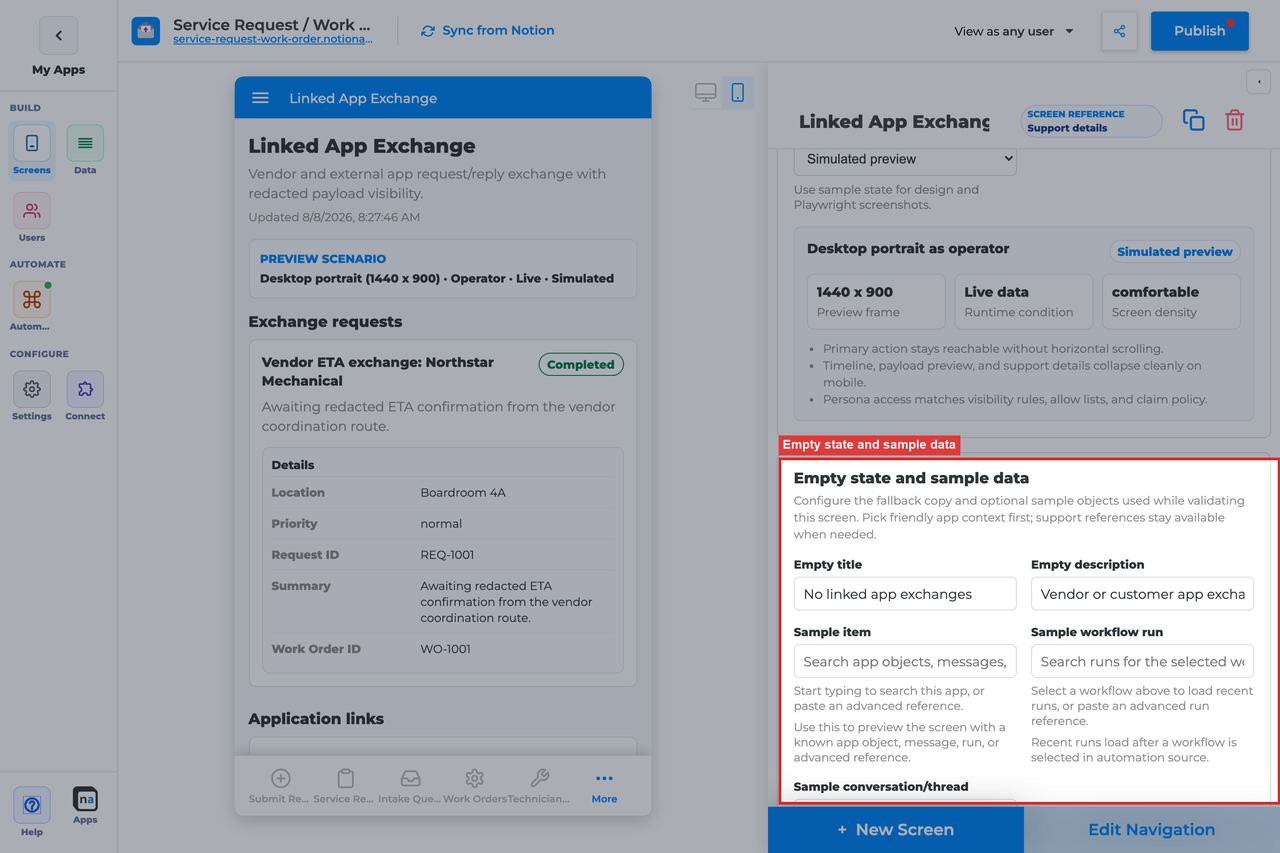
A new integration desk is often empty at first, so the empty state should reassure users that the connection is simply quiet.
#### Empty title
**What it does:** Sets the headline shown when no exchange items match.\
**How to use it:** Keep the default `No linked app exchanges` unless your team uses a more specific phrase like `No partner handoffs`.\
**Why / recommended default:** The default is accurate and easy to understand.
#### Empty description
**What it does:** Explains when exchange items will appear.\
**How to use it:** Keep or adapt the default `Linked app activity appears here after an app-to-app route is connected.`\
**Why / recommended default:** Helpful empty copy prevents operators from assuming the integration is broken before any traffic exists.
#### Sample item, run, or conversation
**What it does:** Provides builder-only sample references for preview and QA.\
**How to use it:** Use realistic cross-app payloads so you can validate the acknowledgement pattern and payload visibility before a real partner starts sending traffic.\
**Why / recommended default:** Thin or fake samples often hide exactly the field-length and timing issues that show up first in production.
## Recommended Default Setup
| Setting | Recommended value |
| ------------------ | ------------------------------------------------------------------ |
| Listen scope | Linked application (select the linked app; optional channel/topic) |
| Visibility | Operator / Integration / Admin |
| Payload visibility | Redacted preview |
| Show timeline | On |
| Actions | Acknowledge |
## Common Configuration Patterns
### Two-app handoff inbox
Linked application scope + Acknowledge.
### Integration audit view
Entire app for admins; Full payload for trusted operators.
## Testing Checklist
* [ ] Send a linked-app message and confirm it appears.
* [ ] Acknowledge and confirm state updates.
* [ ] Confirm the wrong linked app binding shows empty.
## Troubleshooting
### No exchanges
Linked application not selected, apps not linked, or channel/topic mismatch.
### Cannot acknowledge
Action missing or user lacks access.
## Best Practices
* Configure **Linked App Exchange** for one clear user job.
* Prefer the narrowest listen scope that still shows the right work.
* Keep payload visibility conservative for broad audiences.
* Test as an allowed user and a blocked user before publish.
* Pair related screens (Decision + Conversation + Workflow Status + Notification Center) instead of overloading one screen.
# Operator Console Screen
> Current state: this native screen is part of **Automation**. It is entitlement-gated, uses NotionApps runtime state instead of ordinary Notion data controls, and should be tested with realistic workflow or messaging activity before a maker relies on it in production.
The **Operator Console** screen is a high-level operational dashboard for runs, queue depth, failures, messages, and audit activity.
Think of this screen as **A cockpit for app owners and operators — mostly read-only oversight.**

## Who This Guide Is For
This guide is for makers configuring an **Operator Console** screen in the app builder. It lists every builder option available on the screen and explains how to use each one.
Use this guide when:
* Owners need a single place to monitor automation health.
* Support needs queue depth, failures, and recent activity at a glance.
## What The Screen Is For
### Use Operator Console when
* Owners need a single place to monitor automation health.
* Support needs queue depth, failures, and recent activity at a glance.
### Do not use it when
* Day-to-day claiming of work — use Work Queue.
* Approving items — use Decision.
* Deep run debugging for one process — use Workflow Status / Exception Resolution.
## What Users See In The Live App
* Operational summary cards (runs, failures, queue pressure, messaging activity).
* Recent audit / activity when timeline is enabled.
* Read-only by default (no claim/complete/decision buttons).
| Default | Value |
| ------------------------------- | --------------------------------------------------------------------------- |
| Default listen scope | Entire app |
| Require claim before action | Off (not used) |
| Default preview persona / state | Operator / Live |
| Empty title | No operations data yet |
| Empty description | Workflow, messaging, and automation activity appears after the app is used. |
## Required Foundations
| Requirement | Why it matters |
| ------------------------------------------ | --------------------------------------------------------------- |
| Automation screen entitlement | Operator Console appears in the Automation / Operational group. |
| Workflow and Messaging | Primary foundation for this screen’s runtime state. |
| Private app + Users database (recommended) | Role/tenant visibility and audience policy need user fields. |
## Complete Builder Options Reference
The sections below follow the builder order. Each option is explained in prose so makers can configure an operator-facing oversight surface that stays readable, appropriately restricted, and intentionally read-only.
### Header and screen type
This section defines the console at a glance. Operator Console should feel like a high-level monitoring cockpit, not a work queue and not a single-run detail page.
#### Screen type
**What it does:** Sets the native behavior to **Operator Console**, which renders aggregate operational runtime state instead of ordinary data rows or direct action items.\
**How to use it:** Keep the screen type as Operator Console. Pair it with Workflow Status, Work Queue, or Exception Resolution for the action screens that sit beside it.\
**Why / recommended default:** The console works best as oversight. Trying to turn it into the place where everything also gets done usually makes it harder to monitor anything well.
#### Category
**What it does:** Places the screen in the native Automation or Operational grouping.\
**How to use it:** Keep the built-in grouping and position the console near the top-level operations navigation.\
**Why / recommended default:** Clear organization helps the console serve as the entry point for operators.
#### Title
**What it does:** Sets the user-facing title shown in navigation and on the page.\
**How to use it:** Use names like `Operator console`, `Operations overview`, or `Automation health`.\
**Why / recommended default:** The title should signal oversight and monitoring, not case-by-case work.
#### Description
**What it does:** Adds helper text beneath the title.\
**How to use it:** Explain that the screen shows overall runs, failures, queue pressure, and recent activity.\
**Why / recommended default:** Good description text helps first-time users understand why they are here before they go deeper elsewhere.
### Automation source
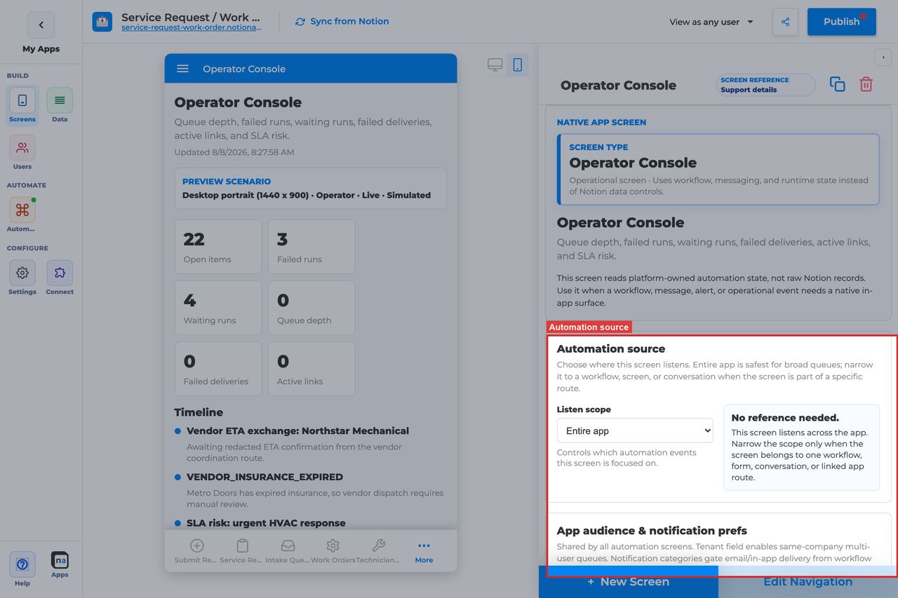
This section decides how broad the console is. Most consoles start broad because they are meant to show app-wide health, but focused consoles also make sense for large apps with several operating teams.
#### Listen scope
**What it does:** Chooses the high-level runtime source shown in the console.\
**How to use it:** Use **Entire app** for a true top-level operations console. Use **Specific workflow** when one team only needs oversight for one process family.\
**Why / recommended default:** Entire app is the usual default because the screen is meant for overview. Narrower scope becomes useful when the app is large enough that one console would otherwise be noisy.
#### Source screen or form
**What it does:** Binds the console to one local source surface when that scope is selected.\
**How to use it:** Use this only when one intake area needs its own localized operational view.\
**Why / recommended default:** Most consoles are broader than one intake surface.
#### Workflow
**What it does:** Filters the console to one workflow when **Specific workflow** is selected.\
**How to use it:** Pick the published workflow the operator team owns.\
**Why / recommended default:** A workflow-specific console can be much easier to read than an app-wide one in large, busy apps.
#### Messaging channel
**What it does:** Narrows the messaging-related operational view to one channel.\
**How to use it:** Use it only when operators need to monitor one message stream closely.\
**Why / recommended default:** Channel filtering is optional and should reflect a real operations use case, not habit.
#### Topic
**What it does:** Narrows message-linked context to one topic.\
**How to use it:** Use it when the operator team only cares about a specific class of events within a channel.\
**Why / recommended default:** Topic filtering can reduce noise, but it can also hide important signals if applied too early.
#### Conversation or correlation
**What it does:** Limits the console to one case or one thread context.\
**How to use it:** Use this only for embedded oversight inside a case-specific experience.\
**Why / recommended default:** Most operator consoles should remain broad and reusable.
#### Linked application
**What it does:** Binds the console to a linked NotionApps application when ops teams need cross-app oversight.\
**How to use it:** Choose it only when partner-app traffic is a meaningful part of what the console should show.\
**Why / recommended default:** Cross-app scope can be powerful, but it is not the standard starting point.
### App audience and notification prefs
These app-level settings matter because the console is often one of the most privileged screens in the app and may still need to respect tenant and role boundaries.
#### Tenant mode
**What it does:** Decides whether operational visibility is isolated by tenant relation.\
**How to use it:** Use **Relation** when delegated operators should only see their own tenant's activity. Use **Off** only for truly centralized or single-tenant internal ops.\
**Why / recommended default:** Broad ops visibility is not always appropriate. Tenant-aware consoles are safer in shared portal environments.
#### Tenant field
**What it does:** Selects the Users-sheet relation that defines tenant membership.\
**How to use it:** Use the same tenant field the rest of the app relies on.\
**Why / recommended default:** Consistency prevents the console from being the one screen that behaves unexpectedly.
#### Role field
**What it does:** Tells the platform which field stores a user's role when it is not named `Role`.\
**How to use it:** Set it only for custom user schemas.\
**Why / recommended default:** Role-driven console access depends on this being correct.
#### Notification categories
**What it does:** Maps categories to user preference fields for the wider app-level notice system.\
**How to use it:** Configure only the categories that really matter to the operations audience.\
**Why / recommended default:** Clean policy keeps the broader operational experience easier to reason about.
#### Add notification category
**What it does:** Adds another category row.\
**How to use it:** Add one only when a real notification pathway exists.\
**Why / recommended default:** Unused categories increase policy complexity without adding value.
#### Save audience policy
**What it does:** Saves tenant and category policy at the app level.\
**How to use it:** Save before retesting console visibility as another persona.\
**Why / recommended default:** Unsaved policy can make a healthy console look broken.
### Template setup state
This diagnostic section is especially helpful after templates are cloned or demo apps are repaired.
#### Setup state indicator
**What it does:** Reports whether the native screen bindings are provisioned, need review, or have no setup report.\
**How to use it:** Treat **Needs review** as a prompt to re-check the broad operational bindings before trusting the console.\
**Why / recommended default:** A console with broken bindings can look deceptively calm because "nothing is happening" is also a valid quiet state.
### Related context
This read-only panel helps you find the screens and workflows operators may need when they leave the console to investigate.
#### Related context panel
**What it does:** Shows discovery counts and related runtime objects.\
**How to use it:** Use it to locate Workflow Status, Exception Resolution, Work Queue, and messaging surfaces that belong with the console.\
**Why / recommended default:** Strong operational navigation starts with knowing what related surfaces already exist.
### Visibility and access

Operator Console should usually be restricted to admins and operators. It is a broad operational window into the app.
#### Visibility rules
**What it does:** Applies condition-based screen visibility.\
**How to use it:** Restrict the screen with role, tenant, or team-based conditions so only the right operators can open it.\
**Why / recommended default:** Broad visibility here can reveal more operational detail than many teams realize.
#### Allowed role names
**What it does:** Adds a direct role allow list.\
**How to use it:** Use focused roles like `Operator, Admin, Support Lead`.\
**Why / recommended default:** A short role list is usually the clearest access model for a console.
#### Allowed users
**What it does:** Grants access to specific named people.\
**How to use it:** Use for pilots or named operational owners, not as the long-term primary access model.\
**Why / recommended default:** Individual exceptions are best kept rare and deliberate.
### Display and action policy
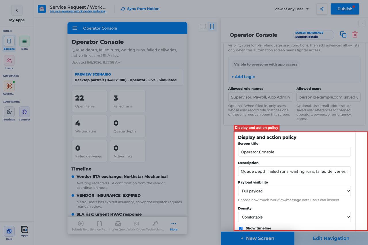
This is one of the most important sections on the screen because the console's value depends on seeing the right level of detail without overwhelming the operator.
#### Screen title override
**What it does:** Refines the live title.\
**How to use it:** Use language that signals a top-level operations view, not a case or queue view.\
**Why / recommended default:** The title should set the user's mental model before they start drilling into details elsewhere.
#### Description
**What it does:** Sets the helper text beneath the title.\
**How to use it:** Explain that the screen provides high-level health, activity, and audit visibility.\
**Why / recommended default:** This helps users understand that the console is primarily for monitoring.
#### Payload visibility
**What it does:** Controls whether the console shows metadata only, a redacted preview, or fuller payload detail.\
**How to use it:** Use **Redacted preview** for most internal consoles and **Full payload** only when a trusted operator team truly needs that depth. Use **Metadata only** if the audience is broader or more executive-facing.\
**Why / recommended default:** Payload detail drives the difference between a safe overview and an overexposed ops screen. Conservative defaults age better.
#### Density
**What it does:** Chooses comfortable or compact spacing for the console.\
**How to use it:** Use **Compact** for dense operator monitoring and **Comfortable** when the audience is broader or less technical.\
**Why / recommended default:** Compact is often a strong choice here because operators usually value more information on screen, but only if readability stays intact.
#### Show timeline
**What it does:** Shows recent activity and audit history in the console.\
**How to use it:** Leave **On** when you want the console to show recent operational movement instead of only static summary tiles.\
**Why / recommended default:** Timeline visibility is often what turns the console from a passive dashboard into a useful triage surface.
#### Require claim before action
**What it does:** Exists in the shared policy section, but Operator Console does not use claim behavior in its default model.\
**How to use it:** Leave it **Off**.\
**Why / recommended default:** The console is read-only by default, so claim settings do not normally change behavior.
### Available actions
Operator Console is read-only by default. That is the expected setup for most maker-built consoles.
#### Default action set
**What it does:** Ships with no claim, complete, or decision actions in the standard registry setup.\
**How to use it:** Keep the console read-only and use navigation to direct operators into the right action screens when they need to go deeper.\
**Why / recommended default:** Read-only design is what lets the console safely summarize a lot of information for a trusted audience.
#### After-action screen
**What it does:** Exists only if you later add custom actions.\
**How to use it:** Most makers leave it unused. If you add actions later, route users into a more focused operational screen such as Workflow Status or Exception Resolution.\
**Why / recommended default:** Blank is the normal default because the console is not primarily an action surface.
#### Target workflow
**What it does:** Supplies a workflow binding for custom actions if you add them later.\
**How to use it:** Leave it empty on the standard read-only console.\
**Why / recommended default:** Unused bindings add maintenance overhead without improving the screen.
### Preview scenario
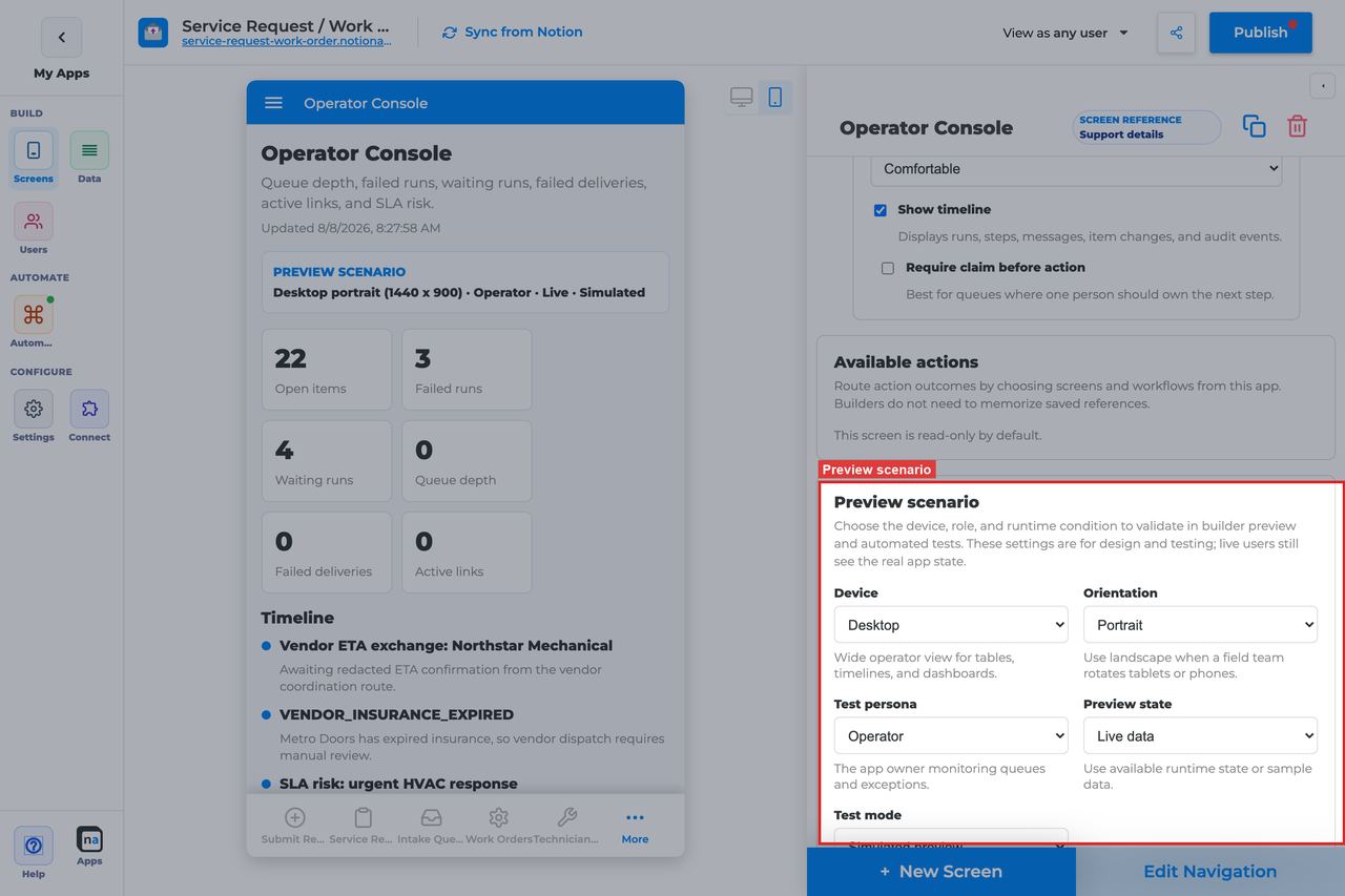
Preview controls help you validate the console's readability and make sure the empty state does not masquerade as healthy operations.
#### Device and orientation
**What it does:** Changes the preview frame across desktop, tablet, and mobile sizes.\
**How to use it:** Check the main operator device first, then validate mobile if leadership or support may glance at the console on phones.\
**Why / recommended default:** Dense overview screens are especially sensitive to smaller layouts.
#### Test persona
**What it does:** Simulates the viewer role.\
**How to use it:** Test as the real operator or admin role that will use the console.\
**Why / recommended default:** Persona testing catches access and visibility issues before publish.
#### Preview state
**What it does:** Simulates states such as Live, Empty, Loading, and Error.\
**How to use it:** Check **Live** for information density and **Empty** to make sure a quiet system still reads clearly.\
**Why / recommended default:** The default preview state is **Live**, but quiet periods are normal on some consoles, so the empty state deserves equal attention.
#### Test mode
**What it does:** Switches between simulated preview and live runtime testing.\
**How to use it:** Use live testing with real automation activity before publish so you can verify that the console is not silently too narrow.\
**Why / recommended default:** Only a live test confirms that the data volume and scope feel right.
### Empty state and sample data
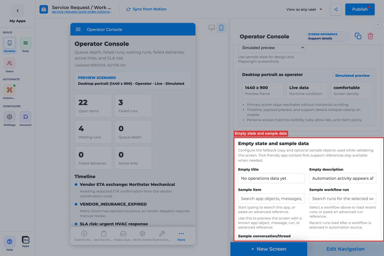
A broad console can be quiet when an app is new or traffic is low. The empty state should make that calm understandable.
#### Empty title
**What it does:** Sets the headline shown when no operational data matches.\
**How to use it:** Keep the default `No operations data yet` unless your team uses more specific operational wording.\
**Why / recommended default:** The default clearly signals low or absent activity, not a rendering failure.
#### Empty description
**What it does:** Explains when data will begin to appear.\
**How to use it:** Keep or adapt the default `Workflow, messaging, and automation activity appears after the app is used.`\
**Why / recommended default:** This copy helps new operators understand that an empty console can be expected in fresh apps.
#### Sample item, run, or conversation
**What it does:** Provides builder-only sample references for preview and QA.\
**How to use it:** Use samples with a mix of success, backlog, and failure signals so you can judge whether the console is actually useful.\
**Why / recommended default:** Thin sample data can make any console look good. Realistic samples show whether the overview still works once the app gets busy.
## Recommended Default Setup
| Setting | Recommended value |
| ------------------ | --------------------------- |
| Listen scope | Entire app |
| Visibility | Admin / Operator only |
| Payload visibility | Redacted preview |
| Show timeline | On |
| Density | Compact for dense ops views |
| Actions | None |
## Common Configuration Patterns
### Owner morning console
Entire app, Admin/Operator, compact, timeline on.
### Support triage hub
Pair with Exception Resolution and Work Queue links in navigation.
## Testing Checklist
* [ ] Generate workflow, queue, and notification activity and confirm console populates.
* [ ] Confirm non-operators cannot open the screen.
* [ ] Confirm empty state before first activity.
## Troubleshooting
### Always empty
App has no automation traffic yet, or visibility restricts the viewer.
### Too noisy
Narrow listen scope or reduce payload visibility.
## Best Practices
* Configure **Operator Console** for one clear user job.
* Prefer the narrowest listen scope that still shows the right work.
* Keep payload visibility conservative for broad audiences.
* Test as an allowed user and a blocked user before publish.
* Pair related screens (Decision + Conversation + Workflow Status + Notification Center) instead of overloading one screen.
# Everyday Chrome Screens
Index. Long per-screen guides already exist on the live site and in repo `docs/everyday-chrome-screens/`. Paste those guides under these URLs. Do not use `/queue-and-activity-screens/` (redirect stubs).
| Screen | URL |
| -------- | ---------------------------------------------------------------------------------------------------------------- |
| Home | [home](https://docs.notionapps.com/screens-and-components/types-of-screens/everyday-chrome-screens/home) |
| Search | [search](https://docs.notionapps.com/screens-and-components/types-of-screens/everyday-chrome-screens/search) |
| My Queue | [my-queue](https://docs.notionapps.com/screens-and-components/types-of-screens/everyday-chrome-screens/my-queue) |
| Activity | [activity](https://docs.notionapps.com/screens-and-components/types-of-screens/everyday-chrome-screens/activity) |
| Profile | [profile](https://docs.notionapps.com/screens-and-components/types-of-screens/everyday-chrome-screens/profile) |
My Queue is a personal feed. Automation **Work Queue** is a different screen — see the Types of Screens Work Queue guide.
# Home
The **Home / Today** screen is the Everyday chrome landing surface. Its job is to answer one question quickly: *what should this user do next?* It does that with a built-in recent activity feed, a configurable primary CTA, and a clean empty state when nothing is waiting.
Use `Home` when you want the app to feel guided on first open. It is especially useful in private apps where users should land on a clear starting point instead of a random data screen.
{% hint style="info" %}
**Who this guide is for**\
Makers adding a Home hub so end users land on next actions instead of a raw list or form. This guide explains every Home builder option in prose, including the related setup that happens outside the small chrome config panel.
{% endhint %}
## What the screen is for
### Use Home when
* Users need a daily starting point
* You want one obvious next-step button
* Users should see recent activity without opening the full `Activity` screen
### Do not use it when
* You need a full Notion record list: use a **List** screen
* You need a shared claim-and-complete desk: use **Work Queue**
* You need a personal workflow inbox: use **My Queue**
* You need an operations health surface: use **Operator Console**
Good examples include a service app that lands on `Submit request`, an onboarding portal that starts with `Begin intake`, or an automation-heavy app that opens with an `Automation Launcher`.
## What users see in the live app
When Home has content, the runtime can show:
* The screen title and description
* A large primary CTA button when a target screen is configured
* A recent activity section populated from the end-user activity feed
When there is no activity and no CTA, users see the empty state instead.
| Default | Value |
| ------------------ | ------------------------------------------------ |
| Display title | Home |
| Empty title | Nothing waiting today |
| Empty description | Assigned work and queue items will show up here. |
| Empty action label | Get started |
| Primary CTA screen | None |
| Entitlement | None |
## Add Home in the builder
1. Open **Screens → + New Screen**.
2. Choose a Notion database as the context anchor.
3. Under **Everyday chrome**, select **Home / Today**.
4. Click **Done**.
5. Configure the empty-state fields and, if needed, the primary CTA.
6. Place Home in navigation, usually first.
7. Publish before live testing.


## Complete Builder Options Reference
Home uses the lightweight chrome config panel. That panel is intentionally small, so the important setup is a combination of the visible fields, a few built-in defaults from the registry, and some builder actions outside the panel.
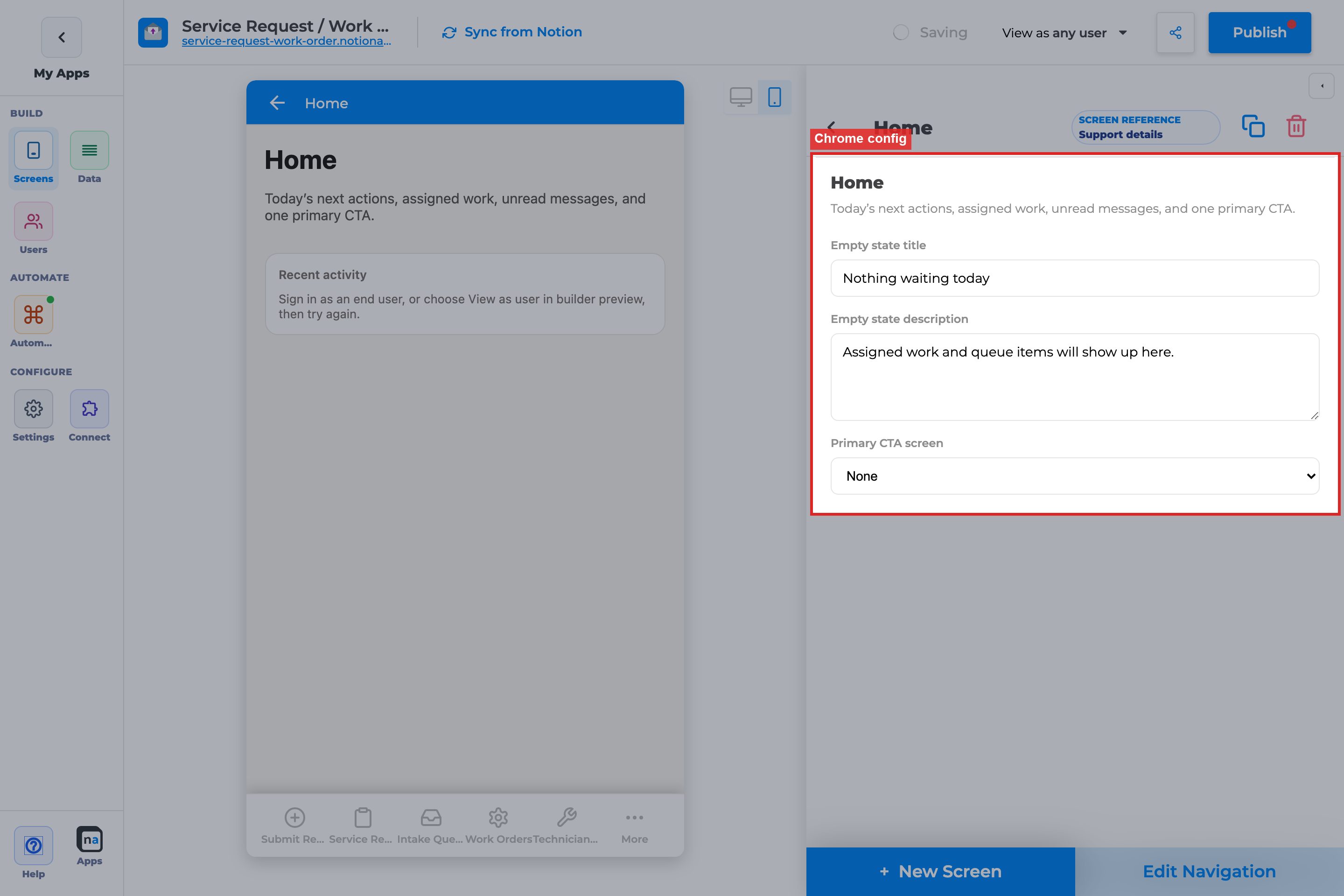
### Screen identity
This section explains the parts that define what Home is before you customize the copy.
#### Screen type
**What it does:**\
This identifies the screen as `Home` and tells the runtime to load Home behavior: recent activity plus an optional primary CTA.
**How to use it:**\
You choose `Home / Today` from the picker when you create the screen. After that, treat the behavior as fixed. If you really need a search surface or a settings surface, add `Search` or `Profile` instead of trying to stretch Home into a different role.
**Why / recommended default:**\
Home works best when it stays focused on orientation and next steps. A common mistake is expecting it to behave like a list or a queue desk, which makes the screen feel too thin for the job.
#### Title and description defaults
**What it does:**\
Home starts with built-in display text from the chrome registry. The runtime uses that text for the screen’s hero area.
**How to use it:**\
Keep the label short and user-facing. `Home` and `Today` are both good. If you rename the screen elsewhere in the builder, use language the end user would understand immediately.
**Why / recommended default:**\
The landing screen should feel universal and calm. A common mistake is naming it after an internal team, process, or sheet, which makes the app feel like builder scaffolding instead of product UX.
### Empty state
These fields control what the user sees when Home has nothing to show yet. That includes a brand-new app, a quiet moment in the day, or a setup where no recent activity exists yet.
#### Empty state title
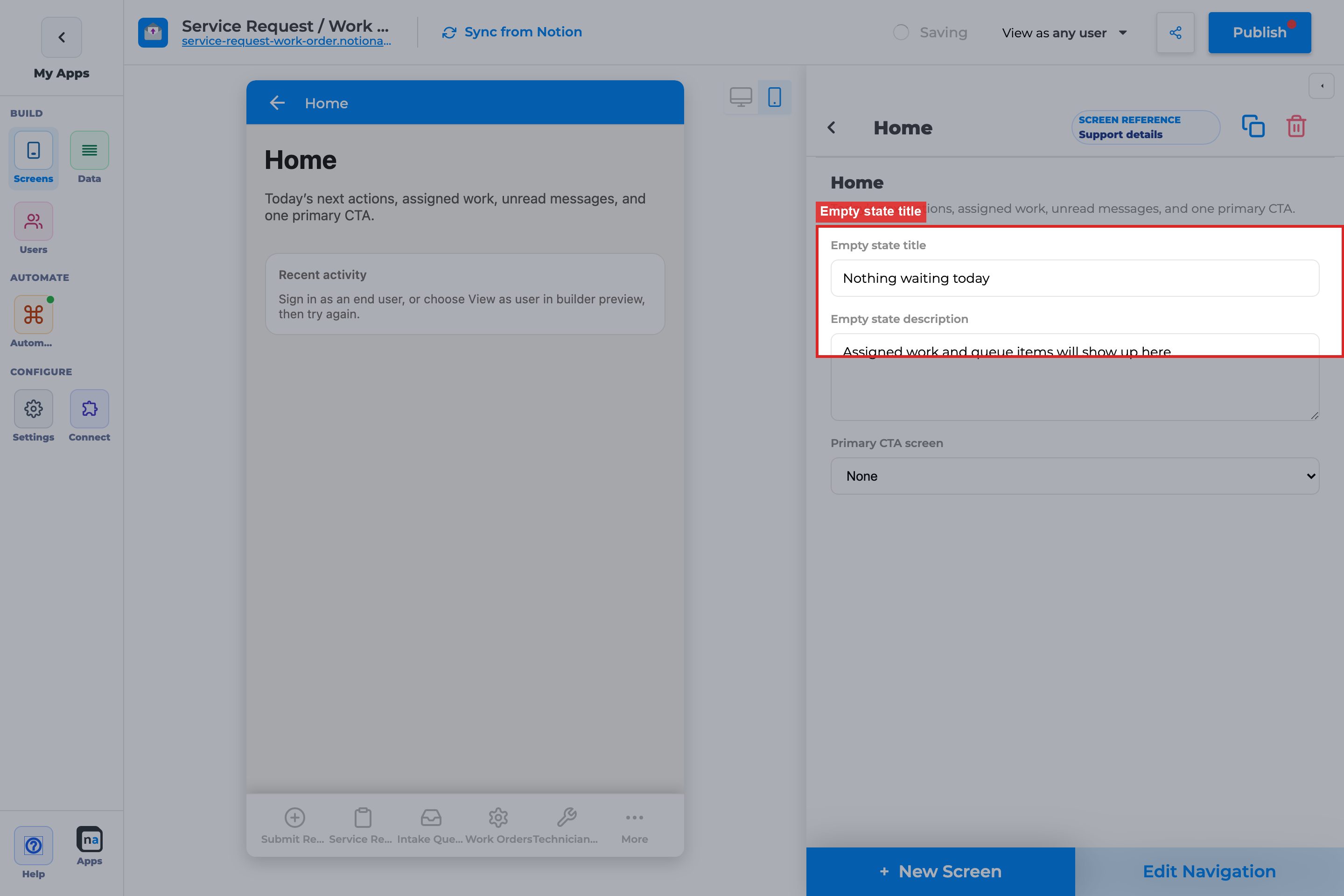
**What it does:**\
This is the headline shown when Home has no recent activity and no CTA content to display.
**How to use it:**\
Use a reassuring sentence such as `Nothing waiting today`. The title should tell the user the state is normal, not broken.
**Why / recommended default:**\
Most apps will hit this state during QA or quieter periods. A calm title keeps the experience trustworthy. A common mistake is using technical wording like `No records found`, which sounds like a failed search instead of a healthy dashboard.
#### Empty state description

**What it does:**\
This describes what will eventually appear on Home when the app becomes active.
**How to use it:**\
Tell users what kinds of items belong here, such as assigned work, queue items, or recent updates. Keep it plain-language and short enough to read quickly on mobile.
**Why / recommended default:**\
The description is your chance to teach the screen’s purpose. The recommended default is the registry text, because it already explains the screen without over-promising. A common mistake is writing generic filler copy that does not tell users what Home is for.
#### Empty action label
**What it does:**\
This is the label the runtime uses for the Home CTA button. By default, Home uses `Get started`.
**How to use it:**\
Know that this value comes from the registry default and is often **not editable in the panel**. In practice, you usually shape the CTA experience by choosing the right target screen, not by trying to rename the button in this config.
**Why / recommended default:**\
`Get started` is a safe default because it works for many first actions. The common mistake is assuming the button label is a fully configurable field when the more important setup choice is the destination screen.
### Home-only action
This is the one builder control that is unique to Home.
#### Primary CTA screen
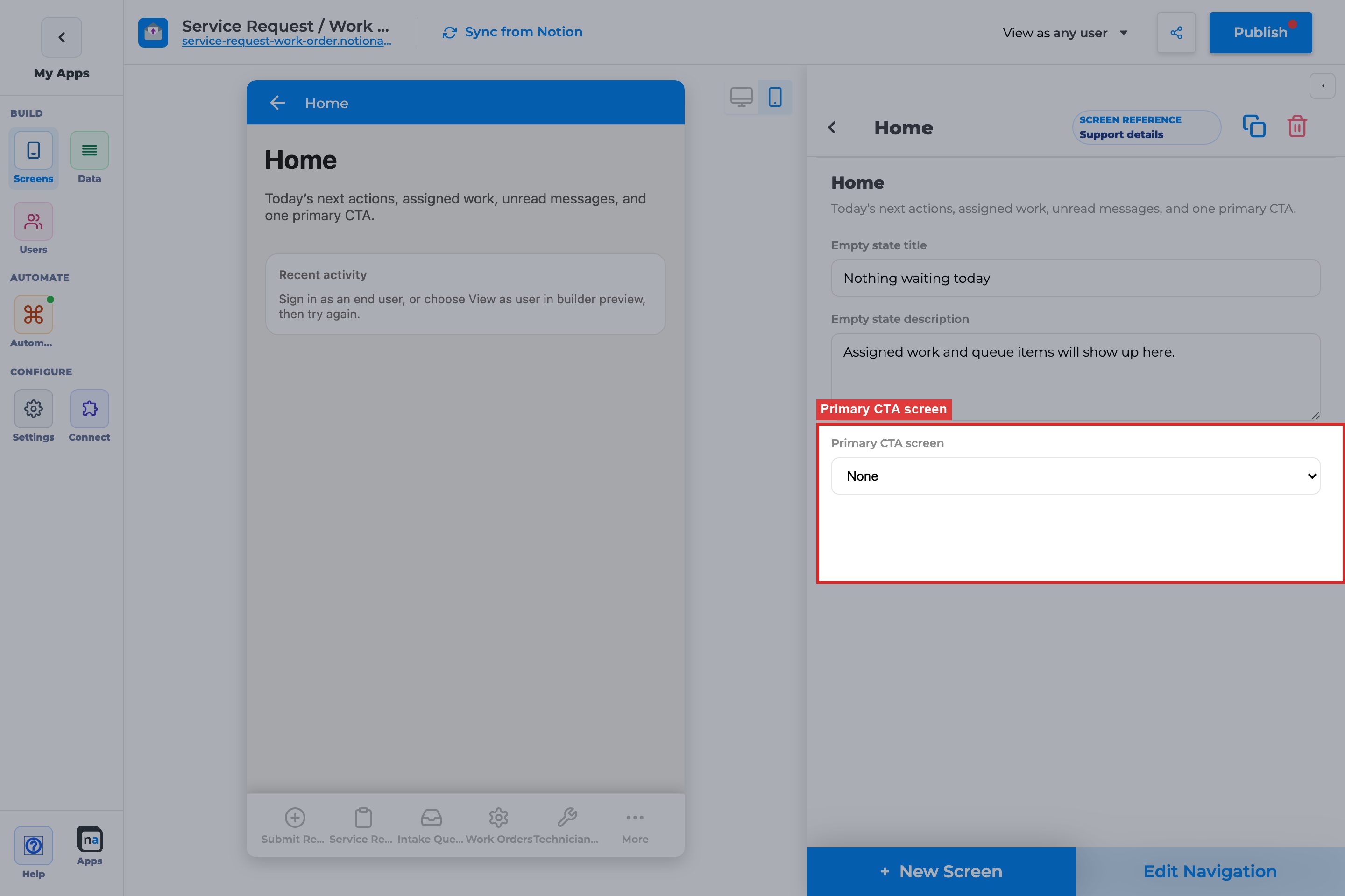
**What it does:**\
This tells Home which screen to open when the user taps the main CTA button.
**How to use it:**\
Point it at the action users perform most often. In the current picker, the practical choices are `Create Form` screens and `Automation Launcher` screens. Leave it blank only if you intentionally want Home to be passive and informational.
**Why / recommended default:**\
The recommended default is to set this to the most common starting action in the app. That makes Home immediately useful. A common mistake is pointing it to a secondary flow or leaving it unset, which makes the landing screen feel incomplete.
{% hint style="success" %}
**Maker tip**\
If you can only pick one strong action for Home, choose the form or launcher users open most often. Home should reduce hesitation, not present a menu of competing options.
{% endhint %}
### Related setup outside chrome config
Home only works well when you also set up navigation, publish flow, and preview correctly.
#### Edit Navigation
**What it does:**\
This determines whether Home appears in the app’s main navigation and where it sits relative to other screens.
**How to use it:**\
Put Home first in side navigation or the first primary tab in most private apps. If the app has role-based shells, make sure each audience still has an obvious landing surface.
**Why / recommended default:**\
Home is the most natural landing destination for many apps. The common mistake is adding Home but burying it behind other screens, which weakens the whole point of having a landing hub.
#### Publish
**What it does:**\
This pushes the Home configuration into the live app so end users can actually use it.
**How to use it:**\
Publish after checking the CTA target and empty-state copy in preview. If the CTA points to a newly added form or launcher, make sure that target screen is also published.
**Why / recommended default:**\
A Home CTA that works in builder but not live is usually a publish gap, not a Home bug. The common mistake is testing half-configured navigation or unpublished targets.
#### View as user
**What it does:**\
This lets you preview Home as a real end-user persona rather than only as the maker.
**How to use it:**\
Use `View as user` when testing private apps, especially if recent activity, permissions, or role-based screen visibility could change what appears.
**Why / recommended default:**\
Home is identity-sensitive because the activity feed is user-contextual. A common mistake is validating Home only as the maker and missing that another role sees no CTA, the wrong activity, or a different landing flow.
#### Navigation and publish as separate concerns
**What it does:**\
These are not the same step. Navigation decides whether the screen is reachable. Publish decides whether live users can see the latest version.
**How to use it:**\
Treat both as required steps. First place Home in navigation, then publish, then test the published result.
**Why / recommended default:**\
Many “Home is missing” or “Home did not update” reports come from skipping one of these steps. The common mistake is fixing copy in the panel and assuming users will see it immediately.
## Recommended default setup
| Setting | Recommended value |
| ----------------------- | ------------------------------------------------ |
| Empty state title | Nothing waiting today |
| Empty state description | Assigned work and queue items will show up here. |
| Primary CTA screen | Main `Create Form` or `Automation Launcher` |
| Navigation | First primary screen |
## Testing checklist
* [ ] Home appears in navigation after publish, because placement is separate from creation
* [ ] The empty-state title and description read clearly on phone and desktop, because Home is often a first impression
* [ ] The primary CTA opens the intended `Create Form` or `Automation Launcher`
* [ ] Recent activity appears after a real submit, message, or decision so the feed is proven, not assumed
* [ ] The activity feed does not expose items a different user should not see
* [ ] `View as user` confirms the right landing experience for each persona
## Troubleshooting
| Symptom | Likely cause | What to check |
| ------------------------------------- | --------------------------------------------- | ------------------------------------------------------------------------ |
| Home always looks empty | No recent activity and no CTA target | Submit a test record and confirm `Primary CTA screen` is set |
| CTA button is missing | No target screen selected | Pick a `Create Form` or `Automation Launcher` |
| CTA appears but opens the wrong place | Wrong target screen configured | Recheck which screen ID was selected in the Home config |
| Users do not land on Home by default | Navigation order or Profile prefs override it | Put Home first in navigation and confirm user landing prefs in `Profile` |
| Maker sees content but users do not | Persona / auth difference | Re-test with `View as user` |
## Best practices
* Keep Home focused on one next step, not many competing actions.
* Pair Home with `Profile` so users can later choose a different landing screen if needed.
* Use `My Queue` or `Activity` for deeper workflow surfaces instead of overloading Home.
# Search
The **Search** screen gives end users one place to look across the app’s linked databases. Instead of opening several lists and guessing where a record lives, users can search by keyword, revisit recent searches, and open matching records directly from the results.
Use `Search` when browsing is too slow and the user’s real job is “I know roughly what I’m looking for, help me find it.” This is especially valuable in apps that span multiple sheets.
{% hint style="info" %}
**Who this guide is for**\
Makers whose users search across multiple databases and need one predictable lookup surface. This guide explains every Search option in prose, including the partially exposed scope behavior that the runtime already supports.
{% endhint %}
## What the screen is for
### Use Search when
* Users need to find a request, asset, order, client, or task by keyword
* Users repeat common lookups and benefit from recent searches
* Search results should open the matching record screen
### Do not use it when
* You only need one list’s built-in filters
* Users need a shared team inbox: use **Work Queue**
* Users need a personal “needs me” feed: use **My Queue**
* You want a scanner-only flow inside a single list: keep that flow on the list
## What users see in the live app
The runtime provides:
* A search field with the placeholder `Search across databases`
* A `Search` button
* Recent searches stored locally for the current app
* Result rows with a title and optional subtitle
* A no-query empty state and a separate no-match state
| Default | Value |
| ------------------------------ | ------------------------------------------------------------------- |
| Display title | Search |
| Empty title | Search your app |
| Empty description | Find records across linked databases. Try a keyword or scan a code. |
| Empty action label | Scan |
| Sheet scope (`searchSheetIds`) | Empty = all linked databases |
| Entitlement | None |
## Add Search in the builder
1. Open **Screens → + New Screen**.
2. Choose a Notion database as the context anchor.
3. Under **Everyday chrome**, select **Search**.
4. Click **Done**.
5. Configure the empty-state copy.
6. Place Search in navigation where users can reach it quickly.
7. Publish before testing in the live app.
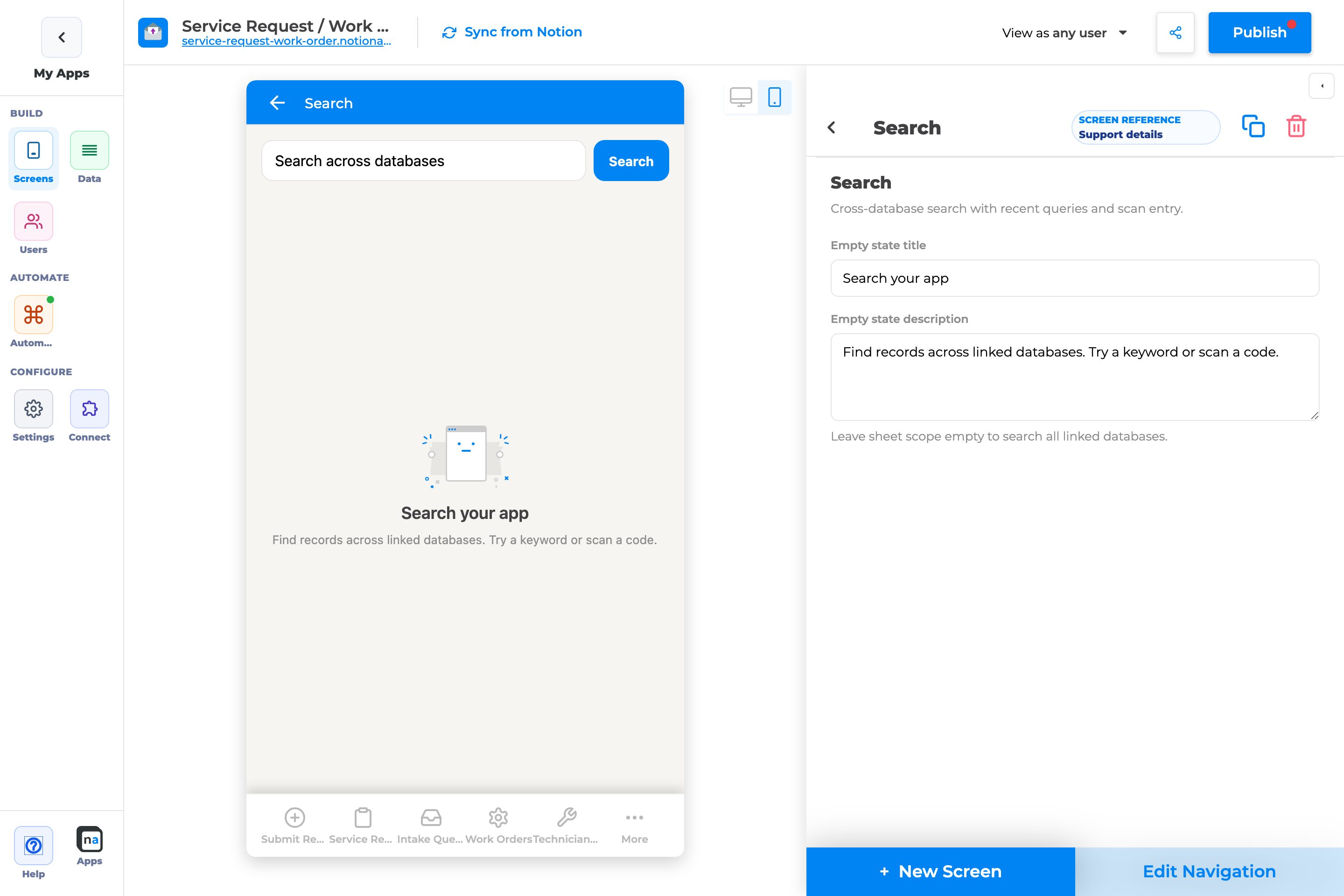
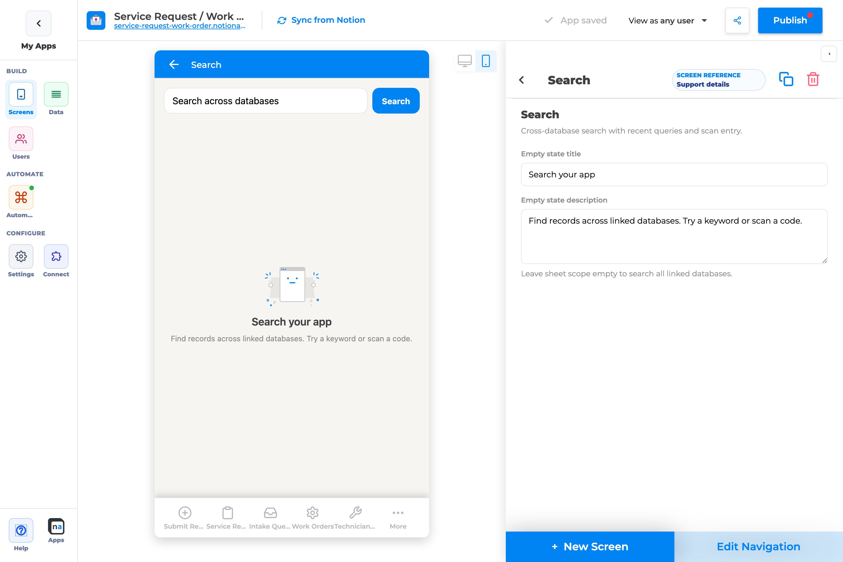
## Complete Builder Options Reference
Search uses the same lightweight chrome config panel as the other Everyday chrome screens. The visible controls are minimal, but the runtime behavior is important, especially for search scope and result navigation.
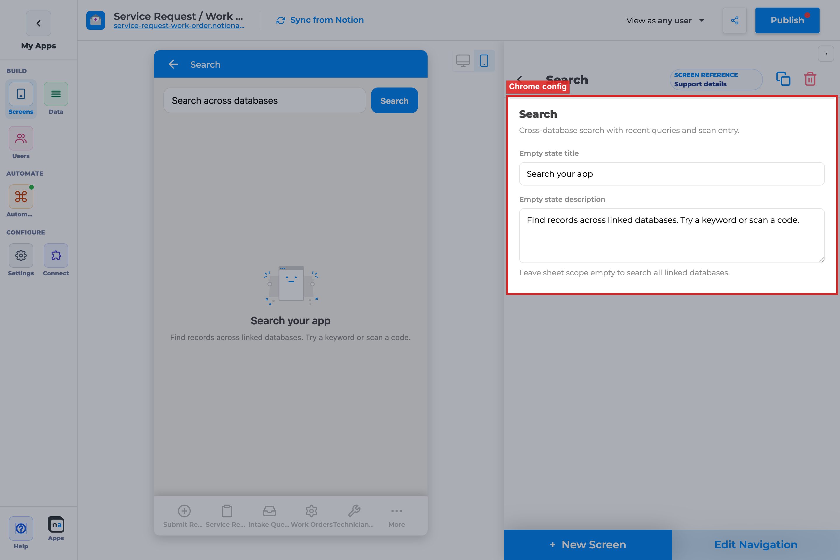
### Screen identity
This section explains the built-in behavior that makes Search different from a list or details screen.
#### Screen type
**What it does:**\
This identifies the screen as `Search` and tells the runtime to load the cross-database search experience with recents and result rows.
**How to use it:**\
Choose `Search` from the Everyday chrome picker when the user job is lookup, not browsing. Do not expect normal list filters, table layouts, or form configuration on this screen.
**Why / recommended default:**\
The recommendation is to use Search only when users truly need one search box across the app. A common mistake is adding Search as a substitute for a missing list screen, which creates a poor experience for users who need browsing rather than lookup.
#### Title and description defaults
**What it does:**\
Search starts with registry-provided display text and empty-state framing.
**How to use it:**\
Keep the navigation label simple, usually `Search`. The value of this screen comes from being easy to spot, not from a clever name.
**Why / recommended default:**\
Users expect the search surface to be obvious. A common mistake is renaming it to something branded or technical, which makes a core utility harder to find.
### Empty state
These fields shape the screen before the user starts typing.
#### Empty state title
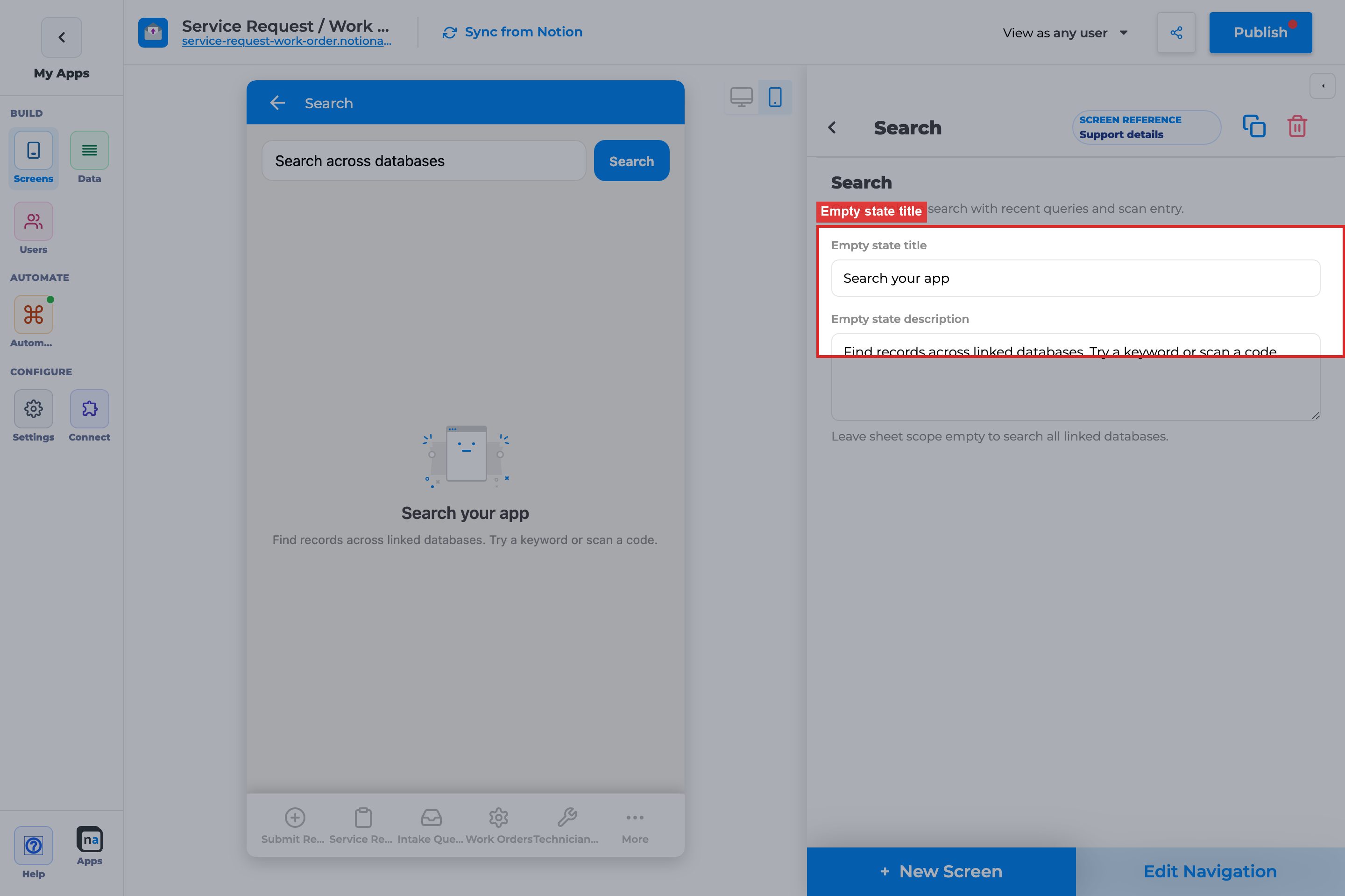
**What it does:**\
This is the heading shown when the search field is empty and no results are being shown.
**How to use it:**\
Use wording that encourages the user to start searching. `Search your app` is a strong default because it is direct and broad enough for many use cases.
**Why / recommended default:**\
The screen often opens in this state, so the title should teach the behavior quickly. A common mistake is making the title too specific to one database when Search is meant to work across many.
#### Empty state description

**What it does:**\
This explains what kinds of searches the user can perform before they enter a query.
**How to use it:**\
Mention the types of data users can find and, if relevant, that they can use a keyword or scan path. Keep it short enough to be useful on mobile.
**Why / recommended default:**\
The recommended default already teaches two useful ideas: the search is cross-database, and scan-related lookup may also be part of the app. A common mistake is leaving the description generic, which misses a chance to set expectations.
#### Empty action label
**What it does:**\
The registry default for Search includes the action label `Scan`.
**How to use it:**\
Be aware that this is a runtime default, not a fully exposed builder field in the chrome config panel. In other words, you should not count on being able to tune this label from the panel today.
**Why / recommended default:**\
This matters because makers sometimes assume every visible string is directly editable. The common mistake is spending time hunting for a setting that is not exposed instead of validating the broader search flow.
### Search scope
This is the most important Search-specific concept for makers.
#### Sheet scope (`searchSheetIds`)
**What it does:**\
This optional setting narrows Search so it only queries specific databases. When it is empty, the runtime searches across all linked databases.
**How to use it:**\
The recommended setup is to leave `searchSheetIds` empty unless you have a strong, user-facing reason to restrict search. The current builder panel only shows a hint telling you that empty scope means all linked databases. The full multi-picker is not fully exposed there yet, but the runtime already honors `searchSheetIds` if it exists in the layout JSON.
**Why / recommended default:**\
The default should almost always be broad scope. Users usually interpret Search as “search the app,” not “search one carefully limited subset.” The common mistake is over-narrowing scope and then getting bug reports that Search cannot find records that do exist elsewhere.
{% hint style="warning" %}
**Scope guidance**\
Leave sheet scope empty unless there is a real boundary users understand, such as a role-specific app area or a compliance reason to exclude certain databases. Over-restricting Search makes the screen feel broken.
{% endhint %}
### Related setup outside chrome config
Search only feels complete when the maker also handles result destinations, navigation, publish flow, and user preview.
#### Result destination screens
**What it does:**\
Search results open the screen associated with the matching record. If that destination does not exist, the search experience feels incomplete even if the search query worked.
**How to use it:**\
Make sure each searchable database has an appropriate downstream screen, usually a details-style destination, so tapping a result leads somewhere useful.
**Why / recommended default:**\
Search is only as good as the record-opening path behind it. A common mistake is validating that results appear but forgetting to test where the user lands after tapping one.
#### Edit Navigation
**What it does:**\
This controls whether Search appears in the app’s main navigation and where users encounter it.
**How to use it:**\
Put Search somewhere users can reach without hunting for it. In many apps that means a primary tab or a near-top side-nav item, often close to Home.
**Why / recommended default:**\
Search is a utility screen, so discoverability matters. A common mistake is placing it too deep in navigation and then concluding users “do not use search,” when they may simply not find it.
#### Publish
**What it does:**\
Publishing makes the configured Search screen available in the live app.
**How to use it:**\
Publish after verifying the empty-state copy and after confirming the target destination screens are also live.
**Why / recommended default:**\
Search issues are easy to misdiagnose if one part of the navigation or result flow is unpublished. The common mistake is testing a new Search screen against an old published shell.
#### View as user
**What it does:**\
This lets you preview Search as a specific persona while testing visibility and result behavior.
**How to use it:**\
Use `View as user` when result visibility depends on role or private-app access. Search may be broad in concept, but the records a person can actually open can still differ by user.
**Why / recommended default:**\
Search can appear healthy for the maker while missing useful results for a real persona. The common mistake is validating only as the builder account and missing permission-based behavior.
## Recommended default setup
| Setting | Recommended value |
| ----------------------- | ---------------------------------------------------------- |
| Empty state title | Search your app |
| Empty state description | Mention keyword search and, if relevant, scan-based lookup |
| Sheet scope | Empty, so all linked databases are searchable |
| Navigation | A visible tab or side-nav item near Home |
## Testing checklist
* [ ] Search finds a known record from one database, proving the basic query path
* [ ] Search also finds a known record from a different database when scope is empty
* [ ] The empty state appears before typing, so the no-query experience is readable
* [ ] A nonsense query shows the `No matches` state, which proves the app is handling misses cleanly
* [ ] Tapping a result opens the correct downstream record screen
* [ ] Recent searches reappear after leaving and returning, because that local-memory behavior is part of the value
* [ ] `View as user` confirms role-specific result visibility where relevant
## Troubleshooting
| Symptom | Likely cause | What to check |
| ---------------------------------------------------------- | ------------------------------------------------------------------------- | -------------------------------------------------------------- |
| Search always returns no matches | Scope is too narrow or the query is weak | Clear `searchSheetIds` and test with a known title value |
| Search finds records in one database but not another | Scope is restricted or the second sheet is not part of the searchable set | Recheck scope and linked database coverage |
| A result appears but opens the wrong place | The downstream screen mapping is not what you expected | Test which record screen is associated with that result |
| Recent searches do not stick | Browser or device storage was cleared | Remember recents are local to the device/browser |
| Search feels broken to users even though some results work | Scope is too narrow for user expectations | Reconsider whether broad app-wide search is the better default |
## Best practices
* Default to broad search unless you can explain the limit in user language.
* Keep Search near Home so users can shift from orientation to lookup quickly.
* Test the full flow from query to opened record, not just the result list.
# My Queue
`My Queue` moved out of the Everyday chrome docs because it is **not** an Everyday chrome screen in the builder. It belongs to the separate **Queue & activity** picker group and requires **Workflow**, **Messaging**, or **Approval Management**.
Use the full guide here:
[**Queue & Activity → My Queue**](https://docs.notionapps.com/screens-and-components/types-of-screens/queue-and-activity-screens/my-queue)
Why this moved:
* The picker group is different: `Queue & activity`, not `Everyday chrome`
* The entitlement requirement is different: automation-related features must be enabled
* The user job is different: `My Queue` is a personal “what needs me?” feed, not a general app-shell screen like `Home`, `Search`, or `Profile`
If you are deciding between screen types, use `My Queue` for personal queue items and notifications, and use Automation **Work Queue** when users must claim or complete shared work.
# Activity
`Activity` moved out of the Everyday chrome docs because it is **not** an Everyday chrome screen in the builder. It belongs to the separate **Queue & activity** picker group and requires **Workflow**, **Messaging**, or **Approval Management**.
Use the full guide here:
[**Queue & Activity → Activity**](https://docs.notionapps.com/screens-and-components/types-of-screens/queue-and-activity-screens/activity)
Why this moved:
* The picker group is different: `Queue & activity`, not `Everyday chrome`
* The entitlement requirement is different: automation-related features must be enabled
* The user job is different: `Activity` is a chronological “what changed?” feed, not a general app-shell screen like `Home`, `Search`, or `Profile`
If you are choosing between nearby surfaces, use `Activity` for history, `My Queue` for personal work that needs attention, and `Operator Console` or `Workflow Status` for operational monitoring.
# Profile
The **Profile** screen is the Everyday chrome preferences surface. It lets end users pick a default landing screen, control notification preferences, save those preferences, and log out of the app.
Use `Profile` when you want built-in user preferences without building a custom settings workflow on top of a Notion users database. It is especially important in private apps where users should control where they land after sign-in.
{% hint style="info" %}
**Who this guide is for**\
Makers who need a built-in settings page instead of a custom form. This guide explains every Profile-related option in prose, including the runtime preferences users control and the maker setup those preferences depend on.
{% endhint %}
## What the screen is for
### Use Profile when
* Users need to choose which primary screen opens after login
* Users should toggle in-app or email notifications for themselves
* Users need a clear `Log out` path in a private app
### Do not use it when
* You need to edit user record fields such as role or phone number: use an **Update Form**
* You want builder-only app settings such as branding or maker preferences
* You need identity-provider administration such as SSO or password reset flows
## What users see in the live app
Profile can show:
* A list of primary screens the user can choose as the default landing screen
* Notification toggles for in-app and email delivery
* A `Save preferences` button
* A `Log out` button
| Default | Value |
| ------------------ | --------------------------------------------------------------- |
| Display title | Profile |
| Empty title | Your profile |
| Empty description | Set notification preferences and choose where the app opens. |
| Empty action label | Save |
| Entitlement | None |
| Prefs API | Auth-only; public apps without a signed-in user skip prefs load |
## Add Profile in the builder
1. Open **Screens → + New Screen**.
2. Choose a Notion database as the context anchor.
3. Under **Everyday chrome**, select **Profile**.
4. Click **Done**.
5. Put Profile somewhere predictable, usually last in navigation or under `More`.
6. Publish before end-user testing.
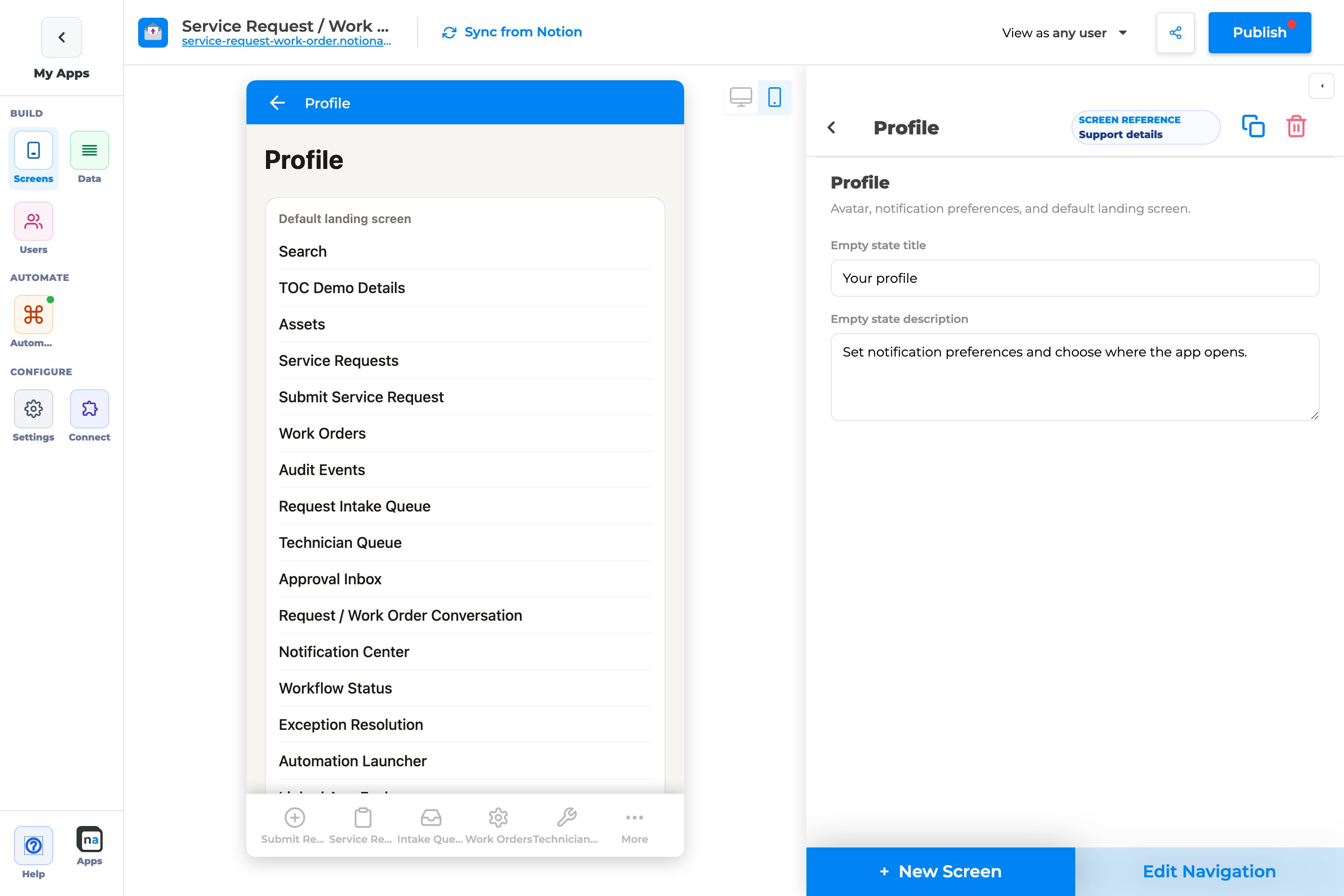
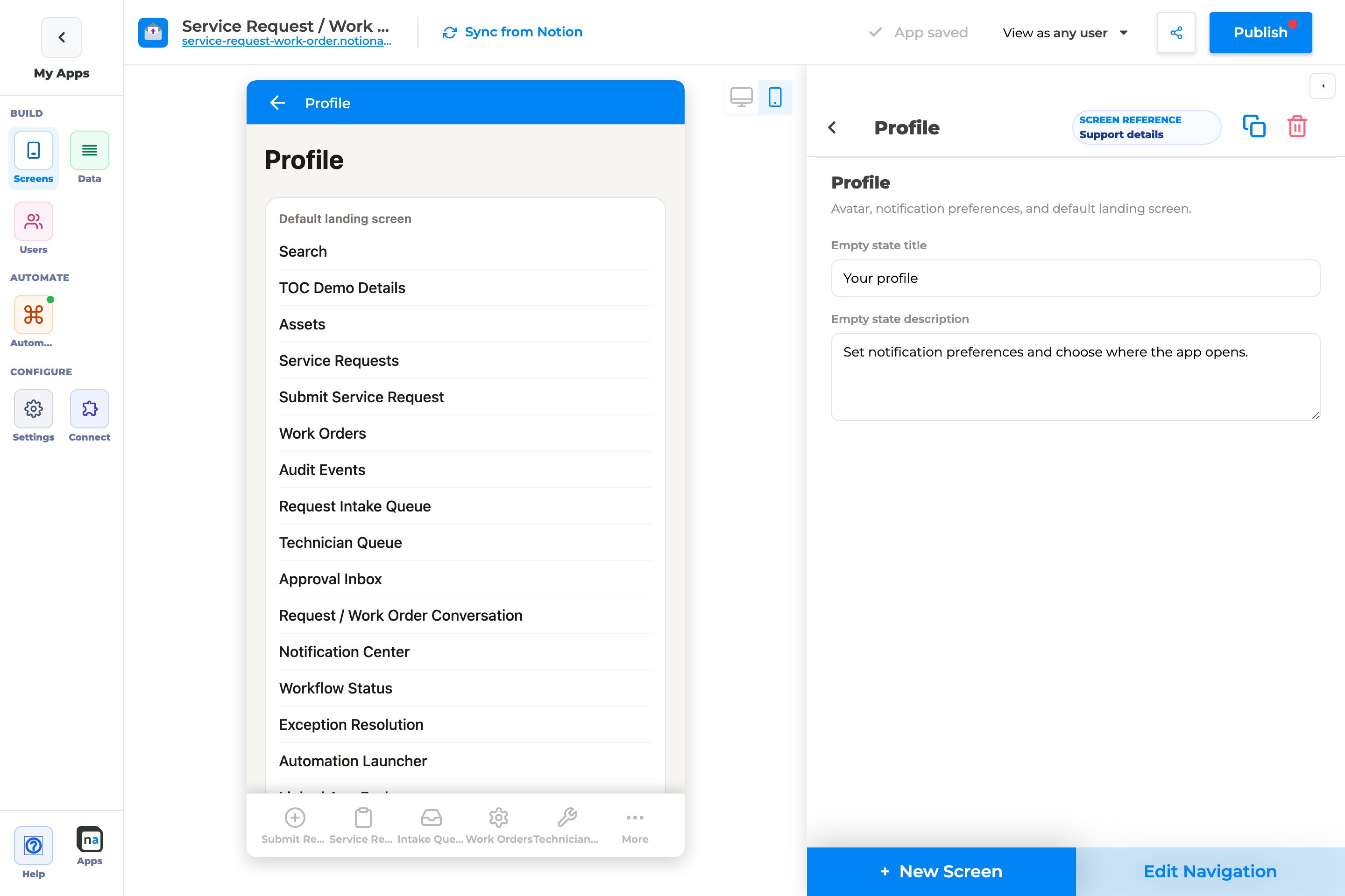
## Complete Builder Options Reference
Profile uses the same lightweight chrome config panel as Home and Search, but most of its important behavior happens at runtime through end-user preferences. That means good maker setup matters even more than visible panel fields.
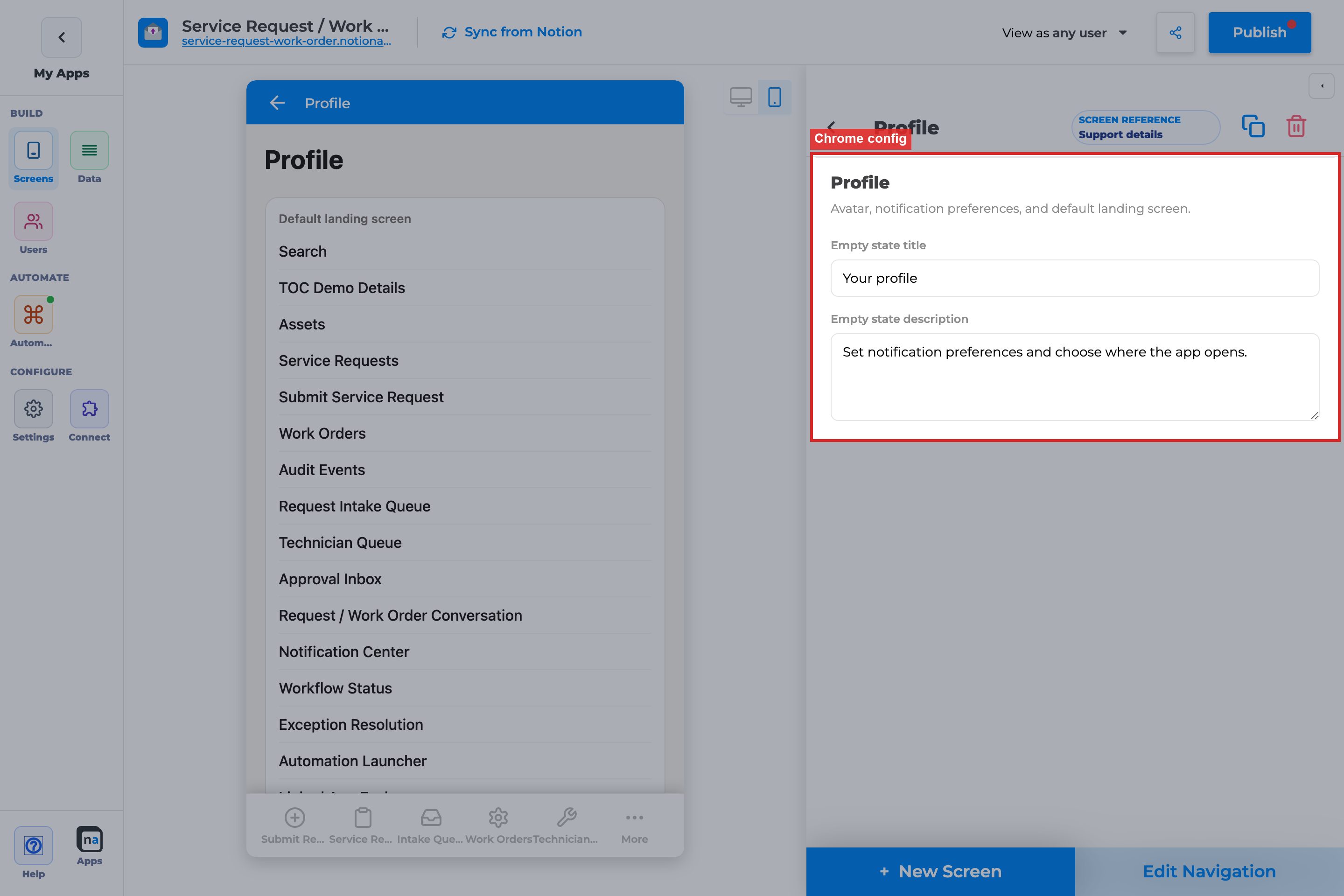
### Screen identity
This section explains what makes Profile a built-in preferences surface rather than a generic data screen.
#### Screen type
**What it does:**\
This identifies the screen as `Profile` and tells the runtime to load built-in preferences and logout behavior.
**How to use it:**\
Choose `Profile` from the Everyday chrome picker when the job is user preferences. Do not use it as a substitute for a Notion-backed user profile form if you need editable user fields.
**Why / recommended default:**\
Profile is best when it stays focused on app preferences. A common mistake is expecting it to manage all user data, which leads makers to look for fields and controls that belong on a normal form screen instead.
#### Title and description defaults
**What it does:**\
The registry provides the default title and descriptive framing for the Profile screen.
**How to use it:**\
Keep the name obvious. `Profile` is usually the right choice because users already understand what settings or account areas usually live there.
**Why / recommended default:**\
Settings surfaces should be easy to find. A common mistake is renaming Profile to something abstract like `Preferences Hub` when plain language would be clearer.
### Empty state
These values supply the screen’s baseline copy and save-action framing.
#### Empty state title
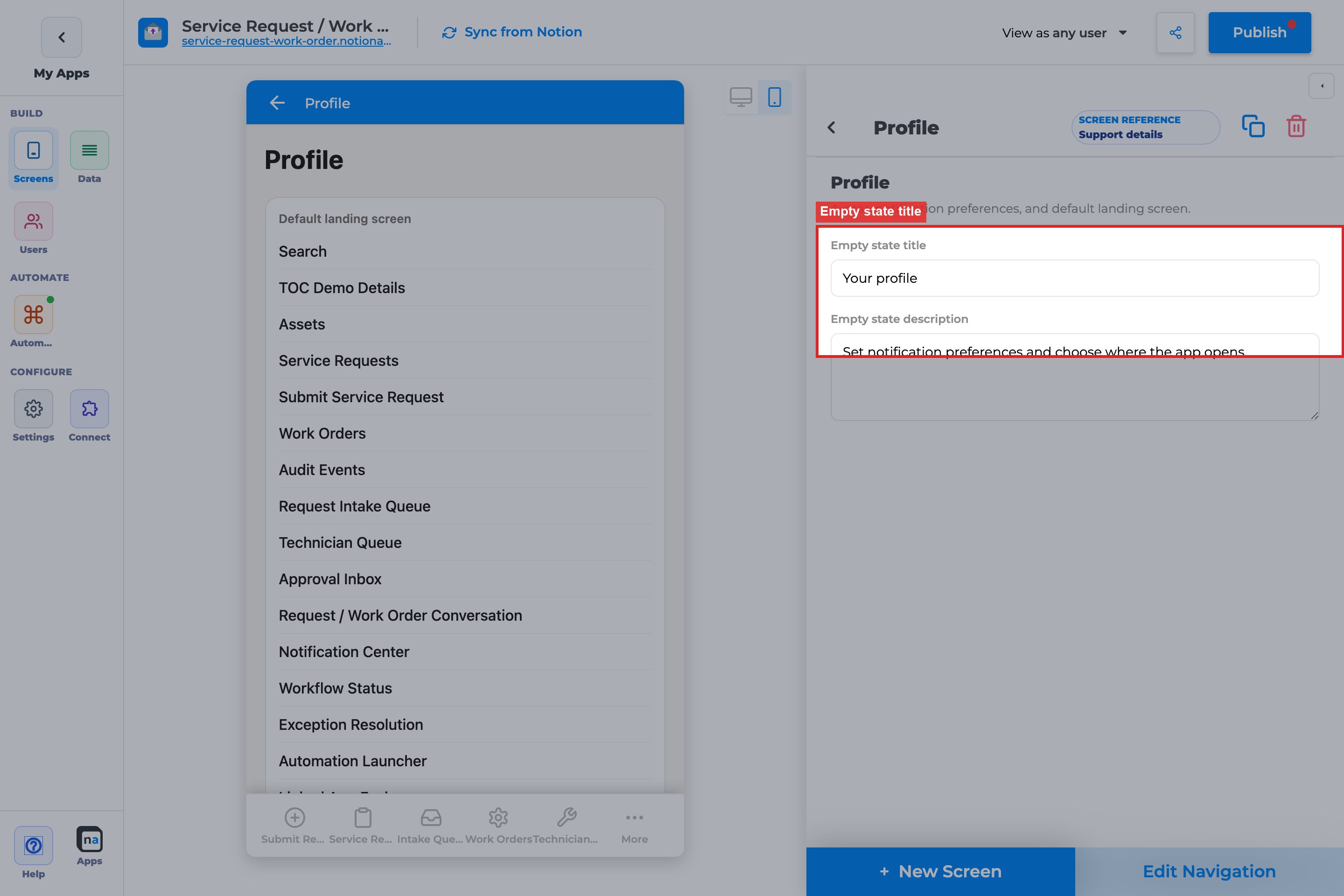
**What it does:**\
This provides the default heading for the screen.
**How to use it:**\
Use a direct label like `Your profile`. Because Profile is not a feed-based screen, the copy should feel personal and stable rather than reactive.
**Why / recommended default:**\
The recommended default works because it immediately signals ownership. A common mistake is using workflow language here, which makes the settings page sound like another work surface instead of a personal preferences area.
#### Empty state description
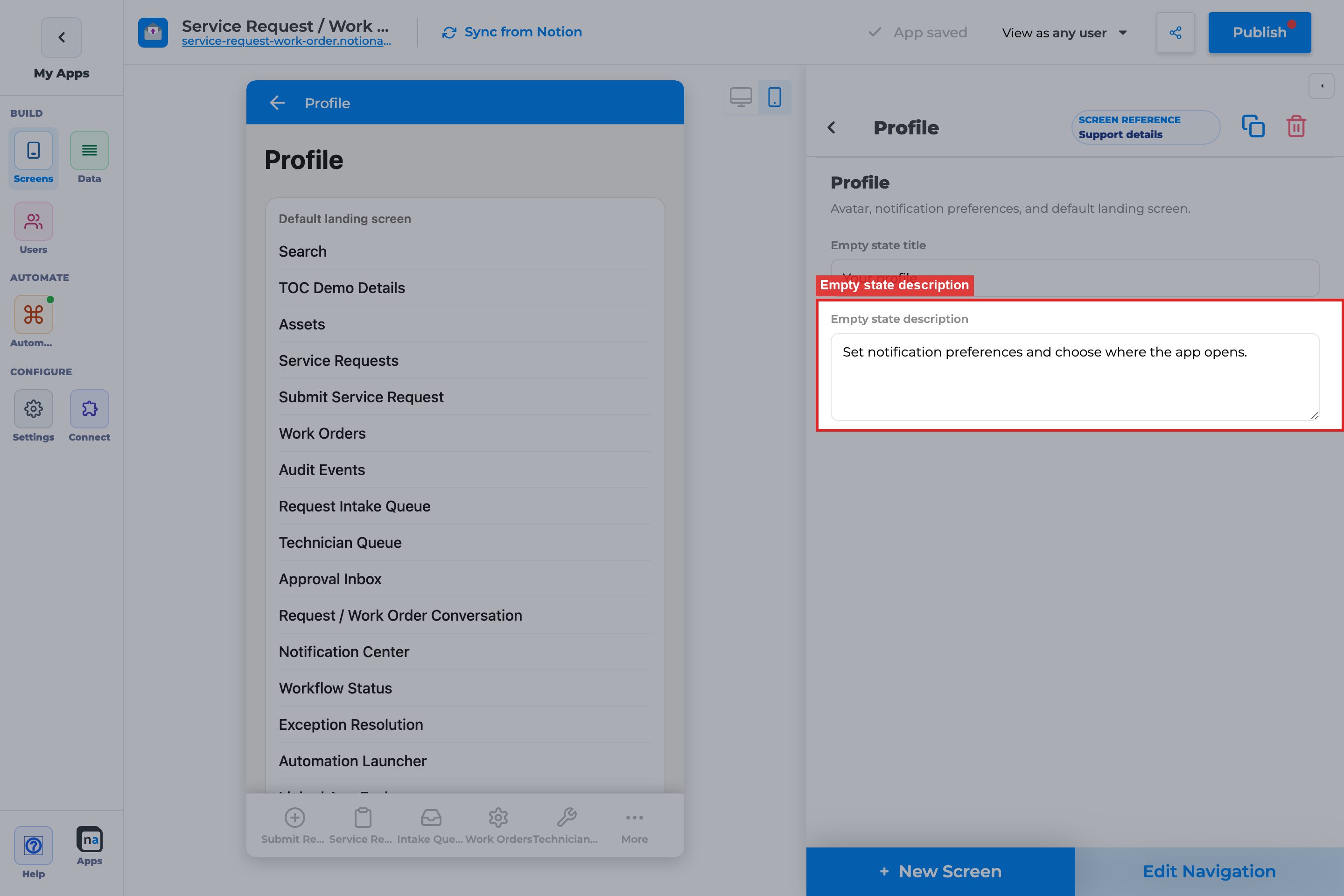
**What it does:**\
This explains what the user can control on the Profile screen.
**How to use it:**\
Mention the two big jobs: choosing where the app opens and setting notification preferences. Keep it short and human.
**Why / recommended default:**\
This description helps users understand why Profile matters. A common mistake is describing only one preference area and leaving the other as a surprise.
#### Empty action label
**What it does:**\
The registry default associated with Profile is `Save`.
**How to use it:**\
Treat this as a runtime default rather than a fully exposed panel field. The visible button text users interact with is `Save preferences`, and the important maker task is making sure the preference choices are useful and testable.
**Why / recommended default:**\
The key decision is not the wording of the save affordance, but whether the user has meaningful options to save. A common mistake is assuming the button label is the primary customization lever.
### End-user preferences at runtime
These are the controls the user sees on Profile. They are not all directly configurable in the chrome config panel, but the maker still needs to understand and support them.
#### Default landing screen
**What it does:**\
This lets the user choose which screen the app should open after sign-in or after preferences load.
**How to use it:**\
Only screens marked as **primary** in navigation appear in this list. If you want a screen to be a landing choice, mark it primary in `Edit Navigation`. Good candidates are `Home`, `My Queue`, and other role-specific hubs.
**Why / recommended default:**\
This setting gives users control over how they start their day. The recommended maker setup is to expose only a small set of strong landing candidates. A common mistake is forgetting to mark screens as primary, which makes the landing list look empty or incomplete.
#### In-app notifications
**What it does:**\
This lets users toggle whether they receive notifications inside the app.
**How to use it:**\
Offer this when your app generates meaningful in-app notices and users need personal control. Test it with real notification-producing flows rather than assuming the toggle is enough.
**Why / recommended default:**\
In-app notifications are usually a good default because they are contextual and less intrusive than email. A common mistake is enabling a notification-heavy workflow but never checking whether the toggle meaningfully affects the experience.
#### Email notifications
**What it does:**\
This lets users opt in or out of email-based notifications.
**How to use it:**\
Use email when the audience expects follow-up outside the app or may not be logged in continuously. For many internal apps, leaving email off by default is a safer starting point unless the business process depends on it.
**Why / recommended default:**\
Email can be useful, but it also creates noise faster than in-app alerts. A common mistake is assuming every audience wants email the same way, which often leads to alert fatigue.
#### Save preferences
**What it does:**\
This persists the user’s selected landing screen and notification settings through the prefs API.
**How to use it:**\
Test the full save cycle: change a setting, tap `Save preferences`, reload, and confirm the new state sticks. Make sure users know their changes are not final until they save.
**Why / recommended default:**\
The runtime does not treat preference changes as automatically committed. A common mistake is toggling options in preview, navigating away, and thinking the system lost the change when it was never saved.
#### Log out
**What it does:**\
This ends the end-user session.
**How to use it:**\
Always validate logout in the same auth setup your users will use in production. That is especially important for private apps with external auth hosts or SSO-related flows.
**Why / recommended default:**\
Logout is a trust feature as much as a security feature. A common mistake is adding Profile but never testing whether logout returns the user to the correct signed-out state.
{% hint style="success" %}
**Maker tip**\
If you want users to choose a landing screen, mark those candidate screens as **primary** first. Profile only lists primary screens in the default landing picker.
{% endhint %}
### Related setup outside chrome config
Profile is only as good as the surrounding navigation and auth setup.
#### Edit Navigation
**What it does:**\
This controls whether Profile appears in the app shell and which screens count as primary landing candidates.
**How to use it:**\
Put Profile in a predictable place, usually last in a side nav or under `More` on mobile. Separately, make sure the screens you want available for landing selection are marked primary.
**Why / recommended default:**\
Navigation setup affects two things at once: discoverability of Profile itself and the contents of the landing-screen picker. A common mistake is handling only one of those.
#### Publish
**What it does:**\
Publishing makes Profile and any related navigation changes live.
**How to use it:**\
Publish after you configure both Profile and the primary screens it should reference. Then test in the live app, not just the builder preview.
**Why / recommended default:**\
Profile bugs are often really navigation or publish mismatches. A common mistake is changing a screen’s primary status in builder and forgetting that the live picker will not update until publish.
#### View as user
**What it does:**\
This lets you preview Profile as a specific end user, including role-based visibility and auth-sensitive behavior.
**How to use it:**\
Use `View as user` when checking which landing choices appear, how preferences load, and whether notification settings make sense for different personas.
**Why / recommended default:**\
Profile behavior depends on the user context. A common mistake is validating only as the maker and missing that another role has no landing options or a different visible screen set.
#### Public-app auth limitation
**What it does:**\
The prefs API is auth-only. In public apps without a signed-in end-user token, runtime preference loading is skipped.
**How to use it:**\
If you are testing Profile in a public shell, know that preference persistence may not behave the same way as in a private signed-in app. Use a real authenticated context or `View as user` when available.
**Why / recommended default:**\
This avoids false bug reports. A common mistake is treating public-preview behavior as proof that preferences are broken when the screen is intentionally auth-dependent.
## How landing screen works
1. The user opens `Profile`.
2. They choose one of the primary screens listed under `Default landing screen`.
3. They tap `Save preferences`.
4. On the next app start, the runtime uses that saved preference when the chosen screen is still available to that user.
If no preference is saved, the app falls back to its normal default navigation behavior, which is often the first primary screen.
## Recommended default setup
| Setting | Recommended value |
| ------------------------- | --------------------------------------------------------------- |
| Empty state title | Your profile |
| Empty state description | Explain landing screen and notifications |
| Navigation | Last item or `More` |
| Primary screens available | `Home`, `My Queue`, and any role-specific hubs users truly need |
## Testing checklist
* [ ] Profile appears in a predictable navigation location after publish
* [ ] The expected primary screens appear in the landing-screen picker, proving navigation is configured correctly
* [ ] Selecting a landing screen and tapping `Save preferences` persists after reload
* [ ] In-app and email toggles save correctly rather than only changing visually
* [ ] Logout returns the user to the correct signed-out experience
* [ ] `View as user` confirms the right choices for each persona
* [ ] Public-app testing is interpreted correctly, knowing prefs are auth-only
## Troubleshooting
| Symptom | Likely cause | What to check |
| ------------------------------------------ | ----------------------------------------------------------------- | -------------------------------------------------------------------- |
| Landing list is empty | No screens are marked primary | Update `Edit Navigation` so at least one candidate screen is primary |
| User saves prefs but still lands elsewhere | The chosen screen is hidden or unavailable to that user | Recheck screen visibility and persona-specific access |
| Preference changes disappear | User did not tap `Save preferences`, or prefs API did not persist | Re-test the full save cycle in an authenticated session |
| Logout is missing or broken | Auth flow or private-app setup is incomplete | Validate the app’s auth host and signed-out redirect |
| Profile looks inactive in a public app | Prefs API is auth-only | Test with a real signed-in end user or `View as user` |
## Best practices
* Add Profile to every private app.
* Keep the landing-screen choices small and meaningful instead of exposing every possible primary screen.
* Mention in onboarding or Home copy that users can change their landing screen in Profile.
# Queue & Activity Screens
Redirect stub. These URLs 404’d as a second tree.
* My Queue → [Everyday chrome → My Queue](https://docs.notionapps.com/screens-and-components/types-of-screens/everyday-chrome-screens/my-queue)
* Activity → [Everyday chrome → Activity](https://docs.notionapps.com/screens-and-components/types-of-screens/everyday-chrome-screens/activity)
Do not keep a parallel Queue & Activity book.
# My Queue
Redirect. Canonical page: [Everyday chrome → My Queue](https://docs.notionapps.com/screens-and-components/types-of-screens/everyday-chrome-screens/my-queue).
# Activity
Redirect. Canonical page: [Everyday chrome → Activity](https://docs.notionapps.com/screens-and-components/types-of-screens/everyday-chrome-screens/activity).
# Customize a screen
To customize a screen on NotionApps, follow the steps below:
1. Open the app builder and select the screen that you want to customize from the app preview (in the center of the app builder).
2. The configuration section for the screen is visible on the right side of the app builder.
{% hint style="info" %}
A screen can have customizations based on the type of screen. For example, list screens like View Items or Update Items have customizations for filtering, sorting, or in-app filtering items. Screens like View Single Item allow for customizations by adding different components to represent the item/page, such as text, images, or buttons.
{% endhint %}
3. In the configuration section, you can configure various options such as the layout of the screen, the visibility of fields, the display of images, and more.
{% hint style="success" %}
As you make changes, they will reflect in the mobile preview in the center of the app builder. These changes are *automatically saved* but only show up on your link after publishing the app.
{% endhint %}
Over the next pages, we will talk about specific customizations for these screens.
# View types (List, Grid, Calendar, Board)
This page describes how to change view type amongst List, Grid, and Calendar views.
One page for every list view mode. `/screens-and-components/calendar-view` and `/grid-view` redirect here. How-tos such as Board List View stay short and link to this page.
Applies to List (View Items), List (Update Items), and Select Items. Details, forms, content, and native automation screens do not use these view types.
## What this is / when to use it
| View type | Enum | Use when | Do not use when |
| --------- | ---------- | --------------------------------------- | ---------------------------------------- |
| List | `LIST` | Users scan rows, sort, and open details | You need a month of dates at a glance |
| Grid | `GRID` | Title image or card layout matters | You need dense ops tables |
| Calendar | `CALENDAR` | The job is a date | The database has no usable date property |
| Board | `BOARD` | Users move cards across a select/status | You need a spreadsheet of 20 columns |
## Before you start
1. The screen is a list-family screen.
2. For Calendar: a date property exists (`date`, or `created_time` / `last_edited_time` if you only need a read-only calendar).
3. For Board: a single-select or status property exists for columns.
4. For Grid gallery: a files/image property exists for the card image.
## Build it
1. Open the list screen.
2. Open **View type** (screen settings).
3. Pick `LIST`, `GRID`, `CALENDAR`, or `BOARD`.
4. Set the mode-specific controls in the table below.
5. Preview phone and desktop. Board and calendar overflow differently on mobile.
6. Publish.
## Every control
### Shared
| Control | Options | What it does |
| --------------- | -------------------------------------- | ------------------------------------------------------------------------------------------------------------------------------------------------------------------------------------- |
| View type | `LIST` / `GRID` / `CALENDAR` / `BOARD` | Layout engine. |
| Filters / sorts | Builder | Working set. Board columns still honor filters. |
| In-app filters | `DYNAMIC` / `PRE_DEFINED` | End-user narrowing on top of the view. |
| Grouping | Property | Extra grouping on list/grid. On board, the board property is the primary grouping. |
| Desktop split | On / off | Master-detail: the list/board/calendar stays on one side, details or update fields on the other. See [Desktop view](https://docs.notionapps.com/screens-and-components/desktop-view). |
### Grid
| Control | Options | What it does |
| ------------------ | ------------------------ | -------------------------------------------------------------------------------------- |
| Grid type | `CARD` / `GALLERY` | Card is a compact tile with title + a few fields. Gallery emphasizes the image. |
| Image property | Files / image field | Card cover. Missing files show a placeholder. |
| Image style / fill | Orientation + fill enums | How the cover crops. |
| Aspect ratio | — | Gallery looks best near 4:3 or 1:1. See the troubleshooting note on grid aspect ratio. |
### Calendar
| Control | Options | What it does |
| -------------- | ----------------------------------- | ------------------------------------------------------------------------------------------- |
| Calendar mode | `DAY` / `WEEK` / `MONTH` / `AGENDA` | Default visible range. Users can usually switch modes in the live app when you enable them. |
| Date property | Date field | Where the event sits. All-day vs time follows the property. |
| Title field | Text | What appears on the event chip. |
| Color / status | Optional select | Chip color. |
`DAY` and `WEEK` need a date-time property to be useful. `MONTH` works with date-only. `AGENDA` is a chronological list of upcoming dated rows.
### Board
| Control | Options | What it does |
| -------------- | -------------------------------- | --------------------------------------------------------------------------------- |
| Board property | Select or status | One column per option, plus an empty column when the property is blank. |
| Card title | Text | Card heading. |
| Card fields | View components | Keep to three or fewer. |
| Drag to change | On when the property is writable | Dragging writes the select/status. Formula/rollup columns cannot be drop targets. |
## What users see
* **List.** Rows. Tap opens details or reveals update fields.
* **Grid.** Cards or gallery tiles. Tap opens the same destination as list.
* **Calendar.** A day/week/month/agenda of dated rows. Tap opens the record. Creating from a calendar slot (when enabled) opens the create form with that date prefilled.
* **Board.** Columns. Drag updates the board property. Tap opens the record.
Desktop split: selecting a card/row/event loads the details or update pane without leaving the view.
## Limits and plans
* Calendar without a date property falls back to an empty month. It will not invent dates from text.
* Board columns follow Notion select options. Renaming an option in Notion requires [sync](https://docs.notionapps.com/databases/reload-and-sync) before the column title updates.
* Dragging on a board is a write. Guests on a public app can change Notion data if the screen is visible and the property is writable.
* Large boards (many options × many cards) are slower on phones. Filter the working set.
* Grid `GALLERY` is not a second product. It is a `GRID` subtype.
## Example
A field-ops app has **Jobs**.
* Dispatch uses **Board** on Status (`Scheduled` / `On site` / `Done`). Drag is on.
* The same database has a second screen **This week** as **Calendar** `WEEK` on Scheduled date.
* Marketing uses a third screen **Portfolio** as **Grid** `GALLERY` on the cover file.
Three screens, one database, one view-type page.
## Fix problems
| Symptom | Likely cause | What to do |
| --------------------------------- | ----------------------------------------------------- | ------------------------------------------------------------------------------- |
| Calendar empty | Wrong or missing date property | Bind a real date field. Sync. |
| Board has no columns | Property is not select/status | Change the board property. |
| Drag does nothing | Property read-only, or disable editing | Check [field map](https://docs.notionapps.com/databases/notion-property-types). |
| Gallery has no images | Files property empty or mapped as URL with no preview | Use a files property; sync. |
| Old Calendar / Grid docs disagree | Those URLs are stubs | This page is canonical. |
## Related
Next: [Filtering, Sorting, or Grouping](https://docs.notionapps.com/screens-and-components/customize-a-screen/filtering-sorting-items) and [In-app Filtering](https://docs.notionapps.com/screens-and-components/customize-a-screen/in-app-filtering). Desktop split details: [Desktop view](https://docs.notionapps.com/screens-and-components/desktop-view).
# Filtering, Sorting, or Grouping Items
Filtering, sorting, and grouping are powerful tools that help users find and organize data more efficiently.
Filtering allows users to narrow down a list of items based on specific criteria.
Sorting helps users arrange items in a specific order.
Grouping helps users visually segregate the items based on a particular property.
{% hint style="info" %}
Grouping is only available on List Screens (View Items/Update Items).
{% endhint %}
{% hint style="info" %}
This is different from Notion databases filtering, sorting, or grouping because you can create multiple apps with different filters, sorts, or groups and provide it to different groups of users.
{% endhint %}
To filter or sort items, open the app builder. Go to the desired screen through the app preview. Click on "+ Add Filtering", "+ Add Sorting", "+ Add Grouping" to add filtering or sorting.
### Filtering
To add filtering, click on "+ Add Filtering". This will add a default filter condition that you can customize further. You can select a database column, a filter operator, and a value to filter by. You can also apply "and" or "or" logic to the conditions to determine how these are conditions are joined together.
{% hint style="info" %}
You can create complex conditions with "and"/"or" operators. For example, *Task Status* is equal to *Done* and *Due Date* is *Today*.
{% endhint %}
### Sorting
To add sorting, click on "+ Add Sorting". This will add a default sort that you can customize further with the fields/columns to sort by. You can select the order, either ascending *(A → Z)* or descending *(Z → A)*, for each field.
{% hint style="info" %}
Keep in mind that during sorting, the first condition would be first used to sort and the second condition would be further used to sort grouped items inside the first sort result.
{% endhint %}
That's it! Now can you filter or sort your items to view them in a more efficient way.
{% hint style="info" %}
It's important to note that when filtering items, the items are sent filtered from our servers, and the users only have access to the data visible on the app.
{% endhint %}
### Grouping
To add grouping, click on "+ Add Grouping". This will add a default group that you can customize further with the column/property to sort by. You can select the sort order, either ascending *(A → Z)* or descending *(Z → A)* for the grouping property.
{% hint style="info" %}
Currently only one property can be used to group items.
{% endhint %}
{% hint style="info" %}
Sorting and grouping work well together. The grouping takes priority and inside the groups, the items are sorted based on your sorting order.
{% endhint %}
# In-app Filtering
Canonical page for end-user filters on a list. Builder filters (the working set) stay on [Filtering, Sorting, or Grouping](https://docs.notionapps.com/screens-and-components/customize-a-screen/filtering-sorting-items). Identity vs restriction: [Data restriction vs filters](https://docs.notionapps.com/databases/data-restriction-and-filters).
## What this is / when to use it
In-app filters are chips or pickers **users** change at runtime.
| Type | Enum | What the user gets |
| ----------- | ------------- | ----------------------------------------------------------------------- |
| Dynamic | `DYNAMIC` | Every distinct value currently in that field (across rows they can see) |
| Pre-defined | `PRE_DEFINED` | Only the chips you configured |
Use `PRE_DEFINED` when the business has two or three statuses. Use `DYNAMIC` when the field is a growing set (client names, cities).
When **not** to: hiding another client’s rows. That is data restriction.
## Before you start
The list screen exists. The field is synced. Name length ≤ 100 characters.
## Build it
1. Open the list → **In-app filters**.
2. Add a filter. Name it (“Status”).
3. Pick the field. Pick `DYNAMIC` or `PRE_DEFINED`.
4. For pre-defined, add the values users may tap.
5. Publish. As an end user, tap a chip. Confirm the list narrows.
## Every control
| Control | Options | What it does |
| ------------------ | ------------------------- | ---------------- |
| Type | `DYNAMIC` / `PRE_DEFINED` | Value source |
| Field | Sheet field | What you filter |
| Name | ≤ 100 chars | Chip group label |
| Pre-defined values | List | Allowed chips |
Scan is a different feature: [Barcode/QR](https://docs.notionapps.com/screens-and-components/barcode-qr-code-scanner).
## What users see
A filter bar. Dynamic shows values from **visible** rows only (restriction already applied). Clearing chips returns the builder-filtered working set.
## Limits and plans
Dynamic on a huge text field is noisy. Prefer a select. In-app filters do not bypass restriction.
## Example
Requests list: `PRE_DEFINED` Status = Open / In review / Done. Staff “All clients” list (restriction disabled): `DYNAMIC` on Client.
## Fix problems
| Symptom | What to do |
| ------------------------ | ----------------------------------------------------------- |
| Chip missing a value | Dynamic: no visible row has it. Pre-defined: add the value. |
| User sees another tenant | Restriction off. Not an in-app bug. |
## Related
[View types](https://docs.notionapps.com/screens-and-components/customize-a-screen/view-types-list-grid-calendar-board). [Data restriction vs filters](https://docs.notionapps.com/databases/data-restriction-and-filters).
# Screen Actions
Record actions on a list or details screen: `CREATE`, `UPDATE`, `DELETE`, `UPDATE_MULTIPLE`.
* Bulk update: [List (Update Items)](https://docs.notionapps.com/screens-and-components/types-of-screens/update-items-form#bulk-update)
* Form submit (`on_submit`): [Form submit redirection](https://docs.notionapps.com/screens-and-components/form-submit-redirection-and-other-submit-actions)
* Button click (`OPEN_URL` / tel / mailto / sms): [Button component](https://docs.notionapps.com/screens-and-components/type-of-components/button-component)
This page is the index for those three. Do not fork a fourth actions book. Old URL “automated actions on save” maps here for screen-level actions and to form submit for `on_submit`.
# Add new component to screen
Components allow you to customize the appearance and functionality of a screen in NotionApps. By adding a component, you can show or update specific fields in a more visually appealing and user-friendly way. Here's how you can add a component to a screen:
1. Go to a secondary screen, such as View Item, by clicking on a row in a List screen OR by clicking the "Go To Screen" button in the screen configuration section.
2. Once you're on the secondary screen, click on the plus (+) button in the screen configuration section.
3. In the panel that opens up, you can either select a logic based on the field you want to show, and a default component will be added to the screen (which you can customize later). Alternatively, you can select a specific component from the "Components" section and change its field to the desired field.
4. Customize the component as per your preferences. You can adjust its appearance, layout, and functionality by using the customization options available.
# Screen Visibility
In some applications, you may want to show or hide screens based on who is logged in. This is where the *Screen Visibility Logic* comes in. Let's take the example of a Task management app. Suppose we want to show a screen to create a *New Task* only for managers but hide it for other employees.
{% hint style="info" %}
Before using the screen visibility, please ensure your app is private by selecting a users database. Learn how to do it here.
{% endhint %}
1. Go to the screen you want to hide. You will see a section named, *Screen Visibility Logic.* Click on the *+ Add Logic* button.
2. Further, select the *Role* column (this could be different for your app) from your Users' database.
3. Add a condition where the *Role* column's data is equal to *Manager*.
With this, when a user logs in to the app only if their *Role* property has the value *Manager*, they can see the *New Task* screen.
### View as a specific user
To test screen visibility in the app builder, you can click the "View as" button in the top bar and select a user.
*"Any user"* means no user has been selected.
If a screen is hidden for the currently selected user, you will see a message on top of the screen.
# Type of Components
Canonical index for every shipped component family. The old bullet list is not coverage. Each family page below is the long reference. This page stays an index plus the controls that apply to **every** component.
How-tos (Metric Card, Media Gallery, Status Timeline, Unique ID Chip, sections/stepper, validation, prefill) stay short and link here or to the family page.
## What this is / when to use it
A component is one block on a screen: a heading, a field, a button, a comments thread. Pick the family from the job, not from the Notion property name.
| Job | Family | Page |
| ---------------------------------------------- | ------------ | ------------------------------------------------------------------------------------------------------------------------------ |
| Show a value | View | [View data components](https://docs.notionapps.com/screens-and-components/type-of-components/view-data-components) |
| Collect or edit a value | Inputs | [Add/Update data components](https://docs.notionapps.com/screens-and-components/type-of-components/add-update-data-components) |
| Open a URL, phone, email, SMS | Button | [Button component](https://docs.notionapps.com/screens-and-components/type-of-components/button-component) |
| After submit: write, go to screen, or redirect | Form actions | [Form submit redirection](https://docs.notionapps.com/screens-and-components/form-submit-redirection-and-other-submit-actions) |
| Show or hide a block | Visibility | [Component visibility](https://docs.notionapps.com/screens-and-components/component-visibility) |
| Threaded discussion | Comments | [Comments](https://docs.notionapps.com/screens-and-components/type-of-components/comments) |
When **not** to add a component: if the user needs a different **screen** (a list, a queue, a content page), add a screen. Components do not replace Select Items or Work Queue.
## Before you start
1. You are on a details, form, update list, or content screen. Native automation screens use their own builder sections, not this palette.
2. The Notion property exists if the component reads or writes data. See [Notion property types](https://docs.notionapps.com/databases/notion-property-types).
3. You know whether the block is view-only or an input.
## Build it (shared)
1. Open the screen.
2. **Add component**. Choose a type. You can switch types later with the type switcher when the new type accepts the same property.
3. Bind **Input property** / **View property** when the block is data-backed.
4. Set required, default, disable editing, and visibility (tables below).
5. Copy/paste logic if you need the same visibility or default on another field.
6. Preview, then publish.
## Every control (shared)
These appear on almost every data component. Family pages list type-specific enums.
| Control | Options | What it does |
| ------------------ | ------------------------------------------------ | ------------------------------------------------------------------------------------------------------------------------------------ |
| Label | Text | User-visible name. |
| Property | Sheet field | Notion property the component reads or writes. |
| Required | On / off | Empty value blocks submit. Independent of format validation. |
| Disable editing | On / off | Show the value without allowing change (update forms / update lists). |
| Default value | `NONE` / `EXACT` / `DYNAMIC` (`CURRENT_USER`) | Prefills create forms. Exact is a literal. Dynamic current user writes the logged-in user into a people/user/text field. |
| URL prefill param | Name | Create forms only. See [Prefill Create Forms from a URL](https://docs.notionapps.com/how-to-guides/prefill-create-forms-from-a-url). |
| Validate input | Off / Email / Phone | Text fields. See [Validate Email and Phone](https://docs.notionapps.com/how-to-guides/validate-email-and-phone-on-form-fields). |
| Visibility | `NONE` / `ROW` / `USER_INPUT` / `LOGGED_IN_USER` | [Component visibility](https://docs.notionapps.com/screens-and-components/component-visibility). |
| Copy / paste logic | Clipboard in builder | Copies visibility and related logic, not the property binding. |
| Type switcher | Compatible types | Change Text → Long text without losing the property when the field type allows it. |
Section + stepper (form layout) lives on [Form (Add Item)](https://docs.notionapps.com/screens-and-components/types-of-screens/add-new-item-form#sections-and-stepper). The how-to stays a short job.
## What users see
View components render the current Notion value (or empty). Input components render a control; on submit they write the property if it is writable. Hidden components are not shown and do not collect input.
## Limits and plans
* One component per property is the usual pattern. Two inputs bound to the same property fight on submit.
* Read-only Notion types still accept a **view** component. An **input** bound to formula/rollup will not write. See the field map.
* Comments, HTML block, and page content have their own plan/moderation notes on those pages.
## Example
A Create Form **Add request** uses: Heading, Text (title, required), Long text (details), Options dropdown (priority), User (assignee, default `CURRENT_USER`), File upload (attachment), Button (cancel URL), and submit actions documented on the form-actions page.
## Fix problems
| Symptom | Likely cause | What to do |
| -------------------------------- | -------------------------------------- | ---------------------------------------------------------------------------------------------------------------- |
| Property missing in the picker | Not synced, or type unsupported | [Reload and sync](https://docs.notionapps.com/databases/reload-and-sync). Check the field map. |
| Required error on a hidden field | Visibility hides it but required is on | Unset required, or keep the field visible. |
| Prefill ignored | Update form, or param name mismatch | Prefill is Create Form only. Match the param. |
| Save failed in the builder | Component points at a deleted property | [Save failed / field missing](https://docs.notionapps.com/troubleshooting/save-failed-field-missing-after-sync). |
## Related
Open the family page that matches the component you are adding. Next on the maker path after fields: [Component visibility](https://docs.notionapps.com/screens-and-components/component-visibility) and [Screen Actions](https://docs.notionapps.com/screens-and-components/customize-a-screen/screen-actions).
# View data components
Canonical family page for every **view** component. Replaces the one-sentence stubs. Inputs are on [Add/Update data components](/screens-and-components/type-of-components/add-update-data-components). Comments stay on [Comments](/screens-and-components/type-of-components/comments).
## What this is / when to use it
Use a view component when the user should **read** a value or a layout block. Use an input when they should change it.
## Before you start
The screen is Details, Content, a list row, or the read-only part of an update screen. The property exists if the block is data-backed.
## Build it
1. Add component → pick the type in the table.
2. Bind the property when required.
3. Set visibility.
4. Preview empty and filled states.
## Every control
| Type | Enum | Property | Type-specific controls | When to use |
| ----------------- | ------------------- | ---------------------------- | ------------------------------------- | -------------------------------- |
| Details | `DETAILS` | Record | Layout of the details header | The built-in details chrome |
| View data | `VIEW_DATA` | Any displayable | Label, empty text | Generic read-only value |
| Metric card | `METRIC_CARD` | Number / rollup / formula | Label, comparison, format | KPI on details or content |
| Media gallery | `MEDIA_GALLERY` | Files | Image vs video, captions | Multiple files as a gallery |
| Status timeline | `STATUS_TIMELINE` | Status / select + dates | Sort | History of status changes |
| Unique ID chip | `UNIQUE_ID_CHIP` | `unique_id` (stored as text) | Copy-to-clipboard | Show the Notion unique id |
| Show image | `SHOW_IMAGE` | Files / URL | Style, fill, orientation | One image |
| Show video | `SHOW_VIDEO` | Files / URL | Poster | One video |
| Show toggle | `SHOW_TOGGLE` | Checkbox | On/off labels | Read-only checkbox |
| Show URL | `SHOW_URL` | URL | Open in new tab | Clickable link |
| View file | `VIEW_FILE` | Files | Download | Non-image files |
| Contact | `CONTACT` | Email / phone | `email` / `phoneNumber` subcomponents | Tap to mail or dial |
| Heading | `HEADING` | — | Overlay vs normal | Section title |
| Label | `LABEL` | — | Size | Helper text |
| Divider | `DIVIDER` | — | — | Visual break |
| Section | `SECTION` | — | Title, stepper membership | Group fields (forms) |
| HTML block | `HTML_BLOCK` | — | HTML | Custom markup on content/details |
| Show page content | `SHOW_PAGE_CONTENT` | Page | TOC, guest vs signed-in | Notion page body |
| Show user | `SHOW_USER` | People / user (as text) | — | Display who is on the row |
| View location | `VIEW_LOCATION` | Location | Map type | Map pin |
| View address | `VIEW_ADDRESS` | Address | — | Formatted address |
| View signature | `VIEW_SIGNATURE` | Signature | — | Signed image |
How-tos for Metric card, Media gallery, Status timeline, and Unique ID chip remain short jobs that link to this table.
## What users see
They see the current value, or the empty state you configured. They cannot change the Notion property from a view component. Buttons and comments are separate types.
## Limits and plans
* `unique_id` is mapped to **text**. The chip is display + copy, not an editor.
* People / created\_by / last\_edited\_by are mapped to **text**. Show user displays that string; it is not a live Notion people picker.
* Files are mapped to **URL** internally. Preview still works when the file is a Notion file.
* Formula and rollup display as text (or number when the metric card can parse them). They never write back.
* HTML block is not a replacement for a Content screen. Prefer [Content](https://docs.notionapps.com/screens-and-components/types-of-screens/content) for landing pages.
* Show page content freshness follows [Reload and sync](https://docs.notionapps.com/databases/reload-and-sync#page-content).
## Example
A client details screen: Heading “Delivery”, Unique ID chip, Status timeline, Media gallery of files, Show page content for the brief, Contact for the PM.
## Fix problems
| Symptom | Likely cause | What to do |
| --------------------- | ----------------------------------------- | -------------------------------------------------------- |
| Metric card is blank | Property is not numeric | Bind a number, or a rollup that returns a number. |
| Unique ID chip empty | Database has no unique\_id, or not synced | Add the property in Notion. Sync. |
| Page content stale | Blocks not re-fetched | Reload page content. See sync manual. |
| People shows a raw id | Mapped as text | That is expected. Use a User input if you need a picker. |
## Related
Inputs: [Add/Update data components](/screens-and-components/type-of-components/add-update-data-components). Page body: [Show Page Content](https://docs.notionapps.com/screens-and-components/show-page-content). Content screens: [Content](https://docs.notionapps.com/screens-and-components/types-of-screens/content).
# Add/Update data components
Canonical family page for every **input** component on Create Form, Update Form, and Update List. View-only blocks are on [View data components](/screens-and-components/type-of-components/view-data-components). Address, file, user, location, and signature also have focused pages; those stay as extra depth and must not contradict this table.
## What this is / when to use it
Use an input when the user should **write** a writable Notion property. If the property is formula, rollup, created\_time, last\_edited\_time, created\_by, or last\_edited\_by, use a view component instead.
## Before you start
1. The property is in [NotionFieldsWithReadWriteAccess](https://docs.notionapps.com/databases/notion-property-types#read-vs-write) (or you are collecting a value that only lives in the app, which is rare).
2. You know create vs update: create uses `*_FOR_CREATE` types; update uses `*_FOR_UPDATE`. The builder shows one palette per screen.
3. Validation, required, and prefill rules are decided. See the shared controls on [Type of Components](https://docs.notionapps.com/screens-and-components/type-of-components).
## Build it
1. Add the input.
2. Bind the property.
3. Set required, default (`NONE` / `EXACT` / `DYNAMIC`), disable editing (update only), visibility, and optional URL prefill name (create only).
4. Set the type-specific enum in the table.
5. Preview empty, invalid, and filled. Publish.
## Every control
| Input | Create / update enums | Notion types | Type-specific controls |
| -------------------- | ---------------------------------- | ----------------------------------------------------------------------- | -------------------------------------------------------------------------------------------------------------------------------------------------- |
| Text | `INPUT_TEXT_FOR_CREATE` / `UPDATE` | title, rich\_text, email, phone, unique\_id (as text), people (as text) | Validate email/phone; max length |
| Long text | `INPUT_LONGTEXT_FOR_*` | rich\_text | Rows, validate email/phone |
| Number | `INPUT_NUMBER_FOR_*` | number | `STEP` vs `SIMPLE` (`NumberComponentStepType`) |
| Date | `DATE_PICKER_FOR_*` | date | `DATE` / `TIME` / `DATE_TIME` |
| Toggle | `INPUT_TOGGLE_FOR_*` | checkbox | On/off labels |
| Options | `SELECT_OPTIONS_FOR_*` | select, status | `DROPDOWN` vs `RADIO` (`OptionsComponentStyle`) |
| Multi-select | `MULTI_SELECT_FOR_*` | multi\_select | Chips; allow add-tag depends on Notion |
| Special multi-select | same family | people-as-text or custom multi | Only when the builder offers the special variant |
| Image | `UPLOAD_IMAGE_FOR_*` | files | `CAMERA` vs `ALL` (`MediaCaptureSource`); `NONE` vs `MAX` compression |
| Video | `UPLOAD_VIDEO_FOR_*` | files | Same capture + compression |
| File | `FILE_UPLOAD_FOR_*` | files | Capture source; size limits on plan |
| User | `INPUT_USER_FOR_*` | people-as-text or users db | Picks an app user, not a raw Notion people widget |
| Address | `INPUT_ADDRESS_FOR_*` | text / address mapping | Structured fields |
| Location | `INPUT_LOCATION_FOR_*` | location | `LocationMapType`, `LocationOutputType` |
| Signature | `INPUT_SIGNATURE_FOR_*` | files / signature | Required means they must sign |
| Reference | `SELECT_DATA` / update data | relation | `NONE` / `DIRECT` / `SELECTION` — Selection opens [Select Items](https://docs.notionapps.com/screens-and-components/types-of-screens/select-items) |
Related focused pages: [Address](/screens-and-components/type-of-components/address), [File upload](/screens-and-components/type-of-components/file-upload), [User field](/screens-and-components/type-of-components/user-field), [Location viewer](/screens-and-components/type-of-components/location-viewer-component) (view), [Signature](/screens-and-components/type-of-components/signature-component).
### Number `STEP` vs `SIMPLE`
* `SIMPLE` — type a number.
* `STEP` — plus/minus stepper. Use for quantities.
### Date visibility
* `DATE` — calendar date only.
* `TIME` — time only.
* `DATE_TIME` — both. Match how the Notion property is used.
### Media
* `CAMERA` — camera only (phones).
* `ALL` — camera + library + files.
* Compression `MAX` reduces upload size and quality. `NONE` keeps the original within plan upload limits.
## What users see
A labeled control. Required fields show an error on submit (and often on blur). Format validation shows “Please enter a valid email address” / “valid phone number” without blocking empty optional fields. Submit writes writable properties and then runs [form submit actions](https://docs.notionapps.com/screens-and-components/form-submit-redirection-and-other-submit-actions).
## Limits and plans
* People / created\_by / last\_edited\_by are **text** in the field map. A User input is the supported way to assign an app user.
* Files are **URL** in the field map. Uploads still go through NotionApps file storage and then Notion. Plan **file upload** meters apply. See [Plans](https://docs.notionapps.com/plans-and-entitlements).
* Unique id is text. Do not offer it as an editor unless you know what you are doing; use the chip to display it.
* Adding select options from the app depends on Notion permissions and the troubleshooting guide for new tags.
* URL prefill is Create Form only.
## Example
**Add inspection**: Text title (required), Date `DATE_TIME` for Scheduled, Options radio for Severity, Image `CAMERA` + `MAX` compression, Reference `SELECTION` → Select Items on Sites, Toggle for “Client may see photos.”
## Fix problems
| Symptom | Likely cause | What to do |
| -------------------------- | --------------------------------------------- | --------------------------------------------------------------------------------------------------------------------- |
| Cannot bind formula | Read-only | Use a view component. |
| Camera missing on desktop | `CAMERA` only | Use `ALL` if desktop must upload. |
| User picker empty | Users database not linked, or guests excluded | [Create Users Database](https://docs.notionapps.com/users/create-users-database). See guest dropdown troubleshooting. |
| Relation disabled in logic | Nested relation / projection | [Relations](https://docs.notionapps.com/screens-and-components/relations) and the logic-picker troubleshooting page. |
## Related
Shared controls: [Type of Components](https://docs.notionapps.com/screens-and-components/type-of-components). After submit: [Form submit redirection](https://docs.notionapps.com/screens-and-components/form-submit-redirection-and-other-submit-actions). Field map: [Notion property types](https://docs.notionapps.com/databases/notion-property-types).
# Location Viewer Component
A location viewer can be used to show the data through a column that has *Latitude/Longitude* or a *Google Maps Link*.
{% hint style="info" %}
1. If you have an address in text form, for example *PLG at 123 Linden Blvd*, then it's better to use the Address Viewer Component.
2. For google maps links, only the following format is detected, **.
{% endhint %}
# Signature Component
Signature component in NotionApps allows users to add their signature directly to the database pages/records. It is designed to be user-friendly and reliable.
{% hint style="info" %}
We have three types of Signature components:
1. Add Signature (available on add screens)
2. Update Signature (available on update screens)
3. Signature Viewer (available on update & view screens)
{% endhint %}
{% hint style="info" %}
The result of the signature component is stored as an image in your database property.
{% endhint %}
#### How to Add the Signature Component
1. Click on the "+" (add component) button in the app builder.
2. Navigate to the "Components" section in the popup and select the Signature component.
3. Select the "Files & Media" Notion database property as the property for the component.
#### Conclusion
The Signature component in NotionApps can help businesses improve accountability of their operations.
* **Contract Management**: Easily collect signatures for contracts, consent forms directly via your apps.
* **Workflow Approvals**: Streamline approval processes by integrating signatures for project charters or work orders.
* **Feedback and Acknowledgments**: Capture feedback or acknowledgment from team members or clients.
# Button component
Canonical page for **button click actions**. Form submit is a different system — that lives on [Form submit redirection](https://docs.notionapps.com/screens-and-components/form-submit-redirection-and-other-submit-actions). Cross-link, do not fork a third “actions” book.
## What this is / when to use it
A **Button** (`BUTTON`) is a component the user taps. It does **not** submit the form. It runs one click action:
| Action | Enum | What it does |
| ---------- | ------------ | --------------------------------------------------------- |
| Open URL | `OPEN_URL` | Opens a link (http/https, or an in-app path you control). |
| Dial phone | `DIAL_PHONE` | Opens the device dialer with a number. |
| Open email | `OPEN_EMAIL` | Opens a mailto. |
| Open SMS | `OPEN_SMS` | Opens a sms: draft. |
Use a button when the user should leave the current context without writing the form.
Use **form `on_submit`** when the user should save the row and then change data, go to a screen, or redirect. Those subtypes are `change_data`, `go_to_screen`, `redirect_url`.
When **not** to use a button:
* “Save” / “Submit” — that is the form submit control.
* “Start approval” — attach a workflow to submit or to a workflow button in Automation, not `OPEN_URL`.
* “Pick related rows” — use a reference input with `SELECTION`.
## Before you start
1. You are on Details, Content, or a form where a secondary action makes sense (Cancel, Call client, Open contract).
2. The URL / phone / email / SMS value is either a literal or bound to a property (Show URL vs Button — prefer Button when you want a labeled control).
## Build it
1. Add **Button**.
2. Set the label (“Call client”, “Open invoice”).
3. Set color style `DARK` or `LIGHT`.
4. Set **On click** to one of `OPEN_URL`, `DIAL_PHONE`, `OPEN_EMAIL`, `OPEN_SMS`.
5. Bind the value (literal or property).
6. Set visibility if only some users should see it.
7. Publish and tap the button on a phone and on desktop.
## Every control
| Control | Options | What it does |
| -------------------------- | ----------------------------------------------------- | ---------------------------- |
| Label | Text | Button text. |
| Color | `DARK` / `LIGHT` | Visual style. |
| On click | `OPEN_URL` / `DIAL_PHONE` / `OPEN_EMAIL` / `OPEN_SMS` | Click action. |
| URL / phone / email / body | Literal or field | Payload for the action. |
| Visibility | Shared visibility enums | Hide for some rows or users. |
Screen-level actions (create/update/delete/bulk) are not button components. They are [Screen Actions](https://docs.notionapps.com/screens-and-components/customize-a-screen/screen-actions).
## What users see
A tappable control. It does not validate the form and does not write Notion. If the device cannot dial (desktop without a tel handler), the browser shows its default failure.
## Limits and plans
* Buttons do not start Workflow Foundation by themselves. Use a form submit trigger or a workflow **button\_clicked** attachment when the workflow builder offers it — that is an Automation binding, not `ButtonOnClickAction`.
* `OPEN_URL` to another screen’s public URL is brittle. Prefer `go_to_screen` on submit, or a hidden-nav screen opened from Screen Actions.
* SMS and dial need a real device capability.
## Example
Details of a vendor: Button **Call** = `DIAL_PHONE` on Phone, Button **Email** = `OPEN_EMAIL` on Email, Button **Portal** = `OPEN_URL` on the vendor’s URL property.
The form’s Submit still uses `on_submit` → `go_to_screen` → Thank you content page.
## Fix problems
| Symptom | Likely cause | What to do |
| ------------------------------- | -------------------------------------- | ------------------------------------------------------------ |
| Button “does nothing” on submit | You expected it to save | Use the form submit button. |
| Workflow does not run | Click action is not a workflow trigger | Bind `button_clicked` in Automation, or use form\_submitted. |
| mailto empty | Email property empty | Bind a filled property or a literal. |
## Related
Form submit: [Form submit redirection](https://docs.notionapps.com/screens-and-components/form-submit-redirection-and-other-submit-actions). Screen record actions: [Screen Actions](https://docs.notionapps.com/screens-and-components/customize-a-screen/screen-actions). Workflow triggers: [Trigger catalog](https://docs.notionapps.com/automation/advanced-reference/trigger-catalog).
# Comments
The Comments feature lets builders add moderated discussion areas to published NotionApps pages. Visitors can add comments or replies, while builders can review, approve, schedule, pin, edit, hide, or remove comments before they appear publicly.
Use comments when you want lightweight feedback, discussion, testimonials, approvals, notes, or Q\&A directly inside a published app.
## What Comments Includes
Comments gives you three connected workflows:
* A **Comments component** that builders add to a screen.
* A **published app experience** where visitors add comments or replies.
* A **moderation queue** where builders review and manage submitted comments.
{% hint style="info" %}
Comments are associated with the specific screen and Comments component where they were submitted. If an app has more than one Comments component, each component has its own comment thread.
{% endhint %}
## Add a Comments Component
{% stepper %}
{% step %}
## Open your app in the NotionApps builder.
{% endstep %}
{% step %}
## Go to the screen where you want visitors to leave comments.
{% endstep %}
{% step %}
## Add a **Comments** component to the screen.
{% endstep %}
{% step %}
## Select the component to open its settings.
{% endstep %}
{% step %}
## Configure the comment behavior and display options.
{% endstep %}
{% step %}
## Save and publish the app.
{% endstep %}
{% endstepper %}
## Configure Comment Behavior
When the Comments component is selected, use its settings to control how comments work in the published app.
### Core Options
* **Comments enabled**: Allows visitors to submit new comments.
* **Replies enabled**: Allows visitors to reply to approved top-level comments.
* **Allow anonymous comments**: Allows visitors who are not signed in to comment.
* **Required guest fields**: Requires guest visitors to provide a name, email, or both.
* **Maximum comment length**: Limits the number of characters allowed in each comment.
* **Sort order**: Controls how public comments are ordered.
* **Show comment count**: Displays the number of visible comments in the published app.
* **Show pending to author**: Lets a comment author see their own pending comment while it waits for approval.
### Published Display Options
Use these settings to control the published app experience:
* **Start collapsed on published app**: Opens the published page with the Comments section minimized.
* **Show add comment action**: Shows or hides the `+ Comment` action.
* **Show reply action**: Shows or hides the `+ Reply` action under approved comments.
{% hint style="success" %}
For a cleaner published page, turn on **Start collapsed on published app**. Visitors can still open the section when they want to read or add comments.
{% endhint %}
## Published App Experience
When a visitor opens a published app page with comments, the Comments section may appear collapsed or expanded depending on the builder setting.
{% stepper %}
{% step %}
## Click the Comments header or **Show** control to expand it.
{% endstep %}
{% step %}
## Click `+ Comment` to open the comment form.
{% endstep %}
{% step %}
## Enter the required guest information, if configured.
{% endstep %}
{% step %}
## Submit the comment.
{% endstep %}
{% endstepper %}
After submission, comments usually enter the moderation queue before appearing publicly.
## Reply to a Comment
If replies are enabled, visitors can reply to approved top-level comments.
{% stepper %}
{% step %}
## Expand the Comments section.
{% endstep %}
{% step %}
## Find the approved comment.
{% endstep %}
{% step %}
## Click `+ Reply`.
{% endstep %}
{% step %}
## Enter the reply text and any required guest fields.
{% endstep %}
{% step %}
## Submit the reply.
{% endstep %}
{% endstepper %}
Replies are also moderated before they appear publicly, unless your workflow treats them differently through moderation status.
## Moderate Comments
Builders manage submitted comments from the app Settings area.
{% stepper %}
{% step %}
## Open the app in the builder.
{% endstep %}
{% step %}
## Go to **Settings**.
{% endstep %}
{% step %}
## Open the **Comments** tool.
{% endstep %}
{% step %}
## Review comments in the moderation queue.
{% endstep %}
{% endstepper %}
The moderation queue shows the comment body, author details, status, submitted time, and context for where the comment was submitted.
## Understand Comment Context
Each moderation row includes context fields so you can identify where the comment belongs:
* **App**: The app where the comment was submitted.
* **Screen**: The screen associated with the comment.
* **Component**: The specific Comments component associated with the comment.
* **Parent comment**: Shown when the item is a reply.
{% hint style="warning" %}
If your app has multiple Comments components, check the Screen and Component context before moderating. Comments do not automatically move between different comment sections.
{% endhint %}
## Filter and Search the Queue
Use the moderation toolbar to find comments quickly.
Available queue filters include:
* All
* Pending
* Approved
* Disapproved
* Hidden
* Deleted
* Scheduled
* Expired
You can also search comment text from the moderation queue.
## Moderate a Comment
From each comment row, builders can take several actions:
* **Approve**: Makes the comment eligible to appear publicly.
* **Disapprove**: Rejects the comment.
* **Hide**: Removes the comment from public display without deleting it.
* **Save edit**: Saves changes to the comment text.
* **Save schedule**: Saves visibility dates.
* **Pin**: Pins an approved top-level comment.
* **Unpin**: Removes pinned status.
{% hint style="info" %}
Only approved comments that are inside their visibility window appear in the published app.
{% endhint %}
## Schedule Comment Visibility
Use visibility dates to control when an approved comment appears publicly.
* **Visible from**: The earliest date and time the comment can appear.
* **Visible until**: The date and time the comment stops appearing.
Leave **Visible from** empty to show the comment as soon as it is approved.
Leave **Visible until** empty to keep the comment visible forever.
{% hint style="success" %}
If there is no visibility end date, the comment remains visible indefinitely as long as it stays approved and is not hidden or deleted.
{% endhint %}
Pinned comments appear before other approved top-level comments.
Use **Pin order** when you want more control over the order of pinned comments:
* Lower numbers appear first.
* Blank pin order uses pin time after ordered pins.
* Pinning is intended for approved top-level comments, not replies.
## How Published Comments Appear
A comment appears in the published app when all of the following are true:
* The comment belongs to the current app, screen, and Comments component.
* The comment status is **Approved**.
* The comment is not hidden or deleted.
* The current date is after **Visible from**, if one is set.
* The current date is before **Visible until**, if one is set.
If a comment is approved but does not appear, check the screen/component context, visibility schedule, and status.
## Best Practices
* Use one Comments component per discussion area.
* Use clear screen names so moderation context is easy to understand.
* Keep comments collapsed by default on long published pages.
* Require guest names when you need accountability.
* Use visibility windows for time-sensitive announcements or temporary feedback.
* Pin only the most important approved comments.
* Review the moderation queue regularly if comments are enabled on public apps.
## Troubleshooting
I approved a comment, but it does not show in the published app.
Check that the comment is associated with the same screen and Comments component you are viewing. Also confirm the comment is approved and inside its visibility window.
Visitors are asked for a name when replying.
The Comments component uses the same required guest fields for comments and replies. If **Name** is required, visitors must provide it before submitting either a comment or a reply.
I see an empty Comments section on one screen but comments on another.
Your app may have multiple Comments components. Each Comments component has its own thread and moderation context.
I do not want comments visible immediately when visitors land on the page.
Turn on **Start collapsed on published app** in the Comments component settings.
# Address component
Capture or display a structured **address** on Create/Update forms (and related input flows).
## When to use
* Field service / site visits
* Customer shipping or billing locations
* Any workflow where a dedicated address control beats one long text box
## Maker setup
1. Add or select an Address field/component on a Create or Update form.
2. Bind it to the Notion property you use for location text (or structured address fields, depending on your schema).
3. In Behaviour, mark **required** when submit must block empty addresses.
4. Add helper text so mobile users know what format you expect.
5. Pair with [Location Viewer](https://docs.notionapps.com/screens-and-components/type-of-components/location-viewer-component) when users must see a map pin.
6. Publish and test on mobile keyboards.
## Prefill
URL prefill works only when your Create Form prefill setup includes the address field — see [Prefill Create Forms from a URL](https://docs.notionapps.com/how-to-guides/prefill-create-forms-from-a-url).
## Tips
* Keep one clear Notion property as the source of truth for the address string.
* For field ops, combine Address + [File upload](https://docs.notionapps.com/screens-and-components/type-of-components/file-upload) + [Signature](https://docs.notionapps.com/screens-and-components/type-of-components/signature-component).
* After Notion schema changes, reload databases ([Databases → Reload and sync](https://docs.notionapps.com/databases/reload-and-sync)).
## Related
* [Type of Components](https://docs.notionapps.com/screens-and-components/type-of-components)
* Use case: [Field Operations](https://docs.notionapps.com/use-cases/field-operations)
# File upload component
Let end users attach files/images to Notion file properties from Create/Update forms (and related inputs).
## When to use
* Photos from the field
* PDFs / receipts on requests
* Any Notion **Files & media** property that operators must populate from the app
## Maker setup
1. Ensure the Notion property type is files/media (or compatible).
2. Add the **File upload** component on the form / screen.
3. Configure Behaviour (required, helper text) like other inputs.
4. Publish and test on a real phone (camera roll + file picker).
## Tips
* Large images slow lists — compress when possible (see FAQ on slow images).
* Pair with Details [Media Gallery](https://docs.notionapps.com/how-to-guides/media-gallery) when viewers need a polished gallery.
* Reload data after changing the Notion property type ([Databases → Reload and sync](https://docs.notionapps.com/databases/reload-and-sync)).
* For inspection-style “labeled photo categories,” use a related photos database + allow-add list/selector pattern (see Relations docs).
## Related
* [Address](https://docs.notionapps.com/screens-and-components/type-of-components/address)
* [Signature](https://docs.notionapps.com/screens-and-components/type-of-components/signature-component)
* [Field Operations](https://docs.notionapps.com/use-cases/field-operations)
* [Relations](https://docs.notionapps.com/screens-and-components/relations)
# User field component
Show or select people in relation to your **Users** database / people-like properties inside screens and forms.
## When to use
* Assignee / owner pickers tied to App Users
* Displaying who a record belongs to on Details
* Directory-style fields that should resolve to Users rows
## Maker setup
1. Prefer a Notion **relation** to the Users database when personalization matters.
2. Add the **User field** component and bind the property.
3. Combine with [Data Restriction](https://docs.notionapps.com/users/data-restriction) so users only see appropriate rows elsewhere.
4. For list filtering by logged-in user properties, see [Filter lists…](https://docs.notionapps.com/how-to-guides/filter-list-screens-by-logged-in-user-properties) (entitlement-gated).
## Tips
* Guest Notion users may not appear in some dropdowns — see Troubleshooting FAQ on guest users in dropdowns.
* Keep the Users database email property clean; User field UX depends on healthy App Users data.
* After Users schema changes, reload databases and re-test View as + a real login.
## Related
* [App Users](https://docs.notionapps.com/users/app-users)
* [People / status fidelity](https://docs.notionapps.com/how-to-guides/status-and-people-field-fidelity)
* [Employee Directory](https://docs.notionapps.com/use-cases/employee-directory)
# Component visibility
Canonical page for showing or hiding a component from **row values**, **what the user just typed**, or the **logged-in user**.
## What this is / when to use it
Visibility is evaluated from `FilteringFieldSourceType`:
| Source | Enum | Meaning |
| -------------- | ---------------- | -------------------------------------------------- |
| Always show | `NONE` | No extra rule. |
| Row | `ROW` | Use the saved Notion values on the record. |
| User input | `USER_INPUT` | Use the in-progress form values (create/update). |
| Logged-in user | `LOGGED_IN_USER` | Use the Users database fields of the current user. |
Use `ROW` on details and on forms when the rule should follow what is already stored. Use `USER_INPUT` when revealing “Describe the incident” after the user sets Type = Incident **before** save. Use `LOGGED_IN_USER` when only Admins should see an internal notes field.
When **not** to use component visibility:
* Hiding a whole screen — use [Screen Visibility](https://docs.notionapps.com/screens-and-components/customize-a-screen/screen-visibility).
* Hiding rows — use [Data restriction](https://docs.notionapps.com/users/data-restriction) or list filters.
* Security for a field you still send to the client — visibility is UX. Do not put secrets in a “hidden” component.
## Before you start
1. The fields you compare exist and are synced.
2. For `LOGGED_IN_USER`, the app is private and the Users database has that property.
## Build it
1. Select the component.
2. Open **Visibility**.
3. Choose source `ROW`, `USER_INPUT`, or `LOGGED_IN_USER`.
4. Add conditions (equals, not empty, contains, …) joined by `AND` / `OR`.
5. Preview with View as and by changing the driving field on the form.
6. Publish.
## Every control
| Control | Options | What it does |
| ---------------- | ------------------------------------------------ | ----------------------------------------- |
| Source | `NONE` / `ROW` / `USER_INPUT` / `LOGGED_IN_USER` | Where values come from. |
| Connector | `AND` / `OR` | How conditions combine. |
| Field | Property id | What you compare. |
| Operator / value | Condition | The rule. |
| Copy/paste logic | Builder | Reuse the same rule on another component. |
## What users see
If the rule fails, the component is not shown. Required hidden fields still fail submit if they are empty — unset required on fields that can hide.
## Limits and plans
* `USER_INPUT` only helps on forms. On details it behaves like row data.
* Nested formula/rollup in the condition picker may be disabled. See the relation logic-picker troubleshooting page.
* Guests have no logged-in user. `LOGGED_IN_USER` hides the component for them.
## Example
On **Add request**, Long text “Incident details” is visible when `USER_INPUT` Type equals Incident. Internal “Cost” number is visible when `LOGGED_IN_USER` Role equals Staff.
## Fix problems
| Symptom | Likely cause | What to do |
| -------------------------- | --------------------------------------------------------------------- | --------------------------- |
| Field never shows | Condition too tight, or source is ROW on a create form with empty row | Use `USER_INPUT` on create. |
| Submit blocked | Hidden + required | Turn off required. |
| Works in builder, not live | Not published | Publish. |
## Related
Screen-level: [Screen Visibility](https://docs.notionapps.com/screens-and-components/customize-a-screen/screen-visibility). Forms: [Type of Components](https://docs.notionapps.com/screens-and-components/type-of-components).
# Barcode / QR code scanner
Canonical page for scan on lists and on fields. Product help in the builder points here (not `/customize-app/barcode-qr-code-scanner`).
## What this is / when to use it
Scan lets a user point the camera at a code and jump to a row or fill a field.
| Scan type | Enum | Use when |
| --------- | --------- | ------------------------ |
| Barcode | `BARCODE` | 1D product / asset codes |
| QR | `QR` | 2D codes you generate |
| Multi | `MULTI` | Either, in one control |
Use scan on a **list** to find and open (or select) the matching row. Use scan on a **text field** to fill the value.
When **not** to use it: the property is not the literal code. Scan matches the scanned string to a field value; it does not OCR a photo of a page.
## Before you start
1. A text (or unique id-as-text) property stores the code exactly as the barcode encodes it.
2. Users will scan from a phone with a camera. Desktop support is limited.
3. The list or field is on a published screen.
## Build it
1. On a list: open screen settings → Scan → `BARCODE` / `QR` / `MULTI` and pick the match property.
2. On a text input: enable scan on that component and pick the same type.
3. Publish. In the live app, tap the scan icon, grant camera permission, scan a known code.
## Every control
| Control | Options | What it does |
| -------------- | -------------------------- | ------------------------ |
| Scan type | `BARCODE` / `QR` / `MULTI` | What the camera accepts. |
| Match property | Text-like field | List jump target. |
| Field scan | On / off | Fills that input. |
## What users see
A scan icon. First use asks for camera permission. A match highlights or opens the row, or fills the field. No match shows an empty / not-found state.
## Limits and plans
* Camera permission is a browser/OS prompt. Denied permission means no scan.
* Unique id chips are display; bind scan to the underlying text mapping.
* `MULTI` is slightly slower to lock. Prefer `QR` when you control the labels.
## Example
Warehouse Update List: scan `MULTI` on SKU. Clerk scans, the row highlights, they toggle Received.
## Fix problems
| Symptom | Likely cause | What to do |
| ------------- | ----------------------------- | ------------------------------ |
| No camera | Desktop, or permission denied | Use a phone. Re-enable camera. |
| No match | Extra spaces, wrong property | Store the exact code. Sync. |
| Help link 404 | Old customize-app URL | This page is current. |
## Related
Lists: [List (View Items)](https://docs.notionapps.com/screens-and-components/types-of-screens/list-view-items), [Update Items](https://docs.notionapps.com/screens-and-components/types-of-screens/update-items-form).
# Form submit redirection (and other submit actions)
Canonical page for form **`on_submit`** actions. Button click actions stay on [Button component](https://docs.notionapps.com/screens-and-components/type-of-components/button-component).
## What this is / when to use it
After a Create Form or Update Form successfully writes the row, the app can run one or more **in-app actions**. The action type is always `on_submit`. The subtype is one of:
| Subtype | Enum | What it does |
| ------------ | -------------- | ------------------------------------------------------------------------------ |
| Change data | `change_data` | Writes extra fields on the same row (exact or `CURRENT_USER`). |
| Go to screen | `go_to_screen` | Opens another screen (often a hidden Content “thank you” or the details page). |
| Redirect URL | `redirect_url` | Sends the browser to an external URL. |
Use these when submit should **finish the job** (stamp a status, leave the form, or send the user to a portal).
When **not** to use them:
* Opening a tel/mailto without saving — use a Button.
* Starting a long workflow with many steps — also attach Workflow `form_submitted`. Submit actions and workflows can both run; do not assume one replaces the other. See [Which automation](https://docs.notionapps.com/automation/which-automation).
## Before you start
1. The form saves successfully on its own.
2. Target screens exist if you use `go_to_screen`. Hide them from nav when they are thank-you pages.
3. Fields you stamp with `change_data` are writable.
## Build it
1. Open the form screen.
2. Open **Submit actions** / **Automated actions on save** (same feature; old docs said “automated actions on save”).
3. Add `on_submit`.
4. Choose `change_data`, `go_to_screen`, or `redirect_url`.
5. For `change_data`, pick the field and `EXACT` or `DYNAMIC` (`CURRENT_USER`). Dates also have `DATE` / `TIME` / `DATE_TIME`.
6. For `go_to_screen`, pick the target screen id.
7. For `redirect_url`, enter a full https URL.
8. Publish. Submit a test row. Confirm the stamp, the next screen, or the external page.
## Every control
| Control | Options | What it does |
| ------------- | ----------------------------------------------- | ------------------------------------- |
| Action type | `on_submit` | Only fires after a successful save. |
| Subtype | `change_data` / `go_to_screen` / `redirect_url` | See table above. |
| Field + value | Exact / current user | Extra writes. |
| Target screen | Screen id | In-app navigation. |
| URL | String | External redirect. |
| Submit label | 1–50 characters | The save button text, not the action. |
Desktop submit placement (sticky footer vs inline) is a layout how-to: [Control Desktop Form Submit Placement](https://docs.notionapps.com/how-to-guides/control-desktop-form-submit-placement).
## What users see
They tap Submit. Validation runs first (required, email/phone). If save succeeds, they either stay and see updated values, land on the next screen, or leave the app to the redirect URL. If save fails, submit actions do not run.
## Limits and plans
* Submit actions are not Workflow Foundation. Legacy Databases → Automate (email/SMS/webhook) is a third system. See [Which automation](https://docs.notionapps.com/automation/which-automation).
* `change_data` cannot write formula/rollup.
* Redirect to a custom domain you do not control will lose the session unless that destination is still your app.
* Prefill and submit actions are independent.
## Example
**Add lead** submit:
1. `change_data` Status = `New` (exact).
2. `change_data` Owner = `CURRENT_USER`.
3. `go_to_screen` → Content **Thanks**.
A workflow on `form_submitted` then notifies sales. The thank-you screen does not need to know that.
## Fix problems
| Symptom | Likely cause | What to do |
| -------------------------------- | ----------------------------------------------------- | ------------------------------------------------------------------------------ |
| Redirect happens but row missing | Validation failed and you tested a button, not submit | Use the form submit control. |
| Workflow and redirect race | Both fired | Expected. Workflow is async. Redirect can leave before the queue item appears. |
| Go to screen 404 | Screen hidden and visibility blocks the user | Fix visibility, or pick another target. |
| Old help URL 404 | `/customize-app/form-submit-redirection` | This page is the current path. |
## Related
Buttons: [Button component](https://docs.notionapps.com/screens-and-components/type-of-components/button-component). Forms: [Form (Add Item)](https://docs.notionapps.com/screens-and-components/types-of-screens/add-new-item-form). Workflow: [Trigger catalog](https://docs.notionapps.com/automation/advanced-reference/trigger-catalog).
# Formulas & Rollups
## Lists
You can choose to show formula and rollup properties in Lists like List (*View Items) screen, List (Update Items) screen, List Component, Page Selector Component, etc.*
However, you need to be aware of a limitation:
{% hint style="warning" %}
When you choose a property to view in the lists that is a rollup or formula dependent on a rollup, and if the formula is calculated over more than 25 related pages, Notion provides ***NotionApps*** results based on only the top 25 related pages.
*For example,*
Let's say there are two databases:
* `Projects` and `Tasks`.
* `Projects` has a relation to `Tasks.`
* `Projects` has a rollup property that counts the number of `tasks` linked to a `project`.
**Incomplete Data**
If a `project`is linked to 30 `tasks (> 25),`NotionApps will only receive the property value as 25 (`incomplete value`).
**Complete Data**
If a `project` is linked to `10 tasks`, NotionApps will receive `10 (correct value)`.
{% endhint %}
## Components
Rollups & Formulas can be shown in all components.
{% hint style="success" %}
However, for properties where there might be incomplete data`(> 25 related pages)`, we suggest showing them in the Details (*View One Item)* or Form (*Update One Item)* screens.
On these screens, when using a "View Text" component to view the property, you will see a refresh button next to it.
On clicking the refresh button, we fetch the complete property data from Notion.
{% endhint %}
We are working with Notion to make this experience better. Meanwhile, if you have questions, please reach out to us via our website chat or email us at .
# Relations
Relation properties can be used on NotionApps by either showing the related page data in your app configurations or using the List or Page Selector components.
{% hint style="info" %}
If you don't see Relation properties in your app builder, please click the "Reload" button.
{% endhint %}
## Showing Related Page Data
Properties from related databases could be used in multiple app configurations to show data from the related pages.
## List & Page Selector Components
These components can link, unlink, add, update, or delete related page items.
### List Component
A List component can display an **Inline LIST** of related page items on your form or details screens.
In addition to that, you can create new related pages, and link or unlink pages from the related database.
### Page Selector Component
A Page Selector component can open a new screen to link or unlink existing pages from the related database.
## Show Reload Button
List and page selector components provide an option to "Show Reload Button" next to the component. You should enable this option if:
You have more than 25 pages related to a single page and want to show all the related pages.
For example, a Project is linked to 50 Tasks. Without the reload button, we only show the top 25 Tasks. If you enable the reload button, we load all 50 Tasks.
{% hint style="info" %}
The same logic applies to the reload button when viewing formulas and rollups in NotionApps. If the formula or rollup is calculated over more than 25 related pages, you should enable the "Show Reload Button" option.
{% endhint %}
# Show Page Content
Canonical page for embedding a Notion page body. Content **screens** are different: [Content](https://docs.notionapps.com/screens-and-components/types-of-screens/content).
## What this is / when to use it
`SHOW_PAGE_CONTENT` renders the blocks of a Notion page on details (or on a Content screen). Use it for briefs, SOPs, and long read-only copy that already lives in Notion.
When **not** to: a landing page you want to write in the builder — use a Content screen + HTML. A files gallery — use Media gallery.
## Before you start
The page is shared with the NotionApps integration. You understand [sync](https://docs.notionapps.com/databases/reload-and-sync#page-content) is a separate fetch from row properties.
## Build it
1. Add **Show page content**.
2. Bind the page (the record’s page, or a fixed page).
3. Optionally turn on a [table of contents](https://docs.notionapps.com/how-to-guides/add-a-table-of-contents-to-page-content).
4. Publish. Open as guest (if public) and as signed-in.
## Every control
| Control | What it does |
| ------------------ | -------------------------------------- |
| Page binding | Which Notion page |
| TOC | Jump links for headings |
| Guest vs signed-in | Visibility still comes from the screen |
Internal page links inside the embed: see the troubleshooting page for internal links.
## What users see
Rendered Notion blocks. Stale body means page content was not re-fetched (unsync: not shared, empty, or transform failed).
## Limits and plans
**Blocks** meter. Failed transform can show empty. This is not live collaborative Notion editing.
## Example
Delivery details: properties on top, Show page content for the creative brief, Media gallery for files.
## Fix problems
Empty embed: share the page, reload page content. Slow images: image troubleshooting page.
## Related
[Content](https://docs.notionapps.com/screens-and-components/types-of-screens/content). [Reload and sync](https://docs.notionapps.com/databases/reload-and-sync).
# Desktop view
Canonical page for large-device layout: desktop vs forced mobile, split / master-detail, and how desktop nav interacts with lists.
## What this is / when to use it
By default, large devices use `LargeDeviceView.DESKTOP`: wider lists, optional **split** (master-detail), and desktop navigation (`TOP_TABS` or `DRAWER`). You can force `MOBILE` so a desktop browser shows the phone layout.
Use split when operators should keep the list visible while they read or edit one row (support, receiving, approvals adjacent to a data list).
When **not** to force mobile on desktop: only for apps that are truly phone-first and look wrong when wide. Most portals should stay `DESKTOP`.
## Before you start
The screen is a list, update list, or select-items screen if you want split. Forms have a separate how-to for [submit placement](https://docs.notionapps.com/how-to-guides/control-desktop-form-submit-placement).
## Build it
1. Open **Settings → Appearance** or the desktop view control on the screen (both exist; appearance is the app default).
2. Set large device view to `DESKTOP` or `MOBILE`.
3. On a list, enable **split / master-detail** when you want the right pane.
4. Set desktop nav on [App Navigation](https://docs.notionapps.com/screens-and-components/app-navigation).
5. Preview at a desktop width. Publish.
## Every control
| Control | Options | What it does |
| --------------------------- | -------------------------------------- | --------------------------------------------------------------------------- |
| Large device view | `DESKTOP` / `MOBILE` | App-wide chrome. |
| Split | On / off | List stays; details or update fields open beside it. |
| Desktop nav | `TOP_TABS` / `DRAWER` | See App Navigation. |
| Show mobile view on desktop | Same as `MOBILE` | Old heading; this is the current explanation. |
| Theme preset | `compact` / `comfortable` / `showcase` | Density. See [Appearance](https://docs.notionapps.com/settings/appearance). |
## Show mobile view on desktop devices
This is the same control as large device view = `MOBILE`. A desktop browser then shows the phone column. Use it only for phone-first apps. Most portals should stay `DESKTOP`.
## What users see
**Desktop.** Wider cards, split pane when enabled, top tabs or a persistent drawer.
**Forced mobile.** Centered phone column even on a monitor.
**Split.** Clicking a row updates the pane without leaving the list. Bulk update still uses the list selection, not the pane.
## Limits and plans
* Split is not a second details screen. It reuses the details/update configuration.
* Native automation screens have their own desktop layouts (see each screen guide). Do not expect this split toggle to rewrite Work Queue.
## Example
Staff **Requests** update list: desktop split on, compact theme. Clicking a row edits Status in the pane. Bulk update still selects many rows on the left.
## Fix problems
| Symptom | Likely cause | What to do |
| -------------------------- | ------------------------ | ------------------------- |
| Desktop looks like a phone | `MOBILE` is on | Set `DESKTOP`. |
| Split missing | Not a list family screen | Use a list / update list. |
| Old customize-app URL | Product help updated | This page is current. |
## Related
[App Navigation](https://docs.notionapps.com/screens-and-components/app-navigation). [Appearance](https://docs.notionapps.com/settings/appearance). [View types](https://docs.notionapps.com/screens-and-components/customize-a-screen/view-types-list-grid-calendar-board).
# Calendar view
This URL is a redirect stub. The canonical page is [View types (List, Grid, Calendar, Board)](https://docs.notionapps.com/screens-and-components/customize-a-screen/view-types-list-grid-calendar-board#calendar).
Calendar modes are `DAY`, `WEEK`, `MONTH`, and `AGENDA`. Do not maintain a second calendar manual here.
# Grid view
This URL is a redirect stub. The canonical page is [View types (List, Grid, Calendar, Board)](https://docs.notionapps.com/screens-and-components/customize-a-screen/view-types-list-grid-calendar-board#grid).
Grid subtypes are `CARD` and `GALLERY`. Do not maintain a second grid manual here.
# Databases
Index for the Databases section. Builder rail stub: [Databases (builder rail)](https://docs.notionapps.com/builder/databases).
| Page | Role |
| ------------------------------------------------------------------------------------------------- | ---------------------------------- |
| [Manage linked databases](https://docs.notionapps.com/databases/manage-linked-databases) | Connect / share / unlink |
| [Notion property types](https://docs.notionapps.com/databases/notion-property-types) | Field map, read vs write |
| [Reload and sync](https://docs.notionapps.com/databases/reload-and-sync) | Sync, auto-sync, refresh, rollback |
| [Data restriction vs filters](https://docs.notionapps.com/databases/data-restriction-and-filters) | Who sees which rows |
Formulas, relations, and page content components live under Screens & components and link back here for the data rules.
# Manage linked databases
Control which Notion databases your app can read and write.
## Open Databases
1. Open the app in the builder.
2. Click **Databases** in the left rail (not Settings).
3. Review the list of linked databases and their status.
## Typical maker tasks
* **Confirm the right databases are linked** after you connect Notion or switch workspaces
* **Link an additional database** when you add a new screen that needs a new Notion source
* **Understand why a property is missing** — often the database is not linked, or schema has not been reloaded after a Notion change
## Manage databases entry points
The Databases workspace includes manage/link controls (product copy may say **Manage databases**). Use them when:
* You created a new database in Notion for this app
* A relation points at a database the app cannot see yet
* You need to reconnect after workspace permission changes
## After linking
1. [Reload and sync](/databases/reload-and-sync) so schema and records appear in Screens
2. Map fields on List / Details / Forms
3. If the app is Private, revisit [Data Restriction](https://docs.notionapps.com/users/data-restriction) when personalization properties changed
## Related
* [Connect Notion](https://docs.notionapps.com/get-started/connect-notion)
* [Reload Data (from app builder)](https://docs.notionapps.com/workspace-and-account/reload-data-from-app-builder)
* [Databases overview](/databases)
# Notion property types
Canonical field map. This is what NotionApps stores after sync, what users can edit, and what stays read-only. Product help for formulas/rollups still has its own page; this page is the catalog.
## What this is / when to use it
Every linked database property becomes a **sheet field**. The builder picker, inputs, and view components all use this map. If a property “is missing” or “won’t save,” start here, then [Reload and sync](https://docs.notionapps.com/databases/reload-and-sync).
## Before you start
The database is shared with the NotionApps integration and has been synced at least once.
## The map (`NotionFieldTypeToSheetFieldType`)
| Notion property | Becomes in NotionApps | Typical component | Notes |
| ---------------- | --------------------- | ----------------------------------------- | -------------------------------------------------------------------- |
| Title | Text | Text / Heading | Required by Notion for a page. |
| Rich text | Text | Text or Long text | |
| Email | Email | Text + validate email | |
| Phone | Phone | Text + validate phone | |
| URL | URL | Show URL / Button `OPEN_URL` | |
| Number | Number | Number `SIMPLE` or `STEP` | |
| Checkbox | Toggle | Toggle / Show toggle | |
| Select | Options | Dropdown or Radio | |
| Multi-select | Options | Multi-select | |
| Status | Options | Dropdown or Radio | |
| Date | Date | Date `DATE` / `TIME` / `DATE_TIME` | |
| Created time | Date | View only | Not writable. |
| Last edited time | Date | View only | Not writable. |
| People | **Text** | View, or User input | Stored as a comma-separated string. Not a live Notion people widget. |
| Created by | **Text** | View | Not writable. |
| Last edited by | **Text** | View | Not writable. |
| Files | **URL** | Image / video / file / gallery | Uploads still work; the stored field type is URL. |
| Unique id | **Text** | Unique ID chip | Display / copy. |
| Formula | **Text** | View / Metric card | Read-only. |
| Rollup | **Text** | View / Metric card | Read-only. Nested rollups may not appear. |
| Relation | Reference | Reference `NONE` / `DIRECT` / `SELECTION` | |
## Read vs write
Writable when the integration may update the page:
`title`, `checkbox`, `date`, `email`, `files`, `multi_select`, `number`, `people`, `phone_number`, `relation`, `rich_text`, `select`, `status`, `url`.
Not writable (display only): `formula`, `rollup`, `created_time`, `last_edited_time`, `created_by`, `last_edited_by`, `unique_id` (treat as display).
People is writable **as text** in this map. Prefer the **User** component when you mean an app user.
## Nested formula / rollup / projection
* A rollup that points at a relation’s formula may not appear in the builder. That is the “some rollup properties do not show up” case.
* A rollup that returns an array may display as text, not a number. Metric cards need a numeric result.
* Relation projections in the logic picker can show as disabled. See the troubleshooting page for relation logic.
Do not build a second “nested rollup” URL. Expand this section if you add more cases.
## Build it
You do not “turn on” the map. After you add or rename a property in Notion:
1. [Sync](https://docs.notionapps.com/databases/reload-and-sync).
2. Confirm the property appears with the type above.
3. Bind a matching component. Do not bind an input to a read-only type.
## What users see
They see components, not Notion type names. A people property looks like text unless you used a User picker. A unique id looks like a chip if you added one.
## Limits and plans
* Property count meters apply per plan. See [Plans](https://docs.notionapps.com/plans-and-entitlements).
* Changing a Notion type (select → status, files → url) can orphan builder components and cause [save failed / NoFieldInSheet](https://docs.notionapps.com/troubleshooting/save-failed-field-missing-after-sync).
* Two-way sync frequency is a plan meter; it does not change this map.
## Example
A **Deliveries** database: Title, Status, Date, Files (attachments), People (client — stored as text), Relation to Scopes, Formula “days late”, Unique id.
In the app: Text title, Options status, Date, File upload, User (app user) **or** view-text for the Notion people string, Select Items for scopes, Metric/view for the formula, Unique ID chip. No input on the formula.
## Fix problems
| Symptom | Likely cause | What to do |
| ------------------------------- | ---------------------------------- | ------------------------------------------------------------------------------------------------ |
| People picker missing | Mapped as text | Use User input + Users database. |
| Files component gone after sync | Type changed in Notion | Restore files, or rebind. |
| Formula input does nothing | Read-only | Use view. |
| Builder cannot save | Component bound to a missing field | [Save failed](https://docs.notionapps.com/troubleshooting/save-failed-field-missing-after-sync). |
## Related
[Reload and sync](https://docs.notionapps.com/databases/reload-and-sync). [Formulas & Rollups](https://docs.notionapps.com/screens-and-components/formulas-and-rollups). [Relations](https://docs.notionapps.com/screens-and-components/relations).
# Reload and sync
One sync manual. Workspace pages [Reload Data (from app builder)](https://docs.notionapps.com/workspace-and-account/reload-data-from-app-builder), [Reload Data (from app)](https://docs.notionapps.com/workspace-and-account/reload-data-from-app), [Automatic Reload Data](https://docs.notionapps.com/workspace-and-account/automatic-reload-data), and [Recovery History](https://docs.notionapps.com/workspace-and-account/recovery-history) point here. Product help `autoSync` and `reloadDataFromApp` also point here.
## What this is / when to use it
| Job | What to use | When not to |
| --------------------------------------------------------- | ------------------------------- | ------------------------------------------------------------------------- |
| Pull schema + rows into the builder after a Notion change | **Sync** (builder Databases) | You only changed app layout — publish instead |
| Keep rows fresh on a schedule | **Auto-sync** | You need instant Notion→app on every keystroke |
| Let a signed-in user pull fresh rows | **End-user refresh** | Guests on a public list you do not want to hammer |
| Undo a bad sync / restore a snapshot | **Rollback** (Recovery History) | You meant to revert a **published app version** — that is Version History |
```
Sync = builder ← Notion (schema and data).
Publish = users ← builder.
Refresh = live app ← Notion (rows).
Rollback = builder data ← snapshot.
```
## Before you start
1. The integration can see the database.
2. You understand that sync can add, rename, or drop fields in the sheet map. Dropped fields break components. See [Save failed](https://docs.notionapps.com/troubleshooting/save-failed-field-missing-after-sync).
3. Nobody else should be mid-publish in another tab (409 risk). See [Save conflict](https://docs.notionapps.com/troubleshooting/save-conflict-409-multi-tab).
## Build it
### Sync from the builder
1. Open **Databases**.
2. Select the database.
3. Click **Sync** / **Reload**.
4. Wait until properties and sample rows look right.
5. Open a screen that uses the database. Rebind any component whose property vanished.
6. Publish if end users should see new properties.
### Automatic reload
1. Open Databases → the sheet → **Auto-sync**.
2. Turn it on. Frequency follows your plan meter (two-way / auto-sync interval).
3. Auto-sync refreshes rows. It is not a substitute for a manual sync after you add a property in Notion — still run a builder sync so the field map updates.
### Reload from the published app
1. On a list or details screen, enable **Show reload button** when the builder offers it (also documented on Relations for nested lists).
2. Publish.
3. Users tap reload. The app fetches fresh rows for that sheet. It does not change your screen layout.
## Page content
Show page content is a **separate fetch** from row properties. A row can be fresh while the embedded Notion page body is stale. Reload page content after you share the page with the integration. Unsync reasons: page not shared, empty, or blocks failed to transform.
### Rollback / Recovery History
1. Open **Recovery History** (workspace / databases).
2. Pick a snapshot from before the bad sync.
3. Restore. Confirm the field map matches the components you still have.
4. If the **app definition** is wrong, use [Version History](https://docs.notionapps.com/settings/version-history) instead of Recovery History.
## Every control
| Control | Options | What it does |
| ------------------- | ------------------------ | --------------------------------------------------------------------------------------------------------------- |
| Sync / Reload | Manual | Rebuilds sheet fields from Notion. |
| Auto-sync | On / off + plan interval | Scheduled row refresh. |
| End-user reload | Button on screen | User-triggered row refresh. |
| Recovery History | Snapshots | Rollback synced data/schema snapshots. |
| Page content reload | Separate fetch | Notion block body for Show page content. Unsync reasons: page not shared, empty, or blocks failed to transform. |
| Nested list reload | On relation components | Refresh related rows only. |
## What users see
Users never see “sync” unless you give them a reload button. They see stale or fresh rows. After you sync a breaking schema change and publish, they see missing fields or failed writes until you fix the map.
## Limits and plans
Usage meters that touch this page: **databases**, **pages**, **properties**, **blocks**, **two-way sync frequency**. See [Plans](https://docs.notionapps.com/plans-and-entitlements).
* Auto-sync interval is slower on lower plans.
* Page content is not the same payload as row properties. A row can be fresh while the embedded page is stale.
* Rollback does not delete the Notion pages that were created in the meantime.
## Example
You add a **Delivered file** (files) property in Notion, then rename it. Components still point at the old field id. Builder autosave returns `NoFieldInSheet`. Fix: sync, rebind the file component to the new property, save, publish. If sync made it worse, rollback the snapshot, then rebind.
## Fix problems
| Symptom | Likely cause | What to do |
| ------------------------------- | --------------------------------- | -------------------------------------------------------------------------------------------------------------------------------- |
| Databases missing | Not shared | Share with the integration. |
| Auto-sync “on” but schema stale | Auto-sync is rows, not properties | Manual sync. |
| Data stopped syncing | Token, sharing, or plan | [My data has stopped syncing](https://docs.notionapps.com/troubleshooting/my-data-has-stopped-syncing.-what-could-be-the-issue). |
| Page content empty | Unshared page or transform fail | Re-share. Reload page content. |
| Save failed after sync | Orphan component | [Save failed](https://docs.notionapps.com/troubleshooting/save-failed-field-missing-after-sync). |
## Related
[Notion property types](https://docs.notionapps.com/databases/notion-property-types). [Version History](https://docs.notionapps.com/settings/version-history). Next on the maker path: [Data restriction vs filters](https://docs.notionapps.com/databases/data-restriction-and-filters).
# Data restriction vs dynamic user filters vs per-list disable
Canonical page for the **data half** of “who sees which rows.” Users → [Data Restriction](https://docs.notionapps.com/users/data-restriction) stays the Users-rail entry and should link here for the comparison. List filter how-to stays short.
## What this is / when to use it
Three different features are easy to mix up.
| Feature | Where you set it | What it does | When to use |
| -------------------------------------- | ------------------- | --------------------------------------------------------------------------------------------------------------- | -------------------------------------------------------------------- |
| **Data restriction** (personalization) | Users | Every list/details/form on that database only shows rows that match the logged-in user (or their linked fields) | Client should never see another client’s rows |
| **Dynamic user property filters** | List screen filters | A list filter whose value comes from the logged-in user’s properties | One list should be “my region” without turning on global restriction |
| **Per-screen / per-list disable** | Screen or component | Turns **off** data restriction for that screen or nested list | A staff directory must show everyone even though restriction is on |
| **Builder filters** | Screen | Fixed conditions (`Status = Open`) | Working set, not identity |
| **In-app filters** | Screen | `DYNAMIC` (all values in the field) or `PRE_DEFINED` (chips you define) | User-driven narrowing |
When **not** to stack all five: pick the coarsest control that is safe. Restriction first for tenancy. Then list filters. Then in-app filters for convenience.
## Before you start
1. The app is private and the Users database is linked.
2. A property on the data database can match a user (email, relation to Users, or a shared select like Region).
3. You have a Staff role that may need the disable switch.
## Build it
### Data restriction
1. Open **Users → Data restriction**.
2. Choose the matching fields (user email → row email, or user ↔ relation).
3. Publish. View as a client. Confirm they only see their rows.
### Dynamic user filters on one list
1. Open the list → Filters.
2. Add a filter, set the value source to the logged-in user’s property (see the how-to [Filter List Screens by Logged-in User Properties](https://docs.notionapps.com/how-to-guides/filter-list-screens-by-logged-in-user-properties)).
3. Do not also enable restriction on that database unless you want both.
### Disable restriction on one screen
1. With restriction on, open the staff list.
2. Enable **Disable data restriction on this screen** (product help deep-link).
3. View as staff: all rows. View as client on a different screen: still restricted.
### In-app filters
1. Add an in-app filter.
2. `DYNAMIC` — users pick any value that exists in the column.
3. `PRE_DEFINED` — you define the chips (Open / Closed). Users cannot invent a third chip.
## Every control
| Control | Options | What it does |
| -------------------- | ----------------------------- | ------------------------------------------------- |
| Restriction fields | User field ↔ row field | Tenancy. |
| Disable on screen | On / off | Staff exceptions. |
| Disable on component | Nested list | Data-to-data nested lists can inherit or disable. |
| Filter source | Exact / current user property | Builder filter. |
| In-app type | `DYNAMIC` / `PRE_DEFINED` | End-user chips. |
| In-app name | Max 100 chars | Label. |
**Data-to-data nested lists:** a details screen can show a related list. That nested list honors restriction unless you disable it on the component. Reload on the nested list is the relation “show reload button.”
## What users see
Clients see “their” rows only when restriction is on. Staff on a disabled screen see the working set from builder filters. In-app chips only narrow what is already allowed.
## Limits and plans
* Restriction is not navigation. Hidden screens are a different control.
* Guests have no user record. Restriction treats them as empty — usually they should not see the screen.
* Dynamic user filters need the property on the Users database. Identity dual-write can keep that property fresh. See [Identity admin](https://docs.notionapps.com/users/identity-admin).
## Example
**Deliveries** restricted by Client relation = logged-in user’s Company.
* Client list: restriction on, in-app `PRE_DEFINED` Status.
* Staff “All deliveries”: restriction **disabled** on that screen, builder filter none, in-app `DYNAMIC` Client.
* Details nested “File versions”: inherits restriction so a client never sees another client’s files.
## Fix problems
| Symptom | Likely cause | What to do |
| ------------------------------------ | -------------------------------------------- | ------------------------------------------------- |
| Client sees everyone’s rows | Restriction off, or disable left on | Turn restriction on. Check disable. |
| Staff sees nothing | Restriction on, no disable, user not matched | Fix the match fields or disable the staff screen. |
| Filter how-to and this page disagree | How-to is the short job | This page is the comparison. |
## Related
[Data Restriction](https://docs.notionapps.com/users/data-restriction). [In-app Filtering](https://docs.notionapps.com/screens-and-components/customize-a-screen/in-app-filtering). [Identity admin](https://docs.notionapps.com/users/identity-admin).
# Users overview
Index for the Users section. Rail stub: [Users (builder rail)](https://docs.notionapps.com/builder/users).
| Page | Role |
| -------------------------------------------------------------------------------- | ---------------------------------------------- |
| [Private apps](https://docs.notionapps.com/users/private-apps) | Access + login methods (incl. phone OTP truth) |
| [Create Users Database](https://docs.notionapps.com/users/create-users-database) | Sheet |
| [Add/Remove users](https://docs.notionapps.com/users/add-remove-users) | Invite |
| [App Users](https://docs.notionapps.com/users/app-users) | Live users |
| [Sign up](https://docs.notionapps.com/users/sign-up) | Domains, terms, defaults |
| [Auth and access](https://docs.notionapps.com/users/auth-and-access) | Additional auth, password reset |
| [Identity admin](https://docs.notionapps.com/users/identity-admin) | Dual-write |
| [Data Restriction](https://docs.notionapps.com/users/data-restriction) | Entry; comparison on Databases |
| [Users Analytics](https://docs.notionapps.com/users/users-analytics) | Makers-only report |
| [Roles and navigation](https://docs.notionapps.com/users/roles-and-navigation) | Menus |
| [View as any user](https://docs.notionapps.com/users/view-as-any-user) | Test |
| [Collaborators](https://docs.notionapps.com/users/collaborators) | Builder access |
# Private apps
Canonical page for making an app private and choosing login methods. Phone OTP is documented as it actually ships.
## What this is / when to use it
A **private** app (`AccessType.PRIVATE`) requires a login. A **public** app (`PUBLIC`) does not. Use private whenever rows are personal, commercial, or regulated.
You can still expose **selected screens** to guests. That is [per-screen public access](https://docs.notionapps.com/how-to-guides/per-screen-public-access), not a second access type.
## Before you start
Users database + at least one login method. [Create Users Database](https://docs.notionapps.com/users/create-users-database).
## Build it
1. Open **Users**.
2. Set access to **Private**.
3. Choose **primary** auth:
* Email OTP — `OTP_EMAIL`
* Email & password — `EMAIL_PASS`
4. Optionally add **additional** auth types: Google, Auth0, Okta (and Email OTP beside password, or the reverse).
5. Configure each additional provider under [Integrations](https://docs.notionapps.com/integrations/integrations).
6. Publish. Open a private window. Confirm login.
## Every control
| Control | Enum / options | What it does |
| ------------------ | --------------------------------------------- | --------------------------------------------------------------------------------------------------------------------------------------------------------------------------------------------------------------------------------------------------------------------- |
| Access | `PUBLIC` / `PRIVATE` | Login gate. |
| Primary auth | `OTP_EMAIL` / `EMAIL_PASS` / legacy `OTP_NUM` | How the login screen starts. |
| Additional auth | `google` / `auth0` / `okta` / extra OTP | Extra buttons. |
| Phone OTP | `OTP_NUM` (`AuthType.PHONE` in the frontend) | **Still in the type system** for existing apps. **Not** offered as a new primary method in the current Users UI. Docs that say “unavailable” mean “do not start a new app on phone OTP.” Existing phone apps keep working until you migrate to email OTP or password. |
| Login methods help | This heading | Product help `loginMethods` points here. |
Maker password reset is the NotionApps account. End-user password reset is on the app login when primary is `EMAIL_PASS`.
## Login methods
Primary auth is Email OTP or Email & password. Additional buttons are Google, Auth0, Okta, or a second OTP type. Configure providers under [Integrations](https://docs.notionapps.com/integrations/integrations), then publish.
## Enable Google login method
1. Turn the app **Private**.
2. Add **Google** as additional auth (or use it beside the primary method).
3. Complete [Google Login](https://docs.notionapps.com/integrations/google-login) on Integrations.
4. Publish and confirm the Google button on the login screen.
## What users see
A login screen. Additional providers appear as extra buttons after Integrations are on and published. Signup appears only if you enabled it.
## Limits and plans
SSO and extra providers are plan-gated. See [Plans](https://docs.notionapps.com/plans-and-entitlements) and [Enterprise SSO](https://docs.notionapps.com/enterprise-sso).
## Example
Staff tool: private, Email & password, additional Google. No signup. Users added by invite.
## Fix problems
| Symptom | Likely cause | What to do |
| --------------------------------- | --------------------------------- | ----------------------------------------------------------------------------------------------------- |
| Google button missing | Integration off or not additional | [Google Login](https://docs.notionapps.com/integrations/google-login). |
| Phone option missing on a new app | Expected | Use email OTP or password. |
| Cookies error | Embedded login | [Third-party cookies](https://docs.notionapps.com/troubleshooting/how-to-enable-third-party-cookies). |
## Related
[Sign up](https://docs.notionapps.com/users/sign-up). [Integrations](https://docs.notionapps.com/integrations/integrations). [Auth and access](https://docs.notionapps.com/users/auth-and-access).
# Create Users Database
A Users database in NotionApps is a database with two columns, namely Name and Email. To configure a Users database, please follow the steps below:
1. Create a database like below on Notion.
{% hint style="info" %}
If you created the Users database inside a Page that NotionApps already has access to, then you can skip steps 2-3.
{% endhint %}
2. Go to your app builder's database settings.
3. Click on "Manage Databases" and authorize NotionApps to the newly created Users database.
4. Link the newly created database to the application.
5. Go to the "Users" tab in the left sidebar of the app settings.
6. Click on the "Select Users Database" button and configure your Users settings.
7. Press "Confirm"
8. Publish your application and all the email addresses in the Users database can access the application.
{% hint style="info" %}
The free plan is limited to only 2 users.
{% endhint %}
# Add/Remove users
You can add users to your application in one of two ways:
## #1 Add users from the app builder
To add users from the app builder, please follow these steps:
1. Navigate to your desired application's app builder
2. Click on the "Users" tab from the left sidebar
3. Click on the "+ Add User" button
4. Enter the name and email address of the user
5. Click "Confirm"
## #2 Modify users directly in the database
1. Open your application's users' database on Notion.
2. Add a new page/item with the user's name and email address.
3. Navigate back to NotionApps and click on the "Reload" button in the top bar.
{% hint style="info" %}
Similarly to remove a user, you can remove them from your users' database and then click on "Reload".
{% endhint %}
Read more about how "Reload data" works →
To learn how to create a Users database for NotionApps, refer to the page below.
## Identity tab
On **Users → Identity** you can assign **Role** and **Active**, send password resets for email/password users, and see login origin. Configure the role catalog and optional Notion sync first: [Identity admin](/users/identity-admin).
Reload after Notion-side edits: [Databases → Reload and sync](/databases/reload-and-sync).
# App Users
**App Users** are people allowed to **sign in to a Private published app**. They are rows in the linked Notion **Users** database (plus the builder Users list) — not the same as maker collaborators.
## What makers do here
* See who can authenticate
* **+ Add User** (or add rows in Notion)
* Map name / email properties used for login and personalization
* Power [Data Restriction](https://docs.notionapps.com/users/data-restriction) and Pro+ user-property list filters
* Feed **View as** previews
## Add users
1. Connect a Users database ([Create Users Database](https://docs.notionapps.com/users/create-users-database)).
2. Add a row with a valid **email** matching your Login Method (email OTP, Email & password, and/or Google / Auth0 / Okta).
3. Confirm the person appears under **Users** in the builder (**+ Add User** if you add from the builder).
4. Publish if needed, then test login on the live URL.
Also see [Add/Remove users](https://docs.notionapps.com/users/add-remove-users).
## Remove users
Remove or stop listing the user so they can no longer authenticate. Revoking access does **not** delete their other Notion content rows.
## App Users vs collaborators
| | App Users | Collaborators |
| --------------- | ------------------- | -------------------------------- |
| Surface | Published app login | Builder / My Apps |
| Purpose | End-user access | Edit screens, publish, configure |
| Source of truth | Users database | NotionApps account / team access |
Canonical collaborator guide: Collaborators.
## Personalization
User properties power:
* [Data Restriction](https://docs.notionapps.com/users/data-restriction)
* [Filter lists by logged-in user properties](https://docs.notionapps.com/guides/filter-list-screens-by-logged-in-user-properties) (dynamic user filter entitlement / Pro+)
* Audience menus via Roles and navigation (Screen Visibility Logic)
## Tips
* Keep one clear email property — mismatched emails are the #1 login failure.
* After schema changes to the Users database, reload data from [Settings → Data](https://docs.notionapps.com/settings/data).
* Empty App Users list → fix Users database linking before debugging OTP.
## Related
* Auth and access
* View as any user
* [Sign up](https://docs.notionapps.com/users/sign-up)
Day-to-day Role / Active / password reset: [Identity admin](/users/identity-admin).
# Data Restriction
Users-rail entry. The comparison of restriction vs dynamic user filters vs per-list disable is the canonical data page: [Data restriction vs filters](https://docs.notionapps.com/databases/data-restriction-and-filters).
## What this is
Personalization: rows on a database match the logged-in user. Set the match fields here, then read the data page for disable-on-screen, nested lists, and in-app filters.
## Build it
1. Users → Data restriction.
2. Map user fields to row fields.
3. Publish. View as a client.
4. For staff exceptions and filter types, open the [data page](https://docs.notionapps.com/databases/data-restriction-and-filters).
## Disable data restriction on selected screens components
On a screen or component, turn personalization off when that surface should show all rows the user is otherwise allowed to see. Nested-list exceptions and filter types live on [Data restriction vs filters](https://docs.notionapps.com/databases/data-restriction-and-filters).
# Sign up
Canonical Users page for self-serve signup: allowed domains, terms/privacy links, and default field values. Do not add a parallel “Identity 2” page.
## What this is / when to use it
Signup lets a new person create an app-user row (and a login) without you adding them by hand. Use it for client portals and member apps. Turn it off for staff-only tools.
When **not** to: the app is public and has no users database. Public apps do not sign up.
## Before you start
1. The app is [private](https://docs.notionapps.com/users/private-apps).
2. A [Users database](https://docs.notionapps.com/users/create-users-database) is linked.
3. Primary auth is Email OTP or Email & password. Additional Google / Auth0 / Okta can sit beside it. See [Auth and access](https://docs.notionapps.com/users/auth-and-access).
## Build it
1. Open **Users → Sign up**.
2. Turn **Allow sign up** on.
3. Optionally set **allowed email domains** (for example `example.com`). Addresses outside the list are rejected.
4. Add **terms** and **privacy** URLs. The signup screen shows checkboxes / links.
5. Set **default field values** on the new user row (Role = Client, Active = true).
6. Confirm identity dual-write if you use `role_field_id` / `active_field_id` / `profile_field_ids`. See [Identity admin](https://docs.notionapps.com/users/identity-admin).
7. Publish. Open the app in a private window. Sign up with a permitted email. Confirm the Users row.
## Every control
| Control | What it does |
| -------------------- | -------------------------------------------------------------------------------------------- |
| Allow sign up | Shows the signup entry on the login screen. |
| Allowed domains | Comma-separated hosts. Empty = any email. |
| Terms URL | Linked from signup. |
| Privacy URL | Linked from signup. |
| Default field values | Written on the new Users row (`EXACT` values). |
| Login methods | Primary + additional auth types. Not signup itself, but required for the new user to return. |
## What users see
Login screen → Create account → email/password or OTP → optional terms → they land on the default screen. If the domain is blocked, they see a rejection, not a blank app.
## Limits and plans
* **App users** meter counts each successful signup. See [Plans](https://docs.notionapps.com/plans-and-entitlements).
* Phone OTP (`OTP_NUM` / `AuthType.PHONE`) still exists in the product types for older apps. New apps should use Email OTP (`OTP_EMAIL`) or Email & password (`EMAIL_PASS`). Phone is not offered as a first-class new primary method in the current Users UI; if an existing app already uses it, it continues to work until you migrate.
* SSO (Auth0/Okta) signup still creates a Users row; defaults still apply.
## Example
A client portal: signup on, domains empty (any client email), terms + privacy URLs, default Role = Client, Active = true. Staff are added by [Add/Remove users](https://docs.notionapps.com/users/add-remove-users), not signup.
## Fix problems
| Symptom | Likely cause | What to do |
| ------------------------------------ | ----------------------------- | ----------------------------------------------------------------------------------------------------------------------------------------------------------------- |
| Signup missing | Off, or app public | Turn on. Make private. |
| Valid email rejected | Domain list typo | Fix allowed domains. |
| User row missing Role | Defaults not set | Set default field values. |
| Google signup but they want password | Separate troubleshooting page | [Google vs email/password](https://docs.notionapps.com/troubleshooting/i-signed-up-using-google-but-now-want-to-sign-up-using-email-password.-how-can-i-do-that). |
## Related
[Private apps](https://docs.notionapps.com/users/private-apps). [Identity admin](https://docs.notionapps.com/users/identity-admin). [Auth and access](https://docs.notionapps.com/users/auth-and-access).
# Auth and access
Canonical companion to [Private apps](https://docs.notionapps.com/users/private-apps): additional auth types, password reset, and how Integrations connect to Users. Keep this as the “how login works” page; Private apps stays the switch.
## What this is / when to use it
Use this page when you are adding a second login button, resetting passwords, or deciding OTP vs password.
## Before you start
Private app + Users database. Provider credentials ready for Google / Auth0 / Okta.
## Build it
1. Set primary auth on [Private apps](https://docs.notionapps.com/users/private-apps).
2. Open **Integrations** and add the provider with labeled fields (not JSON). See [Integrations](https://docs.notionapps.com/integrations/integrations).
3. Return to Users and enable that provider as an **additional** auth type.
4. Publish. Test each button in a private window.
### Password reset
| Who | How |
| ------------------- | --------------------------------------------------------------------------- |
| End user (password) | Login → Forgot password → email link. |
| End user (OTP) | Request a new code. There is no password to reset. |
| Maker | NotionApps builder login → Forgot password. This does not change app users. |
## Every control
Covered on Private apps + Integrations. Additional types: `OTP_EMAIL`, `EMAIL_PASS`, `google`, `auth0`, `okta`. Phone `OTP_NUM` is legacy-only for new setups.
## What users see
One primary field (email or email+password) plus extra buttons. Reset is only on password apps.
## Limits and plans
Auth0 / Okta / Enterprise SSO are higher-plan. [Enterprise SSO](https://docs.notionapps.com/enterprise-sso).
## Example
Primary Email OTP, additional Google for staff who already use Google Workspace. Clients never see Google because you only enabled it — actually extra buttons show to everyone on the login screen. If clients must not use Google, do not enable it, or use a separate staff app.
## Fix problems
See Private apps and the Google-vs-password troubleshooting page.
## Related
[Private apps](https://docs.notionapps.com/users/private-apps). [Integrations](https://docs.notionapps.com/integrations/integrations). [Sign up](https://docs.notionapps.com/users/sign-up).
# Identity admin
Canonical page for identity **dual-write**: `role_field_id`, `active_field_id`, and `profile_field_ids`. The existing identity-admin how-to is closer to the verbose bar than most Users pages; this file is the public canonical expansion. Do not create “Identity 2.”
## What this is / when to use it
Identity keeps the **Users database** and the **login identity** in agreement. Dual-write means when a user signs up, is invited, or is deactivated, NotionApps writes the same facts onto the Users row.
| Field id | Meaning |
| ------------------- | --------------------------------------------------------------------------------------------------------------- |
| `role_field_id` | Which Users property stores the app role (Client, Staff, Approver). Navigation and screen visibility read this. |
| `active_field_id` | Which property means “this login may enter.” Inactive users fail login even if they still exist. |
| `profile_field_ids` | Extra Users properties treated as profile (name, locale, phone). Profile screen and some prefs read these. |
Use dual-write when roles and active flags must stay true in Notion, not only in a hidden identity table.
When **not** to: a public app with no users.
## Before you start
1. Users database exists and is synced.
2. You have a Role property (select or text) and an Active property (checkbox or select).
3. You understand [data restriction](https://docs.notionapps.com/databases/data-restriction-and-filters) uses these rows too.
## Build it
1. Open **Users → Identity** (or Identity admin).
2. Map **Role** to `role_field_id`.
3. Map **Active** to `active_field_id`.
4. Add profile properties to `profile_field_ids` (Display name, Language).
5. Set signup defaults so new rows get Role + Active. See [Sign up](https://docs.notionapps.com/users/sign-up).
6. Invite one staff user. Confirm the Notion row shows Role and Active.
7. Deactivate from the app users list. Confirm Active flips and login is denied.
## Every control
| Control | What it does |
| ---------------- | ------------------------------------------------------------------------------------------------ |
| Role field | Dual-write + role menus. |
| Active field | Dual-write + login gate. |
| Profile fields | Dual-write + Profile screen. |
| Provision source | How the identity was created (invite, signup, admin). Read-only diagnostics. |
| View as | Impersonate for testing. [View as any user](https://docs.notionapps.com/users/view-as-any-user). |
Password reset (end user and maker) is not a second identity product:
* **End user** — login screen “Forgot password” for Email & password. OTP users request a new code.
* **Maker** — NotionApps account password reset on the builder login, not inside the app.
## What users see
They see a role-appropriate nav and a Profile screen. They do not see field ids. If they are inactive, they see a login error.
## Limits and plans
* Identity admin for **platform operators** (locks, cross-account) is out of scope for public docs.
* Changing `role_field_id` after users exist does not rewrite history. Backfill Notion, then sync.
* Localization (15+ UI languages) can be a profile field plus the app language picker. See [Profile](https://docs.notionapps.com/screens-and-components/types-of-screens/everyday-chrome-screens/profile).
## Example
Users database: Email, Name, Role (Client/Staff/Approver), Active (checkbox), Company (relation). Map Role, Active, Name. Signup default Role=Client, Active=true. Staff added by invite with Role=Staff.
## Fix problems
| Symptom | Likely cause | What to do |
| ----------------------------- | ----------------------------------- | -------------------------- |
| Nav wrong | Role field not mapped or not synced | Map `role_field_id`. Sync. |
| Deactivated user still enters | Active not mapped | Map `active_field_id`. |
| Profile empty | Profile field ids empty | Add them. |
## Related
[Sign up](https://docs.notionapps.com/users/sign-up). [Roles and navigation](https://docs.notionapps.com/users/roles-and-navigation). [App Users](https://docs.notionapps.com/users/app-users).
# Users Analytics
Canonical expansion of the \~140-word stub. This is still one Users page, not a new analytics product.
## What this is / when to use it
Users Analytics shows how people use the **published** app: who signed in, which screens they open, and (when enabled) visitor counts on public screens.
Use it to answer “is anyone using this?” and “which role is stuck.” It is not Notion analytics and not Workflow run history.
## Before you start
The app has been published and at least one user (or guest on a public screen) has opened it.
## Build it
You do not build Analytics. Open **Users → Analytics** (or the Analytics item in the Users rail).
## Every control
| Control | What it does |
| ---------------------- | -------------------------------------------------------------------------------------------------------------------------------------------------------------------------------------------------------------------------------------------------- |
| Date range | Limits the report. |
| App users | Signed-in people (plan meter: app users). |
| Visitors | Public/anonymous hits (plan meter: visitors). |
| Screen breakdown | Which screens were opened. |
| Searchable field types | Which property types the everyday Search screen can index (text-like fields). Not a separate product — Search configuration lives on [Search](https://docs.notionapps.com/screens-and-components/types-of-screens/everyday-chrome-screens/search). |
| Activity kinds | What the Activity chrome lists: queue, notification, approval, workflow (and related automation item types). See [Activity](https://docs.notionapps.com/screens-and-components/types-of-screens/everyday-chrome-screens/activity). |
End-user **notification prefs** are not this page. Users set them on [Profile](https://docs.notionapps.com/screens-and-components/types-of-screens/everyday-chrome-screens/profile). Makers set audience defaults in the how-to [Configure App Audience and Notification Prefs](https://docs.notionapps.com/how-to-guides/configure-app-audience-and-notification-prefs).
## What users see
Nothing. Analytics is a maker surface.
## Limits and plans
Visitor and app-user meters are plan-gated. Over cap, new visitors may still open public pages but the report and billing treat them as overage — see [Plans](https://docs.notionapps.com/plans-and-entitlements).
## Example
After launch week you see 12 app users, 40 visitors on the public Welcome content page, and almost no opens of Workflow Status. You move Status out of the client nav.
## Fix problems
| Symptom | Likely cause | What to do |
| --------------------- | ---------------------------- | ------------------------------- |
| All zeros | Not published, or no traffic | Publish. Open the app yourself. |
| Visitors but no users | Public screens only | Expected for a landing page. |
## Related
[App Users](https://docs.notionapps.com/users/app-users). [Plans](https://docs.notionapps.com/plans-and-entitlements). Everyday chrome Search / Activity / Profile.
# Roles and navigation
Give different signed-in people different menus — without maintaining separate apps.
NotionApps does **not** ship a separate “multi-role navigation editor” with many named role trees. Audience menus are built from **navigation visibility** and **Screen Visibility Logic** on logged-in user fields (for example a **Role** property on the Users database).
## When you need this
* Managers see Approvals; staff see Submit forms
* Clients see a portal subset; internals see Operator tools
* One app URL, multiple audiences
## Typical setup
1. Add a property on the Users database that distinguishes audiences (commonly `Role`, `Type`, or `Plan`).
2. Ensure every App User has the correct value.
3. For each screen, configure visibility:
* Guest vs signed-in navigation toggles
* **Screen Visibility Logic** using logged-in user fields (example: Role is Manager)
4. Optionally organize desktop items with [Navigation Groups](https://docs.notionapps.com/screens-and-components/navigation-groups) and [App Navigation](https://docs.notionapps.com/screens-and-components/app-navigation).
5. Publish, then verify with View as any user **and** a real login for each audience.
## Screen Navigation Visibility
Deep reference: [Screen Navigation Visibility](https://docs.notionapps.com/workspace-and-account/screen-navigation-visibility).
## Automation “Role” fields
Approval / Messaging wizards may ask for a **Role** field on the Users sheet for routing audiences. That is an Automation configuration concern — related, but not the same control as app chrome visibility. See [Automation](https://docs.notionapps.com/automation) and [Configure app audience and notification prefs](https://docs.notionapps.com/guides/configure-app-audience-and-notification-prefs).
## Related
* App Users
* Auth and access
* [Per-screen public access](https://docs.notionapps.com/guides/per-screen-public-access)
# View as any user
**View as** (builder top bar) lets makers preview the app as a specific App User without signing out of the builder.
## Where to find it
Builder top bar, near **Publish**. Default state is effectively **Any user** / maker view until you pick someone.
## Requirements
* App must be **Private**
* Target person must exist as an App User
* Personalized data / visibility only refreshes usefully after Users + Data Restriction are configured
## What it is for
* Confirm Screen Visibility Logic / audience menus
* Confirm [Data Restriction](https://docs.notionapps.com/users/data-restriction) row filtering
* Spot-check Pro+ logged-in user property list filters
* Sanity-check private screens a user should not see
## Steps
1. Open **View as** and search for the App User.
2. Use phone + desktop preview to click navigation and open records.
3. Switch back to maker / any-user view when finished.
4. Still run one **real published login** before handing the app to customers — View as is a preview, not a full auth substitute.
## Tips
* Empty picker → fix Users database linking / App Users first.
* If records look wrong, reload data ([Settings → Data](https://docs.notionapps.com/settings/data)) then try View as again.
* Combine with Roles and navigation.
## Related
* Private apps
* App Users
# Collaborators (edit the app)
Collaborators are people who can **open the app in the builder** and edit it. They are **not** App Users.
## App Users vs collaborators
| | App Users | Collaborators |
| --------------- | --------------------------- | ------------------------------------------ |
| Where they work | Published app | Builder / My Apps |
| Purpose | Sign in as end users | Design screens, publish, configure Users |
| Configured via | Users database / Users rail | NotionApps account / workspace team access |
## How maker access works today
The builder **Share** control primarily copies/opens the **published app URL** for end users — it is not an “invite editor” dialog.
To let another maker edit:
1. They need a NotionApps maker login.
2. Grant them access to the workspace/app through your NotionApps team / account collaboration model (as available on your plan).
3. Have them open **My Apps** and confirm the app appears.
4. Agree who publishes — simultaneous publishes can hit version conflicts.
If an older FAQ still answers “How can I add collaborators…?”, prefer this page as the canonical explanation: [FAQ entry](https://docs.notionapps.com/frequently-asked-questions/how-can-i-add-collaborators-to-edit-the-apps).
## Related
* App Users
* [Manage Workspaces](https://docs.notionapps.com/workspace-and-account/manage-workspaces)
* [Publish & share](https://docs.notionapps.com/publish-and-share)
# Settings
Index. Rail stub: [Settings (builder rail)](https://docs.notionapps.com/builder/settings).
| Pane | Canonical page |
| --------------- | ----------------------------------------------------------------------- |
| General | [General](https://docs.notionapps.com/settings/general) |
| Appearance | [Appearance](https://docs.notionapps.com/settings/appearance) |
| Comments | [Comments](https://docs.notionapps.com/settings/comments) |
| Version History | [Version History](https://docs.notionapps.com/settings/version-history) |
| Data | [Data](https://docs.notionapps.com/settings/data) |
| Advanced | [Advanced](https://docs.notionapps.com/settings/advanced) |
Publish URL, domain, and collaborators: [Publish & share](https://docs.notionapps.com/publish-and-share).
# Settings → General
Canonical expansion of the General pane. Not a second publish hub.
## What this is / when to use it
General is the app’s identity in the builder: name, default language, and the switches that are not brand, comments, versions, or data.
## Before you start
You have created the app. Renaming here does not change the published URL until you also change the slug on [Publish & share](https://docs.notionapps.com/publish-and-share).
## Build it
1. Open **Settings → General**.
2. Set **App name** (builder list + default title).
3. Set **Default language** (UI strings for the published app; 15+ languages). Users can override on Profile when you give them that control.
4. Review any “support / feedback” link if shown.
5. Save (autosave). Publish if users should see the name/language.
## Every control
| Control | What it does |
| -------------------- | --------------------------------------------------------------------------------------------------------------------------------------------------------------------------------------------------------------- |
| App name | Maker-facing and default chrome title. |
| Default language | Initial UI locale. |
| Support ticket entry | Builder home can open the [Support ticket guide](https://docs.notionapps.com/workspace-and-account/notionapps-support-ticket-guide). That guide is on the maker path via Workspace; this pane may only link it. |
Delete app lives on [Advanced](https://docs.notionapps.com/settings/advanced) and is also described on [Start from a template](https://docs.notionapps.com/get-started/start-from-a-template#delete-an-app).
## What users see
The app name in chrome (unless you override with a Content heading) and the default language until they change prefs.
## Limits and plans
Language packs cover product chrome, not your Notion data. Translate Notion properties in Notion.
## Example
Rename “Copy of App A” to “App B” immediately after clone so you never edit the source by mistake.
## Fix problems
Autosave 409: [Save conflict](https://docs.notionapps.com/troubleshooting/save-conflict-409-multi-tab). Missing field after rename of a property: not this pane — [Save failed](https://docs.notionapps.com/troubleshooting/save-failed-field-missing-after-sync).
## Related
[Appearance](https://docs.notionapps.com/settings/appearance). [Publish & share](https://docs.notionapps.com/publish-and-share).
# Settings → Appearance
Canonical page for brand density, theme presets, and the NotionApps label.
## What this is / when to use it
Appearance controls how the **published** app looks: colors, icon, theme preset, and whether the NotionApps label is visible.
App icon / colour / URL also have a Screens page. Use that for the URL slug and icon files; use this pane for **theme preset** and **white-label**.
## Before you start
You know whether the plan allows **Remove NotionApps label** (white-label).
## Build it
1. Open **Settings → Appearance**.
2. Set primary color and icon if they are here (or use [App Icon, Colour, URL](https://docs.notionapps.com/screens-and-components/app-icon-colour-url)).
3. Set **Theme preset**:
* `compact` — tighter rows, denser ops (padding 8/10, title 16, row min 48).
* `comfortable` — default (12/14, title 18, row min 56).
* `showcase` — airier type, fewer chrome lines (14/16, title 22, row min 64, chrome border 0).
4. Turn **Remove NotionApps label** on if the plan allows it.
5. Preview desktop and mobile. Publish.
## Every control
| Control | Options | What it does |
| ----------------------- | -------------------------------------- | ------------------------------------------------------------------------------------ |
| Theme preset | `compact` / `comfortable` / `showcase` | Density tokens on `[data-notionapps-end-user-root]`. |
| Remove NotionApps label | On / off | White-label. Plan-gated. |
| Color / icon | Brand | Visual identity. |
| Custom CSS / font | How-tos | Account-level polish. Do not fork those how-tos into this pane. |
| Large device view | `DESKTOP` / `MOBILE` | See [Desktop view](https://docs.notionapps.com/screens-and-components/desktop-view). |
## What users see
Spacing, type size, and whether a NotionApps badge appears in the chrome. PWA “Add to Home Screen” still uses the icon you set. See [Add To Home Screen](https://docs.notionapps.com/workspace-and-account/add-to-home-screen-pwa).
## Limits and plans
White-label is a paid/entitlement switch. Theme presets are available on current builder apps; `comfortable` is the default if an old app has no preset.
## Example
A warehouse app uses `compact`. A marketing catalogue uses `showcase` plus Remove NotionApps label on a plan that includes it.
## Fix problems
Label still visible: plan does not include white-label, or you did not publish.
## Related
[Desktop view](https://docs.notionapps.com/screens-and-components/desktop-view). [Publish & share](https://docs.notionapps.com/publish-and-share). Custom CSS / font how-tos.
# Settings → Comments
Pane for app-wide comment moderation switches. The verbose component guide is [Comments](https://docs.notionapps.com/screens-and-components/type-of-components/comments) — do not retell that book here.
## What this is / when to use it
Use this pane to turn comments on for the app, set guest required fields, and choose sort order defaults. Configure each Comments component on the screen for the rest.
## Before you start
Read the Comments component guide if you have not already.
## Build it
1. Open **Settings → Comments**.
2. Enable comments if the app should allow them.
3. Set default sort: `newest_first` / `oldest_first` / `most_recently_active`.
4. Set guest required fields: `name` and/or `email`.
5. Publish. Add a Comments component on a details screen.
## Every control
| Control | Enum | What it does |
| -------------- | ---------------------------- | ----------------------- |
| Enable | On / off | App-level gate. |
| Default sort | `CommentsComponentSortOrder` | Default thread order. |
| Guest required | `name` / `email` | What guests must enter. |
Full moderation, notifications, and per-component controls: Comments component page.
## What users see
A thread on screens that have the component, if this pane allows comments.
## Limits and plans
Comments may be plan-gated. See the component page.
## Example
Client details: comments on, guests must enter name+email on the public review screen; signed-in clients skip guest fields.
## Fix problems
Component missing or empty: enable this pane, then add the component. Deep troubleshooting is on the Comments page.
## Related
[Comments](https://docs.notionapps.com/screens-and-components/type-of-components/comments).
# Settings → Version History
Canonical page for published app versions. Data snapshots are [Reload and sync](https://docs.notionapps.com/databases/reload-and-sync#rollback-recovery-history), not this pane.
## What this is / when to use it
Each **Publish** writes a version. Version History lets you **revert** the app definition (screens, settings, bindings) to an older published version.
Use it when a publish shipped a bad layout. Do not use it to undo a Notion row change.
## Before you start
You have published at least twice. Users can keep using the current version until you revert and publish again (revert flows may republish — follow the UI).
## Build it
1. Open **Settings → Version History**.
2. Pick a version (time + who published).
3. Preview if the UI offers it.
4. Revert. Confirm.
5. Tell users only if the URL or login behavior changed. They do not reinstall. See the troubleshooting page on reinstall.
## Every control
| Control | What it does |
| ---------------------- | ----------------------------------------------------------------------------------------------------------------------------- |
| Version list | Past publishes. |
| Revert | Restores that app definition. |
| Workspace revert entry | [Revert Version History](https://docs.notionapps.com/workspace-and-account/revert-version-history) is a pointer to this pane. |
## What users see
After revert+publish, they get the older screens on next load. No store reinstall. PWA may need a refresh.
## Limits and plans
How many versions you keep can follow the plan. Revert does not roll back Notion data.
## Example
You published a nav change that hid Home. Revert to this morning’s version. Re-do the nav more carefully.
## Fix problems
409 while publishing a revert: close extra tabs. [Save conflict](https://docs.notionapps.com/troubleshooting/save-conflict-409-multi-tab).
## Related
[Publish & share](https://docs.notionapps.com/publish-and-share). [Recovery History](https://docs.notionapps.com/databases/reload-and-sync#rollback-recovery-history).
# Settings → Data
Pane for app-level data switches. The sync manual is [Reload and sync](https://docs.notionapps.com/databases/reload-and-sync). This page does not become a second sync book.
## What this is / when to use it
Data settings are the few toggles that apply to **the whole app**: whether end users may refresh, default auto-sync participation, and links into Databases.
## Before you start
Databases are already linked.
## Build it
1. Open **Settings → Data**.
2. Confirm the linked database list (or jump to Databases).
3. Set any app-wide refresh / cache switches the pane shows.
4. For per-database sync, leave this pane and use the sync manual.
## Every control
| Control | What it does |
| --------------------- | ----------------------------------------------------------------------------------------------------------------------------------------------------------- |
| Linked databases list | Shortcut to [Manage linked databases](https://docs.notionapps.com/databases/manage-linked-databases). |
| App-wide refresh | Default for end-user reload when screens inherit it. |
| Cache / offline notes | PWA may cache chrome; row freshness still follows sync. See [Add To Home Screen](https://docs.notionapps.com/workspace-and-account/add-to-home-screen-pwa). |
## What users see
Only what you enabled (a reload button, fresher rows). They do not see this pane.
## Limits and plans
Meters: databases, pages, properties, blocks, file uploads, two-way sync frequency. [Plans](https://docs.notionapps.com/plans-and-entitlements).
## Example
Turn on app-wide “allow reload” so every list can show a refresh control, then disable it on a public catalogue screen.
## Fix problems
Data stopped syncing: troubleshooting page + sync manual, not this short pane.
## Related
[Reload and sync](https://docs.notionapps.com/databases/reload-and-sync). [Notion property types](https://docs.notionapps.com/databases/notion-property-types).
# Settings → Advanced
Canonical page for dangerous or rare app switches: delete, custom JS gate, and other advanced flags.
## What this is / when to use it
Advanced is the pane you open on purpose. Most makers never need it after the first publish.
## Before you start
You understand delete is irreversible for the NotionApps app (Notion data stays).
## Build it
1. Open **Settings → Advanced**.
2. Use **Custom JavaScript** only if the plan allows it and you have read the how-to.
3. **Delete app** — type the name, confirm. See [Start from a template](https://docs.notionapps.com/get-started/start-from-a-template#delete-an-app).
4. Leave feature flags you do not recognize alone.
## Every control
| Control | What it does |
| ------------------ | ------------------------------------------------------------------------------------------ |
| Custom JS | Plan-gated. How-to stays the job page. |
| Delete app | Removes the app, URL, and builder history. |
| Experimental flags | Internal or entitlement-gated. If a flag is undocumented, do not treat a stub as coverage. |
## What users see
Nothing unless you ship custom JS that changes the chrome.
## Limits and plans
Custom JS and some flags are entitlement-gated.
## Example
Delete a failed clone after you confirm the source app is intact.
## Fix problems
Deleted the wrong app: restore from a clone if you have one. Notion rows are still in Notion.
## Related
[Plans](https://docs.notionapps.com/plans-and-entitlements). [Hire an expert](https://docs.notionapps.com/hire-an-expert) if you need JS you do not want to own.
---
[Next Page](/llms-full.txt/1)