Control Desktop Form Submit Placement
Place the Create/Update Form Submit button independently on desktop — without changing how it behaves on phones.
This guide shows how to set Desktop position and Desktop alignment, preview the result, and publish.
What you get
Section titled “What you get”On desktop (builder preview and published desktop browsers) you can choose:
| Desktop position | Behavior |
|---|---|
| Match mobile | Same placement rules as the phone setting (legacy / default) |
| Floating over content | Button floats over the form (similar to floating mobile) |
| End of form content | Button sits at the end of the form fields (scrolls with content) |
| Sticky page footer | Button stays pinned to the bottom of the page while scrolling |
Plus Desktop alignment: Left, Center, or Right.
Before you start
Section titled “Before you start”You need:
- A Create Form or Update Form screen
- Access to that screen’s submit / Behaviour settings in the builder
- Permission to Publish
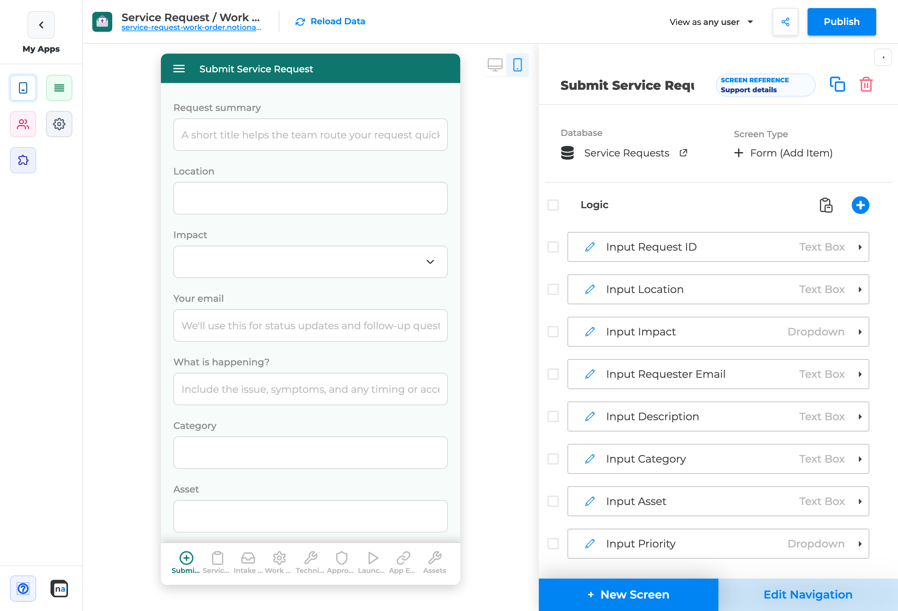
Step 1 — Open the form screen
Section titled “Step 1 — Open the form screen”- Open your application in the NotionApps builder.
- Select the Create Form or Update Form (for example, Submit Service Request).
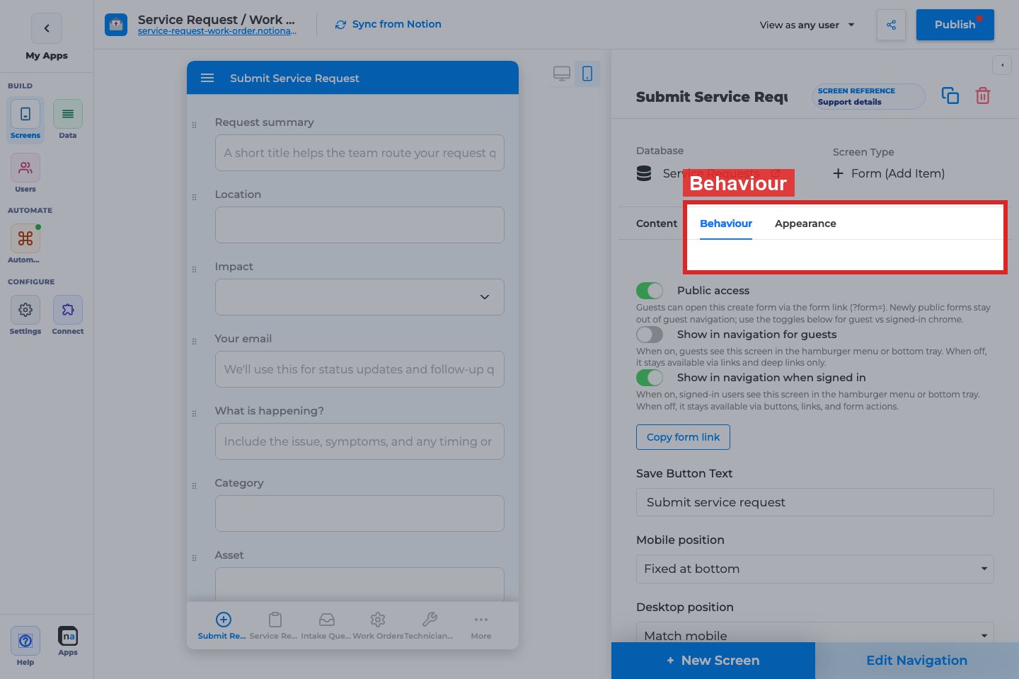
- In the right panel, find the submit button / Behaviour section that includes position controls.
Step 2 — Note the Mobile position
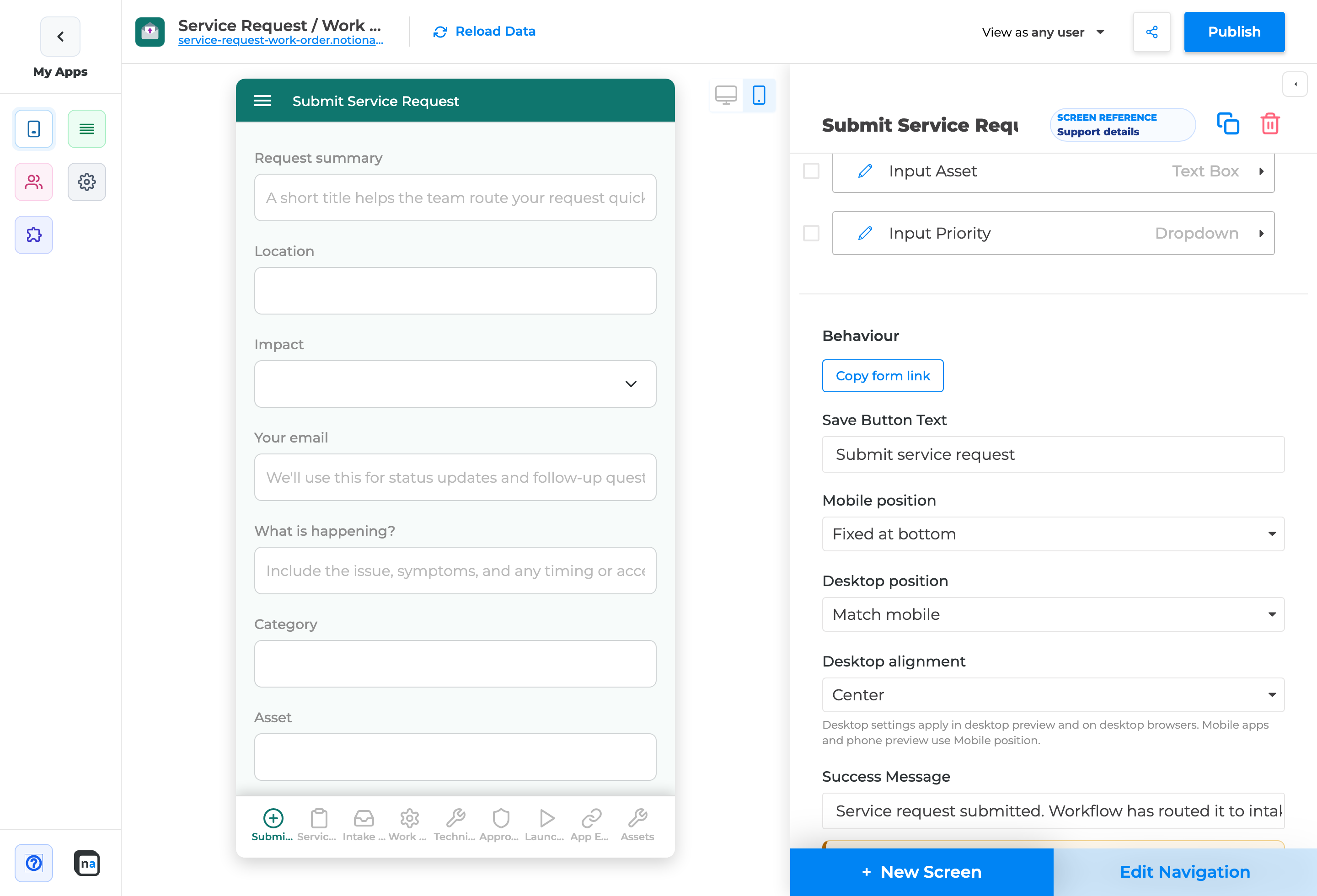
Section titled “Step 2 — Note the Mobile position”- Find Mobile position.
- Confirm the current phone setting (Floating or Fixed at bottom).
- Keep this for phone / mobile apps — desktop settings do not override it.
Step 3 — Choose Desktop position
Section titled “Step 3 — Choose Desktop position”- Find Desktop position.
- Change it from Match mobile to one of:
- Floating over content
- End of form content
- Sticky page footer
- Prefer:
- End of form content for short forms
- Sticky page footer for long forms where users should always see Submit
- Floating over content when you want the button to hover over the form
Step 4 — Choose Desktop alignment
Section titled “Step 4 — Choose Desktop alignment”- Find Desktop alignment.
- Pick Left, Center, or Right.
- Alignment only matters when Desktop position is not Match mobile.
Step 5 — Preview desktop vs phone
Section titled “Step 5 — Preview desktop vs phone”- Switch preview to Desktop.
- Scroll a long form and confirm Submit placement matches your choice.
- Switch preview to Phone.
- Confirm phone still follows Mobile position only.
Step 6 — Publish and verify live
Section titled “Step 6 — Publish and verify live”- Click Publish.
- Open the published app in a desktop browser and complete (or scroll) the form.
- Open the same form on a phone (or narrow window) and confirm mobile placement is unchanged.
When to use which option
Section titled “When to use which option”| Goal | Recommended Desktop position |
|---|---|
| Keep today’s behavior | Match mobile |
| Long intake forms — Submit always visible | Sticky page footer |
| Short forms that read top-to-bottom | End of form content |
| Match a floating mobile feel on desktop | Floating over content |
End-to-end example (makers)
Section titled “End-to-end example (makers)”Goal: A long “Submit Service Request” Create Form should keep Submit visible while scrolling on desktop, centered, without changing the phone layout.
- Open Submit Service Request.
- Leave Mobile position as-is (for example Floating).
- Set Desktop position → Sticky page footer.
- Set Desktop alignment → Center.
- Preview desktop (scroll) and phone.
- Publish and retest live.
Checklist
Section titled “Checklist”- Correct Create/Update Form selected
- Mobile position reviewed (unchanged unless you intend to)
- Desktop position set to an opt-in value
- Desktop alignment set
- Desktop preview verified (including scroll)
- Phone preview still correct
- App Published
Troubleshooting
Section titled “Troubleshooting”| Symptom | Likely cause | What to do |
|---|---|---|
| Desktop looks unchanged | Still on Match mobile | Choose Floating / End of form / Sticky footer |
| Phone layout changed too | You edited Mobile position | Restore Mobile position; use Desktop controls only |
| Sticky footer clipped | Nested scroll / short viewport | Try End of form content; widen desktop preview |
| Alignment ignored | Desktop position is Match mobile | Opt in to a desktop position first |
| Live app differs from preview | Not published | Publish again |
Related notes for makers
Section titled “Related notes for makers”- Desktop placement is stored on the form’s submit button config with the app.
- Update Forms support the same desktop controls as Create Forms.
- Visibility / disable rules on Submit still apply regardless of placement.
Annotated builder screenshots
Section titled “Annotated builder screenshots”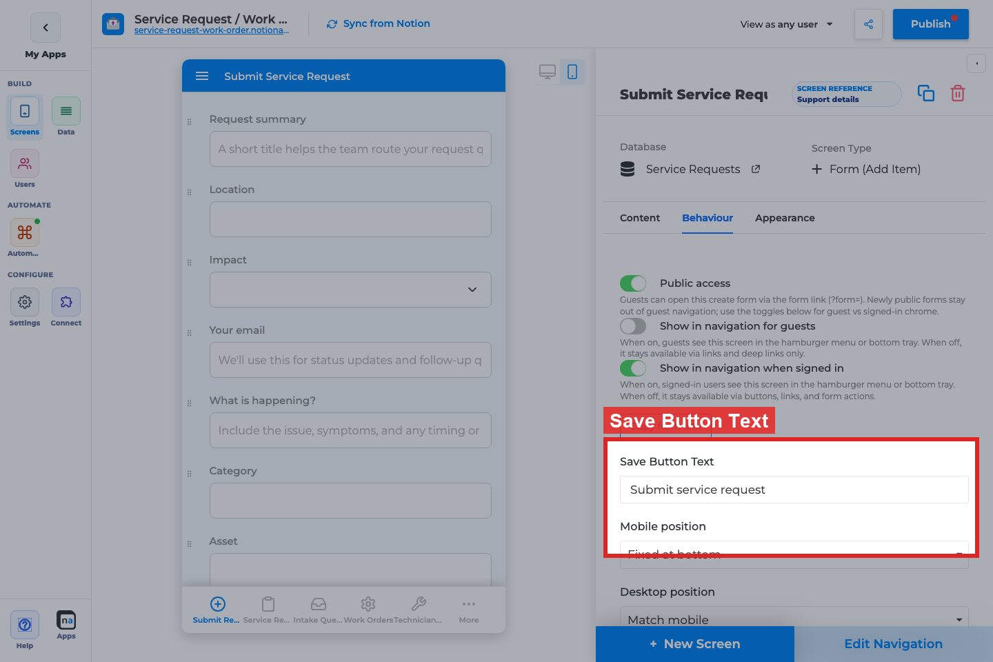
Complete Builder Options Reference
Section titled “Complete Builder Options Reference”Form Behaviour → Save button
Section titled “Form Behaviour → Save button”Save Button Text
Section titled “Save Button Text”What it does: Sets the submit label users see.
How to use it: Use the action verb (“Submit request”, “Save changes”).
Why / recommended default: Prefer specific verbs over generic “Save” on intake forms.
Desktop position / Desktop alignment
Section titled “Desktop position / Desktop alignment”What it does: Places the desktop submit control (for example sticky footer vs inline).
How to use it: Choose the placement that keeps the button visible on long forms without covering fields.
Why / recommended default: Sticky/footer on long desktop forms; inline on short forms.
Mobile position
Section titled “Mobile position”What it does: Places the submit control on phone layouts.
How to use it: Keep mobile submit easy to reach with the thumb.
Why / recommended default: Bottom / sticky on mobile for multi-section forms.
Full form options: Form (Add Item).