List (View Items)
The List (View Items) screen shows many records from a Notion database in one place. It is the main browsing surface for apps: users scan rows, search or filter, and open a details screen when they need more.
What the screen is for
Section titled “What the screen is for”Use List (View Items) when
Section titled “Use List (View Items) when”- Users need to browse many records from one database
- You want search, sorting, grouping, or end-user filters
- Row click should open a Details screen
- You may also want an Add path into a Create Form
Do not use it when
Section titled “Do not use it when”- Users only submit new records with no browsing: use Form (Add Item)
- Users edit one existing record: use Form (Update One Item) or List (Update Items)
- Work is claim-and-complete workflow items: use Work Queue
- The page is static HTML: use Content
What users see in the live app
Section titled “What users see in the live app”- A list, grid, calendar, or board of records (View Type)
- Mapped Title / Description / Caption / Tag / Image fields (depending on layout)
- Optional search, scanner, and in-app filters
- Optional add button when Add New Item is enabled
- Row tap opens the configured Details screen when Open Item On Click is on
Add List (View Items) in the builder
Section titled “Add List (View Items) in the builder”- Open Screens → + New Screen.
- Choose the Notion database to list.
- Under Data screens, select List (View Items).
- Click Done.
- Map Title (required) and other Data fields.
- On Behaviour, point Go to Screen at a Details screen.
- On Appearance, pick List / Grid / Calendar / Board.
- Publish and test on phone and desktop.
Complete Builder Options Reference
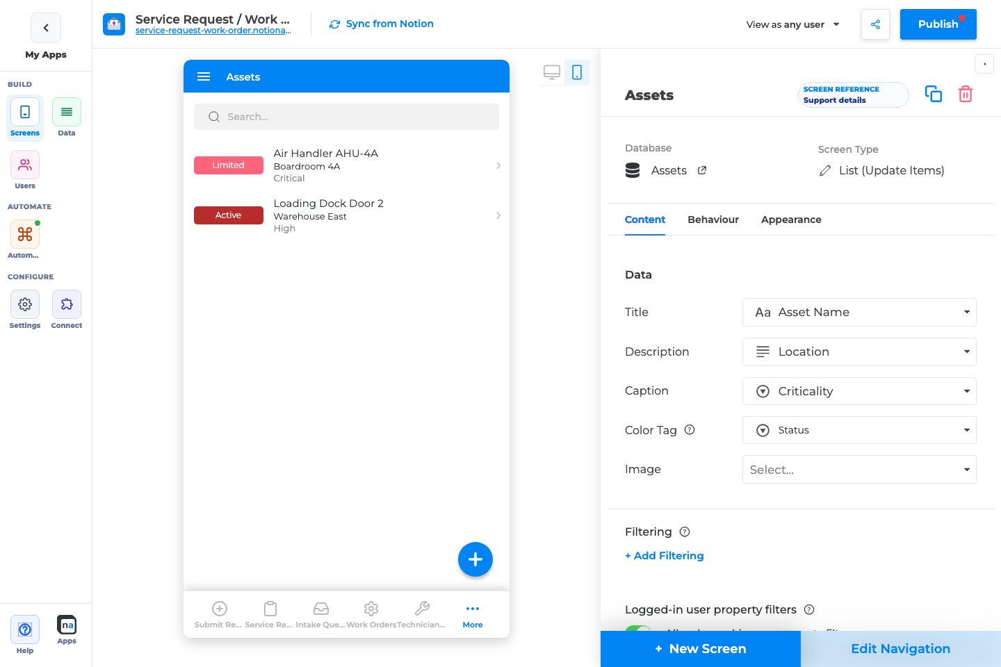
Section titled “Complete Builder Options Reference”List configuration uses three inspector tabs: Content, Behaviour, and Appearance. Per-field styling and validation are edited in the field inspector after you open a Details/Form field — not on these list tabs.
Content tab
Section titled “Content tab”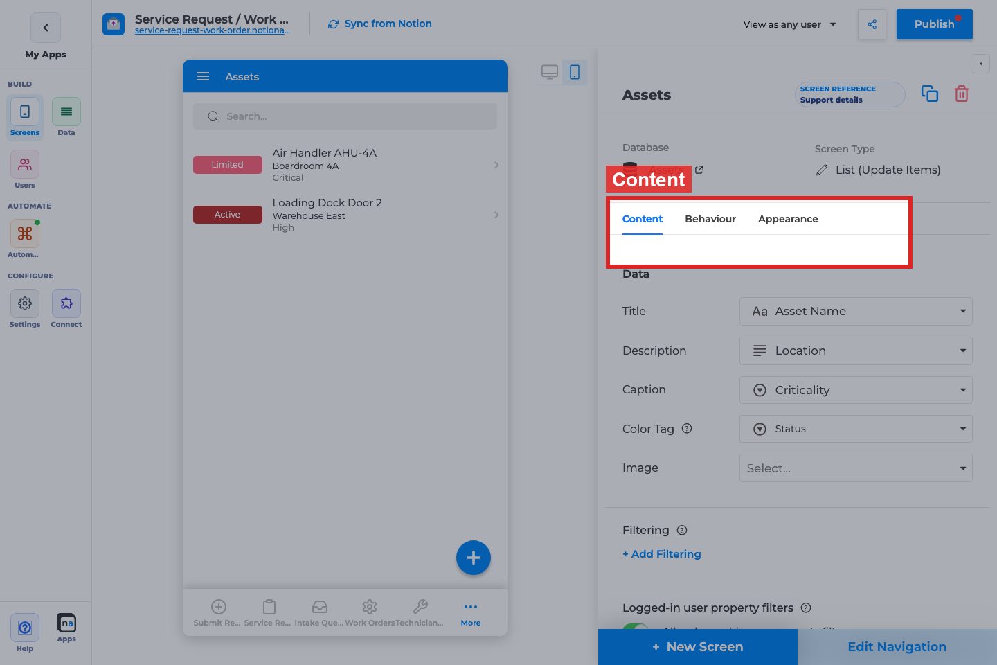
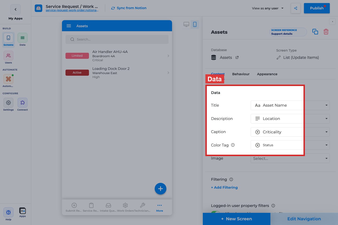
Title
What it does:
Sets the primary property shown as each row’s title. Required for a usable list.
How to use it:
Pick the field users recognize first (name, request summary, ticket title). Avoid IDs unless users search by ID.
Why / recommended default:
Title is the scan target. A common mistake is mapping a weak or empty property, which makes every row look identical.
Description / Caption
What it does:
Optional secondary and tertiary text under the title. Hidden in compact List layouts and unavailable in Calendar mode.
How to use it:
Use Description for status or owner; Caption for dates or short metadata. Keep both short for mobile.
Why / recommended default:
Leave blank until the title alone is not enough. Overloading description text makes dense lists hard to scan.
Color Tag
What it does:
Maps a select/status-style property to a colored tag on each row, with optional per-option colors.
How to use it:
Point it at Status or Priority. Set colors that match your app theme.
Why / recommended default:
Use for one high-signal status field. A common mistake is tagging a field with too many options, which becomes noisy.
Image
What it does:
Shows an image property on each row (List/Grid styles vary).
How to use it:
Map a file/image property. On Appearance, tune Image Style / Fill / Grid Image Style.
Why / recommended default:
Only enable when images add recognition value. Empty image slots waste space.
Date (Calendar only)
What it does:
When View Type is Calendar, Date replaces Description/Caption/Tag/Image and places items on the calendar.
How to use it:
Map the date property that should position events. Pair with Title only.
Why / recommended default:
Required for Calendar to be useful. Wrong date fields scatter items incorrectly.
Filtering
Section titled “Filtering”
Filter rows / + Add Filtering
What it does:
Maker-defined filters that permanently limit which rows appear on this screen (separate from Data Restriction and In-App Filtering).
How to use it:
Add conditions that define this list’s job (for example Status is Open). Use + Add group for nested and / or / not (up to 3 levels). On each condition, pick a value type: Fixed value, Logged-in user, Logged-in user property, Current row, Today / Now / Start of week / Start of month, or URL parameter.
Why / recommended default:
Prefer a clear maker filter over teaching users to filter everything manually. A common mistake is duplicating Data Restriction here. A missing URL parameter matches no rows. Walkthrough: Filter lists with groups and dynamic values.
Logged-in user property filters
Section titled “Logged-in user property filters”
Allow logged-in user property filters
What it does:
Lets filters compare list properties to the signed-in user’s Users-sheet properties (for example Owner equals Me).
How to use it:
Enable when each user should see “my” rows. Requires a linked Users sheet and matching properties. May be plan-gated.
Why / recommended default:
Excellent for private portals. Do not enable for public guest lists — guests have no user profile.
Grouping
Section titled “Grouping”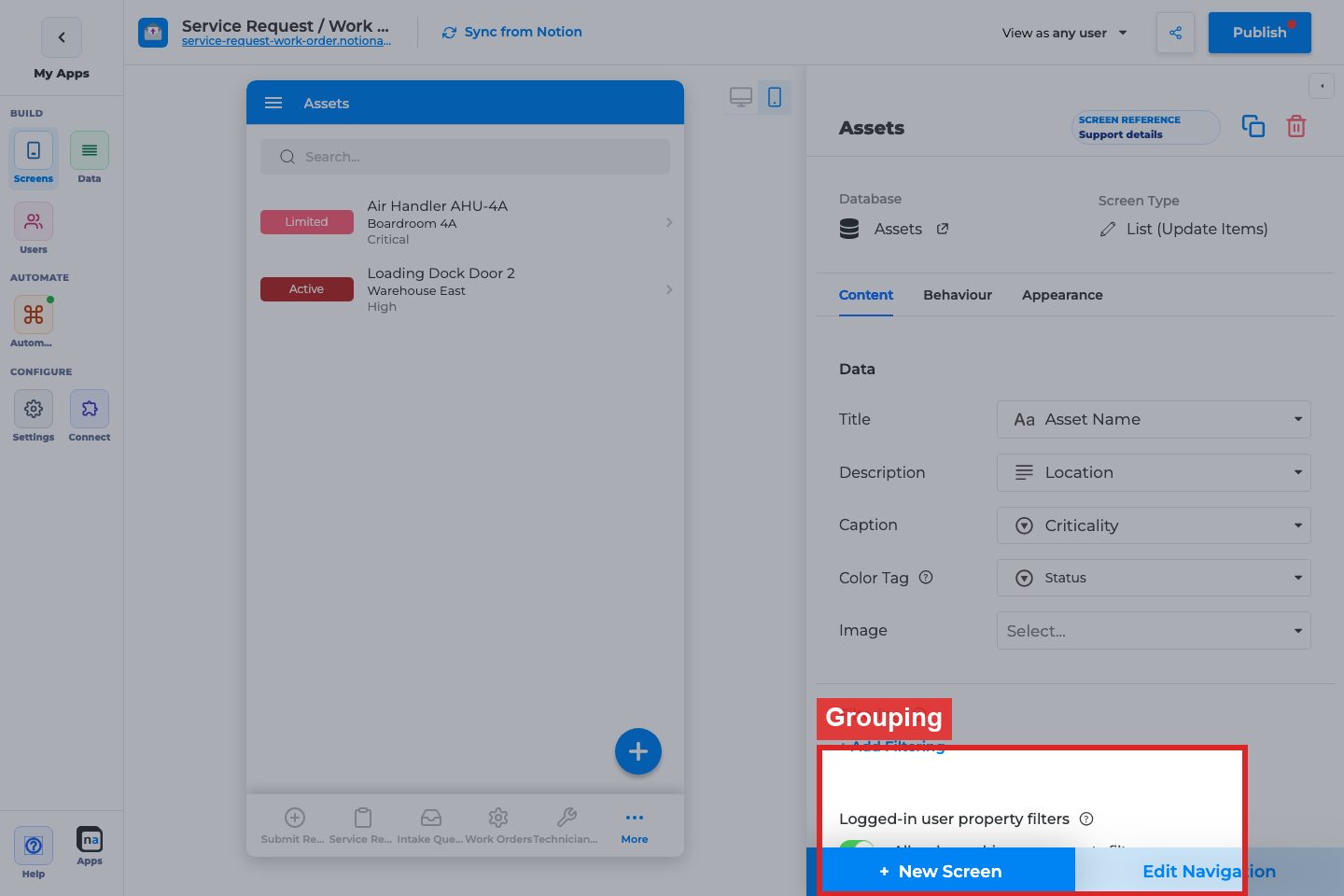
Group By / Order / + Add Grouping
What it does:
Groups rows by a property (feature/beta may apply). Hidden for Calendar. Typically one group level.
How to use it:
Group by Status or Category when users triage by buckets. Choose A→Z or Z→A order.
Why / recommended default:
Skip grouping until the list is long enough that buckets help. Grouping empty or unique fields adds clutter.
Sorting
Section titled “Sorting”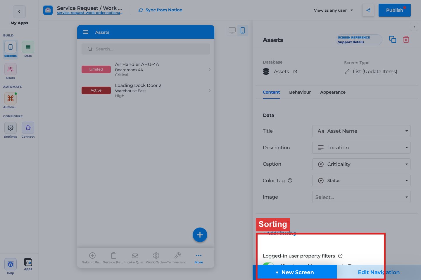
Sort By / Order / + Add Sorting
What it does:
Default sort for the list. Hidden for Calendar.
How to use it:
Sort by newest date or priority. Add multiple levels only when needed.
Why / recommended default:
Default to newest-first for operational lists. Unsorted lists feel unfinished.
In-App Filtering
Section titled “In-App Filtering”
Filter Name / Filter Columns / + Add Filter Property
What it does:
Defines filters end users can change while browsing (distinct from maker Filtering).
How to use it:
Expose 1–3 useful columns (Status, Category, Owner). Name filters clearly.
Why / recommended default:
Use for exploratory browsing. Do not expose every column — mobile filter UIs get heavy.
Behaviour tab
Section titled “Behaviour tab”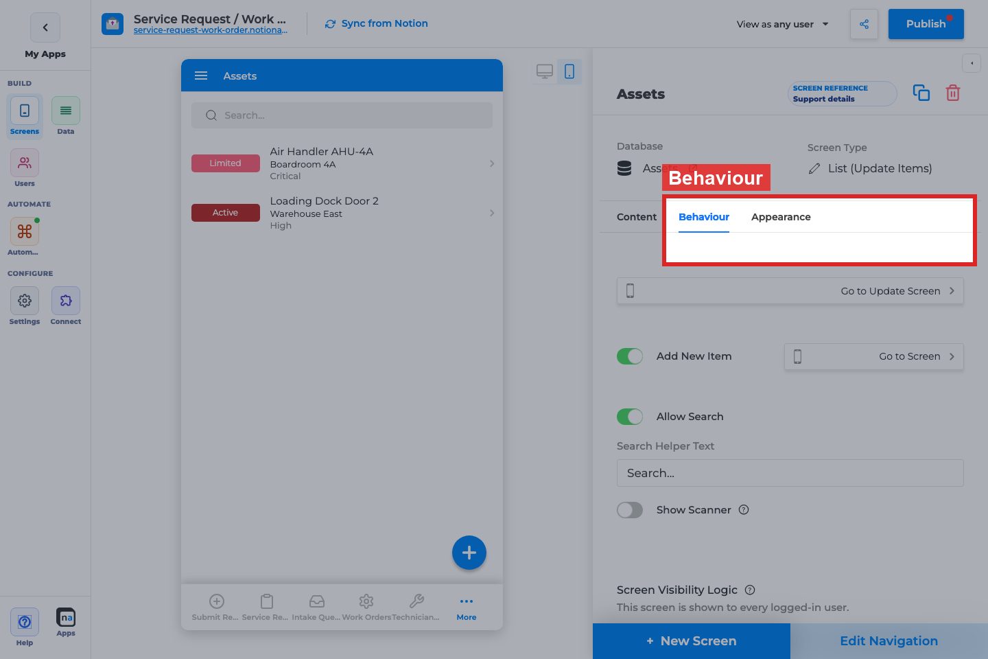
Open Item On Click / Go to Screen
Section titled “Open Item On Click / Go to Screen”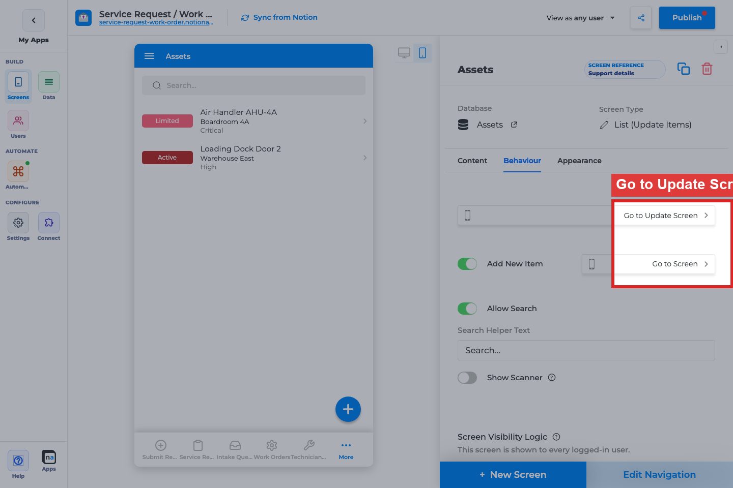
What it does:
When on, tapping a row opens the selected Details (or other) screen.
How to use it:
Turn on for browse→details flows. Pick the Details screen for the same database.
Why / recommended default:
On for almost every View List. Leaving it off makes the list feel dead.
Add New Item
Section titled “Add New Item”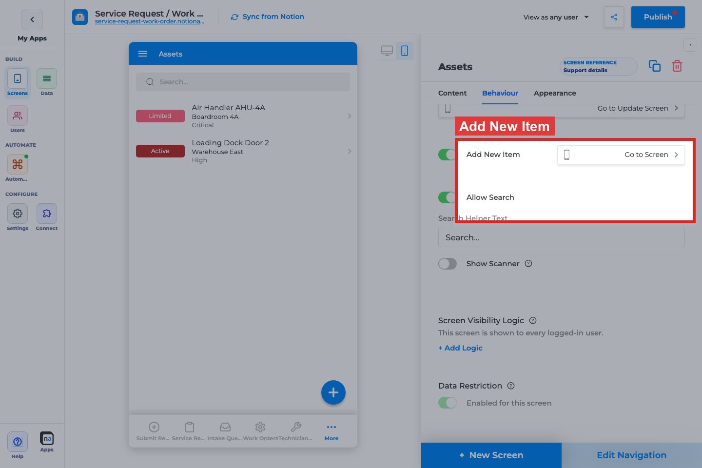
Add New Item / Go to Screen
What it does:
Shows an add affordance that opens a Create Form screen.
How to use it:
Enable when users should create records from this list. Point to the matching Form (Add Item).
Why / recommended default:
On for operational intake lists; off for read-only directories.
Allow Search
Section titled “Allow Search”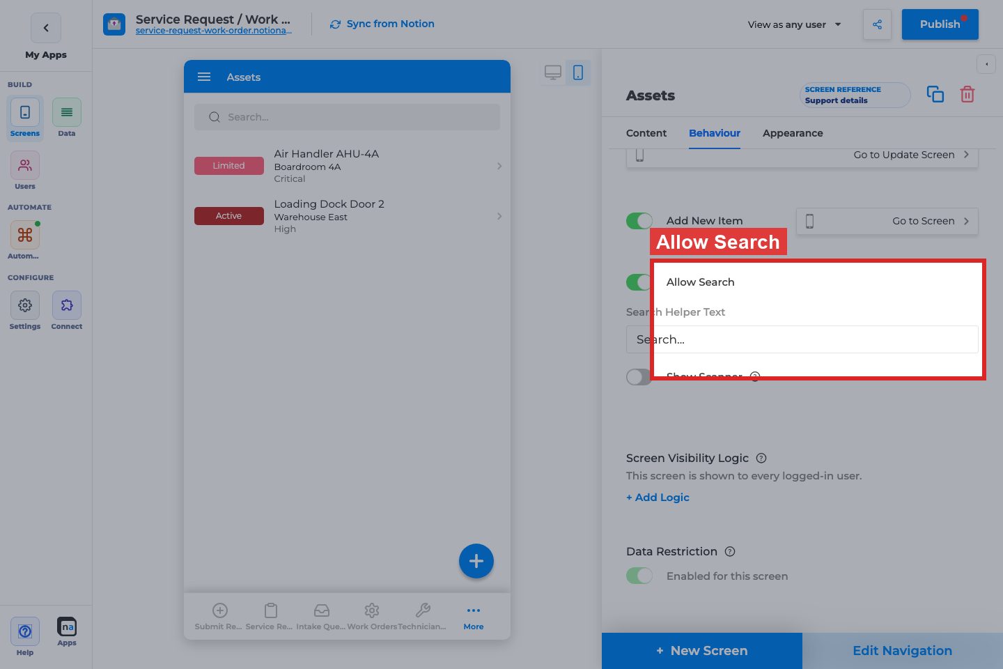
Allow Search / Search Helper Text / Show Scanner / Scan Type
What it does:
Adds a search bar; optional barcode/QR scanner with type Barcode or QR Code.
How to use it:
Enable search for large lists. Set helper text like “Search requests”. Enable scanner only when users scan codes into the same properties.
Why / recommended default:
Search on for lists over ~20 rows. Scanner off unless the workflow is scan-driven.
Screen Visibility Logic
Section titled “Screen Visibility Logic”
Status / + Add Logic
What it does:
Controls who can open this screen (restricted vs unrestricted). Logic filters use the Users sheet on private apps.
How to use it:
Keep unrestricted for shared team lists. Add user-sheet logic when only certain roles should see the screen.
Why / recommended default:
Unrestricted unless the screen is role-sensitive. Do not confuse this with Filtering (which rows) or Data Restriction (which rows per user).
Data Restriction
Section titled “Data Restriction”
Enabled for this screen
What it does:
Applies database personalization so each user only sees rows they are allowed to access. Disabled on public apps or when the sheet is not personalized.
How to use it:
Enable for customer/partner portals. Keep off for shared staff desks that should see all open work.
Why / recommended default:
Match the database’s personalization strategy. Enabling without a Users mapping looks like an empty list bug.
Appearance tab
Section titled “Appearance tab”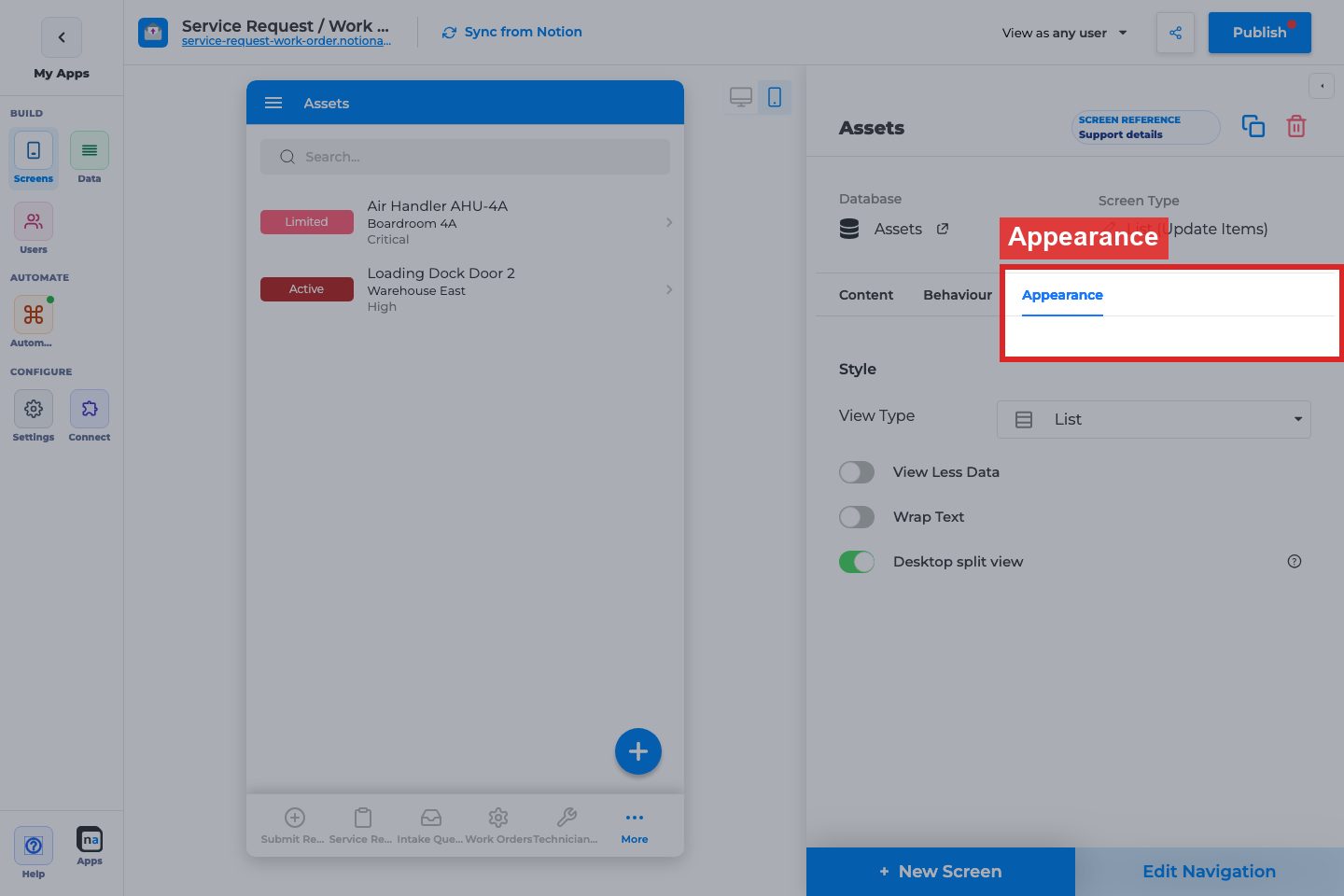
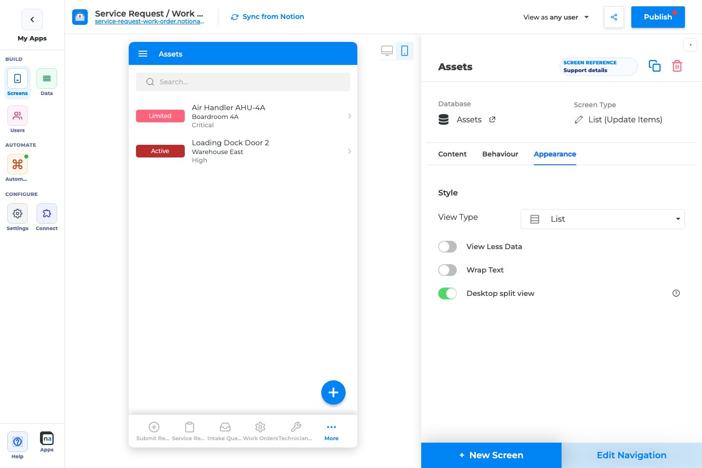
View Type
Section titled “View Type”
View Type
What it does:
Chooses List, Grid, Calendar, or Board presentation.
How to use it:
List for dense ops queues; Grid for image-heavy catalogs; Calendar for dated work; Board for status columns.
Why / recommended default:
List is the safest default. Calendar requires a Date mapping; Board needs a useful status/select property.
Style controls (conditional)
Section titled “Style controls (conditional)”Grid Column Size / Grid Image Style
What it does:
Grid density and image crop style when View Type is Grid.
How to use it:
Large for marketing-style cards; Small for denser catalogs.
Why / recommended default:
Large when images matter; Small when titles matter more.
Image Style / Image Fill
What it does:
Shape and fit for list/grid images (not Calendar).
How to use it:
Match brand (square vs round). Use Fit for logos; Fill for photos.
Why / recommended default:
Square + Fill is a solid default for photos.
Default Mode / Allow Mode Change (Calendar)
What it does:
Calendar starts in Day/Week/Month/Agenda; optional user mode switching.
How to use it:
Month for overview; Week for scheduling teams. Allow Mode Change when users need flexibility.
Why / recommended default:
Month + Allow Mode Change on for most calendar lists.
View Less Data / Wrap Text / Desktop split view
What it does:
Compact list density; wrap long text; show list+details side-by-side on wide desktops.
How to use it:
View Less Data for long operational lists. Desktop split view when desktop users triage quickly.
Why / recommended default:
View Less Data on for dense queues; Desktop split view on for staff desktop apps.
Related setup outside the inspector
Section titled “Related setup outside the inspector”Edit Navigation
Section titled “Edit Navigation”What it does:
Controls nav label, icon, and whether the list appears in guest/signed-in navigation (and Public access on private apps via the screen accordion).
How to use it:
Put primary lists in navigation. Keep secondary lists hidden and open them from buttons. Use Reuse screen to put the same list in two tabs; Detach when that extra tab needs its own filters.
Why / recommended default:
One primary list in nav beats five competing lists. Reuse instead of cloning when the tabs should stay in sync. How-to: Reuse a Screen in Navigation.
Field inspector on Details/Form
Section titled “Field inspector on Details/Form”What it does:
Per-field labels, required, validation, visibility, defaults — configured on Details/Form screens, not on List Data mapping.
How to use it:
After list→details navigation works, polish field-level options on the Details/Form screens.
Why / recommended default:
Do not expect list Data mapping to replace field inspector setup.
Recommended default setup
Section titled “Recommended default setup”| Setting | Recommended value |
|---|---|
| Title | Primary human-readable property |
| Open Item On Click | On → Details screen |
| Add New Item | On only if users create from this list |
| Allow Search | On for larger lists |
| View Type | List |
| Filtering | Match the list’s job (e.g. open items only) |
| Data Restriction | On for personalized portals; off for shared staff desks |
Testing checklist
Section titled “Testing checklist”- Title mapping is readable on mobile
- Row click opens the intended Details screen
- Add button opens the intended Create Form (if enabled)
- Maker Filtering shows the expected subset (including groups, clock tokens, and URL parameter if you used them)
- In-app filters work for end users
- Search finds known records
- Calendar/Board/Grid layouts render with required fields
- Data Restriction / visibility behave correctly per persona (
View as user)
Troubleshooting
Section titled “Troubleshooting”| Symptom | Likely cause | What to check |
|---|---|---|
| List is empty | Filtering, Data Restriction, or empty DB | Relax filters; test as another user |
| Row click does nothing | Open Item On Click off or missing Go to Screen | Behaviour tab |
| Calendar empty/wrong | Date not mapped or wrong field | Content → Data → Date |
| Search missing | Allow Search off | Behaviour tab |
| Users see others’ rows | Data Restriction off | Behaviour → Data Restriction |
Best practices
Section titled “Best practices”- One list job per screen (Open requests, Closed archive) instead of one mega-list.
- Always pair View List with a Details destination.
- Keep in-app filters few and meaningful.
- Prefer maker Filtering for permanent scope; In-App Filtering for exploration.