Status Timeline
Status Timeline
Section titled “Status Timeline”Status Timeline
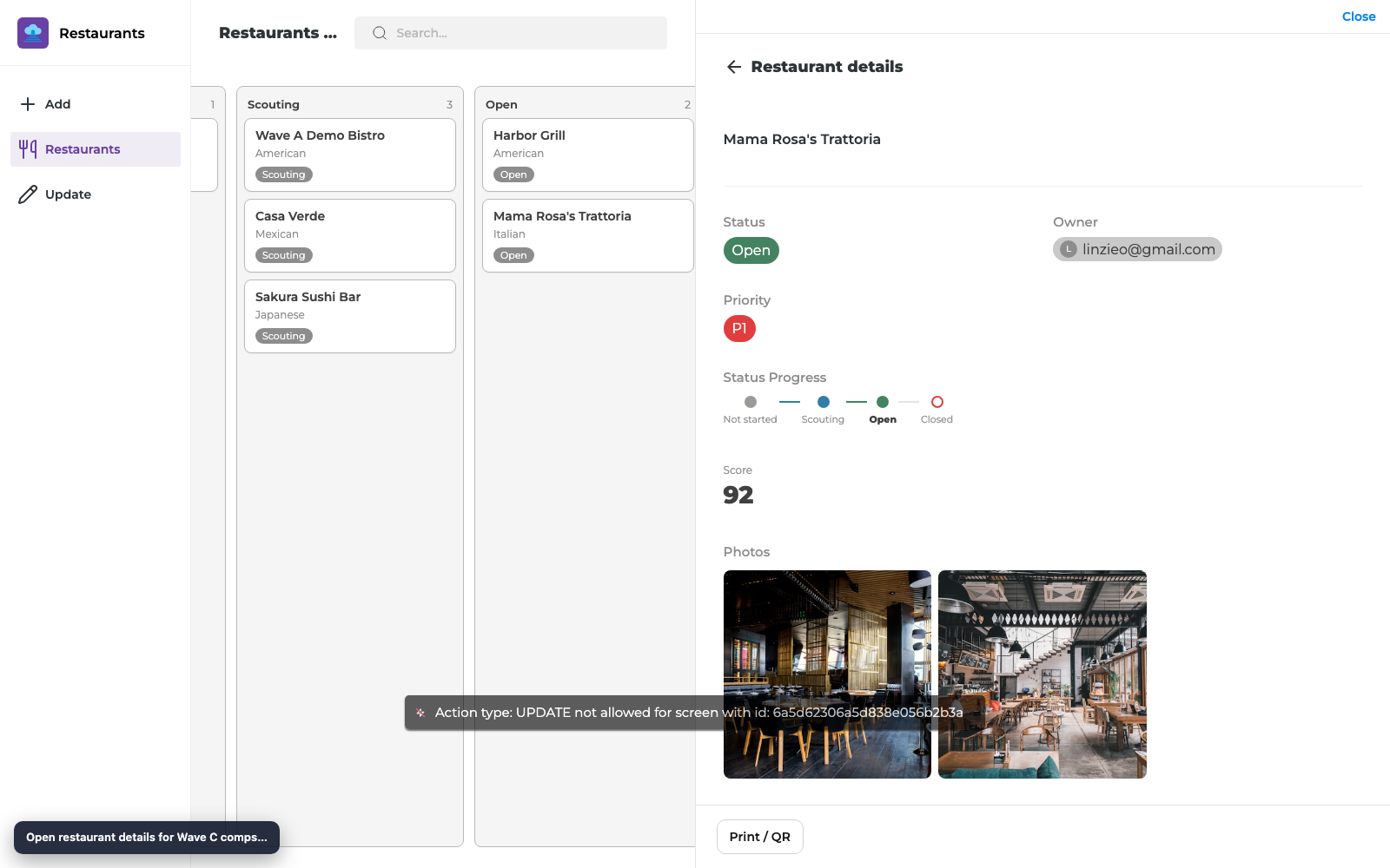
Section titled “Status Timeline”Show a horizontal Status Timeline on Details so users see where a record sits in its Status lifecycle (past → current → upcoming options).
What you get
Section titled “What you get”| Capability | Maker setup | End-user result |
|---|---|---|
| Lifecycle strip | Add Status Timeline, bind Status field | Options in a horizontal progress-style row |
| Active marker | Automatic from record value | Current status emphasized |
| Option order | From Notion Status options | Matches Notion’s configured order |
Before you start
Section titled “Before you start”- A Notion Status property with the options you care about
- A Details screen
- Reload Data after editing Status options in Notion
Step 1 — Add Status Timeline
Section titled “Step 1 — Add Status Timeline”- Open the Details screen.
- Add component → Status Timeline.
- Bind it to the Status property.
- Optionally set a label (for example Status Progress).
Step 2 — Preview across statuses
Section titled “Step 2 — Preview across statuses”- Open records in different statuses (Not started, Scouting, Open, Closed).
- Confirm the timeline highlights the correct active option each time.
- Publish and re-check in the live app.
Checklist
Section titled “Checklist”- Status Timeline bound to Status
- Option order matches Notion after Reload Data
- Active status is obvious for several sample records
- Changing Status elsewhere (Board / Update Form) updates the timeline after refresh
Troubleshooting
Section titled “Troubleshooting”| Symptom | Likely cause | Fix |
|---|---|---|
| Missing options | Stale sheet metadata | Reload Data |
| Wrong active step | Record Status empty or different property | Bind correct Status field |
| Want to edit on the timeline | Component is view-only | Use Board DnD or Update Form |
Related reading
Section titled “Related reading”- Board List View — change Status by dragging columns
- Status and People Field Fidelity
- Board layouts and Details polish (overview)
- 20 Jul 2026 Release
Builder options at a glance
Section titled “Builder options at a glance”This guide teaches a focused maker workflow. For the full screen option inventory (What it does / How to use / Why) and annotated builder screenshots, use the matching Types of Screens guide:
- Data screens: List (View Items), Details, Form (Add Item), Form (Update One Item), List (Update Items), Content
- Everyday chrome / Queue & activity: see the Types of Screens index
- Automation native screens: Native Automation Screens
Recommended defaults
Section titled “Recommended defaults”- Change one option family at a time, then publish and test on phone and desktop.
- Prefer screen-level settings in Content / Behaviour / Appearance before custom CSS/JS.
- Keep public access and navigation visibility intentional on every screen you link from this guide.