Polish Your Published App Look and Layout
Make published NotionApps feel like finished products — not utility admin forms. This guide covers the published-app visual system: login polish, layout density presets, form spacing and sticky Submit, desktop master–detail, details action rails, and cleaner app names (no more “Copy of …”).
What you get
Section titled “What you get”| Feature | Where you configure it | What end users see |
|---|---|---|
| Login hero + wrapping title | Automatic from app color / icon / name | Brand-colored header, rounded inputs, full title (no hard 27-character cut) |
| Layout presets (Compact / Comfortable / Showcase) | Settings → General → Layout presets | Spacing, type scale, radii, and denser/airier forms & lists |
| Color presets | Same General preview (or Appearance) | Accent / theme color |
| Sticky desktop Submit | Create/Update Form Behaviour (or default) | Submit stays pinned while scrolling on desktop |
| Heading section rhythm | Add Heading comps on forms | Clear visual groups between field sections |
| Desktop master–detail | Automatic on wide desktop List screens | List left · details/forms right |
| Details sticky actions | Automatic on desktop Details | Edit / Delete stay visible at the bottom |
| Page Content TOC (new comps) | Show Page Content settings | Side TOC defaults on for new comps when enough headings exist |
| “Copy of” cleanup | Publish + login display | Clone prefixes stripped for end users |
Before you start
Section titled “Before you start”You need:
- An application in the NotionApps builder with at least one List, one Details (or Update Form), and one Create Form
- Permission to Publish
- A desktop browser window wide enough to preview desktop layouts (about 1100px+ for master–detail)
Part A — Layout presets (Compact / Comfortable / Showcase)
Section titled “Part A — Layout presets (Compact / Comfortable / Showcase)”Layout presets change spacing, type, radii, and density — not only the accent color.
Step A1 — Open General settings
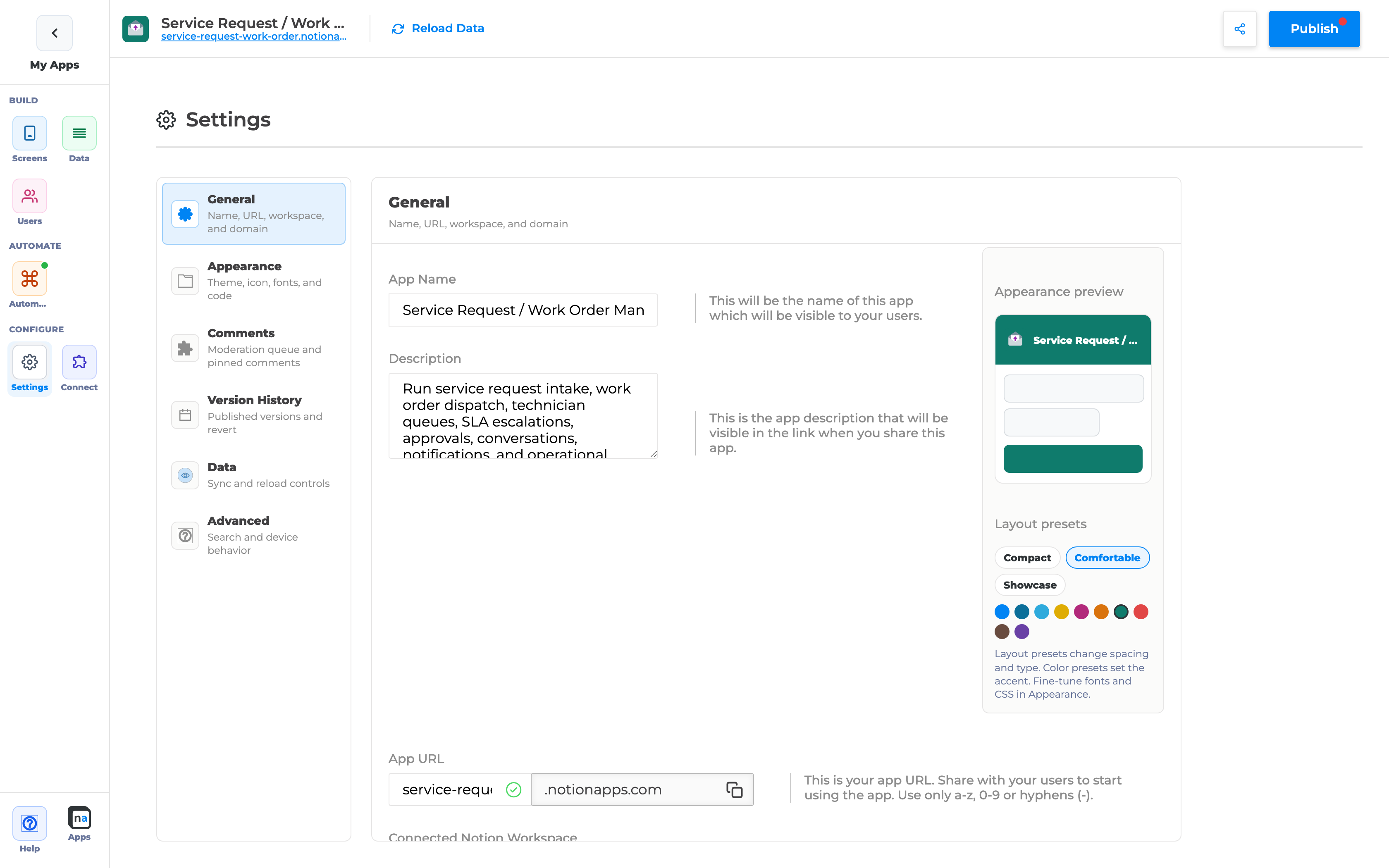
Section titled “Step A1 — Open General settings”- Open your app in the builder.
- Click Settings in the left rail.
- Stay on General (name, URL, workspace).
- Look at the right-hand Appearance preview card.
Step A2 — Choose a layout preset
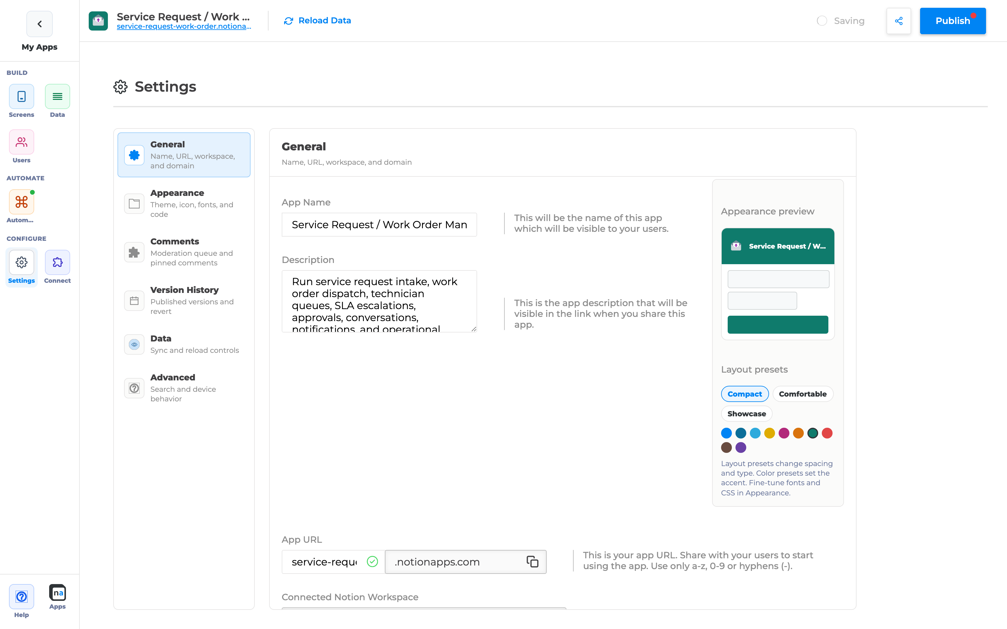
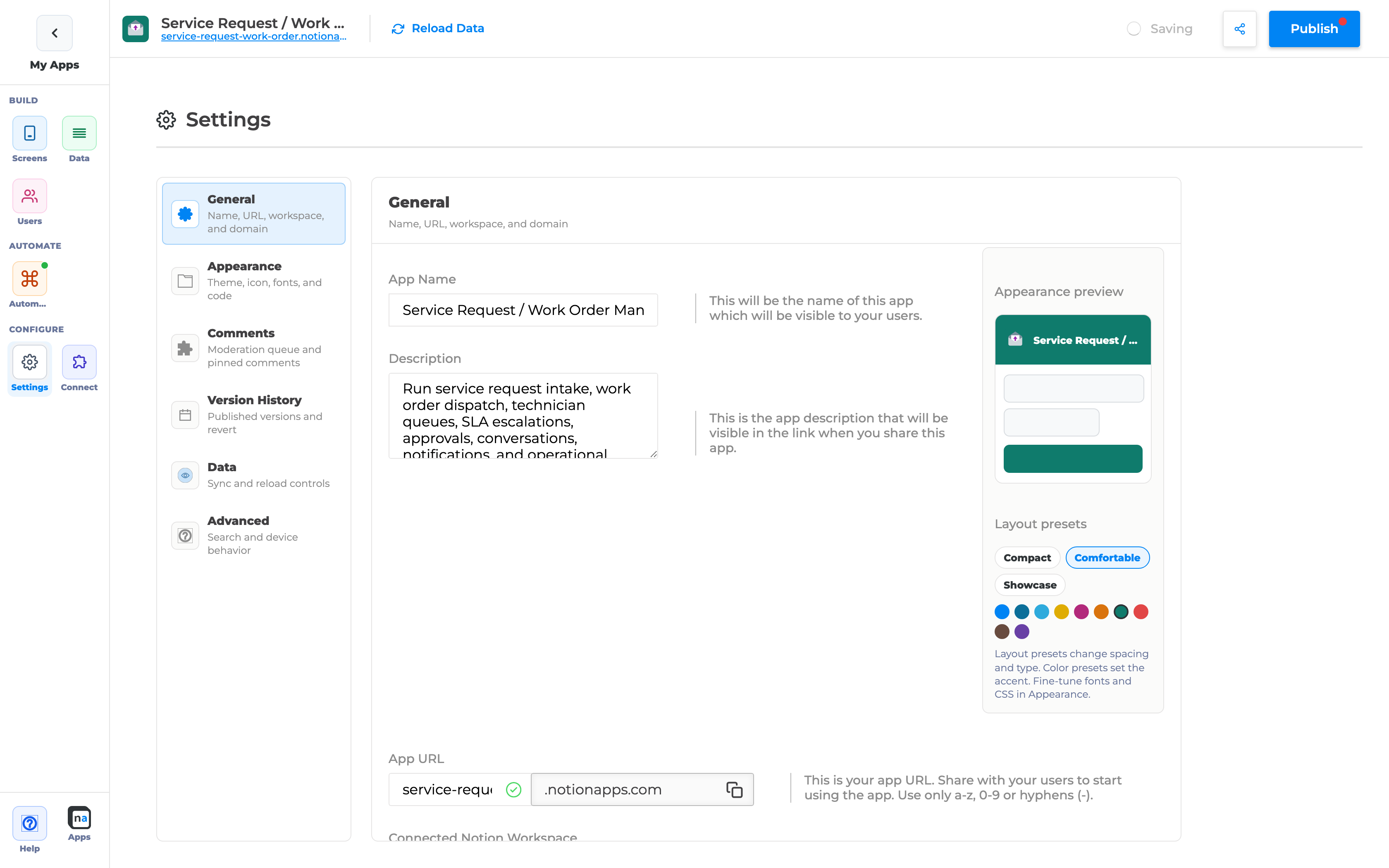
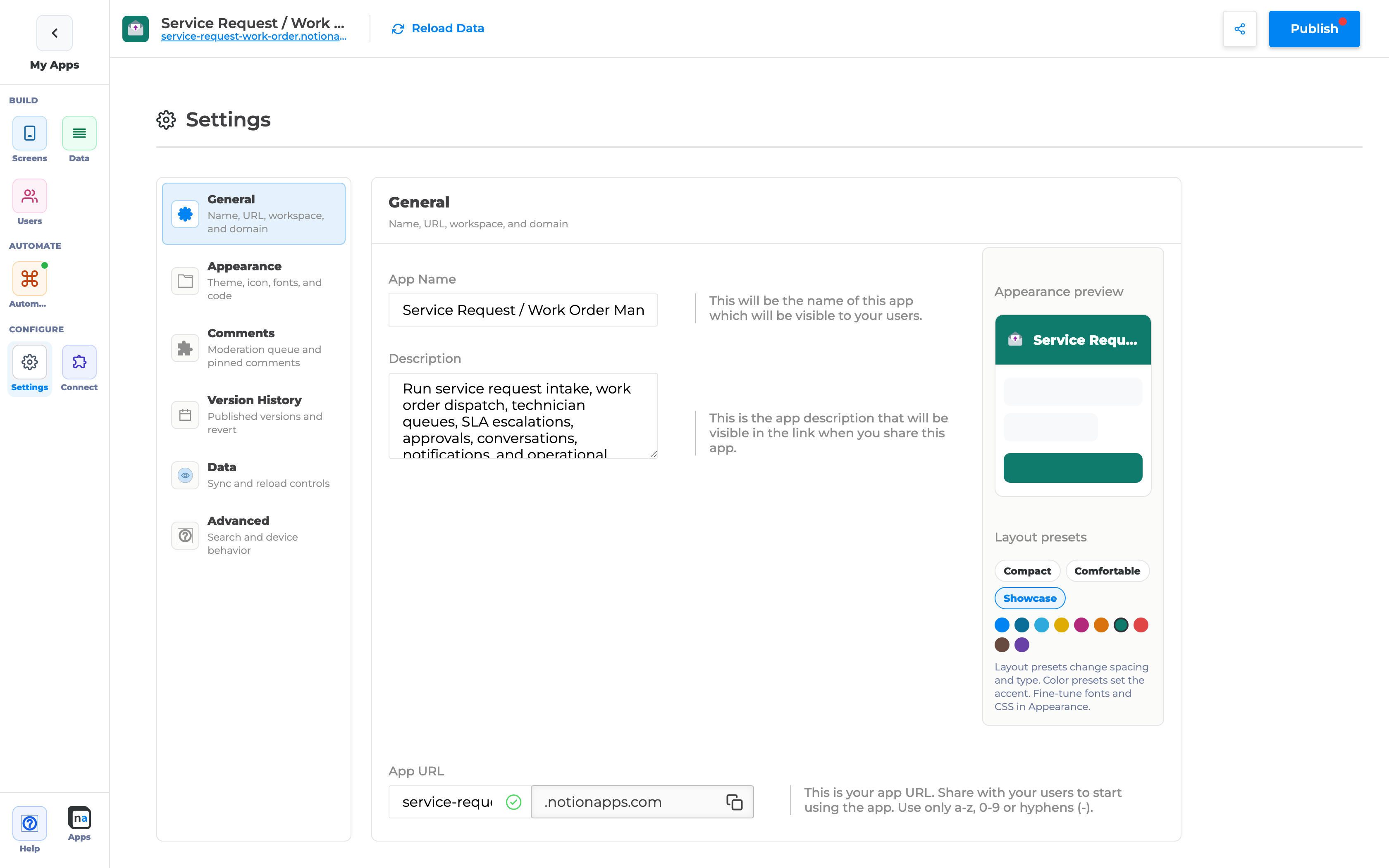
Section titled “Step A2 — Choose a layout preset”- Find Layout presets.
- Click one of:
- Compact — tighter rows/padding, smaller type (dense ops UIs)
- Comfortable — default; taller fields, softer radii (everyday work)
- Showcase — larger type, airier spacing, fewer chrome lines (portals / catalogues)
- Watch the mini phone preview update live.
Step A3 — Pair with a color preset
Section titled “Step A3 — Pair with a color preset”- Under Layout presets, use Color presets (swatches) to set the accent.
- For fonts / Custom CSS, open Appearance.
When to use which preset
Section titled “When to use which preset”| Goal | Preset |
|---|---|
| Field / ops tools with long lists | Compact |
| Most internal tools (recommended start) | Comfortable |
| Client portals, catalogues, editorial feel | Showcase |
Part B — Login chrome (published app)
Section titled “Part B — Login chrome (published app)”End users see a brand hero, a wrapping app title, and rounded login controls.
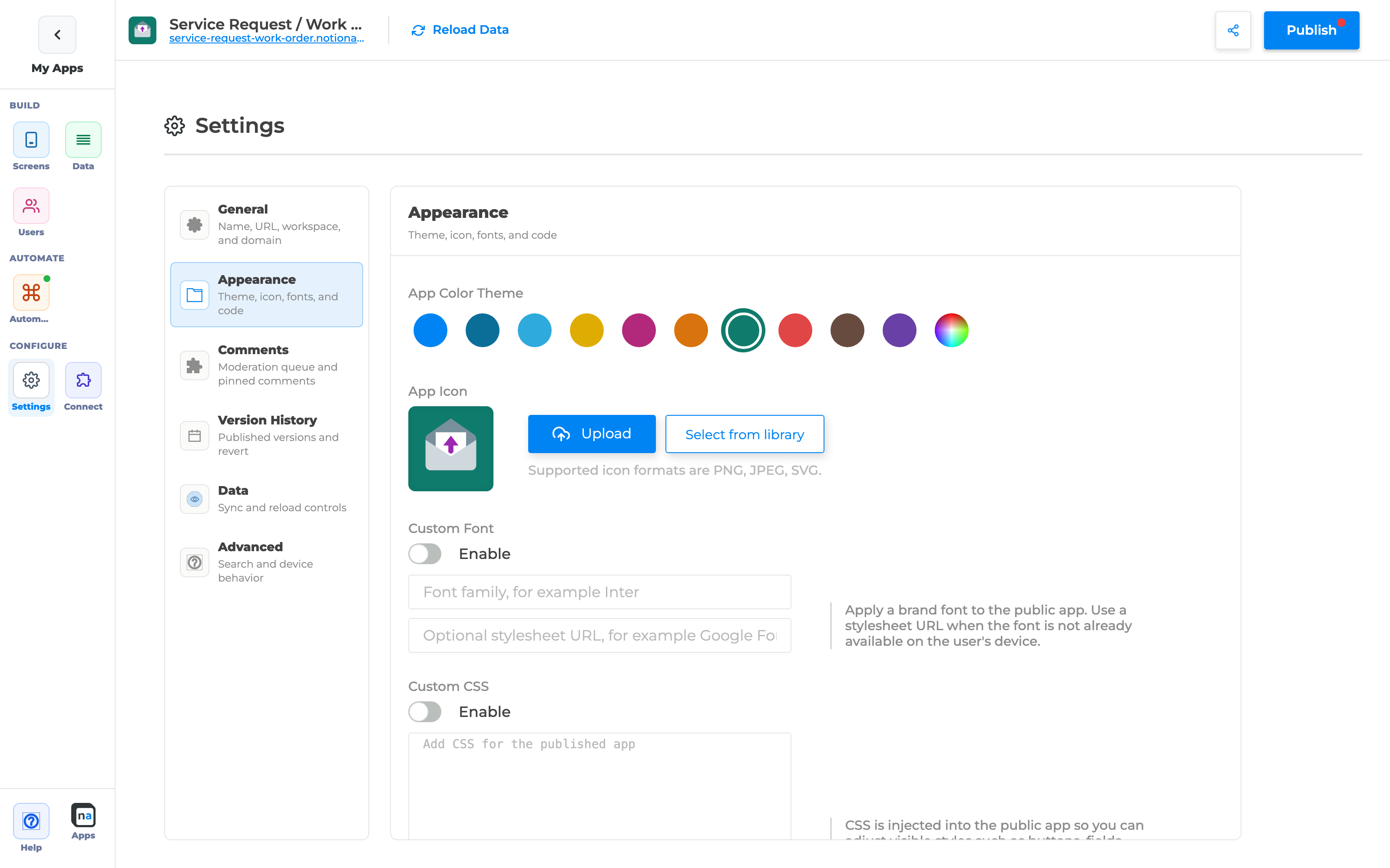
Step B1 — Set branding inputs
Section titled “Step B1 — Set branding inputs”- Settings → General: App name (avoid leaving “Copy of …” in names you care about for users — see Part F).
- Settings → Appearance (or General color swatches): theme color.
- Upload / select an App icon.
Step B2 — Preview the published login
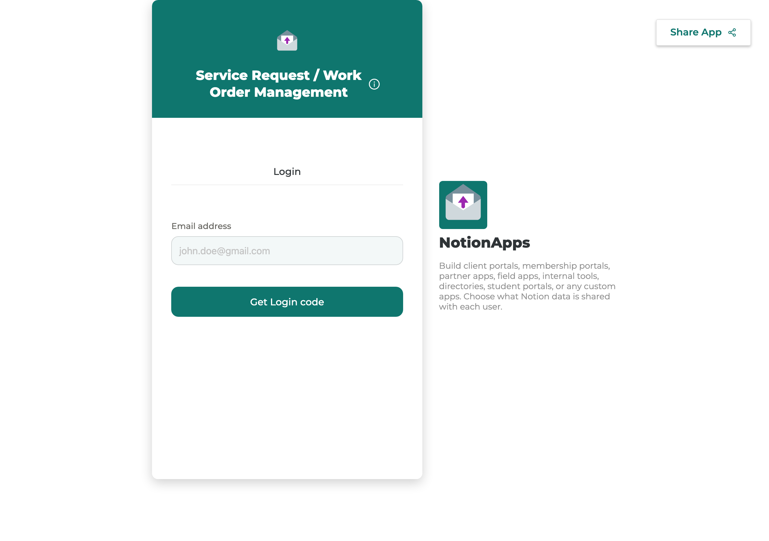
Section titled “Step B2 — Preview the published login”- Publish (or open the end-user URL for the app).
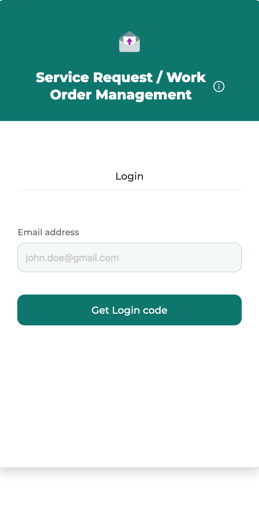
- Confirm:
- Title can wrap across 2–3 lines (not truncated mid-word at 27 characters)
- Top band uses your theme color with the app icon
- Email / code inputs and primary CTA use larger corner radii (~12px)
- Google / Okta / Auth0 buttons still appear when enabled
Part C — Form runtime (spacing + sticky Submit)
Section titled “Part C — Form runtime (spacing + sticky Submit)”Step C1 — Open a Create or Update Form
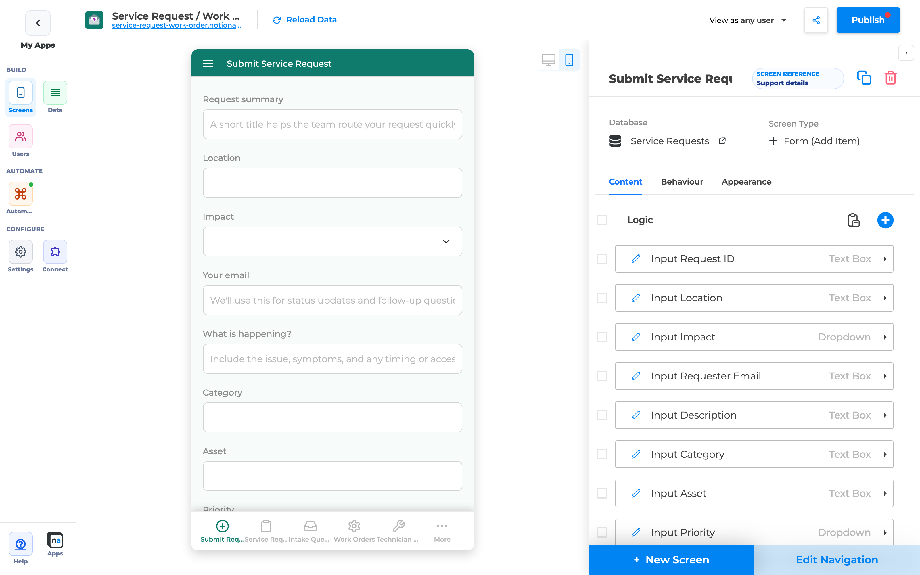
Section titled “Step C1 — Open a Create or Update Form”- Go to Screens.
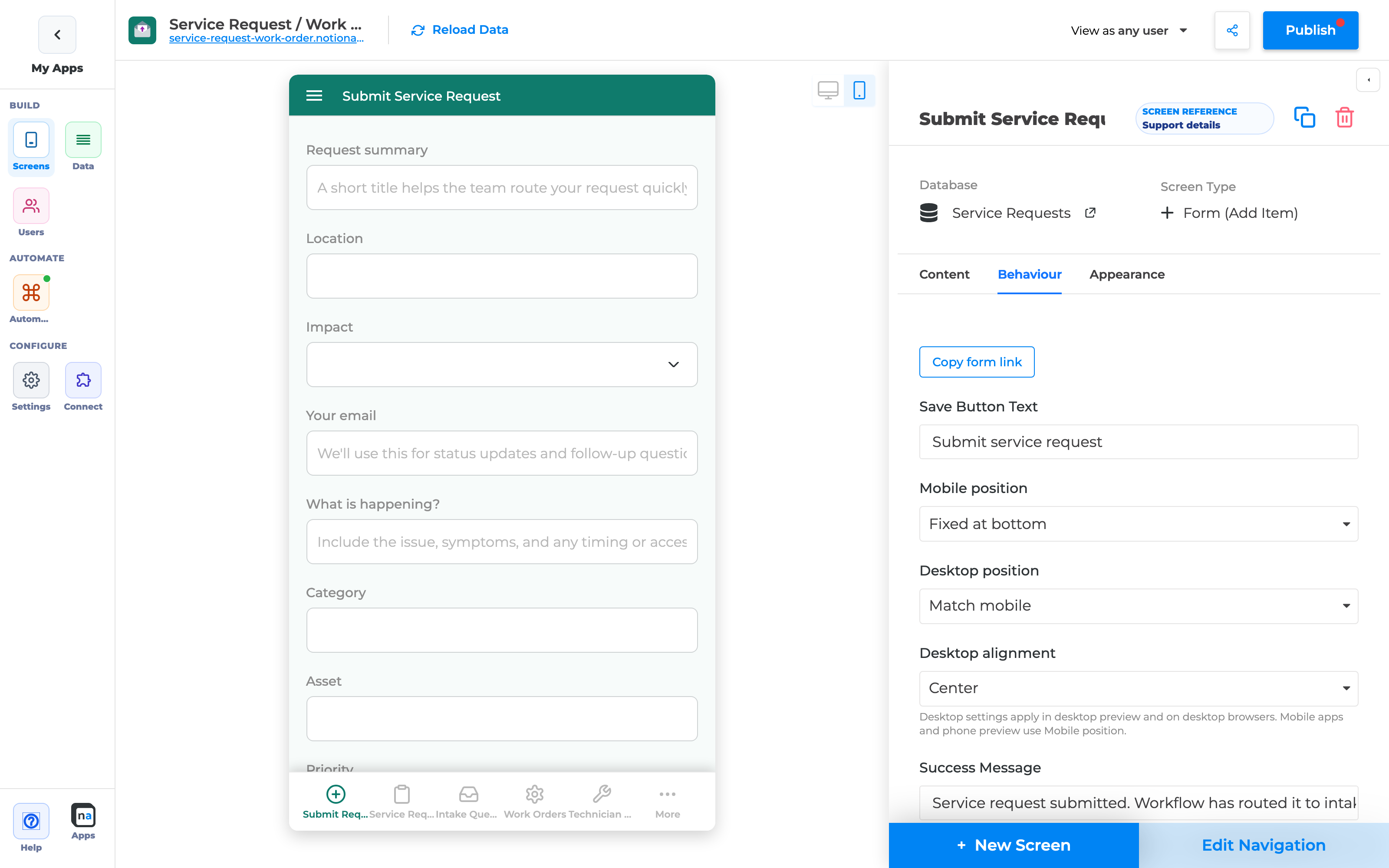
- Open a Create Form (for example Submit Service Request).
- Switch the preview to Desktop.
Step C2 — Use Headings to group sections
Section titled “Step C2 — Use Headings to group sections”- In Add to screen / Logic, add Heading components between groups of fields.
- Headings get extra vertical space so forms read as sections (without a new “section” component type).
Step C3 — Desktop sticky Submit
Section titled “Step C3 — Desktop sticky Submit”On desktop, Create/Update forms default to a sticky page footer Submit when you have not overridden placement.
- Open the form’s submit / Behaviour controls.
- Review Desktop position:
- Leave unset / use sticky footer for long intake forms
- Or set Floating / End of form / Match mobile as needed
See also: Control Desktop Form Submit Placement.
- Scroll the desktop preview — Submit should stay visible at the bottom when sticky.
Step C4 — Confirm phone is unchanged
Section titled “Step C4 — Confirm phone is unchanged”- Switch preview to Phone.
- Confirm Submit still follows Mobile position only.
Part D — Desktop master–detail (List | Details / Form)
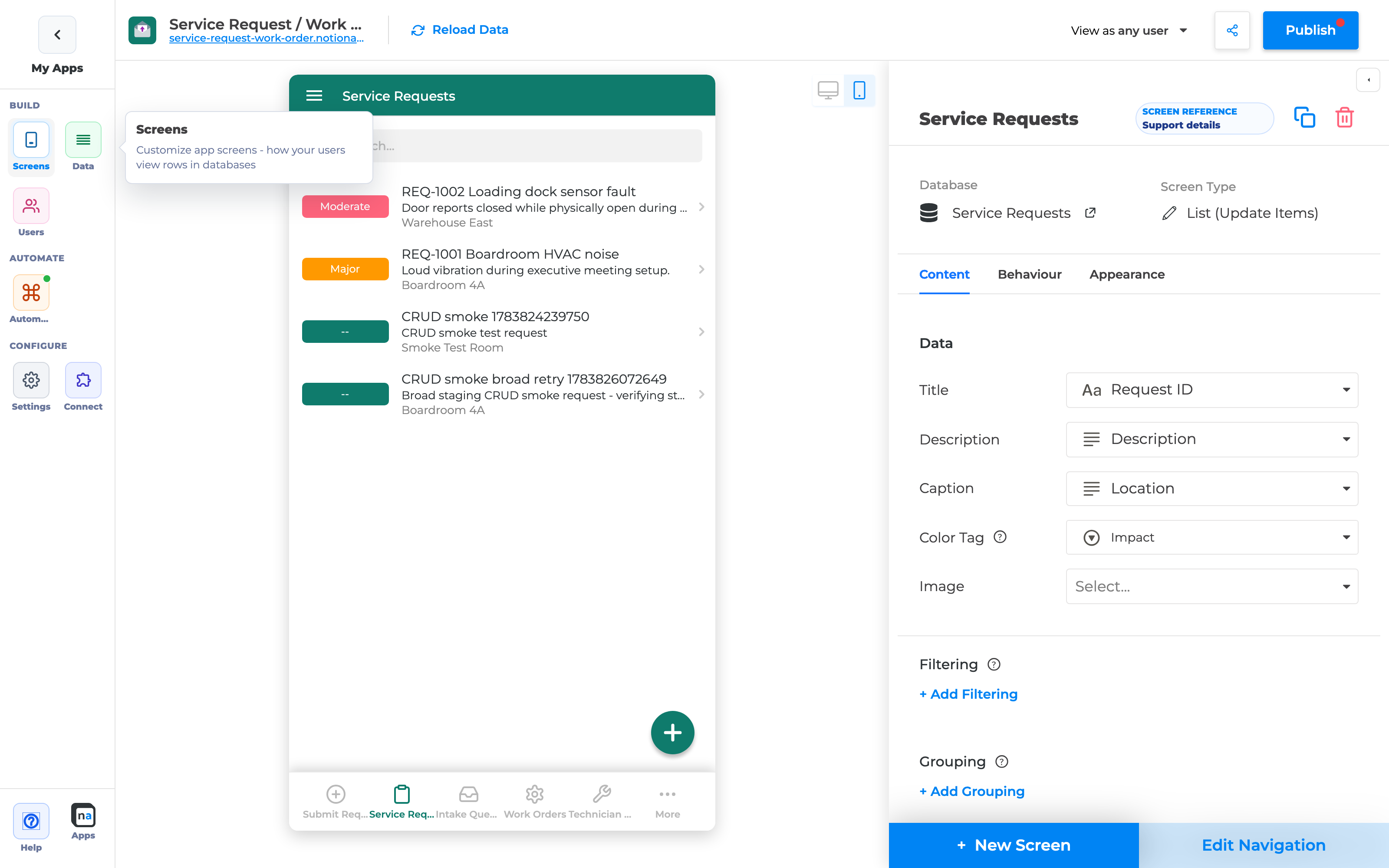
Section titled “Part D — Desktop master–detail (List | Details / Form)”On desktop with a wide enough preview/window (≥ ~1100px), List screens open records in a right pane instead of pushing a full-screen Details/Form.
Step D1 — Open a List on Desktop
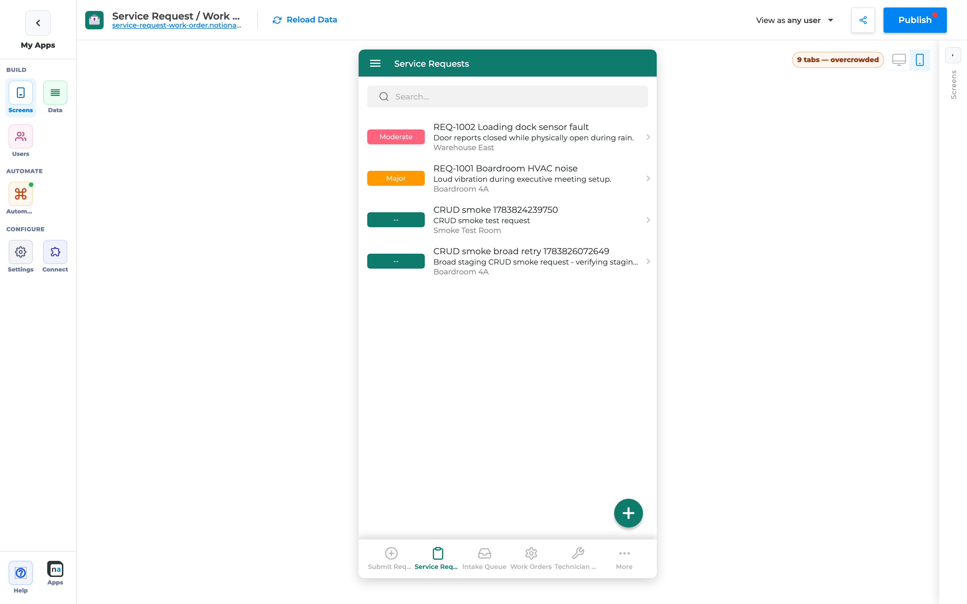
Section titled “Step D1 — Open a List on Desktop”- Screens → select a List (for example Service Requests).
- Switch preview to Desktop.
- Optionally click Hide configuration so the preview is wide enough.
- Until a row is selected, the right pane shows Select a row.
Step D2 — Select a row
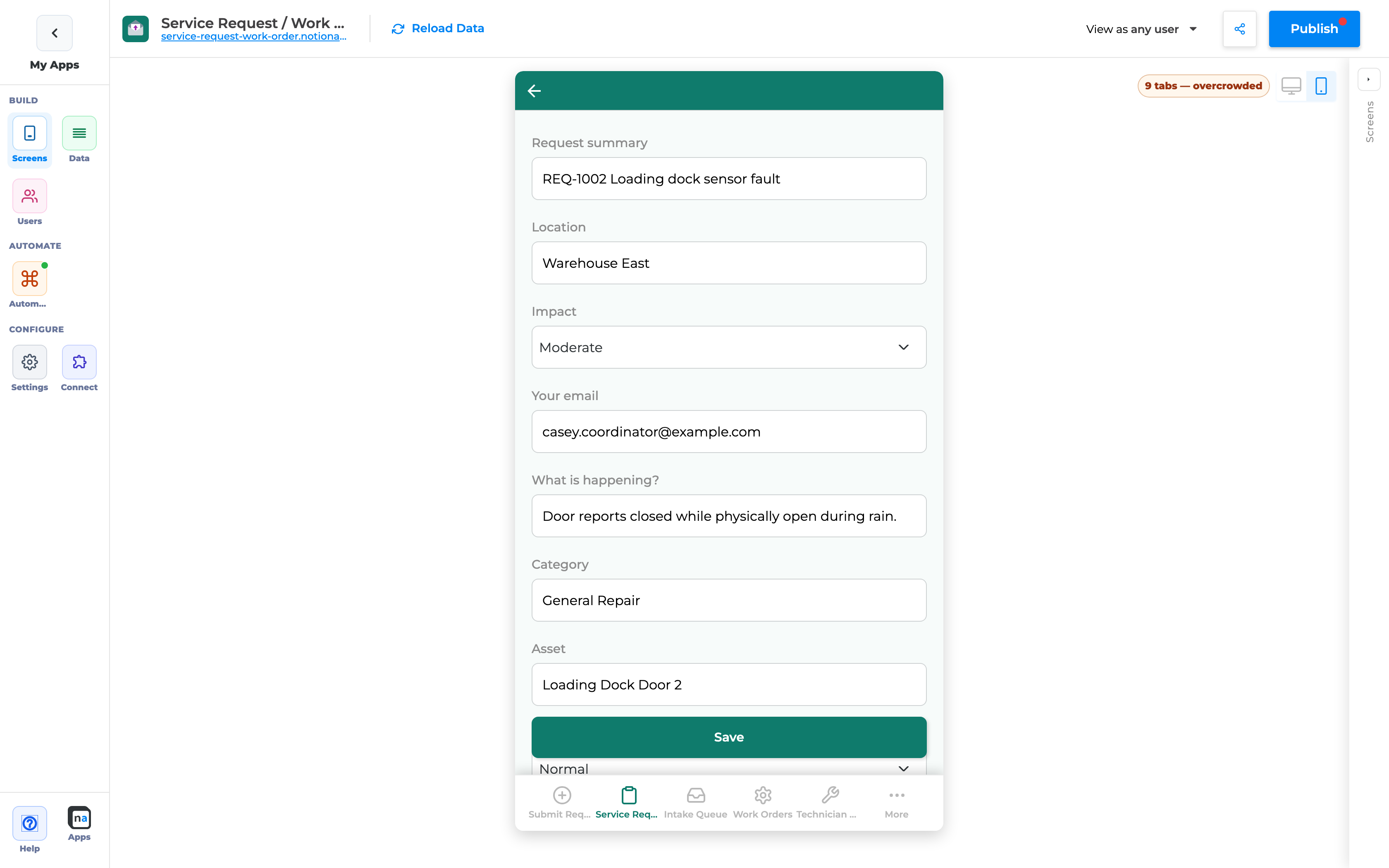
Section titled “Step D2 — Select a row”- Click a list row.
- Details (or Update Form) open in the right pane.
- Use Close on the pane toolbar to clear the selection (empty “Select a row” state).
Step D3 — Create from the list FAB
Section titled “Step D3 — Create from the list FAB”- Click the list + / create action on desktop.
- The Create Form opens in the right pane (same workspace), not a second phone column.
Step D4 — Phone / narrow desktop still stack
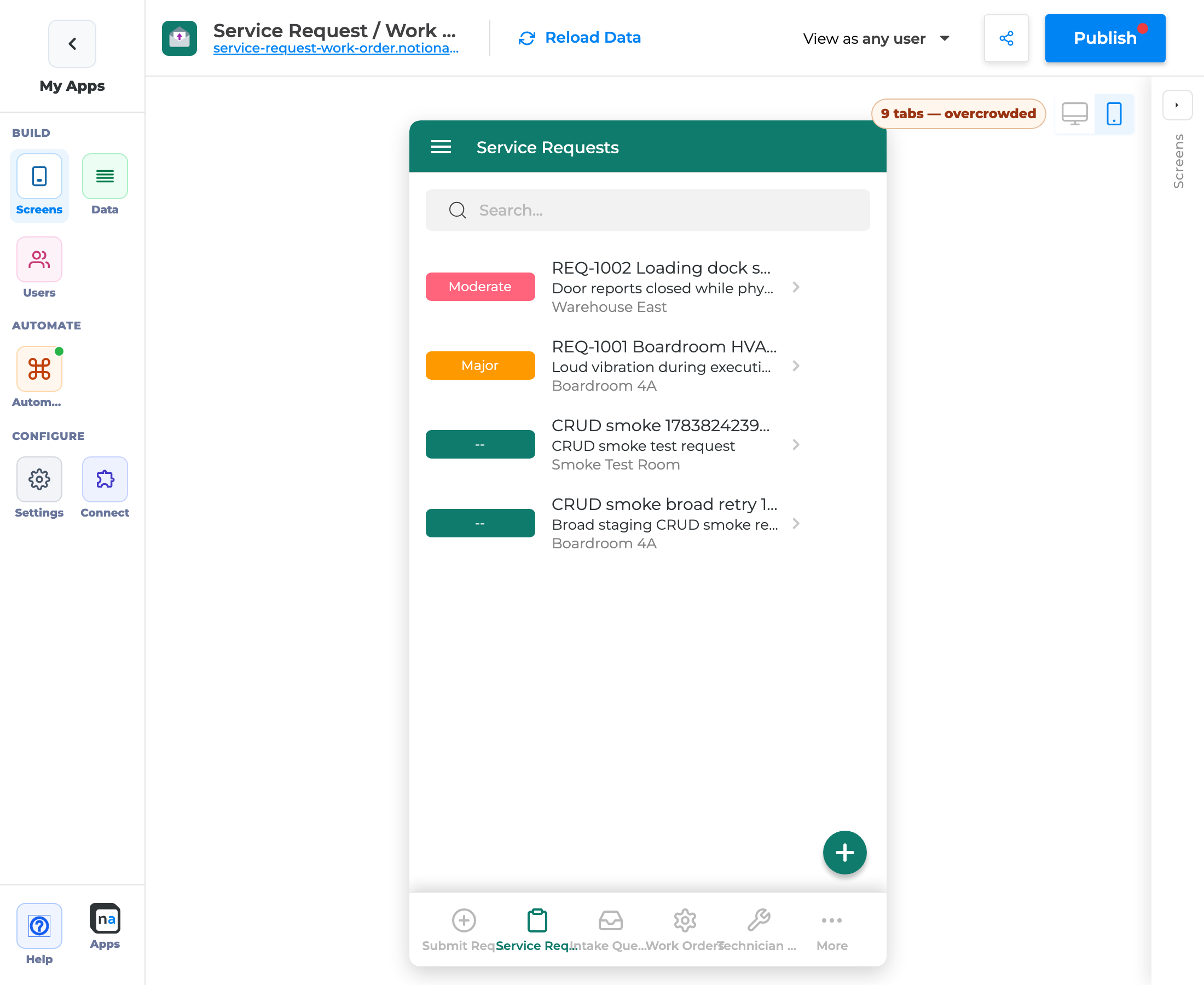
Section titled “Step D4 — Phone / narrow desktop still stack”- Switch to Phone preview (or shrink below the breakpoint).
- Row tap still pushes Details/Form on the stack — mobile navigation is unchanged.
Part E — Details sticky action rail + Page Content TOC
Section titled “Part E — Details sticky action rail + Page Content TOC”Details sticky actions (desktop)
Section titled “Details sticky actions (desktop)”On desktop Details, primary actions (Edit / Delete) sit in a sticky footer rail — similar to sticky Submit on forms — so users do not scroll to find them.
Page Content table of contents (new comps)
Section titled “Page Content table of contents (new comps)”- On a Details (or Form) screen, add Show Page Content.
- Open the component settings — Table of contents defaults to enabled for newly created comps.
- TOC still only appears when the page has at least the minimum heading count (default 2).
- Existing comps without stored TOC prefs stay off (no forced migration).
Part F — Cleaner app names (“Copy of …”)
Section titled “Part F — Cleaner app names (“Copy of …”)”Cloning an app still creates draft names like Copy of …. End users should not see that prefix.
| Surface | Behavior |
|---|---|
| Login / OTP titles | Leading Copy of is stripped (including nested copies) |
| Publish | Published app name is sanitized so clones stop shipping the prefix |
| Draft / builder name | Can still show Copy of … until you rename |
Maker tip: After cloning, rename the app under Settings → General before you publish to customers.
End-to-end example (makers)
Section titled “End-to-end example (makers)”Goal: Ship a Service Request app that looks intentional on desktop and phone.
- Settings → General → Layout preset Comfortable + your brand color.
- Confirm login on the published URL (hero color, wrapping title, rounded fields).
- Open Submit Service Request → Desktop preview → sticky Submit + Heading sections.
- Open Service Requests List → Desktop + wide preview → click a row → details in the right pane with sticky Edit/Delete.
- Switch to Phone → confirm stack navigation and mobile Submit.
- Publish and retest the live app.
Checklist
Section titled “Checklist”- Layout preset chosen (Compact / Comfortable / Showcase)
- Color / icon set for login hero
- Published login title wraps; no hard truncate
- Forms use Headings for section grouping
- Desktop Submit sticky (or intentional override)
- Phone Submit still follows Mobile position
- Desktop List shows master–detail at wide width
- Phone List still stack-pushes Details/Form
- Details sticky Edit/Delete on desktop
- New Page Content comps: TOC enabled when headings qualify
- App renamed / publish sanitized (no customer-facing “Copy of …”)
- App Published
Troubleshooting
Section titled “Troubleshooting”| Symptom | Likely cause | What to do |
|---|---|---|
| Layout presets do nothing in preview | Looking at Appearance only / not saved | Use General → Layout presets; wait for save; refresh preview |
| Login title still truncated | Old published build | Publish again; hard-refresh end-user |
| No master–detail pane | Phone preview or narrow desktop | Desktop view + widen ≥ ~1100px; Hide configuration |
| Row still full-screen pushes on desktop | Below breakpoint | Widen preview; confirm Desktop toggle |
| Sticky Submit missing | Desktop position = Match mobile / overridden | Set Sticky page footer (or clear override) |
| TOC missing on old Page Content | Existing comps default off | Enable TOC in component settings |
| “Copy of” still on login | Name does not start with prefix, or not published | Rename in General; publish |
Related Guides
Section titled “Related Guides”- Control Desktop Form Submit Placement
- Add a Table of Contents to Page Content
- Find Your Way Around the Builder Nav Rail
- Custom CSS Guide
- Custom Font Guide
Builder options at a glance
Section titled “Builder options at a glance”This guide teaches a focused maker workflow. For the full screen option inventory (What it does / How to use / Why) and annotated builder screenshots, use the matching Types of Screens guide:
- Data screens: List (View Items), Details, Form (Add Item), Form (Update One Item), List (Update Items), Content
- Everyday chrome / Queue & activity: see the Types of Screens index
- Automation native screens: Native Automation Screens
Recommended defaults
Section titled “Recommended defaults”- Change one option family at a time, then publish and test on phone and desktop.
- Prefer screen-level settings in Content / Behaviour / Appearance before custom CSS/JS.
- Keep public access and navigation visibility intentional on every screen you link from this guide.