Select Option Badges
Select Option Badges
Section titled “Select Option Badges”Select Option Badges
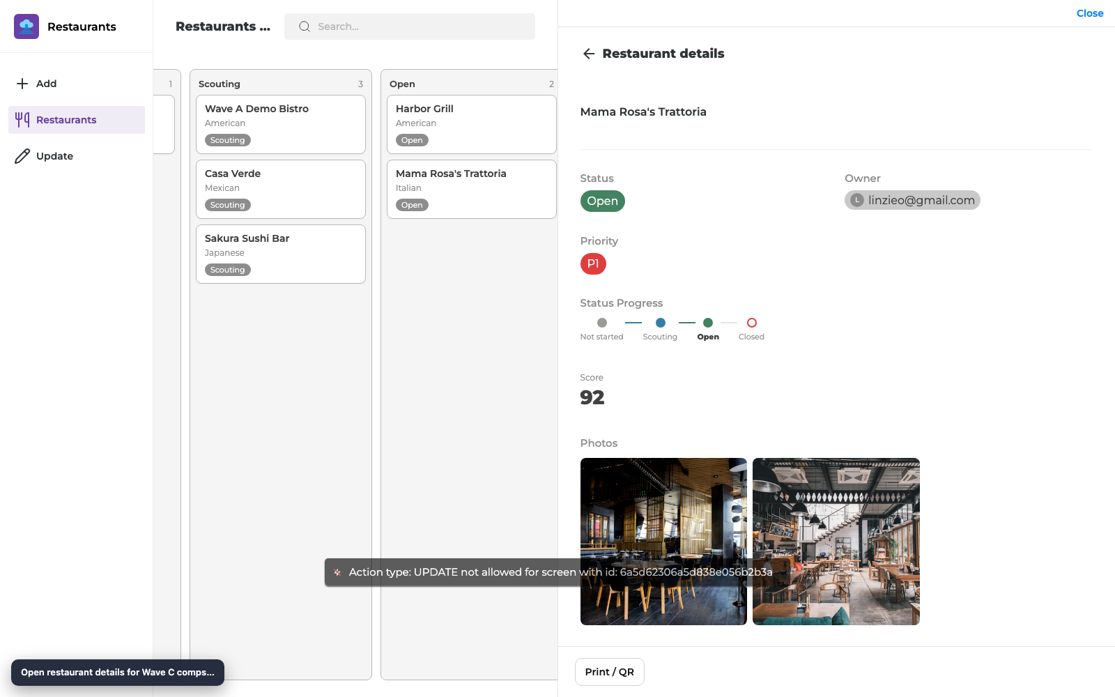
Section titled “Select Option Badges”Show Notion Select (and Status) options as colored badges/chips in lists and Details so Priority, Stage, and similar fields match Notion’s colors.
What you get
Section titled “What you get”| Surface | Behavior |
|---|---|
| List tags | Select options use Notion colors when tag colors are seeded / synced |
| Details chips | Select values render as colored badges |
| Status | Continues to use Notion status colors (see Status & People guide) |
Before you start
Section titled “Before you start”- A Notion Select (or Status) property with colored options
- That property mapped on List and/or Details
- Reload Data after you change option colors in Notion
Step 1 — Sync option colors
Section titled “Step 1 — Sync option colors”- In Notion, set option colors on your Select property (for example P1 = red, P2 = orange).
- In the builder, click Reload Data.
- Open a List that tags by that Select field and confirm tag colors match Notion.
Step 2 — Confirm Details badges
Section titled “Step 2 — Confirm Details badges”- Open Details for a record with a Select value (for example Priority = P1).
- Confirm the value appears as a colored badge/chip, not plain unstyled text.
- Change the option in Notion or via an Update Form, Reload/Publish as needed, and re-check.
Checklist
Section titled “Checklist”- Select options have colors in Notion
- Reload Data completed
- List tags reflect those colors
- Details shows a colored badge for the Select value
- App is Published after layout changes
Troubleshooting
Section titled “Troubleshooting”| Symptom | Likely cause | Fix |
|---|---|---|
| All tags one color | Stale metadata | Reload Data; republish |
| Badge missing on Details | Component still plain Details/text | Use chip-capable display / ensure Select field is mapped |
| Color wrong vs Notion | Option renamed/recolored | Reload Data; clear cache / hard refresh published app |
Related reading
Section titled “Related reading”Builder options at a glance
Section titled “Builder options at a glance”This guide teaches a focused maker workflow. For the full screen option inventory (What it does / How to use / Why) and annotated builder screenshots, use the matching Types of Screens guide:
- Data screens: List (View Items), Details, Form (Add Item), Form (Update One Item), List (Update Items), Content
- Everyday chrome / Queue & activity: see the Types of Screens index
- Automation native screens: Native Automation Screens
Recommended defaults
Section titled “Recommended defaults”- Change one option family at a time, then publish and test on phone and desktop.
- Prefer screen-level settings in Content / Behaviour / Appearance before custom CSS/JS.
- Keep public access and navigation visibility intentional on every screen you link from this guide.